For some time I was worried about the design of our tables. I was looking forward to the moment when I can bring them to a decent look.
Here's what they looked like before we seriously set about redesigning the project.
Table before redesign
If you place such a table in a design document, such as the one used in Figma, you won’t be able to find any special problems. Everything in such a table is normally read. But as soon as the component begins to fill up with real data, the tables begin to look completely bad.
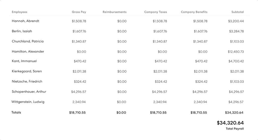
The fact is that we, at Gusto, help other companies to carry out payroll calculations. Some of these companies have dozens of employees. As a result, we constantly show our customers large volumes of complex information. For example, this is a detailed structure of the employee’s salary structure, as well as detailed information on taxes at various levels. This means that the component that implements the table plays a very important role for our customers. This also means that our design team needs to make every effort to ensure that this component performs well when outputting large amounts of data. For example, in the situation shown below.
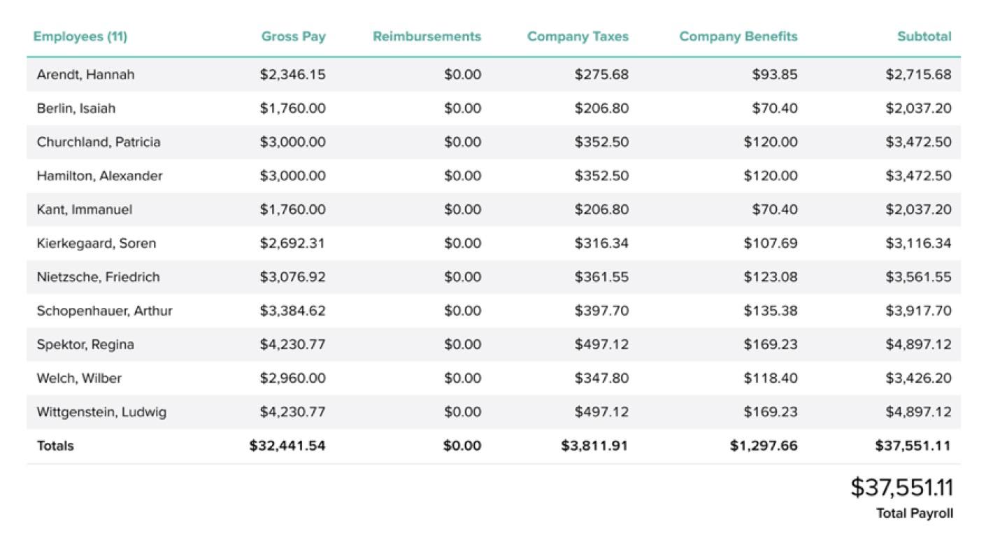
Example populated table
After conducting a study of user behavior, we found that our customers usually look at such tables, trying to understand the data they display. Is the salary calculated correctly for this employee? Do all tax amounts look correct? Is there an error here? Unfortunately, we can do little in terms of UX to make it easier for our customers to handle taxes. However, there was one problem in the user interface that had bothered me for many years. And I knew that its solution would help improve the perception of tables.
In order to talk about this problem and its solution, let's first talk about how numbers are arranged in sets of descriptions of characters that are fonts.
In most fonts, numbers usually have different widths. As a result, for example, the number 4 is likely to be wider than the number 1. And usually there is no problem here. When numbers are used in simple sentences - different widths of numbers - this is completely normal. We generally don’t think or worry that something like $ 1,235.55 may be longer or shorter than $ 9,993.24.
The numbers have different widths.
But in other cases, when certain numbers are displayed in groups, for example, in tables, this can turn into a real nightmare due to the fact that the decimal point is aligned differently, even if the numbers next to which it is located aligned correctly. This means that when you quickly scan the table, $ 1000.00 can suddenly become very similar to $ 100.00.
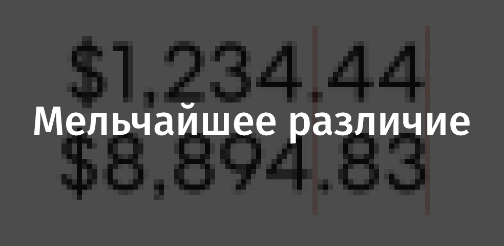
Look very carefully at the following example, get closer to the monitor if you want, and note that the numbers here are not aligned correctly.
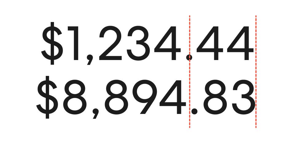
Incorrectly aligned numbers
These numbers are inferred in the same style. The only difference between the two numbers is that they use different glyphs. And so - these are numbers from one font, the same letter spacing is used when outputting them.
We would like that, ideally, all numbers would be aligned correctly, and that the decimal point would always occupy the same position, which would improve the readability of the tables.
The good thing is that on the web a solution to this problem has existed for many years. We are talking about the OpenType feature built into many fonts regarding the use of alternative styles for numbers. This feature can be called in the font description, for example, as “Tabular Figures”, “tabular figures”, “monospace figures”. You can enable this feature as follows:
.table { font-variant-numeric: tabular-nums; }
To activate this feature in Figma you need to select the text and go to the OpenType settings on the right side of the screen. Below it is shown how it looks now, but in the future this panel may well change.
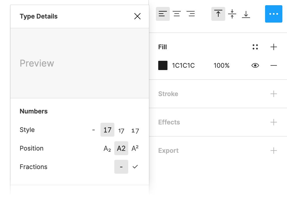
Font settings in Figma
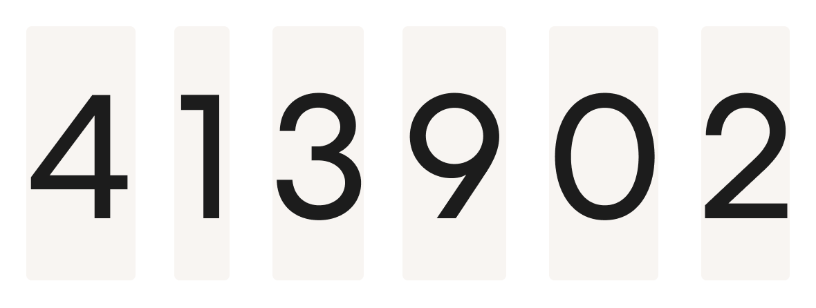
It is important to note that not all fonts support this feature. Therefore, do not expect that the font you choose will support special characters for displaying numbers. Always check everything. But, in any case, what is obtained as a result is worth the effort spent on finding a suitable font. Just take a look at the following figure. Needless to say, thanks to the
font-variant-numeric: tabular-nums
option, the pair of numbers on its right side looks much better than the pair of numbers on the left.
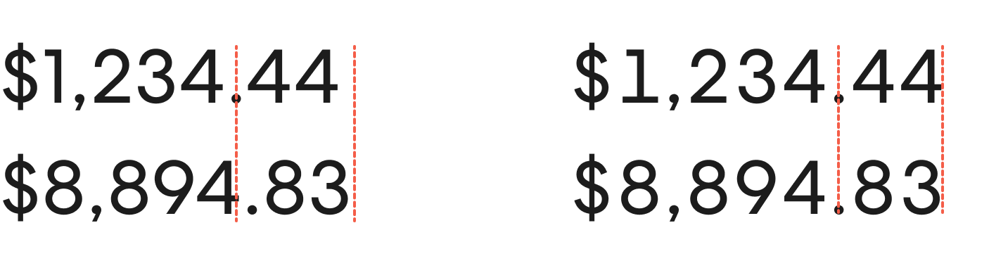
Using the font-variant-numeric: tabular-nums option
It can be seen that now the decimal point will always be in the same position. You may notice that the symbol
1
in the Centra font used here began to look different. But to really see the advantages of the new method of data output over the old one is possible only where large columns of numbers have to be output. Especially in the tables.
Old and new table output options
I believe that the new and old table variations are very different! While each number used to live its own life, the use of table numbers made it easier to quickly view tables and made it easier for users of our system to check table data.
Suddenly, it turned out that the table, designed in a new way, looks much neater than the old table. And when you start comparing the old version with the new one, you begin to understand that the smallest change in the design of the user interface can greatly affect the appearance of the project.
Dear readers! Have you ever encountered situations when a small adjustment of the font design of a project seriously improved its appearance and the convenience of working with it?