How to organize and host GUI components in a JavaFX application.
This is the fourth article in the JavaFX series. In a previous article, I described how to use FXML and SceneBuilder to create your user interface. Now we look at the layouts.
All posts in the JavaFX series:
- JavaFX Tutorial: Getting Started
- JavaFX Tutorial: Hello world!
- JavaFX Tutorial: FXML and SceneBuilder
- JavaFX Tutorial: Basic Layouts
- JavaFX Tutorial: Advanced Layouts
- JavaFX Tutorial: CSS styling
- JavaFX Weaver: Integrating JavaFX and Spring Boot Applications
Layouts
Layout is a container for components. Layouts are useful in that you can position this container as a whole no matter what components are inside. Moreover, each scene can contain only one component, so you need a layout as the root component for your scene so that you can place all the necessary components of the scene. Of course, one layout is usually not enough, but you can put one layout inside another.
In addition to this, layouts also organize and place your components within themselves. Depending on the layout used, child components may be located:
- One by one horizontally
- One by one vertically
- Stacked on top of each other
- In the grid
There are many more options. The important thing is that the layout automatically updates the position of its children when it is resized. Thus, you can have a consistent layout, even when the user resizes the application window.
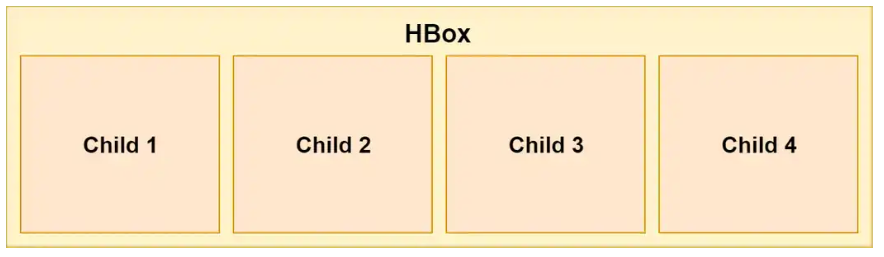
HBox
This is one of the easiest mockups available. It simply puts all the objects horizontally in a row, one after another, from left to right.
In FXML, you can use HBox as follows:
<HBox> <Button>1</Button> <Button>2</Button> <Button>3</Button> <Button>4</Button> </HBox>
In Java, you can use this code:
HBox hbox = new HBox(); Button btn1 = new Button("1"); Button btn2 = new Button("2"); Button btn3 = new Button("3"); Button btn4 = new Button("4"); hbox.getChildren().addAll(btn1, btn2, btn3, btn4);
Spacing
Our elements are now neatly arranged in a row, one after another:
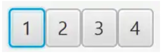
However, this option is not very good, since the elements are arranged one after another without gaps. Fortunately, we can determine the spacing between components using the HBacing spacing property:
<HBox spacing="10"> ... </HBox>
Or in Java using setSpacing () :
HBox hbox = new HBox(); hbox.setSpacing(10);
Padding
Elements are now positioned correctly, however, there is still no indentation between elements and HBox itself. It may be helpful to add padding to our HBox:
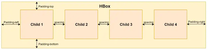
You can specify each area to be filled separately - top, bottom, left and right.
<HBox> <padding> <Insets top="10" bottom="10" left="10" right="10"/> </padding> ... </HBox>
The same can be done in Java:
HBox hbox = new HBox(); hbox.setPadding(new Insets(10, 10, 10, 10));
Vbox
VBox is very similar to HBox, but instead of displaying internal components horizontally one after another, it displays them vertically in a column:

You can still set the spacing and padding properties in the same way as in HBox.
The VBox code is used in exactly the same way as HBox, only the name is different:
<VBox spacing="10"> <padding> <Insets top="10" bottom="10" left="10" right="10"/> </padding> <Button>1</Button> <Button>2</Button> <Button>3</Button> <Button>4</Button> </VBox>
And in Java:
VBox vbox = new VBox(); vbox.setPadding(new Insets(10, 10, 10, 10)); vbox.setSpacing(10); Button btn1 = new Button("1"); Button btn2 = new Button("2"); Button btn3 = new Button("3"); Button btn4 = new Button("4"); vbox.getChildren().addAll(btn1, btn2, btn3, btn4);
Stackpan
This layout is useful for placing its components on top of each other. The insertion order determines the order of the elements. This means that the first element is at the bottom, the next is at the top, and so on.
This can be useful, for example, in order to show a picture in the layout and display some text or button on top of it.

The following example uses StackPane in FXML:
<StackPane> <ImageView> <Image url="/image.jpg"/> </ImageView> <Button>Click Me!</Button> </StackPane>
Same Java example:
StackPane stackPane = new StackPane(); Image image = new Image(getClass().getResourceAsStream("/image.jpg")); ImageView imageView = new ImageView(image); Button btn = new Button("Click Me!"); stackPane.getChildren().addAll(imageView, btn);
Align Elements
You can set the alignment of elements on the stack to better organize their arrangement:
<StackPane alignment="BOTTOM_CENTER"> ... </StackPane>
Of course you can do the same in Java:
StackPane stackPane = new StackPane(); stackPane.setAlignment(Pos.BOTTOM_CENTER);
Margin
If you want to further control the arrangement of elements in more detail, you can set margins for individual elements on the stack:
<StackPane alignment="BOTTOM_CENTER"> <ImageView> <Image url="/image.jpg"/> </ImageView> <Button> <StackPane.margin> <Insets bottom="10"/> </StackPane.margin> Click Me! </Button> </StackPane>
Or in Java:
StackPane stackPane = new StackPane(); Button btn = new Button("Click Me!"); stackPane.getChildren().add(btn); StackPane.setMargin(btn, new Insets(0,0,10,0));
Flowpan
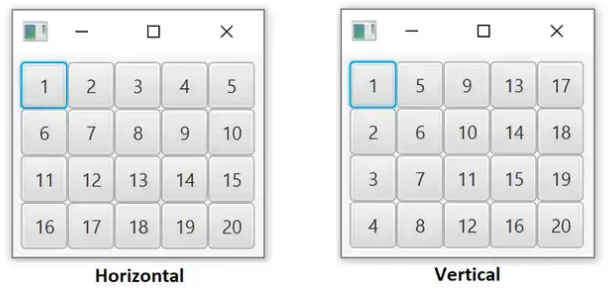
The Flow panel can work in two modes - horizontal (default) or vertical.
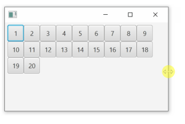
In horizontal mode, items are displayed horizontally, one after the other, as in HBox. The difference is that when there is no more horizontal space, it is transferred to the next row under the first and continues again. Thus, there can be many lines, and not just one, as in HBox.
Vertical mode is very similar, but (like VBox) it displays elements vertically, from top to bottom. When there is no more space, he adds another column and continues.
The following figure illustrates these two modes:
Note that the elements do not have to be the same size as in the image above.
Notice how the position of the components is recalculated if you resize the container:
You can set the internal filling of this layout in the same way as for HBox and VBox. However, using the spacing property is slightly different. Instead of a single property for spacing, you need to have separate horizontal and vertical spacing properties, as elements can be displayed in multiple rows / columns. Use hgap for the horizontal spacing property and vgap for the vertical property .
FlowPane flowPane = new FlowPane(); flowPane.setOrientation(Orientation.VERTICAL); flowPane.setVgap(10); flowPane.setHgap(10); flowPane.getChildren().addAll(...);
FlowPane example in FXML:
<FlowPane hgap="10" vgap="10" orientation="VERTICAL"> ... </FlowPane>
Tilepan
This layout is very similar to FlowPane. Its way of displaying components is almost identical. You can still use horizontal or vertical mode and define vgap and hgap .
One important difference is the size of the cells. FlowPane only assigns the space needed for each component. TilePane, on the other hand, makes the size of all cells the same depending on the largest element. Thus, all controls are well aligned in rows / columns.
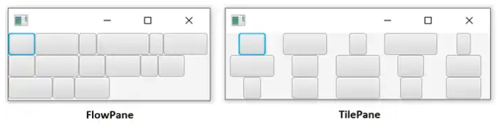
In the image above, the same components are placed in the same way, but you can easily notice the difference.
FlowPane places controls one after another, without extra intervals
TilePane places controls in cells of the same size based on the largest element.
The creation of TilePane is no different from FlowPane, except for the name.
<TilePane vgap="10" hgap="10" orientation="VERTICAL" >
Same thing in Java:
TilePane tilePane = new TilePane(); tilePane.setVgap(10); tilePane.setHgap(10); tilePane.setOrientation(Orientation.VERTICAL);
What's next
The article examined the use of several basic layouts for placing components in a JavaFX application. In fact, JavaFX has a much more diverse selection of layouts. Advanced layout options will be discussed in the next article.