Angular gradient inside rectangle
I came across this while working on one of our projects and instead of implementing such an effect using an image or SVG, we decided to use a linear gradient, the advantage of which was that it was easy enough to change the angle of inclination, gradient colors, etc. directly in CSS.

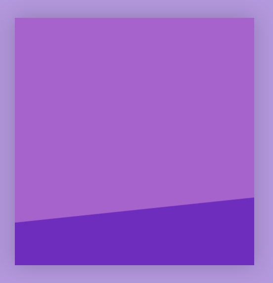
Figure 2: jagged borders of an angular gradient
The result looked like that shown in Figure 2. As you can see, there were quite noticeable protruding notches at the border of the transition of the gradient colors.
Fortunately, there is a very simple way to solve this problem! Usually, when you want to create a line of abrupt color change in a linear gradient, write the code something like this:
background: linear-gradient(176deg, white, white 75%, black 75%, black 100%);
This means that in the range from 0 to 75% of the block size, the fill color will be white, and starting with 75% - black. This creates a rather jagged line. Unfortunately, with a certain gradient angle and block size, a rather ugly zigzag can result.
Correction of this requires very small changes - add the decimal part to the second percentage, which will create a slight blur at the color transition line. Depending on your specific situation, you may need to select the necessary value so that the blur is not very noticeable - but visually smoothes it.
background: linear-gradient(176deg, white, white 75%, black 75.3%, black 100%);

Comparison of jagged and smooth gradient lines
CodePen example:
I hope in the future this will help you in solving the problems.