The current surge in articles on design systems has inspired us to talk more about what we are working on at Societe Generale. We have been experimenting with our design system for a long time, and as a designer who deeply cares about technical details, I personally consider this a huge achievement in my career.
Since the design system is a language that allows designers and developers to work in harmony, I gathered this material together with my colleague Fabien Zibi, our lead developer. We will talk about the life cycle of our system design and share the experience of fruitful cooperation, hoping that it will help and inspire people who are just embarking on this journey.

How we have evolved over the years
At Societe Generale, we have been developing our systems approach since 2014. At that time, we started with already developed prototyping resources and already encoded components for static HTML to begin the process of synchronizing digital technologies in SG Markets products, our B2B financial services market.
This allowed us to understand the behavior of our users with typical financial interfaces and see which types of components and which types of design were most effective. Regular reviews over the next few years allowed us to make our vision clearer.
Starting in 2017, we began a more in-depth process of working with the design system. Defining the basic principles and guidelines helped us to unify the system, and the intensive update of all our components led to a much easier design process. The entire design team has contributed to this work!
Later, the growing collaboration between designers and developers, combined with our strategy of attracting early projects, inspired us with confidence in the ability of our design system to be widely accepted by various development groups. This led to the release of a fully scalable system design adapted for the needs of B2B and B2E (Business Worker) with its dedicated ecosystem, which is currently used by more than 750 digital projects around the world.
But let's get you back to the beginning, to get to know more about the various stages that we went through, and to briefly familiarize ourselves with our tools that we used in everyday work.
Starting point: Building on the past
Creating a system design is one thing, and introducing such a system across the entire company is another. To do this, you need to think about what is ready and to what extent you can use it.
When the first SG Markets services were developed, we used Bootstrap 3, the advantage was the use of the open source community - we did not want to invent a wheel or a bicycle ourselves.
The continued use of Bootstrap as the central technology of the design system seemed particularly natural progress - especially after the release of Bootstrap 4, which by default provided us with a library of core components, SCSS variables and fixed many problems.

Our first step was to understand how the new library works. We created a table of more than a thousand SCSS variables that helped us quickly identify which parts needed to be changed in order to start configuring Bootstrap.
Then we added variables for our specific needs. The result was “SG” Bootstrap 4 (“SGBS4”), which, with our own artistic direction applied to existing components, was ready to become our main structure. The existing use of Bootstrap 3 throughout the company made it easy to upgrade to a new system.
Introduction to the basics
With an agreed technical foundation, we created our basic guidelines for artistic direction around the clear principles that underlie the entire concept of our design system.
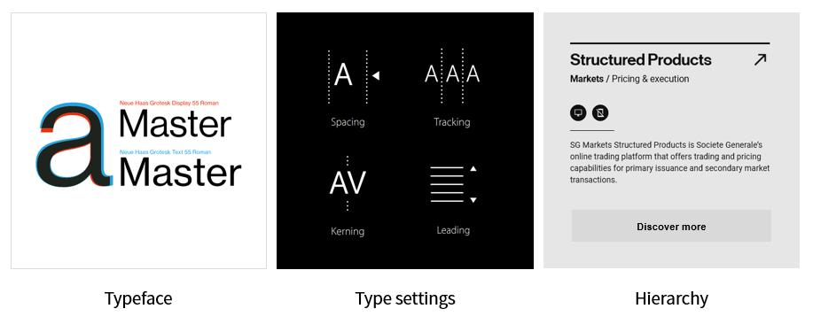
Typography
In most cases, typography makes up 90% of the site’s content. Therefore, we placed typography at the center of our design system.
Space
For harmonious layouts and a good content hierarchy, we establish an estimated relationship between margin, indentation, and space.
Shades
Our choice was inspired by the international graphic style and essence of the financial industry.
In the early stages of system design, most of our time was spent on basic recommendations. When they became stable, it was easy to identify a set of scalable components. Today, every time we want to add, improve or change something, we make sure to comply with these basic principles, because they work together to further build the system.
Three whales design system
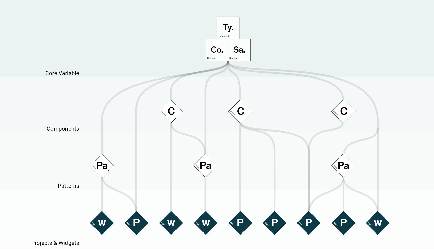
The main variables and the main directions of the artistic direction are the foundations on which we were able to build our design system. In other words, they are subatomic elements that then allow atoms to be created.
1. The structure of atomic design
Atomic design is a methodology consisting of five separate steps working together to create systems design interfaces in a more thoughtful and hierarchical way.
- Brad Frost
Since we already had an existing structure of components from our previous technical structure, we decided to keep its philosophy and reduce the five initial levels of atomic design to three, namely the following: components , patterns and patterns / widgets . At the root level of the diagram of these levels, we have kept the main variables — typography, color, and intervals — to which we have added content recommendations.
Together with this structure, the result is an easily customizable system in which all components and templates can be combined or work individually. We define the difference between components and templates on the following scale: components represent individual assets, such as buttons, input data or cards, while templates combine components into forms, headers and date picker fields.
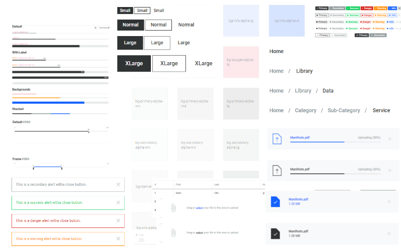
2. Patterns, patterns and widgets
Our patterns, templates, and widgets are regularly reviewed and updated to reflect the new use cases and feedback we receive to ensure that we provide the best user experience. These resources also facilitate the development of an interface for developers - the entire system is fully reusable and (almost) inextricable in code.
3. Guides
Guides and instructions to help designers and developers use resources wisely.
Our guidelines are our “one voice of truth” - they give us clear and consistent design directions. Our common goal is to combine user interaction with our products so that when the user is already familiar with one product, he can easily use the others.
These guidelines also make the product development phase faster - our designers can make sure that their design does not only correspond to the individual style, but also fully matches the design system.

Our design process and its ecosystem
Processes are constantly evolving throughout the life cycle of the system. In order for development to be harmonious and not grow into chaos , one must rely on well-established processes.

Therefore, we have developed an ecosystem of supporting tools that help to constantly interact and work with our design system.
1. Project resources are available in Adobe XD along with components and templates that are ready to use for prototyping.
2. Up- to-date documentation necessary to share the principles and rules of use at any time (with code fragments).
3. InVision and Typeform allow us to share prototypes with our users and help collect feedback.
4. “Sandbox” for programmers , which is a “live” editor, where designers and developers can quickly share code fragments and test components in any of our topics. This is our latest addition to the ecosystem. Since we work with a wide variety of options, from less financially difficult to very complex, we designed the ecosystem so that any designer or developer can share their templates.
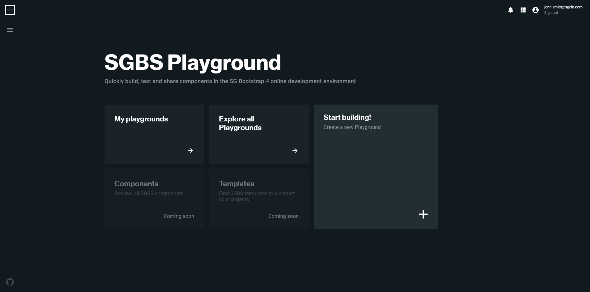
5. The sandbox site , with access for the entire community, designed for technical experiments with all assets in the code. It contains pages for each group of components and allows us to test new versions and updates of the system design in real time (therefore, if we do something, there will be no serious consequences!). This adds another layer of feedback to development until the update becomes available.
6. Github Entreprise to track, develop, and collect issues. In order to ensure transparency and traceability, we record every change in our components and collect feedback, specifications and changes from designers and developers using the system. Anyone can report an error and even fix it with a pull request or deletion request.
What's next? Check and Improve!
Today, we are in a state where we have a stable, but still developing set of resources and tools that we use daily. To move on, we ask experienced users of our system design what new features or assets they will need. In parallel, we also ask new users how, in their opinion, we can improve adaptation to the design system. Thus, we create invaluable synergy with our users and gradually facilitate implementation, which is a key success factor. Like many companies around, Societe Generale consists of diverse teams with different skills and levels of inspiration. All this makes it rather unreasonable to immediately impose a new system on these teams and their products.
If you are starting to create your own design system, here is our main tip: stay wide-minded creators ! One thing that we learned when creating our system design is that we cannot be right about everything right away or create a perfect system on the first try. Creating a system design is a large project that requires a lot of work, but keep in mind that anyone who uses it can be a carrier of valuable ideas. Therefore, "you will not win this war" with the adoption of the design of the system, if you refuse to make the system open and let it be scalable.