Because of this, designers often focus on the design accessibility options for people with disabilities. They mislead others into believing that their interface is unavailable when it actually satisfies accessibility requirements. The theses contained in this article will try to debunk common myths about the availability of color contrast.
Myth number 1. WCAG requirements are always optimal
The Web Content Accessibility Guide ( WCAG ) is used as a standard for determining available color contrast. However, these recommendations are not always practicable. Instead of following it like a dogma, you should use the guidelines to make design decisions, and not blindly execute them.
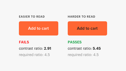
One of the cases where WCAG standards are not applicable in practice is the contrast in the brightness of white text. Both buttons below have a blue background, but one has white text and the other is black. When you ask users which button is easier to read, most will tell you that a button with white text is more readable ( source ). But color contrast ratios say something else.
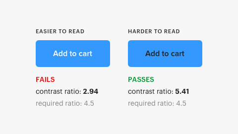
The contrast ratio for black text is 5.41, which meets the WCAG requirement. However, the contrast ratio for white text is 2.94, which is not a normal indicator. In accordance with the requirements for contrast, a button with white text should be less readable, but more readable.
A similar study comparing the white and black text of a button confirms this conclusion. Not only do users with normal vision find white text easier to read, but color blind people have made the same decision ( source ).
This contrast inaccuracy seems to occur with white text on a blue and orange background. WCAG contrast ratios do not always take into account the high brightness contrast of white text. White is pure brightness without hue or saturation, and brightness is the strongest form of contrast. Therefore, it becomes clear why a button with white text is easier to read.
The reason why the contrast parameter did not pass with white text is because it has high brightness and is in the background with high brightness. Bright text on a bright background seems computationally low-contrast. Your design should match what people see, not computational algorithms. That is why the look of the designer plays an important role in the "final formula".
WCAG is a guide to help designers select the right color contrasts. Here the famous expression of the founder of the discipline of general semantics Alfred Korzybski is applicable - “The map is not a territory”. Do not confuse the reality model directly with reality itself.
Myth number 2. The text must comply with the requirements of AAA, otherwise it is inaccessible text
WCAG has different levels of compliance for availability. Some believe that all text should comply with the highest level of requirements (AAA), otherwise it will not be available to a significant part of their users. This concept is incorrect and becomes apparent when you understand how the AAA requirement was formed.
AAA requires a contrast ratio of 7: 1 to compensate for the loss of contrast sensitivity in low-vision users (with a loss of vision of 20/80 or more). Many of these users use assistive technologies that have contrast enhancement features. They need this technology because they do not just view content on one interface, but on several at once. The AAA requirement applies only to users with a 20/80 loss of vision who do not use assistive technologies, and there are very few such users ( source ).
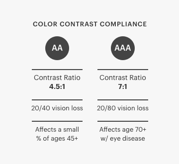
20/80 vision loss is rare among the general population and mainly affects older people suffering from age-related eye diseases. The study showed that the weakest vision in humans is associated with aging ( source ). If most of your user base is older than 70 years, meeting AAA requirements makes sense and moreover, it must be implemented. A standard of 70 years or older is one because visual acuity begins to decline among users with healthy eyes at that age ( source ).
AA compliance is sufficient for most users. The AA requirement is a contrast ratio of 4.5: 1 to compensate for the loss of contrast sensitivity by users with a 20/40 loss of vision. The study showed that “most people maintain at least visual acuity (20/40 or higher) up to 80 years” ( source ). This conclusion means that meeting the AA requirement will make your text available to most users of the interface.
Myth number 3. Interface components have the same contrast standard as text.
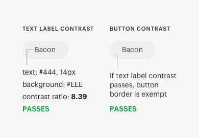
Many make the mistake of maintaining the interface components in the same standard of contrast as the text, although their standards are different. The components of the interface have a contrast ratio of 3: 1, and the text is 4.5: 1. Text requires higher contrast because users need to read it. Interface components often do not require reading text and have a lower standard ( source ).
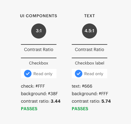
The contrast of the text is affected by many nuances, such as font size and boldness. Large font sizes (18 pt) and text with a large font weight (14 pt bold) require lower contrast ratios ( source ). In addition, some interface components may be exempt from this requirement. Before you bind an interface component or text to a contrast ratio standard, make sure you apply it correctly.
Myth number 4. Inaccessible buttons and gray text look like disabled functionality
Another common myth is that gray text is inaccessible text. Many people think that users cannot read gray text because it looks low contrast. Sometimes this may be true, but sometimes it is a false assumption. For example, the button below has gray text, although some users find it unavailable. However, its launch through the contrast checker shows that it not only complies with the AA standard, but also significantly exceeds the standard.
Another myth you can hear is that the gray button is not available because it does not meet the standard of the contrast ratio. It turns out that success criteria for buttons do not require a visual border indicating the area of impact. If the button with the text has a frame, there are no contrast requirements except the text contrast ( source ). Thus, the gray button, which most consider inaccessible, meets the contrast requirement.
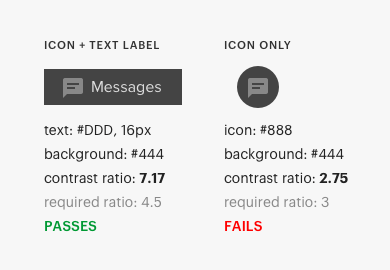
This success criterion also means that the icons next to the buttons do not have a contrast requirement if the text label corresponds to a contrast ratio of 4.5: 1. However, if the icon does not have a text label, a 3: 1 contrast ratio requirement applies to the icon.
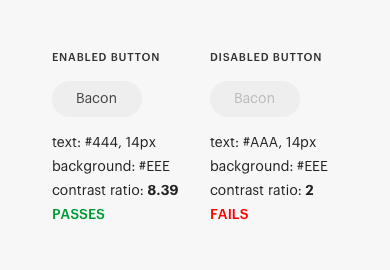
There is also the myth that the gray buttons look disabled, which is often spread by biased observers who do not understand the correct purpose of inactive components. Disabled buttons are indicated by a lack of contrast above the text label. When a button is hard to read, users are not worried about it, which is basically the goal of a disabled button. Not to mention that the contrast requirement does not apply to inactive components.
Myth number 5. Color blind people cannot distinguish contrasting colors
A common assumption is that if a design uses color contrast to convey information, color blind people will not notice the difference. Color tone and color contrast are two different dimensions. Color blind users are difficult to distinguish certain shades, but they do not have difficulty in perceiving differences in color contrasts ( source ).
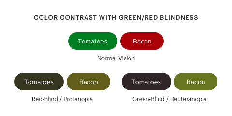
For example, many people find that the buttons below are not available for color blind, because it uses color contrast to indicate different states. But the bottom line is that color blind people can quite clearly distinguish contrasting colors. Buttons use only one color shade without other competing ones and have sufficient contrast.
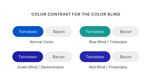
Using the color blind simulator, you can simulate the perception of color by color blind and what they see. Users with a deficit of red-green color and a deficit of blue-yellow color easily see the difference in color contrast.
Color blind users can hardly notice color contrast when green and red have almost the same darkness ( source ). The example below shows what color blind users will see if the buttons are red and green with the same darkness.
If you use competing color tones to distinguish between states, you need some other visual cue other than color. But if you use color contrast only to distinguish between states, it is likely to be acceptable and affordable for color blind people.
There are different types of color blindness, but the ones you should focus on the most are red-green. Red-green color blindness affects more than 99% of all color blind in the world ( source ). There are several color blind simulators that you can use for testing, for example, this extension for Google Chrome is Colorblindly .
Myth number 6. A color signal alone is not enough to transmit information
This myth is probably the one in which designers are mistaken most often. They often refer to the requirement “Use of color” without understanding when this standard is applied. There are nuances in these standards that you need to understand before you start using them.
The accessibility requirement states that "color should not be used as the only visual means for conveying information, indicating an action or distinguishing an element." However, this standard applies only when specific colors are assigned specific values to inform the user ( source ). In other words, if you use color differences to convey information, you need an extra signal. But if you use contrast to transmit information, you do not need an additional signal if the difference in contrast is high enough.
For example, the toggle buttons below use blue to indicate an active state. But there is no special meaning for blue. The active state is transmitted through color contrast, not color cast.
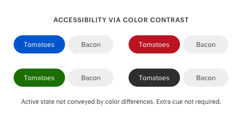
The color cast for the active state is arbitrary. You can use any other color shade, and this will be enough if it maintains a high level of contrast with respect to an inactive state. Therefore, the “Use of color” requirement does not apply to this scenario.
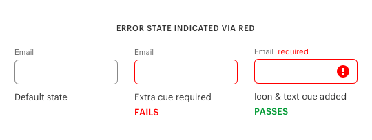
An example in which color has a specific purpose is an example of an error state in the fields of an input form. Red is often used to indicate an error in a text field. In this case, red is not enough to indicate the error state, because color blind people will not see it. Red will appear black to them. Therefore, you need an additional signal, such as text or an icon, to indicate the status of the error.
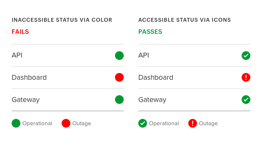
Another example is the use of color to indicate the state of a system on a page. Color shades of green and red are often used to indicate the severity of system messages. In this case, the “use of color” requirement applies because there is a specific purpose for color shades. Icons are needed here to help color blind people distinguish between each of the system states.
Color contrast is not always the only signal when it comes to conditions. Visual depth is also a hint that users experience. This happens when objects contrasting with the background appear closer and dominate, while objects that have no contrast appear even further and dominate. The blue button in this example seems closest to users. As a result, emphasis and its domination mean an active state.
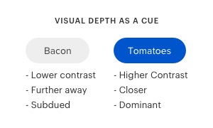
It is this manipulation of contrast with the background, which creates depth in the buttons and allows users to distinguish between the active state. If both buttons had the same level of contrast, users could not perceive depth as a visual signal.
Myth 7: affordable design meets the needs of every user on the planet.
In an ideal world, any designer would like to satisfy the needs of any user. However, this is a very ideal, and therefore unattainable, situation. Even if you use WCAG to the fullest, there will always be a user who finds your design difficult through the prism of his perception of design through vision.
Instead of striving for an ideal based on an unattainable fantasy, strive for an ideal based on an achievable reality. The reality is that an affordable design cannot satisfy the needs of every user, but it can satisfy the needs of as many users as possible.
Understanding this truth means recognizing the fact that a minority of users will not get the same good experience as most. But, fortunately for the minority, there are assistive technologies with high-contrast modes. Designers who truly understand accessibility will strive to achieve a realistic ideal, not fantasy.
The nuances of the availability of color contrast
Accessibility should always be a design priority for users. WCAG recommendations are an effective tool to help you create an affordable design of the highest standard. The myths described above are not triggered by WCAG guidelines. They are caused by people who misinterpret, misrepresent, and misapply guidelines.
Understanding the nuances of the availability of color contrast will help you exactly meet WCAG standards. If suddenly other people start projecting these myths about the availability of color contrast on your design, you can always fix them. You will remain faithful to visual simplicity and aesthetics, while balancing it with accessibility. And most importantly, the result will be a meaningful interface that will satisfy almost all of its users.