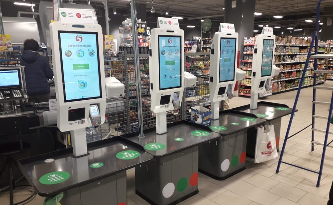
Why did X5 need a self-checkout counter?
Experiments with self-service cash registers (CSRs) began at the X5 Retail Group back in the early 2010s. Already ashore, it was clear that such devices could bring serious benefits to retail, including reducing the number of queues, increasing the throughput of the cash zone, and saving customers time. But the first "independent" ticket offices were bulky and slow, and in bulk purchase they cost like the very Boeing.
However, the hypothesis was confirmed: there is definitely good use from digital cash registers. The first steps gave us the main thing - an understanding of those key indicators, upon reaching which the devices pay off and begin to bring benefits to the network . If we want to set up self-service checkouts not in beautiful showcases of the center of Moscow, but in thousands of Pyaterochka all over Russia, our “digital” employee must be several times lower than the market, be fast, maintainable in the fields, attractive, reliable ... In general, everything as we love - cheaply, efficiently, quickly. That is a practically unsolvable task.
We started by looking for ready-made solutions. We looked at a variety of markets, without missing out on the most hype initiatives, like trolleys with cameras. There is no reason to be surprised: today, at any “technology review”, on the one hand, the equipment of international giant vendors is presented, on the other - Chinese innovations. Moreover, in Asia, natural selection in technology is much faster than in Europe, due to the size of the market and the pressure of a highly competitive environment.
As a result, often even prototypes of Asian manufacturers are better brought to mind, because vendors from the Celestial Empire always try several options at once and, choosing the best, are accepted to duplicate it.
We decided to try the Chinese cash registers on ourselves and at the end of 2018 went to assess the level of digitalization of Chinese stores ( you can read about this here ). Needless to say, thousands of stores across the country turned out to be packed with compact CSR monoblocks of local production running Android, without weights (they have everything packed in advance) and with cashless payments. According to the results of the first requests to manufacturers, it turned out that the usual

So a certain ideal appeared in my head in terms of appearance. The internal structure, of course, did not correspond to our ideas. One wrong hand movement after opening the candy bar - and everything is broken. Since it is usually inside, as in a laptop, all the boards are in the clear. It is technologically advanced, but not for field repairs.
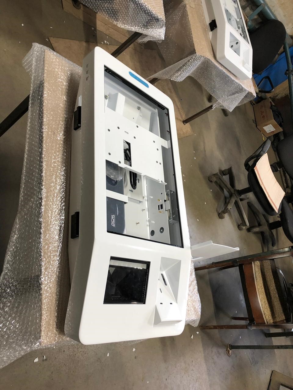
Where did Pyaterochka begin “box office DIY”
Initially, the innovation laboratory tried to go the shortest of reasonable ways. We asked for samples of terminals from a suitable price category and prepared to choose the best one in terms of a set of parameters, having somehow moderated your ego on the topic of maintainability.
But it was not there! Almost all cheap Chinese CSRs are based on ARM processors and, accordingly, run on Android. At the same time, the X5 Retail Group's cash infrastructure has been built on Intel architecture for several years. And changing the basis for the sake of a single innovation is simply impossible, at least without huge investments (read - for a pilot launch it is impossible in principle).
More substantive negotiations began with manufacturers. As it turned out, the issue of processors is not so acute, and the transfer of the device to Intel chips added a moderate $ 200-400 to its price. But another difficulty was revealed: the devices were designed for the domestic market, and Chinese trade legislation was much more liberal than the Russian one. The local players did not know what a fiscal registrar is. But you still needed a bank terminal!
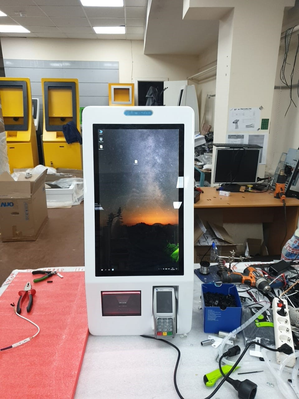
The new device was supposed to be convenient for the buyer, and for store employees, and for network service contractors. It would also be nice to leave a foundation for future development: new forms of payment, neural networks, so what else will we come up with ...
Mikhail Kucherenkov, Head of Innovation Solutions
Creating a new device for the store, you are not able to predict all the scenarios of its use, which will be in demand in two to three years. Large vendors are now making equipment to meet the current needs of retailers. And nothing more, otherwise the cost of the device will rise, they will lose their competitive advantage in tenders. We started from both urgent tasks and where the technology is moving in retail. Therefore, for example, stereo speakers, a microphone, a 3D camera were added to the terminal. And most importantly, they designed it so that, as needed, it was possible to gradually replace the filling with a more powerful one. Moreover, right in the store it will be possible to “upgrade” the self-checkout counter to a new level in 10 minutes. This means that its life cycle will be longer.
The laboratory made the first intermediate conclusion: to get a device that fully meets the technical specifications, you need to design it from scratch. Either by a large vendor, or by yourself. Moreover, in terms of costs, these two options were equivalent. But if you want to do well (and scale) - do it yourself! Therefore, they decided to focus the expertise on the development of devices and software for them inside the company, and the production of devices themselves should be taken outside according to the OEM principle.
How we assembled a digital cash register with our own hands
At first, few people believed in the project outside the laboratory of innovation: in the X5 Retail Group (for obvious reasons) no one had ever developed their own hardware. However, agreed that you need to try.
The primary understanding of what CSR design should be is based on the best market models and common sense. In particular, when analyzing Chinese devices, it became clear that the most reasonable way is to make the box office look extremely simple and at the same time close to modern user gadgets.
And then the adventures with their own development began. The cash desk interface was written from scratch inside the innovation lab. They also designed the iron and the casing on their own with the support of one of the manufacturers of self-service systems, entrusted the physical implementation of the ideas to the same contractor with an R&D division and production facilities. And they started prototyping the box office.
An important task during the prototyping was to combine the expertise in classic trading equipment collected by different units of X5 and put it into the device. On average, the next iteration of changes materialized in two weeks, and these iterations were evaluated by the working group.
Each element of the hardware filling was searched separately. There were no difficulties with models of the periphery - due to the basic requirement “everything is like at the usual Pyaterochka cash desks.” Fiscal registrars and bank terminals were included in the overall design of the device. All other components were chosen to your taste, experience and ingenuity. a barcode scanner so that customers don’t have to “aim” for a long time, and they, believe me, suffer from it, and this “kills” the customer’s experience. In the current assembly, we use large Datalogic and Symbol scanners to quickly scan barcodes of different t Stand.
The team of "innovators" composed the technical stuffing from the most successful iron models that were available during the design period. A slightly different element base will go into mass production - these are the realities of the industry. A common story: I looked at an excellent Intel processor, you want to order, for example, several thousand units in the next three years, when it suddenly turns out that it is being discontinued. As a result, we have to dwell on a comparable chip with a guarantee that it will be possible to buy it in large quantities in the next five years.
Our developers made the CSR block fanless: fewer moving parts - less dust settles, higher reliability. Initially, the configuration was based on the quad-core Intel Celeron J3455 with low TDP, but soon it will be replaced by an older model with similar characteristics. The choice of low TDP was deliberate: it forces you to write effective software, with an eye to limited resources. And meticulously approach the choice of other technologies. Say, you can’t fasten a heavy software component for working with queues to the system.
Everything was tested, up to the depth of installation of the pinpad inside the case and the angle of its inclination. Ergonomic solutions were tested on the basis of life situations: is it convenient for people of different sizes to bring a card to a reader, is it easy to attach a large smartphone to it.
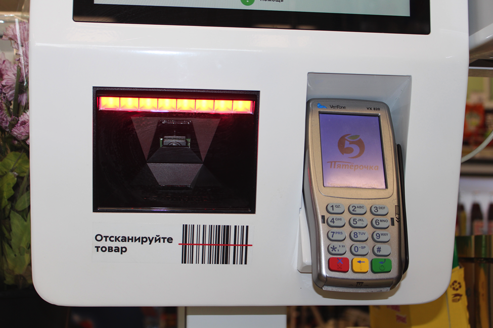
Solutions were sought based on applied tasks. For example, it was required to provide a CSR camera. It can be mounted in different ways. Many vendors do this flush. The first prototype was made with such an installation scheme - it turned out that with respect to the selected design of the box office it was unsuccessful. They tried to make the “head” of the camera separately. It became better, but tests showed that the “head” should be raised higher and the angle of its tilt should be changed so that it was convenient for customers to work with the display. How much higher, they tested on the prototype during live tests in the trading floor.
In fact, prototyping was a series of fast iterations with models from ... matches and acorns. More precisely, electrical tape, cardboard, boxes, wooden wedges - in general, everything that was at hand and helped to evaluate the solution here and now. After all, if you do something for a long time, especially in a new sphere, it is likely that you will not do it at all. Therefore, they constantly checked, mainly on themselves and on their colleagues.
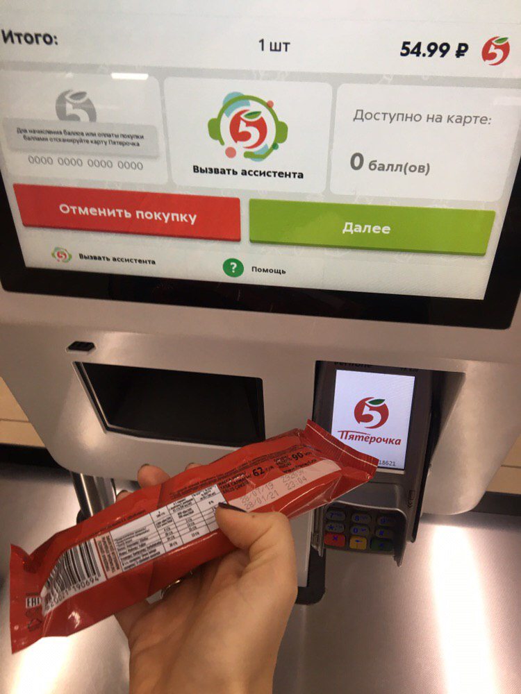
By the end of June, the vision of “CSR of a healthy retailer” was finally settled in the laboratory: they drew up the terms of reference for the OEM-manufacturer, prepared drawings and wrote software for the selected hardware. Then ordered a pilot series of devices and furniture for them.
How to make a cashier attractive
To assemble iron and make the design of the case is half the battle. The software will decide whether they will use the cash desk, and use it with pleasure (and the creators of the cash desk themselves a little ... but mostly the software). Last but not least, its interface. In retail, self-service cash registers created by large vendors evolved from equipment used by cashiers. And the interfaces of such devices were originally designed for store employees to work with them. Such an UI (verified) drives ordinary people into a stupor , and no wonder: the buttons are square, the color scheme is unusual, the logic of actions escapes - this is not a modern mobile application with clear accents on the UI.
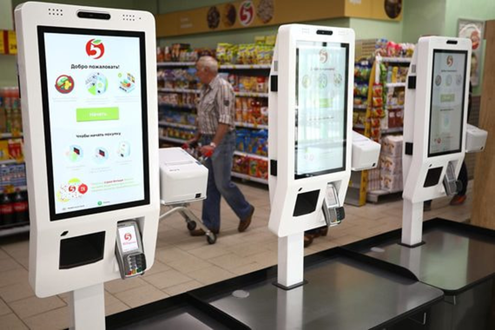
The innovation laboratory studied what software for CSR is generally available on the market, and realized that it is more appropriate to build on already implemented familiar cases, like in fast food. People are used to such terminals and enjoy using them. Therefore, from the very beginning, the team that created it in CSR was guided by the usability of just such devices, as well as by modern web interfaces.

The same arguments dictated the choice of the technological stack: Electron JS framework, HTML, CSS. In addition, web technologies enable you to quickly implement changes. The interface design (he also went through several transformations) was outsourced in the laboratory, and the communication layer between the GUI and the core of the POS system was written by ourselves - third-party developers would have been dealing with the platform device for more than one month.
In essence, cash desk software serves as a front-end add-on over the existing platform: for example, Pyaterochka has long been using its own software solution - GK. It is impossible to rewrite the platform from scratch - too much is tied to it. As well as making changes to it and supporting them from release to release (see the very beginning of our article). Therefore, it was decided to wrap the cash register core in a shell that actually emulates the work of a cashier. Rather, it converts everything that the user with the screen does into operations that are understandable to the backend.
This approach complicates the system a little, which means it reduces its reliability, but it allows you to quickly create a finished product. Moreover, without the risk of "collapse" one of the important business operations, such as fiscalizing a check and working with bank cards.
Step forward and two back
In the same way as in the case of R&D in terms of iron, the creation of interfaces has turned into an “iterative meat grinder”. And in the same way, after several successive transformations, sometimes we had to go back a few steps.
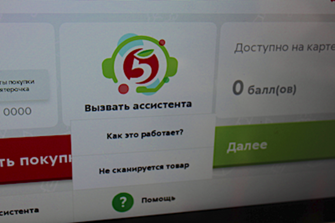
At an early stage of UI development, the desire to make the interface “like on a smartphone” first led the team along the wrong track. The "Back" button is placed on the top left, the menu call is on the top right. But it quickly became clear that such an arrangement is inconvenient on a large display: they still need to be reached. You understand this especially clearly when you look at your grandmother next to the cash register. She sees, but she is comfortable when everything is in the middle. Therefore, all controls are moved down.
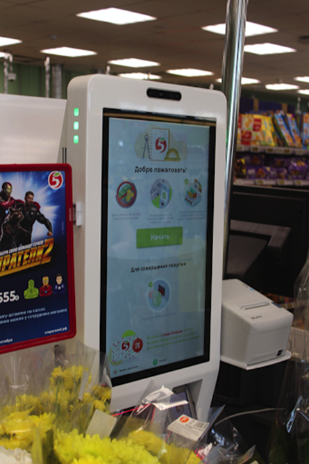
In addition, it was vital to ensure that the interface responds quickly to any customer action. In a world where a person is thinking about changing a smartphone, if it opens up five seconds longer on his current Instagram, few will agree to endure a checkout that has been “thinking” for a long time.
What happened and how our CSR work today
The team that created the CSR was able to make the device meet all the requirements that were put forward at the start of the project: in terms of production cost, ease of use, reliability, maintainability and ease of service in the fields, readiness for the evolution of technology and a quick upgrade and etc.
The pilot began about six months ago: 75 “digital cashiers” went to work in 14 stores of the Pyaterochka chain in different parts of Moscow. The results show customers like it! Although not everything is perfect, but there is a lot of work ahead.
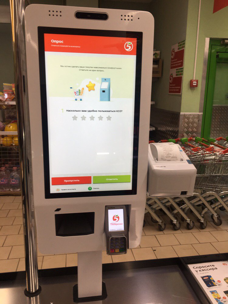
Of course, it’s not yet possible to transfer all purchases to CSR (yes, we don’t want to): firstly, they are intended primarily for those who have relatively few purchases, and secondly, the device is not yet able to automatically calculate the cost of a weighted item. We already installed such scales in the second stage of the pilot.
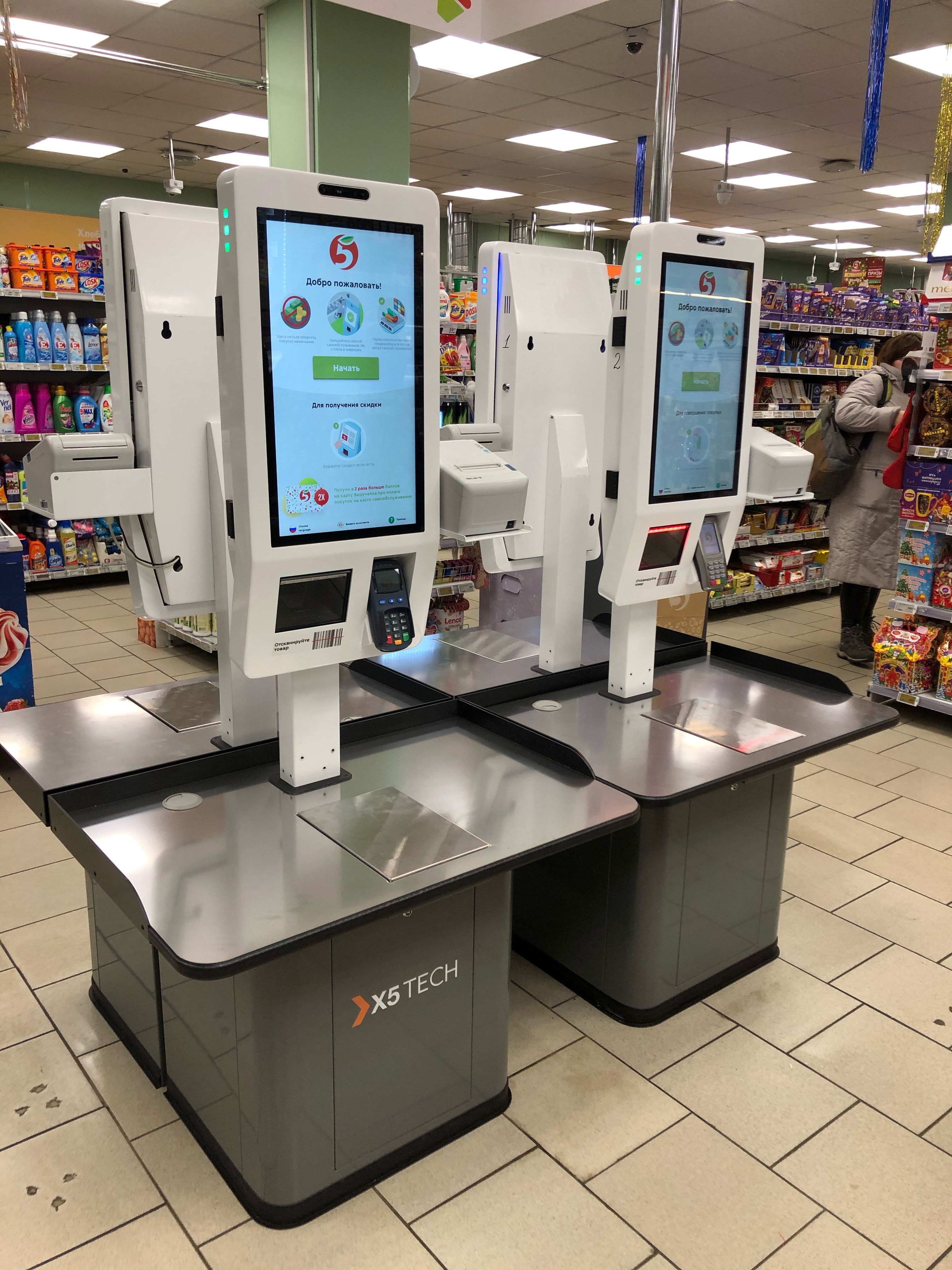
CSR works a little faster than a regular cash register. The digital cash desk in the laboratory was built on a new hardware base with a margin of safety for several years in advance. In addition, the software for the device is written in order to minimize delays.
Most willingly, as expected, young people and middle-aged people reached the self-checkout counters. Someone likes the idea of making a purchase using a gadget, someone is attracted by what is called Look and Feel in the design (the white terminals in the current iteration are really pretty). However, older people are more likely to use CSR than anticipated. In their own words, the main advantage of this format of purchases is that no one rushes them, when scanning it is easy to check the prices of products and, if the goods can not afford it, just put it aside and do not buy. Most regular customers master the CSR interface in one or two approaches.
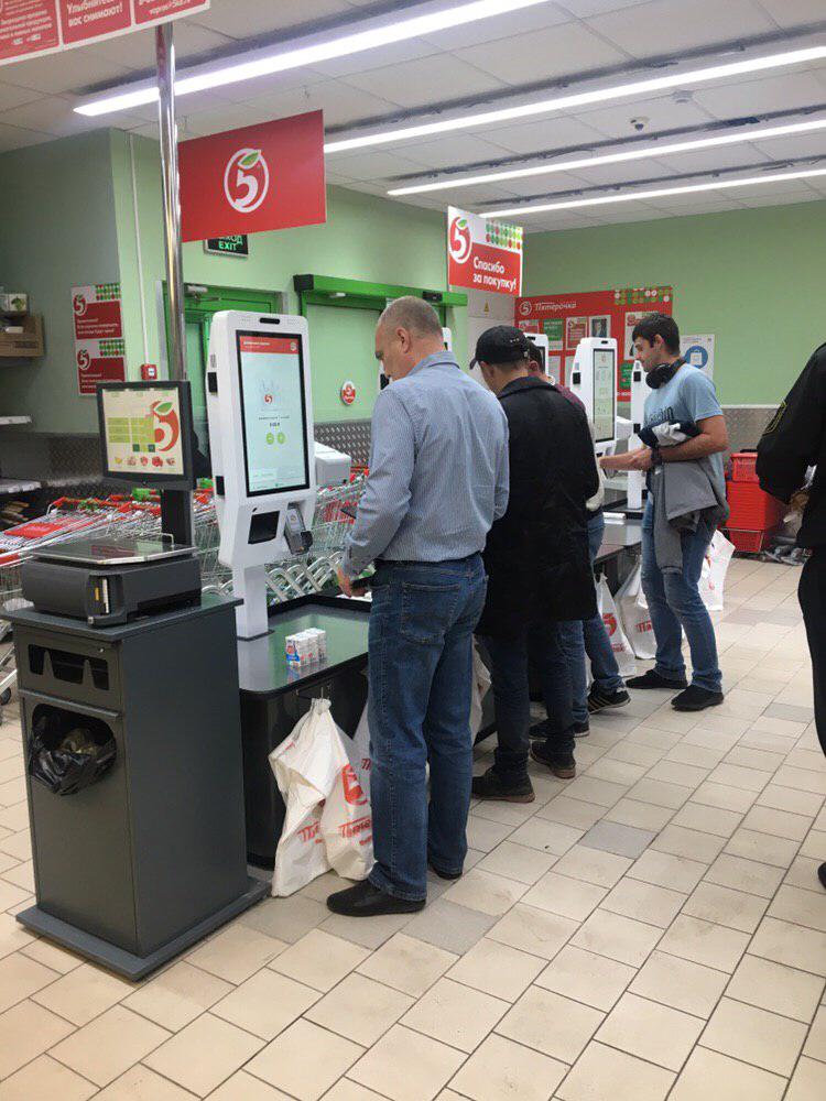
Now in the cash zones where CSR is installed, assistants work. Their duty is to come to the aid of customers, to support and suggest actions to beginners. From the point of view of UX, difficulties arise rarely in a person who purchases 2-3 goods — a bottle of water, a loaf of bread, a chocolate bar. Rather, in the first use, psychological support is important that someone is nearby and ready to help. Usually, real help is needed when a store visitor is faced with tasks that, in the case of standard cash desks, are hidden from him and that are solved by cashiers. For example, the law requires that when buying cigarettes or alcohol that the buyer is an adult, make sure the store employee. Therefore, after scanning the bottle of alcohol, CSR is blocked, and the inscription appears on the screen: "An assistant will come up to you now." It is possible that in the future, with the evolution of legislation, it will be possible to implement either biometric authentication, or at least remote authentication, similar to car sharing: the client opens the passport to CSR, his face and document are photographed by the built-in camera, and the remote employee in the center verifies his data.
The devices are able to accrue points according to the Pyaterochka loyalty program. True, there is no reader of discount cards in the current CSR performance: work with bonus points is implemented through the Pyaterochka application.
What awaits the "digital box office" in the near future
According to the results of the first stage of testing, we have already set about finalizing the checkout and are almost ready to tell you about scaling our devices to hundreds and thousands of stores. This is the next interesting task.
As for the ticket offices themselves, the road-map for their functional development is scheduled for about two years in advance. Among the improvements planned for the near future are the introduction of a weight platform, payment with QR codes, etc. (in order to reduce the cost of the pilot’s first stage, the box office did not supply weights). But, of course, everything will depend on what customers themselves need. They usually speak very clearly if asked and listened carefully.
You quickly get used to the good - you just need to overcome yourself a bit and try a new shopping experience. In the end, if you do not like this “release”, you can always roll back and return to the usual Gala, which knows how to cancel the purchase.
True, most of our customers are already choosing a “digital cashier”.
