Accessibility on the web is essential for a fair and equitable society. The more our social and professional sphere of life goes online, the more important for people with disabilities becomes the ability to participate in all online interactions without additional barriers. Just as building architects can care for or neglect accessibility technologies such as wheelchair ramps, web developers can help or hinder users who use additional means of accessing the Internet.
Thinking about users with disabilities, we must remember that often they use services in almost the same way, simply using other tools. Among these tools, the most popular are: screen readers, screen loops, browser scaling, text size increase, or voice control. But the list is not limited to them.
Often, improving site accessibility benefits everyone. Although we usually think of people with disabilities as people who are in this state all the time, in fact, anyone can find a temporary loss of functionality. For example, someone is a blind person, someone has a temporary eye infection, and someone is just on the street under the bright, blinding sun. All this may be the reason why the user is currently not able to see what is displayed on the screen. Anyone can, for some reason, temporarily become limited in capabilities, and therefore improving the accessibility of your websites will improve the convenience of all users, regardless of their condition.
The Web Content Accessibility Guidelines (WCAG) provide guidelines on how to make your site accessible. These recommendations were used as the basis for our analysis. However, there are often situations in which it is very difficult to programmatically analyze the availability of a website. For example, a web platform provides several ways to achieve similar functional results, but the code underlying it can be dramatically different. Therefore, our analysis is only a rough estimate of the overall availability of websites.
We identified four main categories: readability, media elements on the web, ease of page navigation, and accessibility using assistive technologies.
During testing, we did not find a significant difference in accessibility between desktop and mobile versions. As a result, all the results presented by us relate to desktop versions, unless otherwise indicated.
Readability
The main purpose of a web page is to provide content that users want to interact with. This content may be a video or a set of images, but more often it is plain text. That is why it is extremely important that this text content is readable. If visitors cannot read the content of the web page, they cannot interact with it, and this will lead to the fact that they simply leave the site. In this section, we will consider three parameters by which sites were rated.
Colour contrast
There are many examples where visitors cannot clearly see the contents of a site. They may be color blind, unable to distinguish the color of text and page background (1 out of 12 men and 1 out of 200 women of European descent). Perhaps the user simply reads the text in bright sunlight, creating a lot of glare on the screen, significantly impairing visibility. Or maybe it's just an elderly person with impaired vision, not able to distinguish colors as well as before.
As a result, to be sure that your site is readable under these conditions, it is important that the text color is sufficiently contrasted with respect to the background.
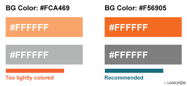
Figure 1. An example of insufficiently contrasting text. Courtesy of LookZook
Only 22.04% of sites make the color of all text contrasting enough. Or in other words, 4 out of 5 sites contain text that merges with the background, which complicates its reading.
Please note that we do not have the ability to analyze the text inside the images, so the value we called is the upper limit of the percentage of sites that have passed the test
Zoom and Page Zoom
Using legible font size and sufficient click area helps users read text and interact with the site. But even those sites that exactly follow the recommendations mentioned cannot fully meet the specific individual needs of each visitor. That's why special device features such as pinch zoom and zoom are so important: they allow users to customize your page to fit their needs. Or in a situation of extremely inaccessible sites using small fonts and buttons, this still gives users the opportunity to interact with page elements.
There are rare examples where disabling scaling is acceptable. For example, when the page in question is a web game using touch control. If you leave the possibility of scaling in this situation, the players’ devices will zoom in and out every time the player double-clicks on the screen, ironically, making this approach unavailable.
Therefore, developers take into account the ability to disable this function by setting one of the following two properties in the viewport meta tag :
- user-scalable set to 0 or no
- maximum-scale set to 1, 1.0
Unfortunately, developers too often abused this, that almost every third site in the mobile version has this feature disabled, and Apple (starting with iOS 10) no longer allows developers to disable the zoom feature. The Safari mobile browser ignores this tag . All sites, no matter which, can be scaled using zoom on new iOS devices.

Figure 2. The percentage of sites by device type on which scaling is disabled
Language definition
The web is full of amazing content. However, there is a catch: there are more than 1000 different languages in the world and the content you are looking for may not be available in the language you speak. In recent years, we have made significant advances in translation technologies, and you probably used one of them (for example, Google Translate).
In order to facilitate this opportunity, translation technologies must know what language the text on your pages is written in. This is done using the lang attribute . Without it, computers are forced to guess this. As you might have guessed, this leads to a lot of errors, especially when the pages are multilingual (for example, navigating your page in English and the contents of the article in Japanese).
To an even greater extent, this problem is noticeable when using speech synthesizer technologies, such as screen readers, which try to read text in the language set by default by the user, unless another language is specified on the site.
From our analysis it follows that 26.13% of the pages do not specify the language using the attribute " lang ". This makes this quarter of all pages potentially prone to the problems described above. The good news is that among sites using the " lang " attribute, 99.68% indicate the correct page language value
Distracting content
Some users, such as those with cognitive impairment, have difficulty concentrating on one task for a long time. These users do not want to deal with sites containing a large number of dynamic and animated elements, especially when these effects are present solely for beauty and are not related to the task being performed. At a minimum, such users need the ability to turn off all distracting animation.
Unfortunately, our data indicate that elements with endlessly repeating animation are quite common on the Internet: 21.04% of pages use it with the CSS properties of endless animation or with the help of the <marquee> and <blink> elements.
However, it is noteworthy that the reason for most of these phenomena is a few popular third-party CSS libraries, which are set by default to endless looping animation playback
Web Media Elements
Alternative text for images
Images are an important part of the modern web. They can tell interesting stories, attract attention and evoke emotions. But not everyone can see these images. Fortunately, in 1995 HTML version 2.0 provided a solution to this problem - the “alt” attribute . It provides web developers with the ability to add a text description of the images that we use, so when someone cannot see this image (or the image did not load), it remains possible to read an alternative description text.
Despite the fact that the alt attribute was introduced 25 years ago, it is still not used for some images by 49.91%, and it does not occur at all at 8.68% of pages.
Audio and video captions
As images are good for storytelling, audio and video content is also good at attracting attention and expressing ideas. When audio and video are not signed, users who for some reason cannot currently listen to it, lose a considerable part of the essence of the material. It is about the need to include signatures for audio and video that we most often hear complaints from deaf or hard of hearing people.
Of the entire list of sites using the <audio> or <video> tags, only 0.54% add signatures (the measurement criterion was the presence of the <track> element).
Convenience of navigation on the page
When you open the menu in a restaurant, the first thing you probably do is read the section headings: snacks, salads, main dishes, desserts. This allows you to quickly examine the menu for possible options, and then immediately switch to the dishes of interest. Similarly, when a visitor opens a web page, his goal is to find the information in which he is most interested - the main reason why he came to the page. In order to help users find the content they are interested in as quickly as possible (and save them from clicking on the "back" button), we try to divide the contents of our pages into several visually distinguishable sections. For example, the heading of the site for navigation, various headings in the article, so that users can quickly go over their eyes, footer for additional information.
Although it is extremely important, we must take care of the layout of the pages so that visitors' devices can correctly recognize these individual sections. Why? Although most readers use the mouse to navigate pages, there are a large proportion of users who rely on keyboards and on-screen readers. The correct operation of these devices is more dependent on how well it recognized the page layout.
Headings
Headings are useful not only from a visual point of view, but also especially important for on-screen readers. They allow screen readers to quickly jump from section to section and indicate where one section ends and the next begins.
To avoid confusing screen reader users, be sure not to skip the header levels. For example, do not jump from H1 directly to H3, skipping H2. Why is it important? Because this unexpected change may lead screen reader users to think that they missed some of the content. This can lead them to start looking for some of the content that they might have skipped, even if it’s actually not. In addition to this, you will only help readers if you adhere to a single style.
With that said, we got the following results:
- 89.36% of the pages use headings somehow. Awesome
- 38.6% of pages skip heading levels
- Strange, but H2 headings are more common than H1 (translator's note: most likely, we are talking about the very fact of using headings of a certain level, and not about their number on the page)
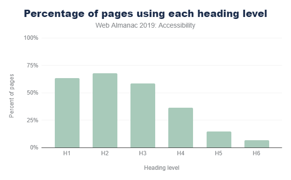
Figure 3. The prevalence of header levels
Index of "main" content
An index of “main” content helps on-screen readers to determine where the main content of a web page begins, so that users can go directly to it. Without this, screen reader users are forced to manually go through all sections of the navigation each time they go to the next page of the site. Obviously, this is very tiring.
We determined that only one of the four (26.03%) pages contains this index. And surprisingly, 8.06% of the pages mistakenly contained more than one main index, forcing its users to guess which of the indexes really reflects the main content.
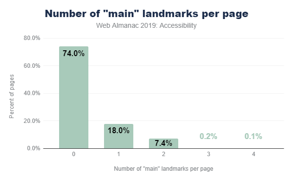
Figure 4. The percentage of pages by the number of main indexes
Sectional HTML Elements
Since HTML5 was introduced in 2008 and became the official standard in 2014, many HTML elements have appeared to help computers and screen readers understand the layout and structure of a web page.
Elements such as <header> , <footer> , <nav> , and <main> indicate in which part a particular type of content is located and allows users to quickly navigate the page. They are widely used in development, with most of them being used on more than 50% of the pages (the <main> tag is an exception).
Other tags such as <article> , <hr> and <aside> help users understand the main content of the page. For example, it reports where one article ends and another begins. These items are not used as often. Each has a rate of 20%. They are not an integral part of the page, so this is not necessarily an alarm.
All these elements are designed primarily to improve accessibility and do not visually stand out, which means that you can replace them with the currently used elements without fear of unforeseen consequences.
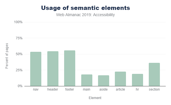
Figure 5. Using different semantic HTML elements
Other navigational HTML elements
Many popular screen readers allow users to quickly navigate through links, lists, list items, frames, and form fields such as buttons, radio buttons, checkboxes on the page. Figure 6 shows how often we came across pages using these elements.

Figure 6. Other navigational HTML elements
Skip Links
Skip links are links located at the top of the page and allow screen readers or users using only the keyboard to go directly to the main content. They allow you to skip all the navigation links and menus at the top of the page. Skip links are especially useful for keyboard users who don’t use on-screen readers, as these users usually don’t have access to other quick navigation modes (for example, headings). It was found that 14.19% in our study have such links.
If you are interested to see how such a link works, just search on Google and click “tab” on the results page. A link hidden before this will appear, as in the figure below
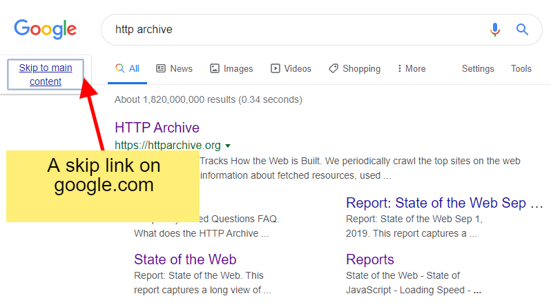
Figure 7. Example skip link on Google
When parsing the page code, it’s hard enough to pinpoint what the skip link is. In this study, if we found a link with an anchor ( href = # heading1 ) among the first three links on a page, then we defined it as a page with this element. Thus, 14.19% is the upper limit of the share of pages using such links.
Hotkeys
Hot keys set via aria-keyshortcuts or accesskey attributes can be used in one of two ways:
- Activating an element on a page like a link or button
- Focus on a specific page element. For example, moving the focus to a specific input field on a page allows the user to start typing right after that.
As a result of our research, we can conclude that the aria-keyshortcuts attribute is practically not used, since it was found only on 159 sites out of more than 4 million. The accesskey attribute is used more often - at 2.47% of pages (1.74% on mobile versions of sites). We are inclined to believe that its more frequent use on desktop versions of sites is due to the fact that developers believe that users access mobile versions of sites only from devices with touch screens and do not use a keyboard.
Particularly unexpected was the fact that 15.56% of mobile and 13.03% of desktop sites that use hot keys assign the same combinations for different elements. This means that the browser is forced to guess which particular key combination should belong to.
Tables
Tables are one of the main ways to organize and present large amounts of data. Many assistive technologies, such as screen readers and switches (which may be useful to users with motor disabilities), may have special features that allow them to navigate tabular data more efficiently.
Headings
Depending on the particular structure of a particular table, using table headers makes it easy to read across columns and rows without losing the context of what data this particular column or row refers to. For screen reader users, moving around a table devoid of row and column headers is no easy task. This is because it is difficult for a screen reader to keep track of their current location in a table without headings, especially when the table is large enough.
To lay out table headers, simply use the <th> tag (instead of <td> ), or the ARIA columnheader or rowheader roles . Only 24.5% of the pages of the table were marked out using one of the indicated methods. Consequently, on the remaining three quarters of the pages, the developers laid out the tables without headings, creating additional difficulties for users of screen readers.
Using the <th> and <td> tags was a more common method for marking table headers. The roles of columnheader and rowheader are practically not used: since they met only on 677 sites (0.058%).
Signatures
Table captions using the <caption> element are useful to provide a greater descriptive context for readers of all types. The signature can prepare the reader for the perception of the information that the table contains, and this can be especially useful for people who can easily be distracted or interrupted. They are also useful for people who might get lost inside a large table, such as screen reader users or someone with learning disabilities or intelligence. The easier it is for readers to understand what data is presented to them, the better.
Despite this, only 4.32% of the pages in the table have a signature.
Assistive Technology Compatibility
Using ARIA
One of the most popular and widely used web accessibility specifications is the Accessible Rich Internet Applications (ARIA) standard. This standard offers many additional HTML attributes to indicate the role of an element, despite its visual representation (that is, their semantic meaning) and what types of actions they are designed for.
Proper use of ARIA can be challenging. For example, we found 12.31% of pages using invalid values for ARIA attributes. This is an urgent problem, because errors when using ARIA attributes are not visually visible. Some of these errors can be detected using automatic validation tools, but usually it still requires manual verification using assistive devices (such as screen readers). This section defines how ARIA is used on the web and in particular which part of the standard is the most common.

Figure 8. The popularity of ARIA attributes among using pages
Role attribute
The role attribute is the most important in the entire ARIA specification. It is used to inform the browser about the purpose of this HTML element (that is, about the semantic meaning). For example, an element styled through CSS as a button should receive the ARIA role " button ".
Currently, 46.91% of pages use at least the ARIA attribute " role ". In Figure 9 below, we have compiled a list of the ten most commonly used values for ARIA roles.

Figure 9. Top 10 aria roles
Looking at the results in Figure 9, two interesting points can be distinguished:
- updating a UI framework can have a major impact on web accessibility
- an impressive number of sites are trying to make modal windows available
Updating UI frameworks can be a way to increase accessibility throughout the web
Top 5 roles, all appear on 11% or more pages and are landmark roles. They are used to aid navigation, and not to describe the functionality of elements such as a drop-down list. This is an unexpected result, because the main motive of ARIA was to give developers the opportunity to describe the functionality of elements made from common HTML elements (for example, <div>).
We suspect that some of the most popular UI frameworks have included navigation roles in their templates. This would explain the widespread use of landmark attributes. If this theory is true, updating popular UI frameworks with better accessibility support can have a huge impact on web accessibility.
Another result pointing to this conclusion is the fact that the more “advanced” but equally important ARIA attributes do not seem to be used at all. Such attributes cannot simply be implemented through UI frameworks, because they may need to be configured based on the structure and appearance of a particular site. For example, we found that the posinset and setsize attributes were only used on 0.01% of the pages. These attributes tell the screen reader user how many items are on the menu list and which one is currently selected. Thus, if a visually impaired user tries to navigate the menu, he should hear an announcement, for example: “Home, 1 out of 5”, “Products, 2 out of 5”, “Downloads, 3 out of 5”, etc.
Many sites try to make modal windows available.
The role of dialog is relatively popular, because making modal windows accessible to screen readers is very difficult. That is why it is very impressive that 8% of the pages analyzed did it all the same. Again, we suspect that this metric could have been achieved through the use of some specific UI frameworks.
Text Labels for Interactive Elements
The most common way a user interacts with a site is through its controls, such as links or buttons. However, screen readers often do not know what action the item will take when it is activated. Often this confusion occurs due to the absence of text labels on the elements. For example, a button containing a left arrow icon indicating that it is a Back button, but not containing a text description of it.
Only about a quarter (24.39%) of pages use buttons or links that include text labels. If the element does not contain such a text label, the screen reader user can read something in common, for example, the word “button” instead of the more specific “Search”.
Buttons and links can almost always be selected using the Tab button and therefore have a prominent appearance. Navigating a site using the Tab button is one of the main ways that users using only the keyboard can browse your site. Thus, the user will certainly encounter buttons and links that are not marked with text, if he or she navigates the site using the Tab button.
Availability of form elements
Filling out forms is a task that many of us do every day. Regardless of whether we make purchases, buy a ticket or send a resume, forms are the main way to transmit information to a website. Because of this, making forms accessible is incredibly important. The easiest way to achieve this is to specify a name for each input field via the <label> tag or the aria-label or aria-labelledby attributes . Unfortunately, only 22.33% of the pages are given names for all form input fields, which means that 4 out of 5 pages have forms that are difficult to fill out
Mandatory and incorrectly filled field pointers
When we meet a field with a big red asterisk, we know that it is required. Or when we click "Submit" and we get a message that incorrect data has been entered, all fields highlighted in a different color should be corrected, and the form will be sent again. However, visually impaired or blind people cannot rely on these visual cues, which is why the HTML attribute “ required ” or the ARIA attributes aria-required and aria-invalid are so important . They provide screen readers with an alternative to the red asterisk and field highlighting. In the form of a nice bonus, when you tell the browser which fields are required, they themselves , without resorting to JavaScript, will check the correctness of the filled fields.
Of all the pages on which forms are present, 21.73% use the required or aria-required attributes when marking required fields. Only one out of five sites uses this. This is an easy step to make your site accessible and unlock useful browser features for all users.
We also found 3.52% of sites with forms marked up using the aria-invalid attribute . However, since their effect only occurs after submitting a form with incorrectly filled in fields, we could not determine the exact percentage of sites that use them in the markup.
Duplicate ID
IDs can be useful in HTML for linking two elements. For example, the <label> element works this way . You specify the ID of the input field that this label describes and the browser associates them. What is the result? Now users can click on this label to focus on the input field, and screen readers will use it as a description.
Unfortunately, duplication of IDs occurs on 34.62% of sites, which means that on many sites the ID specified by the user can refer to several different input fields. Thus, when the user clicks on the label to highlight the input field, in the end he can get focus on the wrong element that he expected. As you can imagine, this can lead to especially dire consequences, for example, on the checkout page in the online store.
This problem is even more pronounced for screen readers, because their users may not be able to visually check what exactly is selected. In addition, many ARIA attributes, such as aria-describedby and aria-labelledby , work similarly to the <label> elementdescribed above. Thus, to make your site accessible, removing all duplicate IDs is a good first step.
Conclusion
Not only people with disabilities need accessibility. For example, anyone who temporarily injures a wrist may have difficulty hovering a mouse over a small area of pressure. Vision often worsens with age, making it difficult to read small text. Dexterity of fingers in people of different ages is also different, making clicking on interactive elements or swiping on mobile versions of sites difficult for most users.
Similarly, auxiliary software is designed not only for people with disabilities, but also to increase the convenience of everyday work:
- , , , . ,
- , , , . ,
- , ,
After creating a site, it is often difficult to implement accessibility for an existing site structure and its elements. Availability is not something that can then be added to the finished product, it should be part of the design and implementation process. Unfortunately, due to the lack of tools pointing to this, many developers are not familiar with the needs of all other users and the requirements of the devices they use.
Despite the fact that the results of our study are not final, they indicate that the use of standards such as ARIA and best accessibility practices (for example, the use of alternative text) is found on a considerable, but non-essential part of the Internet. At first glance, the indicators are quite encouraging, but we suspect that a considerable merit in this UI framework. On the one hand, this is disappointing news, because developers can’t just rely on frameworks to make their sites accessible. On the other hand, it's nice to see how much frameworks can affect Internet accessibility.
The next goal, as it seems to us, is to make the elements that come with the frameworks more accessible. Since many complex widgets used in products (for example, a calendar widget) are ready-made libraries, it would be great if they were initially designed with accessibility in mind. We hope that when we carry out the following analysis, the use of more correctly implemented complex ARIA roles will increase, which means that more complex elements will also become more accessible. In addition, we want to express our hope to see more accessible media elements, such as images and videos, so that all users can enjoy the wealth of the web.