Recently, we published our new Mabiloft website with a completely redesigned clean design and lots of great new illustrations and animations.
After our designer did an amazing job, having thought over and drawing the site, we, the developers, needed to implement the layout, keeping it clean and complete for each device, from the large 2K screen on which we write the code to the old iPhone 4 with it 3.5 inch display.
A few weeks later, the website was almost ready and I looked through it to make sure everything was working as it should. Noticing that the layout of the main page did not display correctly on our iPad, I quickly changed some CSS rules and fixed the error, but ... this led to problems in displaying the layout on all all laptops with a small screen
Looking for a solution to this problem, I found that I could make both layouts perfect using only CSS media expressions without resorting to using JavaScript.
In fact, before that I basically used CSS media expressions to make the layout responsive using max-width and min-width .
Now I have discovered that CSS media expressions are not just max-widths, but many different values. And some of them can be really useful in everyday life.
So what are these media expressions that I'm talking about? You may have heard of some. But I also highlighted several of them, the use of which can be very useful
Viewport size
Yes, I'm talking about width, height, min-width, min-height, max-width and max-height .
Do they need a special introduction? I will be brief.
These media functions are used to set different styles for different screen sizes. They are very useful in developing a responsive system.
Since the width and height functions can only set styles for the exact size of the scope, it is more likely that you will use the max- and min- prefixes. For example, in the following code, styles will only be applied if the viewport height is greater than 320 pixels.
/* , 320 */ body { background-color: #FFD23F; /* */ } @media screen and (min-height: 320px) { body { background-color: #EE4266; /* */ } }
But you can also mix these functions to handle a range of sizes
/* , 320 600 */ body { background-color: #FFD23F; /* */ } @media screen and (min-width: 320px) and (max-width: 600px) { body { background-color: #EE4266; /* */ } }
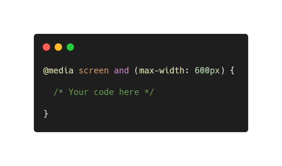
The following example demonstrates how to use the max-width function to change the background color depending on the width of the scope
body { background-color: #0EAD69; } @media screen and (max-width: 1600px) { body { background-color: #3BCEAC; } } @media screen and (max-width: 1280px) { body { background-color: #FFD23F; } } @media screen and (max-width: 960px) { body { background-color: #EE4266; } } @media screen and (max-width: 600px) { body { background-color: #540D6E; } }
Screen orientation
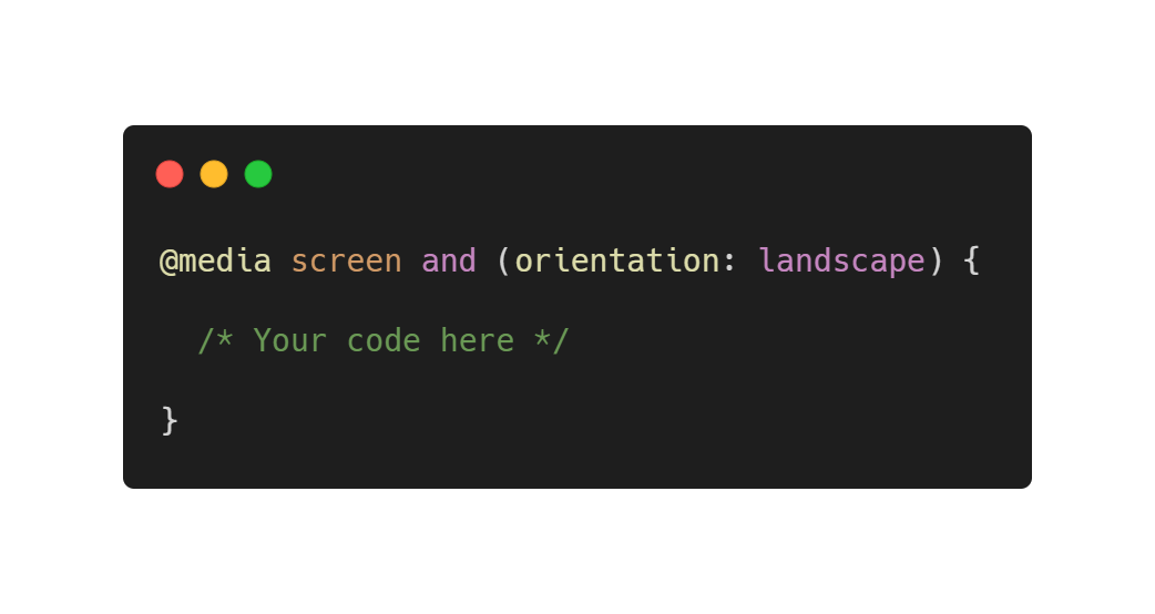
Orientation is a good media feature that allows you to make changes depending on the orientation of the display. It can have two meanings: portrait (portrait) and landscape (landscape / album).
But what does the browser consider portrait and landscape? The value of the portrait will trigger changes every time the height of the scope is greater than the width. Similarly, if the width is greater than the height, the viewport will be considered "landscape".
For example, this code gives the following result:
/* , */ body { background-color: #FFD23F; /* */ } @media screen and (orientation: landscape) { body { background-color: #EE4266; /* */ } }
Aspect ratio
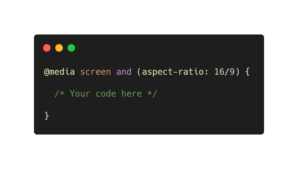
This media function is similar to the orientation function, but is more accurate. You can set the rules for the specific aspect ratio you need. For example, you can set different layouts for phones with screens 16/9 and 18/9.
This function can also have the max- and min- prefix for processing a range of screens with different aspect ratios.
Guidance and pointer
So, I will try to explain these media functions as simple as possible, because they are quite useful.
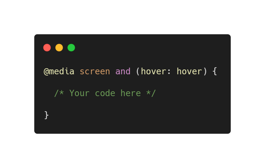
Both hover and pointer media functions relate to defining the main input mechanism on the site. For example, a mouse. Or a finger if you are using a smartphone. To define all input mechanisms, you can use the any-hover and any-pointer functions.
Now, what about they do?
The hover (and any-hover ) function allows the browser to find out if the main input mechanism can hover over elements (for example, like a mouse cursor).
You can use this function to determine the main input mechanism that
- hover: hover , may hover over elements
- hover: none , cannot hover over elements or there is no hover mechanism with input
When is it worth using? For example, when you want to process hover animations on mobile devices, where the input mechanism (finger) cannot hover over elements.
The pointer (and any-pointer ) functions allow the browser to find out if the main input mechanism has a pointer (for example, a mouse), and if so, how accurate it is.
You can use this function to determine the main input mechanism, which:
- pointer: coarse , includes pointer limited precision
- pointer: fine , includes an exact pointer
- pointer: none , does not include a pointer
This is useful, for example, to increase the clickable area of devices with an inaccurate pointer.

Hey, it's all boring. Where are the cool new features that were mentioned before?
Here they are!
Please note that the following functions are experimental and currently have very limited support.
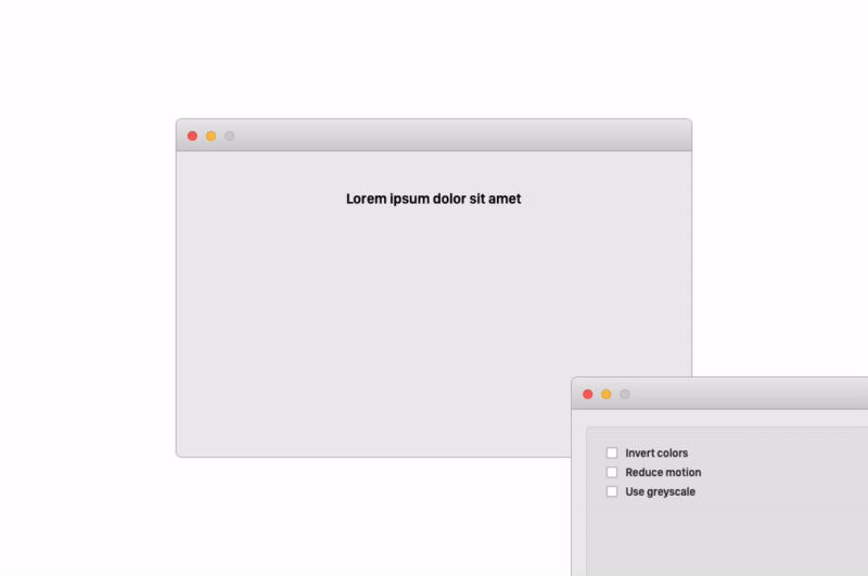
Inverted colors
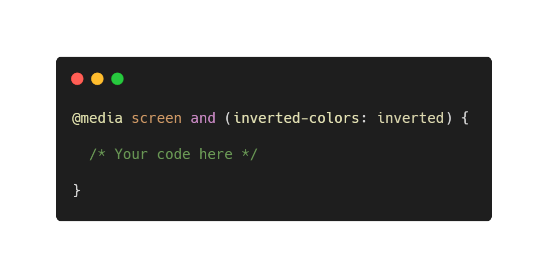
The inverted color feature is very useful if you need to apply some styles when the system colors have the same setting.
Why enable system color inversion? This is usually very useful if you want to improve readability.
Also keep in mind that another good practice is to increase the font and reduce the boldness when the colors are inverted. This is exactly what you can do with media expressions.
This function has only two values:
- inverted : apply styles if colors are inverted
- none : apply default styles
Here is an example! When colors are inverted, text size increases
.text { font-size: 24px; } @media screen and (inverted-colors: inverted) { .text { font-size: 36px; } }
Please note that this feature is currently only supported on Safari (on macOS and iOS). An always up-to-date list of supported browsers can be found here.
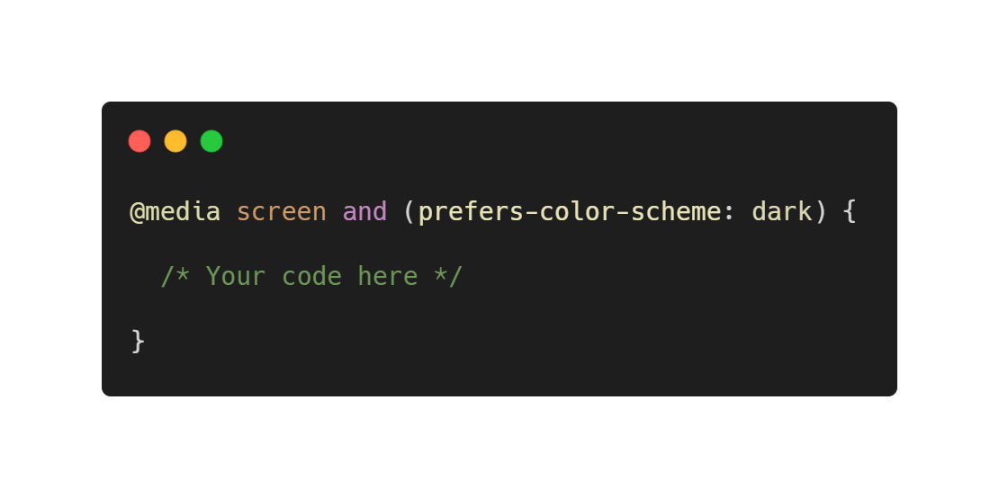
Preferred color scheme
This is one of my favorite features, and I hope that it will gradually become popular.
The function allows developers to set different design options for elements if the color scheme changes. Both Windows and macOS allow users to change the system color scheme from light to dark and vice versa. iOS 13 also introduced this feature, and for Android users, this feature will be available with the advent of Android Q.
Browser support is also decent. The latest versions of Google Chrome, Mozilla Firefox, and Safari currently support this feature. On mobile devices, it is also supported by all major browsers except Opera. An always up-to-date list of supported browsers can be found here.
The values for this function are quite intuitive:
- light : apply styles if the user prefers a light theme
- dark : apply styles if the user prefers a dark theme
- no-preference : apply default styles
You can see how cool this feature is in the example below!
.appbar { background-color: #EE4266; } .fab { background-color: #424242; } @media screen and (prefers-color-scheme: dark) { body { background-color: #424242; } .appbar { background-color: #212121; } h2 { color: #fff; } .fab { background-color: #EE4266; } }

Setting a system dark theme makes the page also dark
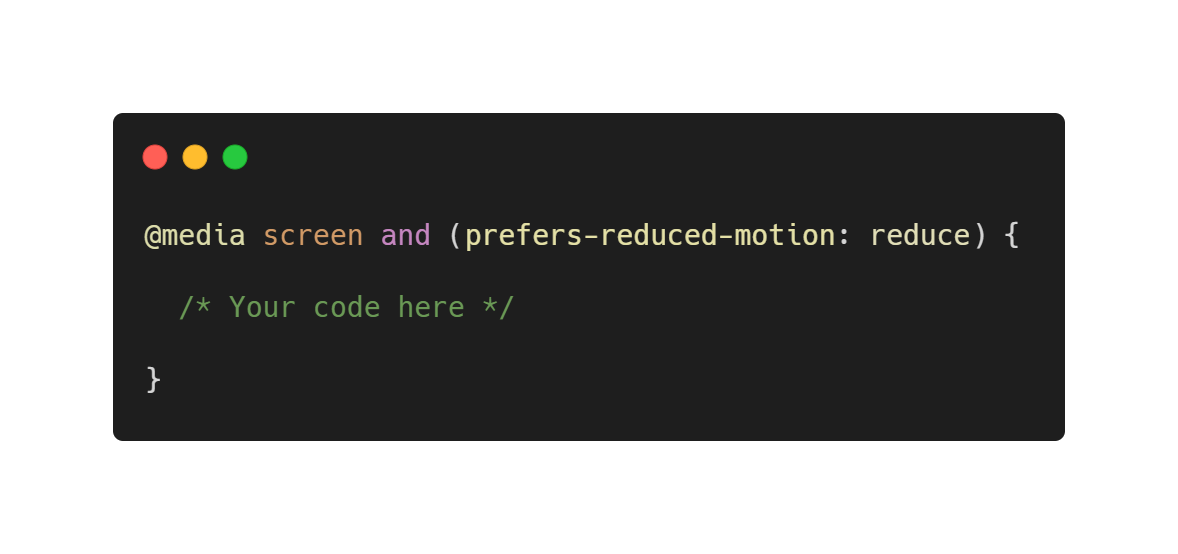
Reduce animation
This is also very important. Personally, I love animations and transitions, and I think that the right animation can really improve the usability of the site. But not everyone likes animations and, more importantly, some people may have vestibular disorders that can cause motion sickness and dizziness. I found a useful article that very well explains such phenomena.
In general, on the most important desktop and mobile operating systems, there is an accessibility option that allows you to solve these problems by reducing the mobility of elements.
This function can have two meanings:
- reduce : applies styles if the user does not want to see animations and transitions. This value is usually used to disable them.
- no-preference : applies regular styles
Check out this feature in the example below:
.pulse { animation: pulse 2s infinite; } @media screen and (prefers-reduced-motion: reduce) { .pulse { animation: none; } }
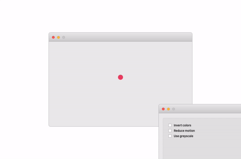
The ripple animation stops when the user selects to reduce the mobility of the elements.
Browser compatibility for this feature is pretty good. At the moment, only Edge and IE do not support it. An always up-to-date list of supported browsers can be found here.
Conclusion
It was an interesting experiment for me, I learned about some of the new features that I will probably now use more often.
I would like to mention some more functions, such as the light-level , which can be used to check the level of ambient lighting, but most of the recently introduced media expression functions still do not have support from any of the browsers, so ... the time has not come yet.
Code examples
You can read the code examples here . The code is publicly available on Github .
Who are we
We are a team of young developers and designers based in Padova, Italy. We develop mobile applications and websites and are always ready to create something great.