However, recently I got a strong feeling that I need to share one non-trivial and, in my opinion, useful trick related to flexbox. A post was prompted by the fact that not a single acquaintance (from students, typesetters, and just people close to the web) was able to solve the problem associated with flexbox, although it only takes 4-6 lines.
So, first the statement of the problem, then the background and, finally, the solution.
Formulation of the problem
- On the big screen, two elements are located horizontally, while adapting on phones - vertically.
- At the same time, on large screens they should be pressed to the edges (as with justify-content: space-between), and on small ones - should be centered (justify-content: center).
It would seem, what is there to decide !? But there is one more condition: you need to do this rebuild in automatic mode - without media queries.
Why, you ask? Why these tricks with the ban on media queries, why flexbox for the sake of flexbox?
And the thing is that the width of the content can be dynamic . For example, the headline and date of the news are next to each other. The date format is clearly defined, and the headers can vary greatly in length. I would like the transfer to go only for those posts where the elements began to be closely on the same line.
And here, after all, a media query will not help in any way, since the width of the screen on which the rebuild takes place depends on the text length. Usually in this case, the media request is put with a margin, focusing on the longest title. For short headlines, this looks so-so.
Another striking example: the logo and menu in the header. The width of the logo is known, but the problem with the menu. Indeed, often we do layout on a formally completed template, but in reality the menu will be formed from the site admin panel. How many points - no one knows , therefore, it is not clear at what width to do the rebuild.

It is clear that on a real site the menu will still be turned into a button for the mobile version. But at what width should this transformation be done if we do not know the number of points? If we are late with this transformation, I would like the menu to fly down beautifully for a while, and not anyhow.
Often when solving such problems, people do not strain. Either they make a media request in advance, with a huge margin to the point of impact, or are content to center only one element out of two.
Method 1 is simply inconvenient, method 2 will look more or less normal for an example with headings and dates, but it will just be terrible for the logo and menu.
So, the statement of the problem. How to organize the perfect behavior of elements on flexbox without media queries: visually place them at the edges of the big screen and center them on impact? (Well, or almost perfect, due to the use of text-align and flex-grow, small restrictions will come out, which can be easily solved with an additional wrapper)
Background
I wanted to achieve this behavior of the elements as soon as I met flexbox a few years ago. However, experiments and reading manuals did not produce results. As a result, it was concluded that only one element will be able to become centered during the jump, and the other will remain on the edge.
There was always something missing to achieve perfect behavior. Flex-grow will help on one screen, harm on another. Margin: auto and text-align help, but they are not enough to achieve the result.
As a result, I, as most coders think, decided that flex simply did not know how to do it. And I successfully forgot this task, having learned to manage with other means and techniques in layout.
The inspiration came in the summer of 2019, when, analyzing the homework on the layout course, I saw the flex-grow applied by no means at all: 0.5 . In that example, the greed of 0.5 did not help much to solve the problem, however, I immediately felt that here it is - a secret ingredient that was always lacking. Not that I did not know that grow can be fractional. It just didn’t occur to me that 0.5 can help to achieve the perfect alignment! Now it seems obvious, because flex-grow: 0.5 is the capture of exactly half of the free space ...
In general, when I saw flex-grow: 0.5, in 10 minutes I completely solved the task of arranging the elements, which since 2014 was considered unsolvable. Seeing that the code was very simple and concise, I decided that I had invented a long-known bicycle. But nevertheless, a few days ago I decided to check how well he is known to the layout designers and launched an interactive development on my youtube channel for web development with 45 thousand subscribers.
I set the task, I began to wait. And none of the subscribers decided it. Do not solve it, and familiar typesetters. There was a growing sense that people simply did not know how to perfectly position elements using flex. And this post has ripened. After all, it now seems to me that a huge number of typesetters believe that, as described in the statement of the problem, it is simply impossible to arrange elements without media queries.
The solution that we will discuss below is quite universal. Sometimes it requires creating an additional wrapper to center the text or display the background correctly. But often it is possible to get along with just 6 lines of CSS code without changing the structure.
Basic solution
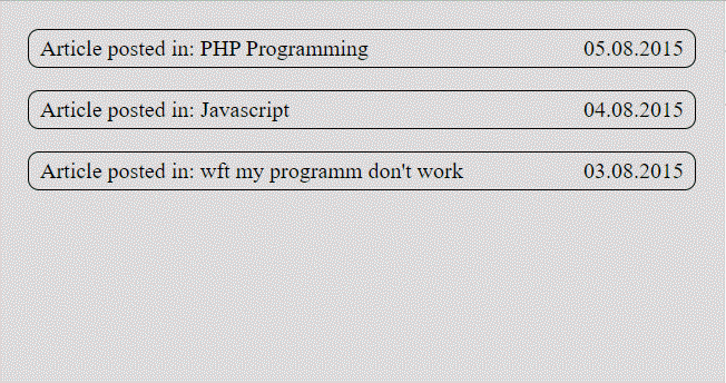
Let's take a small piece of HTML as the basis. This is an example that we saw in the very first gif picture. Date and title are pressed to the edges, and when jumping, they should become centered.
<div class="blog"> <div class="blogItem"> <div class="blogItem__cat">Article posted in: PHP Programming</div> <div class="blogItem__dt">21.10.2019</div> </div> <div class="blogItem"> <div class="blogItem__cat">Article posted in: Javascript</div> <div class="blogItem__dt">22.10.2019</div> </div> <div class="blogItem"> <div class="blogItem__cat">Article posted in: wft my programm don't work</div> <div class="blogItem__dt">23.10.2019</div> </div> </div>
We omit the uninteresting styles associated with backgrounds, frames, etc. The main part of CSS :
.blogItem { display: flex; flex-wrap: wrap; } .blogItem__cat { flex-grow: 0.5; margin-left: auto; } .blogItem__dt { flex-grow: 0.5; text-align: right; }
When you see this code for the first time, you may get the feeling that it was not written by a person, but by a random CSS-properties delusional generator! Therefore, we definitely need to understand how it works!
I suggest that you first carefully study the picture , and only after that move on to the text description located below it.
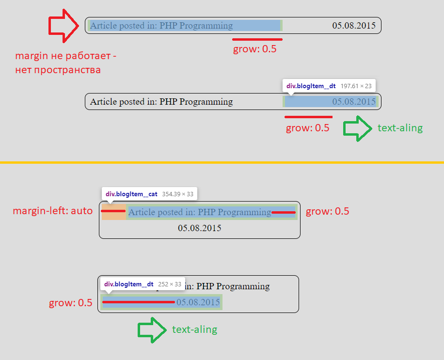
Initially, flex items stand side by side and get size according to their content. flex-grow: 0.5 gives each element half the free space, i.e. there is no free space when they stand nearby. This is insanely important because margin-left: auto does not work at all while the elements are placed on the same line .
The first element immediately stands perfect, the contents of the second need to be nailed to the right edge using text-align: right . As a result, we got an analogue of justify-content: space-between, without writing justify-content at all.
But even greater miracles begin when elements jump to separate lines. Margin-left auto pushes the first element as far as possible from the left edge. Come on, come on, how much space do we have left there? 100% minus element size minus half free from grow = half free ! Here is the alignment!
The second element is at the left edge and occupies a space equal to its base size, plus half free. It's hard to believe, but text-align: right will send the element perfectly centered!
If someone still doesn't believe, here is a link to a working example . It is clearly visible in it that the elements jump at the right time and are ideally centered.
The key to creating such a solution is flex-grow: 0.5, without which it is not possible to disable margin- [left-right] auto on large screens. Another fantastic fact is that justify-content is not used at all . The total paradox of the situation is that any attempt to align content with justify-content will break our scheme.
With exactly the same properties, we can put together larger and more complex elements, for example, the menu and logo - a link to the sandbox . I emphasize once again that the menu will still have to be turned into a button, but now we are much less worried about the fact that it will fly down earlier than necessary. After all, even having flown off, the menu looks very good!
Improved solution
In the comments on the interactive on youtube, they quickly noticed that the text is correctly positioned only until the title is placed on one line on a small screen. On new lines, the text is pushed to the left.
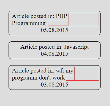
If the title were originally the second element (located to the right of the date), then text-align: right would act on it, because of which the text would look even stranger. By the way, we cannot set the background and date due to flex-grow 0.5.
However, all this is easily solved by creating a child with properties
some-selector { display: inline-block; text-align: center }
Due to the line-blocking, such an element is obtained exactly in the size of the content, and, very importantly, the text-align of the parent puts it in the right place. And already inside the element we use the text-align that we need, most often center.
It is important that we don’t feel the work of this internal text-align until there is only one line in the flex-element.
By the way, inline-flex is fine too!
Code examples
- perfect alignment
- normal background (just for example, the background for the title looks so-so)
This scheme increases the versatility of the solution, but it is not always needed. For example, it is difficult to imagine a menu made in two lines, therefore, a wrapper will not save us - we must turn the menu into a button.
Additional thoughts
Indentation
Now elements before jumping to separate lines, come close to each other. How to add an indent between them without moving them away from the edges of the container?
This task is easily solved by the classical technique: padding - to the elements and negative margin - to the parent. Ready example .
Mirroring
Of course, any of our examples can be mirrored due to wrap-reverse, flex-direction, margin-right: auto, etc. For example, the menu above the logo looks good .
Conclusion
This technique is just an interesting solution to a particular problem. Of course, don’t refuse media requests and believe in flexbox without media. But in the considered examples, in my opinion, this solution seems very interesting.
There is also a detailed video analysis of this technique. However, I was not sure that in the first article on the hub you should give a link to the youtube channel, so I tried to add more pictures to the post, including gif.
I hope that the considered scheme of working with flex-elements will be useful and make life easier for layout designers when solving certain problems!