
Compound Mesh
Andy Clarke made a fantastic presentation “Inspired by CSS Grid Technology” at the State of the Browser conference, which was a real insight for developers with design roots like me. In his talk, he talked about the ways in which ideas from print design can be used on the web to create amazing layouts, and how CSS Grid makes this not only possible, but also much simpler than ever before. One of these principles was the use of composite meshes.
Most of us are probably familiar with using grids for web design and development. Almost all the site layouts that I was assigned to develop were divided into a standard 12-column (or occasionally 24-column) grid with columns of equal width. So far, everything is quite predictable.
Compound meshes, on the other hand, are created by superimposing on each other two or more meshes. Comparisons, for example, of a 5-column grid superimposed on a 4-column grid create a rhythmic pattern and open up possibilities for constructing a more dynamic layout than a regular grid.
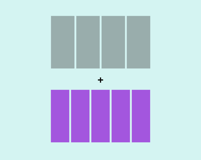
Figure 2 - We start with a 4-column and 5-column grid
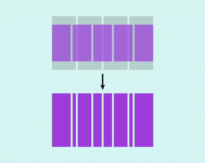
Figure 3 - Grids overlap one another. As a result, we get a composite grid
This is applicable both from a psychological and a technical point of view - we can create the most ordinary layout, despite the use of a composite grid. Andy wrote a detailed article, “ Inspired Design Decisions: Pressing Matters, ” which talks more about composite grids. His presentation from the State of the Browser conference is also available.
Compound Mesh Generator
The fr units make it very easy to implement composite grids in CSS Grid. I like the idea of using composite grids in web design, but I felt that the process of computing them (especially the more complex grid) can be quite time-consuming. I wanted to be able to quickly and conveniently create composite meshes, so, inspired by Andy's talk, I rolled up my sleeves and created a small tool for creating and visualizing them. Enter the number of columns for two grids (with a maximum of 10 columns for each) and the generator will combine them, giving the final value that can be set to the
grid-template-columns
property. For example, a four-column grid plus a five-column grid displays
4fr 1fr 3fr 2fr 2fr 3fr 1fr 4fr
.

This tool is presented on Codepen , so feel free to use it or adapt it to your needs.
Create a grid for an album layout
The composite grid is ideal for the layout of the album, which I would like to make a little unpredictable, but retaining a sense of rhythm and balance. After a small number of experiments with the generator, I settled on a composite grid 6/5, which, as it seemed to me, gave the right number of columns for further manipulations. This gives me the original grid to work with:
.grid { display: grid; grid-template-columns: 5fr 1fr 4fr 2fr 3fr 3fr 2fr 4fr 1fr 5fr; gap: 1rem; }
Defining Grid Rows
Defining grid lines was more difficult and required a bit more trial and error. Each photo in the grid should overlap the other. It turned out to be useful to draw a grid approximately on paper to understand how many lines would be needed.
To maintain a sense of vertical rhythm, I decided that photographs should overlap in a certain way. I assigned this overlay size to a variable so that it can be used throughout the page and updated if necessary (Fig. 4).
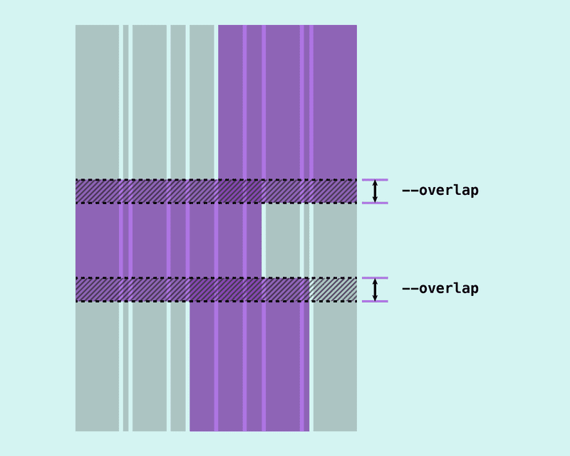
Figure 4 - Vertical Image Overlay
.grid { --verticalPadding: 2rem; --overlap: 6rem; }
Each image also has accompanying text. For this, there should be enough space above and below so that it does not overlap with the previous photo. This involves adding grid lines above and below the caption, which will act as “padding”. Now each image should cover at least four lines of the grid - and the image, which overlaps at the top and bottom, should occupy five lines.

Figure 5 - lines that perform the role of "padding", allow you to maintain a minimum interval between the end of the text block and the beginning of the next image.
But we have not finished designing the grid yet: I decided to set a fixed aspect ratio for the images. Some photos will be portrait, while others will be landscape. I would like the grid layout to work regardless of the aspect ratio of the photos or the length of the text, so it was required that the grid lines be able to adapt.
Instead of using fixed values for strings that act as overlays or padding, we can make these tracks flexible using the minmax () function. This will provide a situation in which the line tracks will have a minimum size, but will expand if necessary for the content.
minmax(var(--padding, auto));
Placement of Elements
Now that we have the skeleton of the grid, it's time to deal with the placement of elements. Understanding and choosing the best way to place them in a grid of any structure can sometimes be difficult. We have a number of different options: line numbers, the span keyword, named lines or areas - and some of them work better than others in certain situations. But there is no right or wrong option and often it comes down to finding the method that is most suitable for you.
As long as everything works as it should, there are no wrong approaches
Placement Using Grid Lines
I often start by placing elements using start and end values — usually the numbers of the first and last line, but if I know the exact number of tracks that the element should cover, I will use the “span” keyword instead. Sometimes I name the grid lines to add important landmarks (for example,
wrapper-start
and
wrapper-end
), but I rarely go so far as to name the grid lines or create grid areas directly for each element in the grid. A strategy that helps me a lot is to indicate negative grid lines in situations where I want to place an element to the end of the grid. I wrote about this in a separate article . I use negative grid lines most often in the column axis, since in most cases (for the grids I work with) the number of columns is known and fixed.
An element located through the
grid-column
property with a value of 1 / -1 will cover all the columns of the grid, from the first to the last:
.item { grid-column: 1 / -1; }
I am more inclined to naming grid lines in situations with grids having a very large number of tracks. In the case under consideration, we have only 10 column tracks, so it seems to me that placing elements by line number seems more convenient for further manipulation.
Using a mixture of positive / negative grid lines and “span” values, simply place the elements along the axis of the columns. Turning on the grid inspector in the Firefox developer panel helps a lot with this, as it allows us to see line numbers.
Placement Using Grid Areas
If we look at the grid. we can see that we have a fairly large number of lines.

Figure 7 - A screenshot from the Firefox grid-inspector in the developer panel showing grid columns and rows
Although I started placing items by line number on the row axis, it quickly becomes difficult to control. The elements should overlap, and it seems difficult for me to track the track on which one element should end and the other begin. In addition, I do not want to use negative grid lines, because there is a possibility that I will want to supplement my layout in the future. If I eventually add more explicit rows to the grid, then negative line numbers will no longer be valid, potentially causing many layout errors.
This was when I decided to create named grid regions on the row axis. Grid areas are created in two ways:
- Using the
grid-template-areas
property, which allows you to effectively “draw” a grid layout as an ascii drawing - Using named grid lines, using
-start
and-end
as suffixes to line names
The
grid-template-areas
property does not allow us to define areas for overlapping elements, so it doesn’t really help us with this particular layout. However, using named grid regions definitely makes the task easier.
If we name the lines for both the row axis and the column axis, we get a grid region (Fig. 8)
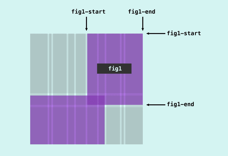
Figure 8 - suffixes of line names with
-start
and
-end
create a grid region
You can then refer to this area when we place an element using the
grid-area
property:
.item { grid-area: image; }
This makes our code more concise and readable than using the grid-column and grid-row properties and listing the row names:
.item { grid-row: image-start / image-end; grid-column: image-start / image-end; }
But in this case, we only need a named grid region on the row axis. This is normal, since we can just reference it using the grid-row property:
.item { grid-row: image; }
Since we have a large number of rows, it seemed to me that it is much easier to write the
grid-template-rows
property vertically so that it reflects the structure of the page:
grid-template-rows: /* */ auto 3rem /* */ minmax(var(--verticalPadding), auto) minmax(0, auto) minmax(var(--verticalPadding), auto) var(--overlap) minmax(var(--verticalPadding), auto) minmax(0, auto) minmax(var(--verticalPadding), auto) var(--overlap) minmax(var(--verticalPadding), auto) minmax(0, auto) minmax(var(--verticalPadding), auto);
Now adding the line names to the right place becomes simpler, since we can visualize the grid structure:
grid-template-rows: [header-start] auto [fig1-start] 3rem [header-end] minmax(var(--verticalPadding), auto) [p1-start] minmax(0, auto) [p1-end] minmax(var(--verticalPadding), auto) [fig2-start] var(--overlap) [fig1-end] minmax(var(--verticalPadding), auto) [p2-start] minmax(0, auto) [p2-end] minmax(var(--verticalPadding), auto) [fig3-start] var(--overlap) [fig2-end] minmax(var(--verticalPadding), auto) [p3-start] minmax(0, auto) [p3-end] minmax(var(--verticalPadding), auto) [fig3-end];
All that remains is to refer to the names of the areas on the row axis when our grid elements are placed:
.fig--1 { grid-column: span 5 / -1; grid-row: fig1; } .fig--2 { grid-column: 1 / span 7; grid-row: fig2; } .fig--3 { grid-column: span 5 / -2; grid-row: fig3; }
The final result (Fig. 10) is available for review on Codepen

Fig 10
Although I haven’t made any extra effort to make this layout responsive, it can be used on even smaller screens than tablets. Adapting the layout for small screens would not be very difficult. Personally, I would choose a simpler grid for such situations, since many visual features will still be lost. But then again, there is nothing right or wrong with that.