Achieving the right contrast with color is challenging, and especially because color is incredibly subjective and has a big impact on the aesthetics of the product. We wanted to create a color system with hand-picked, vibrant colors that would also meet the standards of accessibility and contrast.
When we evaluated external tools to improve color contrast in our products, we noticed two general approaches to solving the problem:
- Manual selection of colors and checking their contrast with the standard. Our experience has told us that this approach has made the choice of colors too dependent on trial and error.
- Create lighter and darker shades from a set of base colors. Unfortunately, a simple dimming or lightening can lead to dull or muffled colors that are difficult to distinguish from each other, and often they do not look very good.
With the existing tools that we found, it was difficult to create a color system that would allow us to choose gorgeous colors, while ensuring their availability by standards. We decided to create a new tool that uses color models of perception in order to get a result about their availability in real time. This allowed us to quickly create a color scheme that matches our needs, and gave us something we could do in the future.
Background
The colors we use in our products are based on the color palette of our brand. The use of these colors in our products allows us to bring some elements of Stripe's corporate identity to our interfaces.

Unfortunately, it was difficult to observe (and maintain) the rules of contrasting with these colors. Internet accessibility guidelines suggest a minimum contrast ratio of 4.5 for small text and 3.0 for large text. When we conducted an audit of the use of colors in our products, we found that none of the colors of the text that we used for small text (except black) did not meet the threshold of contrast.
Choosing the available color combinations required each individual designer or engineer to understand the guidelines and choose color pairs with sufficient contrast in each situation. With certain color combinations, the options were limited, and the available color combinations did not look very good.
When we first looked at ways to improve text contrast in our products, we initially examined the default color offset for text one step darker on our scale - this can be seen in the left column below.
Unfortunately, some of our colors still did not have enough contrast in the next dark shade. As soon as we got a hue with enough contrast at our existing scales (right column), we lost enough brightness in our colors. The colors are as recommended on a white background, but they are dark and cloudy, and it is difficult to distinguish between shades.
Without going further, it would be easy to just accept the compromise you need to choose between available colors or colors that look good. To get both, we needed to redesign our color system from scratch.
We wanted to develop a new color system that would provide three basic rules:
- Predictable Availability: Colors have enough contrast to comply with the rules of accessibility.
- Clear, vibrant hues: Users can easily distinguish colors from each other.
- Permanent visual weight: at each level, none of the colors has priority over the other.
Short introduction about color spaces
We are used to working with color on screens in terms of RGB color space . Colors are set depending on how much red, green, and blue light is mixed on the screen to create color.

Unfortunately, although such a description of colors is natural for computers, it is not natural for humans. What needs to be changed considering the value of the RGB color to make it brighter? More colorful? Add more yellow?
We understand that colors are organized in three ways:
Hue: What color is it?
Color: How colorful is it?
Brightness: How bright is it?

A popular color space that supports specifying colors in this way is HSL . It is well supported in design tools and popular color management code libraries. There is only one problem: the way the HSL calculates lightness is imperfect. Most color spaces do not take into account the fact that human eyes perceive different shades differently as different levels of illumination - at the same level of mathematical brightness, yellow appears lighter than blue.
The image below is a set of colors with the same brightness and saturation in the color space of the display. While color space claims that saturation and lightness are the same, our eyes disagree with this. Note that some of these colors appear lighter or more saturated than others. For example, blue seems especially dark, and yellow and green seem especially light.

There are color spaces that try to model the perception of color by a person. Uniformly perceived color spaces model colors based on factors that are more related to human vision and perform complex color transformations to ensure that these measurements reflect the work of human vision.

When we take a sample of colors with the same brightness and saturation in a perceived uniform color space, we can observe a significant difference. These colors seem to mix together, and each color seems as light and as saturated as the rest.
Surprisingly, there are few tools that support perceived uniform color models, and not one has come close to developing a color palette. Then we decided to make our own.
Color rendering
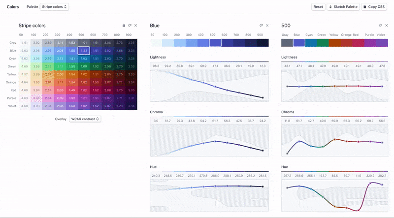
We have created a web interface that will allow us to visualize and manipulate our color system using perceived uniform color models. The tool gave us immediate feedback while we sorted through our colors - we could see the effect of each change.
The color space shown above is known as CIELAB or, affectionately, Lab. L in Lab stands for lightness, but unlike Lightness in HSL, it is designed to be uniform in perception. By translating our color scales into the Lab color space, we can customize our colors based on their perceived contrast and visually compare the results.
The chart below shows the brightness and contrast values of our previous color palette visualized in the color tool. You can see that the perceived lightness of each of our colors has its own curve, and the yellow and green colors are much lighter than blue and purple at the same point.

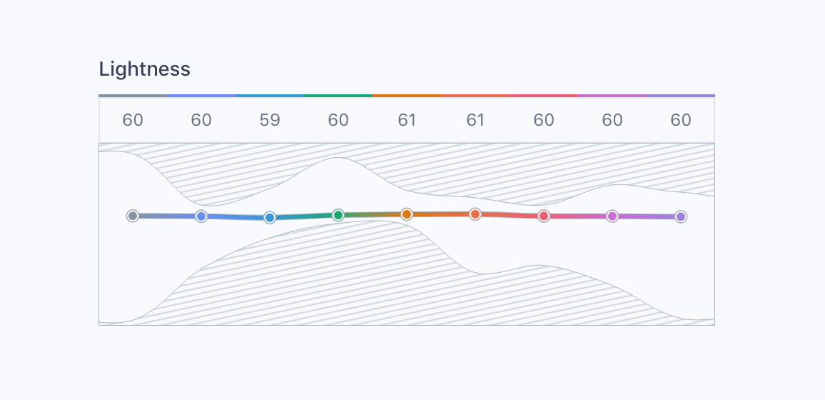
By controlling our colors in a perceived uniform color space, we were able to create a set of colors that have uniform contrast in all shades and retain as much of the expected hue and saturation of our current colors as possible. In the proposed colors, yellow has the same contrast range as blue, but at the same time they still look like our colors.
The diagram below shows that the perceived brightness of each color corresponds to the same curve, which means that each color (labels on the left) has the same contrast value at this level (numerical labels at the top).


Our new tool also showed us that it was doable. Visualization of the perceived uniform color model allowed us to see the limitations of visual perception. The shaded areas on the diagrams are the so-called imaginary colors that are not actually reproducible or perceived.
Most color mixing tools allow you to set values across the entire range for each parameter and simply crop the colors or return the most suitable colors that actually don't match the parameters you specify. Real-time visualization of the available color space when making changes allowed us to iterate much faster because we could tell which changes were possible and which changes brought us closer to our goal: bright, differentiated colors that corresponded to the corresponding principles and standards of contrast.
At certain points, finding a set of the right colors that would work together was like threading a needle into the eye. Here, the shaded areas show how limited the space is, in which there are combinations of values that take into account approximately the same brightness for all shades.
results
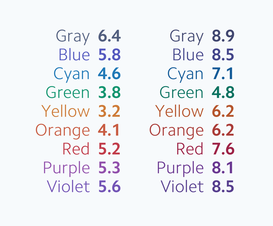
After many iterations and tests with real components and interfaces, we came up with a color palette that achieved our goals: our colors, as expected, met the recommendations for accessibility, retained their clear, vibrant hues and maintained a constant visual weight in all shades.
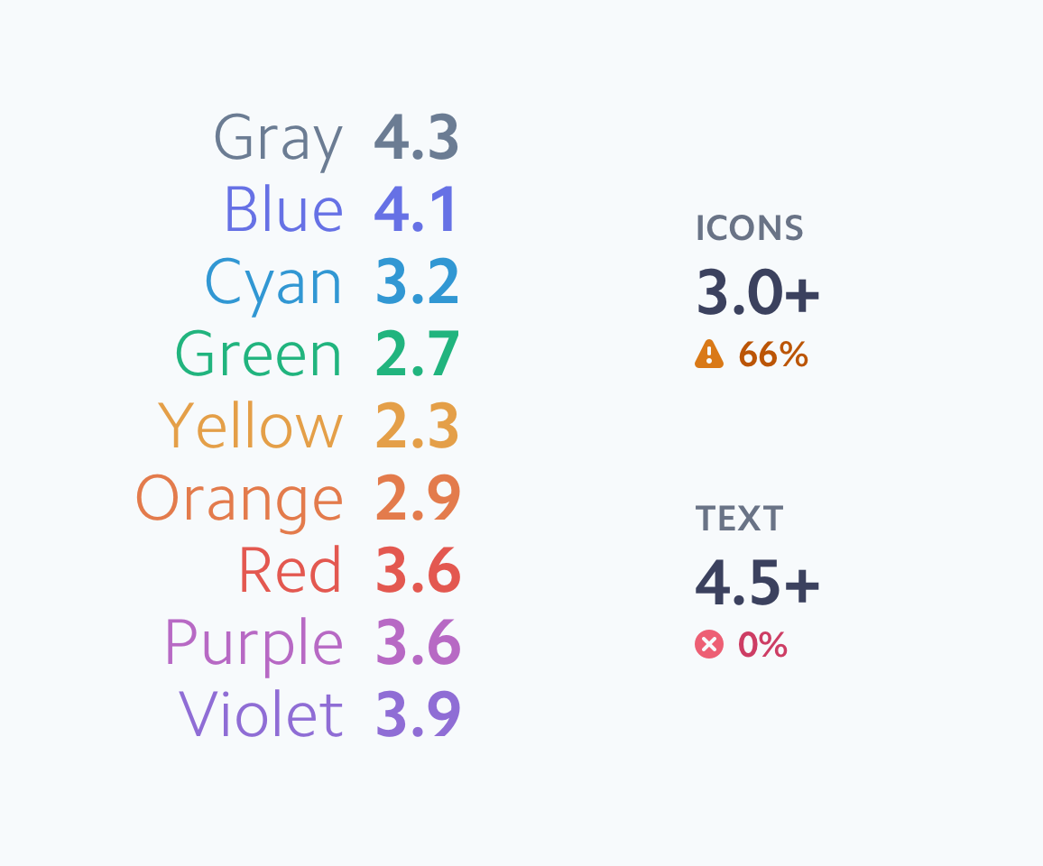
Our new default colors for text and icons now exceed the accessibility contrast threshold defined in WCAG 2.0 guidelines.


In addition to indicating the contrast on a white background, each color also passes when displayed on top of the lightest color value in any shade. Since we usually use these slightly colored backgrounds to shift or highlight areas, this allows us to easily and predictably provide sufficient text contrast in all of our products.
Since new colors are evenly organized based on contrast, we also have built-in simple instructions for choosing suitable contrast pairs in less common cases. Any two colors are guaranteed to have sufficient contrast for small text if they are located at a distance of at least five levels and at least four levels for icons and large text.
Using the contrast indicators built into the system, you can easily adjust the color contrast in various components with predictable results.

For example, we redesigned our Badge component to use a colored background to clearly distinguish each color. With the lightest possible color value, it was too difficult to distinguish from each other. By shifting the background and color of the text by one level, we were able to maintain the contrast of the text for all colors of the icon without fine-tuning each color combination separately.
Conclusion
We learned that developing affordable color systems should not mean messing around in the "dark." We just need to change the way we think about color:
1) Use a perceived uniform color model
When developing an affordable color system, using a uniform perception color model (such as CIELAB) helped us understand how each color looks to our eyes, and not like a computer. This allowed us to test our intuition and use numbers to compare the lightness and colorfulness of all our colors.
2) Affordable does not mean bright
The WCAG accessibility standard intentionally focuses only on the contrast between the foreground color and the background color, and not how bright they are. Understanding how bright each color looks helps to distinguish shades from each other.
3) It’s hard to talk about color, tools should speak
One of the pitfalls in the perception of uniform color patterns is that impossible colors exist - there is no such thing as “very bright dark yellow” or “bright light royal blue”. Creating our own tool helped us pinpoint which colors were possible and allowed us to quickly cycle through our color palette, until we created a palette that was affordable, vibrant and still consistent with our brand.