Finally, the time has come when you do not need to build Android Studio yourself to try the new declarative UI framework for Android. Jetpack Compose is now available as the first Dev Preview on Google’s Maven Repository. With this news, my Monday morning began. And immediately there was a desire to see what a set of tools was that they had been waiting for.

I decided to start my acquaintance right away with an attempt to introduce it into the pet-project published on Google Play. Moreover, in it for a long time I wanted to make a page “About the application”. In this article, I will talk about the main components and stages of connecting Compose:
- Dependency Connection
- Themes and styles. Integration with existing in the project.
- Accessibility and UI tests.
- The main components and analogues of the View heirs.
- Work with State.
Dependency Connection
To start, I updated the studio from 3.5 to 3.5.1 (in vain), added basic dependencies. A complete list can be seen in an article by Cyril .
// build.gradle ext.compose_version= '0.1.0-dev01' //build.gradle dependencies{ ... implementation "androidx.compose:compose-runtime:$compose_version" kapt "androidx.compose:compose-compiler:$compose_version" implementation "androidx.ui:ui-layout:$compose_version" implementation "androidx.ui:ui-android-text:$compose_version" implementation "androidx.ui:ui-text:$compose_version" implementation "androidx.ui:ui-material:$compose_version" }
And then I tried to collect all this because of the dispersed versions of Firebase. After which I ran into Compose obstacles:
app/src/main/AndroidManifest.xml Error: uses-sdk:minSdkVersion 16 cannot be smaller than version 21 declared in library [androidx.ui:ui-layout:0.1.0-dev01] .../ui-layout-0.1.0-dev01/AndroidManifest.xml as the library might be using APIs not available in 16 Suggestion: use a compatible library with a minSdk of at most 16, or increase this project's minSdk version to at least 21, or use tools:overrideLibrary="androidx.ui.layout" to force usage (may lead to runtime failures)
Yes, Compose was only available with minSdk 21 (Lolipop). Perhaps this is a temporary measure, but it was expected to support earlier versions of the OS.
But that is not all. Compose works on Reflection, instead of the Kotlin Compiler Plugin, as previously stated, for example, here . Therefore, in order for everything to start, you need to add the Kotlin Reflect depending on it:
implementation "org.jetbrains.kotlin:kotlin-reflect"
Well, for dessert. Compose dp implements extension functions for Int, Long, Float, which are marked with the inline keyword. This may cause a new compilation error:
Cannot inline bytecode built with JVM target 1.8 into bytecode that is being built with JVM target 1.6. Please specify proper '-jvm-target' option * https://stackoverflow.com/questions/48988778/cannot-inline-bytecode-built-with-jvm-target-1-8-into-bytecode-that-is-being-bui
For the solution, you need to explicitly register the JVM version for Kotlin:
android { … kotlinOptions { jvmTarget = "1.8" } }
That seems to be all. Much easier than building your own studio)
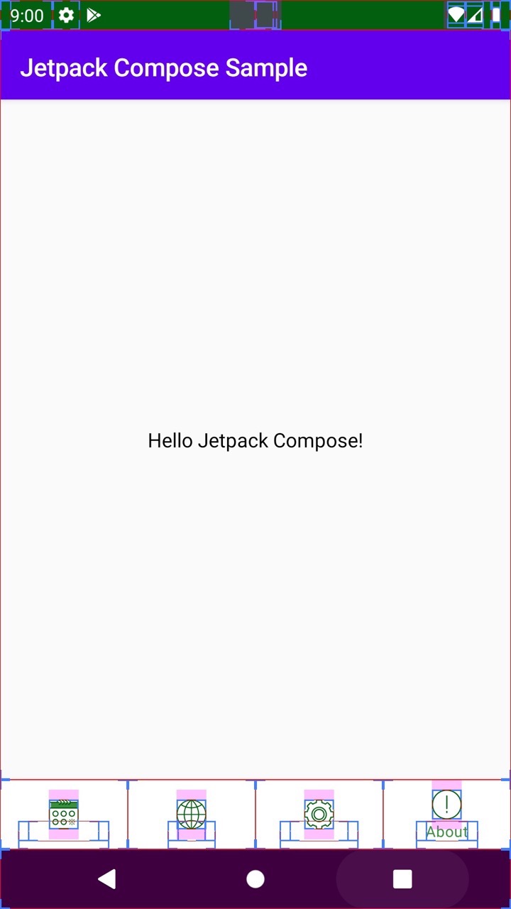
Let's try to run Hello World (also from Cyril's article, but, unlike him, add Compose inside Fragment). The layout for the fragment is an empty FrameLayout.
override fun onCreateView(inflater: LayoutInflater, container: ViewGroup?, savedInstanceState: Bundle?): View? { val fragmentView = inflater.inflate(R.layout.fragment_about, container, false) (fragmentView as ViewGroup).setContent { Hello("Jetpack Compose") } return fragmentView } @Composable fun Hello(name: String) = MaterialTheme { FlexColumn { inflexible { // Item height will be equal content height TopAppBar<MenuItem>( // App Bar with title title = { Text("Jetpack Compose Sample") } ) } expanded(1F) { // occupy whole empty space in the Column Center { // Center content Text("Hello $name!") // Text label } } } }
We start, the following screen turns out:
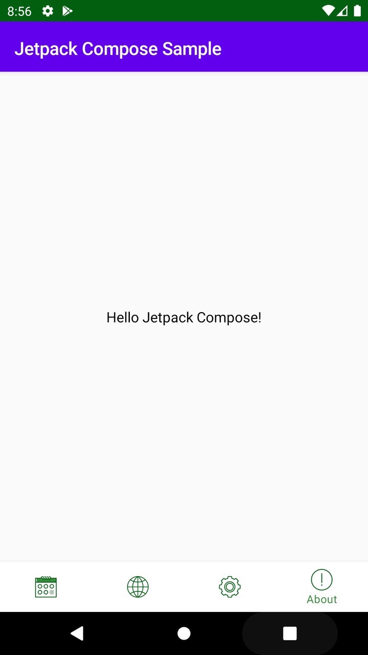
Due to the fact that Composable uses the Material theme by default, we got a purple AppBar. Well, and, as expected, it is not at all consistent with the dark theme of the application:
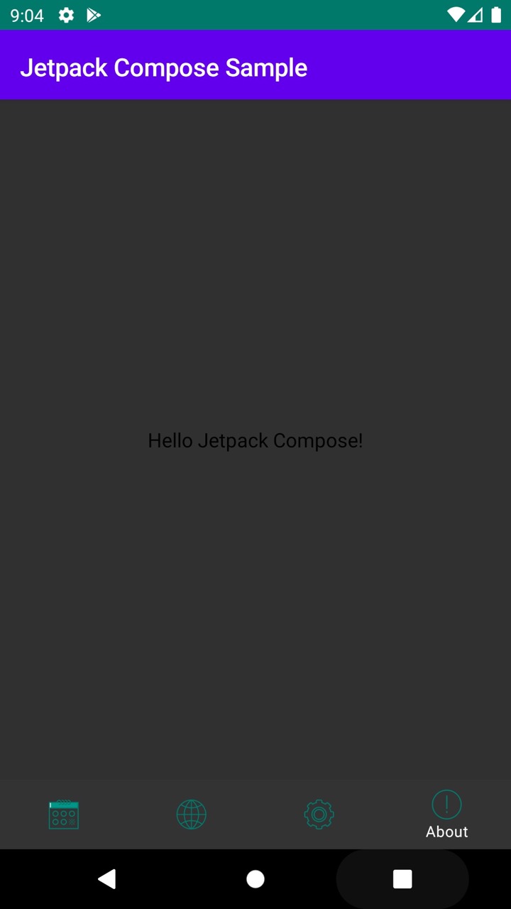
Let's try to solve it.
Themes and styles. Integration with existing in the project.
In order to use existing styles inside Composable, we pass them inside the MaterialTheme constructor:
@Composable fun Hello(name: String) = MaterialTheme(colors = MaterialColors( primary = resolveColor(context, R.attr.colorPrimary, MaterialColors().primary), secondary = resolveColor(context, R.attr.colorSecondary, MaterialColors().secondary), onBackground = resolveColor(context, R.attr.textColor, MaterialColors().onBackground) )){...}
MaterialTheme itself consists of two parts: MaterialColors and MaterialTypography.
To resolve the colors, I used a wrapper over the styles:
private fun resolveColor(context: Context?, @AttrRes attrRes: Int, colorDefault: Color) = context?.let { Color(resolveThemeAttr(it, attrRes).data.toLong()) } ?: colorDefault private fun resolveThemeAttr(context: Context, @AttrRes attrRes: Int): TypedValue { val theme = context.theme val typedValue = TypedValue() theme.resolveAttribute(attrRes, typedValue, true) return typedValue }
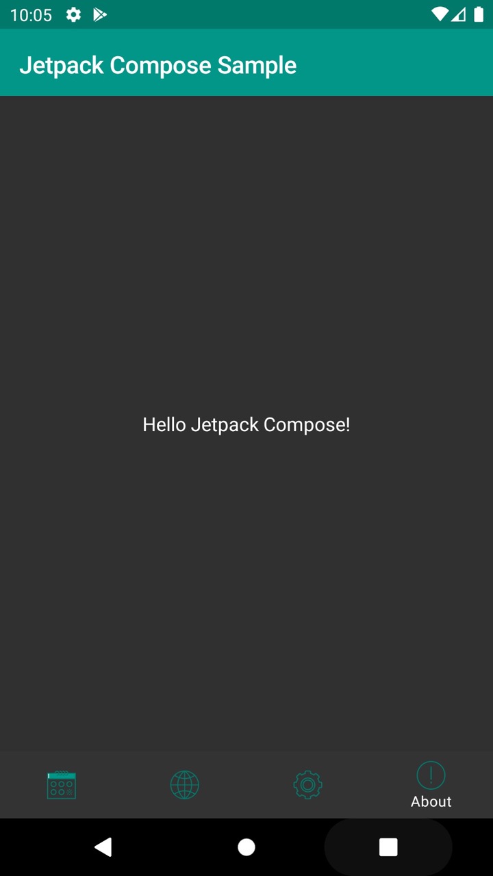
At this stage, the AppBar will turn green. But for repainting the text you need to do one more action:
Text("Hello $name!", style = TextStyle(color = +themeColor { onBackground }))
The theme is applied to the widget using the unary plus operation. We will still see it when working with State.
Now the new screen looks uniform with the rest of the application in both variants of the theme:
Compose also found the DarkTheme.kt file in the sources, the functions from which can be used to identify various triggers for turning on a dark theme on Android P and 10.
Accessibility and UI tests.
Until the screen begins to grow with new elements, let's see how it looks in the Layout Inspector and with the display of the borders of elements in Dev Mode turned on:
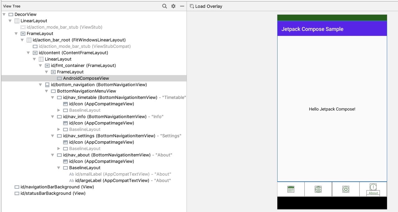
Here we will see FrameLayout, inside which only AndroidComposeView. Existing tools for Accebility and UI testing are no longer applicable? Perhaps instead of them there will now be a new library: androidx.ui:ui-test
.
The main components and analogues of the View heirs.
Now let's try to make the screen a little more informative. First, change the text, add a button leading to the application page on Google Play, and a picture with a logo. I'll show you the code right away and what happened:
@Composable fun AboutScreen() = MaterialTheme(...) { FlexColumn { inflexible { TopAppBar<MenuItem>(title = { Text(getString(R.string.about)) }) } expanded(1F) { VerticalScroller { Column { Image() Title() MyButton() } } } } } private fun Image() { Center { Padding(16.dp) { Container( constraints = DpConstraints( minWidth = 96.dp, minHeight = 96.dp ) ) { imageFromResource(resources, R.drawable.ic_launcher) } } } } private fun Title() { Center { Padding(16.dp) { Text(getString(R.string.app_name) + " " + BuildConfig.VERSION_NAME, style = TextStyle(color = +themeColor { onBackground })) } } } private fun MyButton() { Center { Padding(16.dp) { Button(getString(R.string.about_button), onClick = { openAppInPlayStore() }) } } }
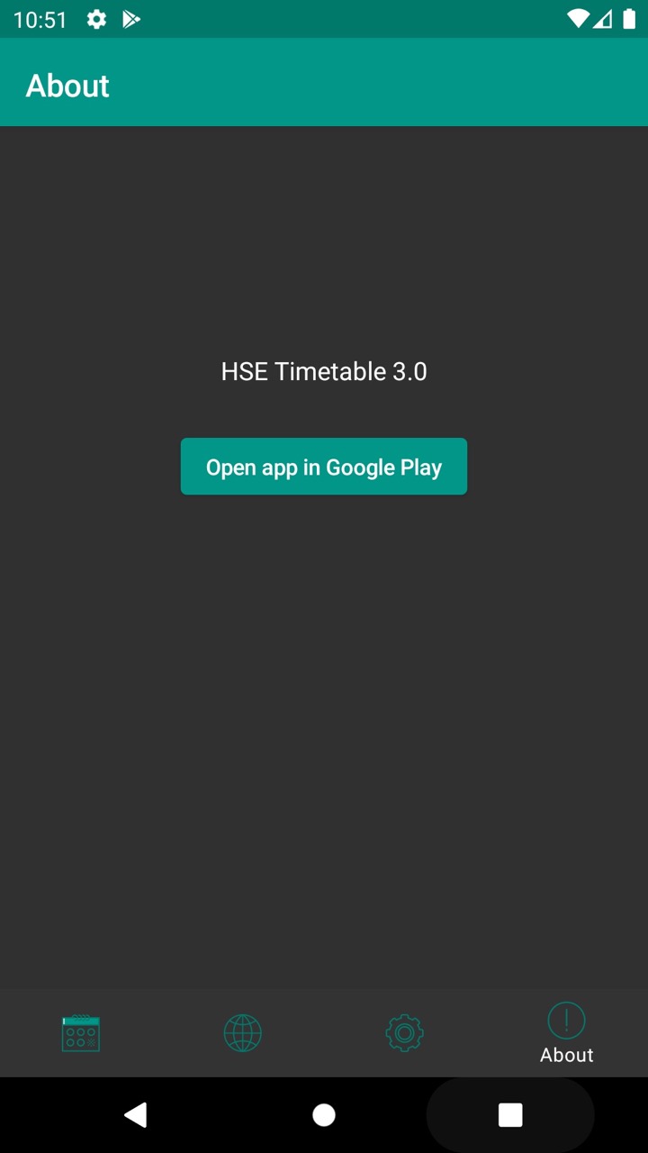
The basic principles of widget composition have not changed since the first appearance of Compose sources .
From the interesting:
- Functions for displaying individual elements do not have to be annotated with @Composable.
- Almost all the properties for widgets turned into separate widgets (Center instead of android: gravity, Padding instead of android: margin, ...)
- I could not display the image from drawables.
- The onClick parameter of the button is not the last one, because of which it is impossible to pass it as a lambda without an explicit name, which would seem more logical:
Button(“Text"){ openAppInPlayStore() }
Now let's go over the main existing ViewGroup and try to find analogues in Compose.
Instead of FrameLayout, you can use Stack. Everything is simple here: the child widgets overlap and are positioned depending on the function used for the attachment: aligned, positioned or expanded.
LinearLayout is replaced immediately by two widgets: Column and Row instead of using the android: orientation parameter. They, in turn, contain FlexColumn and FlexRow within themselves with a layer of inflexible function over a nested subtree. Well, FlexColumn and FlexRow themselves are built on Flex with the parameter orientation = LayoutOrientation.Vertical
or Horizontal
.
A similar hierarchy is in the FlowColumn, FlowRow, and Flow widgets. Their main difference: if the content does not fit in one column or row, the next one will be drawn next, and the embedded widgets will “flow” there. It’s hard for me to imagine the real purpose of these widgets.
The ScrollView effect is achieved by placing a Column or Row inside a VerticalScroller or HorizontalScroller. They both compose inside the Scroller, passing in the parameter isVertical = true
or false
.
In search of an analogue for ConstraintLayout, or at least RelativeLayout came across a new Table widget. I tried to run the sample code in my application: DataTableSamples.kt . But, as I did not try to simplify the example, it did not work out to make it work.
Work with State
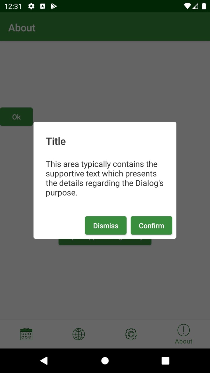
One of the most anticipated innovations of the framework is its readiness out of the box for use in unidirectional architectures built on the basis of a single state. And this was supposed to introduce the @Model annotation to tag classes that provide State for rendering the UI.
Consider an example:
data class DialogVisibleModel(val visible: Boolean, val dismissPushed: Boolean = false) ... @Composable fun SideBySideAlertDialogSample() { val openDialog = +state { DialogVisibleModel(true) } Button(text = "Ok", onClick = { openDialog.value = DialogVisibleModel(true) }) if (openDialog.value.visible) { AlertDialog( onCloseRequest = { // Because we are not setting openDialog.value to false here, // the user can close this dialog only via one of the buttons we provide. }, title = { Text(text = "Title") }, text = { Text("This area typically contains the supportive text" + " which presents the details regarding the Dialog's purpose.") }, confirmButton = { Button("Confirm", onClick = { openDialog.value = DialogVisibleModel(false) }) }, dismissButton = { if (!openDialog.value.dismissPushed) Button("Dismiss", onClick = { openDialog.value = DialogVisibleModel(true, true) }) else { //hidden } }, buttonLayout = AlertDialogButtonLayout.SideBySide ) } }
This creates a data class for the state model, and it does not have to be marked with the @Model annotation.
The initial state itself is created inside the @Composable function using + state.
The visibility of the dialog is determined by the visible property of the model obtained by calling the value property.
This property can also be set to a new immutable object, as happens in the onClick of both buttons. The first hides itself, the second - closes the dialogue. The dialog can be reopened by clicking on the Ok button defined inside the same @Composable function.
When trying to make a state outside this function, an error occurs:
java.lang.IllegalStateException: Composition requires an active composition context.
The context can be obtained by assigning the value of the setContent {} function in onCreateView, but how to use it, for example, in Presenter or another class other than Fragment or Activity, for changing the state is still unclear.
This concludes our review of the new Jetpack Compose library. The framework architecturally justifies its name, replacing all the inheritance, which so inconvenienced the View hierarchy, with composition. There are still too many questions about how analogues of more complex ViewGroups will be implemented, such as ConstraintLayout and RecyclerView; not enough documentation and previews.
It is absolutely clear that Compose is not ready for use even in small combat applications.
But this is just the first version of Dev Preview. It will be interesting to watch the development of the concept of working with State and Compose-based community libraries.
If you find more successful examples of code, or documentation for cases that I could not get, please write in the comments.