Ways to Create Bar Charts Using Python
Over the past year, I have been faced with the need to draw histograms and bar graphs often enough to make me want and able to write about it. In addition, I myself was pretty much lacking such information. This article provides an overview of 3 methods for creating such graphs in Python.
To begin with, I myself did not know for a very long time because of my inexperience: bar charts and histograms are two different things. The main difference is that the histogram shows the frequency distribution - we specify a set of values for the Ox axis, and the frequency is always plotted on Oy. In the bar chart (which it would be appropriate to call barplot in English literature) we specify both the abscissa axis and the ordinate axis.
For demonstration, I will use the beaten scikit learn Iris library dataset. Let's start with imports:
We will transform the iris dataset into a dataframe - so it will be more convenient for us to work with it in the future.
Of the parameters we are interested in, data contains information about the length of the sepals and petals and the width of the sepals and petals.
Using Matplotlib
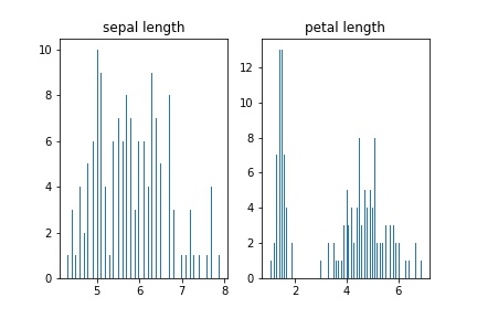
Histogram
Let's build a regular histogram showing the frequency distribution of the lengths of the petals and sepals:
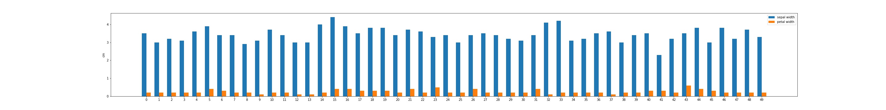
Building a bar chart
We use matplotlib methods to compare the width of leaves and sepals. This seems most convenient to do on a single chart:
For example, and in order to simplify the picture, we take the first 50 lines of the dataframe.
Using seaborn methods
In my opinion, many tasks for building histograms are easier and more efficient to perform using the seaborn methods(in addition, seaborn also wins with its graphical capabilities, in my opinion) .
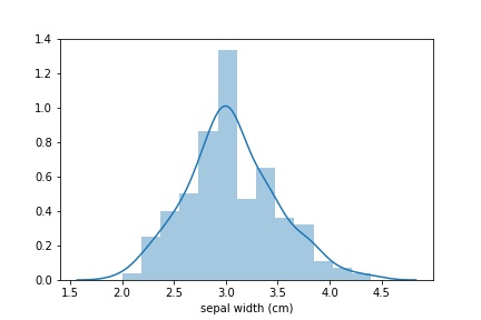
I will give an example of tasks solved in seaborn with a single line of code. Especially seaborn is a winning one when you need to build a distribution. Let's say we need to build a sepal length distribution. The solution to this problem is as follows:
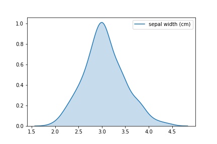
If you only need a distribution schedule, you can do it like this:
Read more about building distributions in seaborn here.
Pandas Bar Charts
Everything is simple here. This is actually the shell of matplotlib.pyplot.hist (), but calling a function via pd.hist () is sometimes more convenient than the less agile constructions of matplotlib-a. You can read more in the pandas library documentation.
It works like this:

Thank you for reading to the end! I will be glad to reviews and comments!
To begin with, I myself did not know for a very long time because of my inexperience: bar charts and histograms are two different things. The main difference is that the histogram shows the frequency distribution - we specify a set of values for the Ox axis, and the frequency is always plotted on Oy. In the bar chart (which it would be appropriate to call barplot in English literature) we specify both the abscissa axis and the ordinate axis.
For demonstration, I will use the beaten scikit learn Iris library dataset. Let's start with imports:
import pandas as pd import numpy as np import matplotlib import matplotlib.pyplot as plt from sklearn import datasets iris = datasets.load_iris()
We will transform the iris dataset into a dataframe - so it will be more convenient for us to work with it in the future.
data = pd.DataFrame(data= np.c_[iris['data'], iris['target']], columns= iris['feature_names'] + ['target'])
Of the parameters we are interested in, data contains information about the length of the sepals and petals and the width of the sepals and petals.
Using Matplotlib
Histogram
Let's build a regular histogram showing the frequency distribution of the lengths of the petals and sepals:
fig, axs = plt.subplots(1, 2) n_bins = len(data) axs[0].hist(data['sepal length (cm)'], bins=n_bins) axs[0].set_title('sepal length') axs[1].hist(data['petal length (cm)'], bins=n_bins) axs[1].set_title('petal length')
Building a bar chart
We use matplotlib methods to compare the width of leaves and sepals. This seems most convenient to do on a single chart:
x = np.arange(len(data[:50])) width = 0.35
For example, and in order to simplify the picture, we take the first 50 lines of the dataframe.
fig, ax = plt.subplots(figsize=(40,5)) rects1 = ax.bar(x - width/2, data['sepal width (cm)'][:50], width, label='sepal width') rects2 = ax.bar(x + width/2, data['petal width (cm)'][:50], width, label='petal width') ax.set_ylabel('cm') ax.set_xticks(x) ax.legend()
Using seaborn methods
In my opinion, many tasks for building histograms are easier and more efficient to perform using the seaborn methods
I will give an example of tasks solved in seaborn with a single line of code. Especially seaborn is a winning one when you need to build a distribution. Let's say we need to build a sepal length distribution. The solution to this problem is as follows:
sns_plot = sns.distplot(data['sepal width (cm)']) fig = sns_plot.get_figure()
If you only need a distribution schedule, you can do it like this:
snsplot = sns.kdeplot(data['sepal width (cm)'], shade=True) fig = snsplot.get_figure()
Read more about building distributions in seaborn here.
Pandas Bar Charts
Everything is simple here. This is actually the shell of matplotlib.pyplot.hist (), but calling a function via pd.hist () is sometimes more convenient than the less agile constructions of matplotlib-a. You can read more in the pandas library documentation.
It works like this:
h = data['petal width (cm)'].hist() fig = h.get_figure()
Thank you for reading to the end! I will be glad to reviews and comments!
All Articles