Text rendering hates you
Table of contents
Text rendering: how complicated can it be? It turns out to be incredibly challenging! As far as I know, literally no system displays the text “perfectly”. Somewhere better, somewhere worse.
Suppose you want arbitrary text with arbitrary fonts, colors, and styles, with line wrapping and text selection support. In fact, these are the minimum requirements for the correct display of complex text, a terminal window, a web page, etc.
In general, let's say right away: there are no consecutive correct answers, everything is much more important than you think, and everything affects everything else.
We will discuss topics that are not united within a single concept, these are just issues that I had to deal with over several years of working on rendering text in Firefox. For example, we will not discuss the problems of text segmentation or managing various text libraries for a specific platform in too much detail, as I am not too interested in this.
1. Terminology
The nature of the text is complex, and English poorly conveys all the nuances. For this document, I will try to adhere to the following terms. Please note that these words are not “correct”, I just find them useful for conveying key concepts to native English speakers who have no experience in linguistics.
Characters:
- Scalar (scalar): Unicode scalar, the "smallest unit" in Unicode (it is also a code point).
- Character: an extended Unicode grapheme cluster (EGC), the “largest unit” in Unicode (potentially consisting of several scalars).
- Glyph (glyph): the atomic unit of rendering given out in a font. It usually has a unique identifier in the font.
- Ligature: A glyph consisting of several scalars and potentially even several characters (native speakers can represent a ligature as several characters, but for a font it is just one character).
- Emoji: "full color" glyph.

Fonts
- Font: A document that maps characters to glyphs.
- Writing / script (script): a set of glyphs that make up a certain language (fonts, as a rule, implement certain scripts).
- Handwritten font (cursive script): any font in which glyphs touch and flow into each other (for example, Arabic).
- Color: RGB and alpha values for fonts (not required for some use cases, but this is interesting).
- Style: bold and italic modifiers for fonts (in practical implementations, hinting, aliases and other settings are usually also supplied).
2. Does style, layout and form depend on each other?
Here's a brief outline to give you an idea of how a typical text rendering pipeline works:
- Stylization (parsing markup, query system for fonts).
- Layout (breaking text into lines).
- Shaping, shaping (calculation of glyphs and their positions).
- Rasterization of the required glyphs to the texture atlas / cache).
- Composition (copying glyphs from the atlas to the desired position).
Unfortunately, these steps are not as simple as they might seem.
Most fonts do not actually provide all possible glyphs on demand. There are too many glyphs, so fonts usually only implement a specific letter. End users usually do not know or do not care about this, so a reliable system should cascade into other fonts if characters are not available.
For example, although markup of the following text does not imply multiple fonts, this is necessary for proper rendering on any system: hello
(Alternatively, you can take the Noto approach and use one Uber font that contains all the characters. Although then users cannot customize the font, and you cannot provide a “native” text interface to users on all platforms. But suppose you need a more reliable decision).
Similarly, for layout you need to know how much space each piece of text takes, but this only becomes known after shaping! Does step 2 depend on the results of step 3?
But to shape, you need to know layout and style, so we seem to be stuck. What to do?
Firstly, stylization applies cheats. Although we really want to get full glyphs, scalars are enough for styling. If the font does not support writing properly, it will not claim to know anything about scalars of that writing. Thus, you can easily find the "best" font as follows:
For each symbol (EGC) in our text, we interrogate each font in the list (cascade) whether all the scalars that make up this symbol are known to it. If so, use them. If we get to the end of the list with no result, we get tofu (
You have probably already seen such an indicator when meeting with emoji! Since some emojis are actually ligatures of several simpler emojis, a font can indicate support for a character by issuing only individual components. In this way,
 if the font is "too old" to know about the new ligature. This can also happen if you have a "too old" Unicode implementation that does not know about the new character, forcing the style system to accept such a partial match.
So, now we know exactly which fonts we will use, without the need to refer to layout or form (although shaping can change our colors, more on this in the next sections). Can we similarly deal with the interdependence of layout and form? No! Things like paragraph breaks give you a tough line break, but the only way to shape is through iterative shaping!
It is necessary to assume that the text is placed on one line, and form this line until the space runs out. At this point, you can perform typesetting operations and find out where to break the text and start the next line. Repeat until everything is done.
3. Text is not separate characters
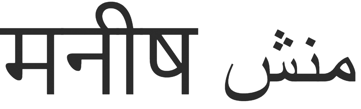
Judging only by English, then you might think that ligatures are some kind of bizarre nonsense. I mean, who really cares that “æ” is spelled “ae”? But it turns out that some languages essentially consist entirely of ligatures. For example, ड् ب بسم consists of the individual characters «ب ب ب م. In any advanced text rendering system (that is, in any of the main browsers), these two lines will look very different.
And no: it's not about the difference between Unicode scalars and clusters of extended graphemes. If you ask a reliable Unicode system (for example, Swift) to give clusters of extended graphemes of this line, it will give out these five characters!
The shape of the character depends on its neighbors: the text cannot correctly display character after character .
That is, you should use a shaping library. The industry standard here is HarfBuzz , and these tasks are extremely difficult to solve on your own. So use HarfBuzz.
3.1. Text overlay
In handwritten fonts, glyphs often overlap to avoid seams, and this can cause problems.
Let's take a look at मनी م منش again. Does it look normal? Now increase:
It still seems beautiful, but let's make the text partially transparent. If you're on Safari or Edge, then the text may look fine! But on Firefox or Chrome, the view is terrible:
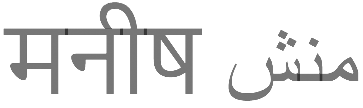
The problem is that Chrome and Firefox are trying to cheat . They correctly formed the text, but as soon as they encounter such glyphs, they are still trying to draw them separately. This usually works fine, except when there is transparency and overlap that produces such dimming.
A “correct” implementation will bring the text to a temporary surface without transparency, and then to the scene with transparency. Firefox and Chrome do not do this because it is expensive and usually not needed for major Western languages. Interestingly, they really understand the problem, because they specifically process such a script for emoji (but we will return to this later).
3.2. Style can change ligature
Okay, this example we are analyzing mainly out of curiosity about how markup can break, although I don’t know any reasonable scenarios where it can really hurt. Here are two pieces of text with the same content but different colors:
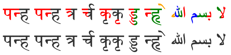
Here's what they look like in Safari:

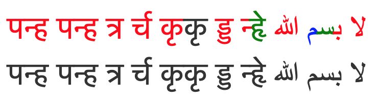
This is what they look like in Chrome (when using its new mockup implementation ):
And here they are in Firefox:
Eventually:
- Safari is inadequate
- Chrome parses glyphs but drops many colors
- Firefox parses glyphs and displays colors at the same time
I think everyone should be on Firefox, right? But if you zoom in, we will see that he is doing something very strange:

He simply divided this ligature into four equal parts with different colors!
The problem is that there really is no reasonable answer as to what should be done here. We divided the ligature into different styles, and since the ligature is in a sense the “unit” of rendering, it makes sense to simply refuse to support such a separation (as most do).
For some reason, someone in Firefox was really enthusiastic about making a more elegant implementation . His approach is to draw a ligature several times with optimal masks and different colors, which works surprisingly well!
There is some sense in trying to support these “partial ligatures”: only shaping can know whether a particular ligature will be displayed, and this depends on the system fonts, so the ligature may appear where no one expected it! A classic English example is a ligature æ from a user-installed font on the border of a hyperlink.
It is also rather strange that English can change in the middle of a word, but cannot handwritten fonts?
Don't even ask about code that breaks lines with partial ligatures.
4. Emoji break color and style
If you display emojis as the native system does, then you need to ignore the text color settings (with the exception of transparency):
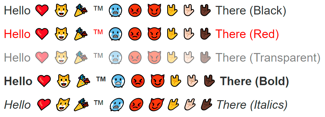
Usually emojis have their own native colors, and this color may even have semantic meaning, as is the case with skin color modifiers. Moreover: they can have several colors!
As far as I can tell, there was no such problem before emoji, so different platforms have different approaches to solving. Some show emojis as a solid picture (Apple), others as a series of monochrome layers (Microsoft).
The latter approach is not bad, because it integrates well with existing text rendering pipelines, “just” breaking the glyph into a series of monochrome glyphs that everyone is used to working with.
However, this means that when you draw a “single” glyph, your style may repeatedly change. It also means that the “one” glyph can overlap itself, which leads to the transparency issues mentioned in the previous section. Still, browsers really correctly combine the transparency of layers in emojis!
This discrepancy can be explained in three ways:
- You are already looking for colored glyphs to process them in a special way, so it’s easy for them to choose a special layout path.
- Handwritten fonts with poor transparency look a little ugly, but emojis completely break down and turn into an illegible character set, so the extra work is justified.
- Western developers care more about emojis than languages like Arabic and Marathi.
Choose the option to your taste.
And yet, how to highlight an emoticon in italics or bold? Ignore these styles? Should they be synthesized? Who knows…
Also, don't these emojis seem oddly small?
Yes, for some reason, a bunch of systems secretly increase the font size for emojis to make them look better.
5. Smoothing is hell
The characters in the text are very small and detailed. It is very important that the text is easy to read. Sounds like a smoothing task! Hell, 480p is really low resolution. More smoothing !!!
 So, there are two main types:
- Grayscale Smoothing

- Subpixel Smoothing

Grayscale smoothing is a “natural” approach. The basic idea is that partially covered pixels get partial transparency. During composition, this will result in the pixel getting the appropriate hue, improving overall detail.
The term grayscale is used for one-dimensional color, just like our one-dimensional transparency (otherwise the glyphs are displayed in one solid color). In addition, in a typical situation of black text on a white background, anti-aliasing literally displays gray shades along the edges.
Subpixel anti-aliasing is a trick that abuses the normal placement of pixels on monitors. It is much more complicated, so if you are really interested, you will have to read more detailed documentation, here is just a brief description of the high-level concept.
The pixels in your monitor are actually three small columns of red, green, and blue. If you want to get red you kind of say “white black black”. In the same way, if you want to get a blue color, then indicate “black black white”. In other words, if you tinker with flowers, you can triple the horizontal resolution and get much more detail!
You might think that such a “rainbow” would be very ugly, but in practice the system works pretty well (although some disagree with this). The human brain loves to recognize patterns and smooth them. Nevertheless, if you take a screenshot of the text with subpixel smoothing, you will clearly see all the extra colors if you resize the image or just look at it on the monitor with a different subpixel layout. This is why screenshots with text often look very strange and bad.
(In general, this system also means that the color of the icon can accidentally change its perceived size and position, which is really annoying).
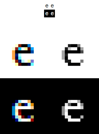
So subpixel anti-aliasing is a really clean hack that can significantly improve text intelligibility, great! But, unfortunately, this is also a huge splinter in the ass!
Note that subpixel glyph displacements occur in any smoothing system. You always want your rasterized glyphs to be snapped to full pixels, but the rasterization itself is designed for a specific sub-pixel offset (a value between 0 and 1).
To understand this, imagine a 1x1 black square with grayscale smoothing:
- If its subpixel offset is 0, then just a black pixel comes out during rasterization.
- If the subpixel offset is 0.5, then when rasterized, two pixels come out at 50% gray.
5.1. Subpixel offsets break glyph cache
Rasterizing glyphs requires an amazing amount of computation, so it’s much better to cache them in a texture atlas. But how to cache textures with subpixel offsets? Each offset has its own unique rasterization!
Here you need to find a compromise between quality and performance, and this can be done by optimizing subpixel displacements. For the English text, a reasonable balance would be the lack of vertical subpixel accuracy with the horizontal offset tied to a quarter of an integer. This leaves only four sub-pixel positions, which still greatly improves quality while maintaining a reasonable cache size.
5.2. Smoothing subpixels cannot be composite
One nice feature of anti-aliasing in shades of gray is that you can freely play with it, and it gracefully degrades. For example, if you convert a texture with text (scaling, rotation, or transformation), it may become a little blurry, but it will look normal in general.
If you do the same with subpixel anti-aliasing, it will look awful. His whole idea is to manipulate the pixels on the display. If the display pixels do not match the pixels of your texture, then the red and blue edges will be clearly visible!
You might think that this is “fixed” simply by a new glyph rasterization in a new location. And indeed, if the conversion is static, this might work. But if the transformation is an animation , it will get even worse. This is actually a very common browser error: if it does not find that the animation is happening with the text, then the characters will twitch , since each glyph jumps between different subpixel bindings with hinting on each frame.
As a result, browsers contain several heuristics to detect such animations in order to force off sub-pixel anti-aliasing for this part of the page (and ideally even sub-pixel positioning). This is quite difficult to reliably implement, because an animation can be triggered by an arbitrarily complex JS, without giving the browser any clear “hints”.
In addition, subpixel smoothing is difficult to use in the presence of partial transparency. In fact, here we configure our channels R, G and B to encode three transparency values (one for each subpixel), but the text itself also has a color and a background, so that information is easily lost.
When using grayscale anti-aliasing, we have a dedicated alpha channel, so nothing is lost. Thus, browsers usually use shades of gray to work with translucent objects.
... Except Firefox. Again, in this strange organization, someone really got carried away and did something complicated: an alpha component. It turns out that you can actually correctly compose text with subpixel anti-aliasing, but this requires three additional transparency channels for R, G and B. It is not surprising that such anti-aliasing doubles the memory consumption.
Fortunately, over the years, sub-pixel smoothing has become less relevant:
- Retina displays do not need it at all.
- The sub-pixel layout on phones blocks this trick (without serious work).
- In newer versions of MacOS, subpixel text is disabled by default at the OS level.
- Chrome seems to more aggressively disable sub-pixel anti-aliasing (not sure if this is the exact policy).
- The new Firefox graphical backend (webrender) abandoned the Alpha component for simplicity.
6. Esoteric
This part is just a collection of little things that do not deserve much discussion.
6.1. Fonts may contain SVG
That sucks. These fonts are mostly provided by Adobe, because some time ago they got into the SVG pretty well. Sometimes you can simply ignore parts of SVG (I believe that the Source Code Pro font technically contains some SVG glyphs, but in practice they are not actually used by websites), but in general you will have to implement SVG support to formally support all fonts.
Have you heard about SVG animated fonts ? No? Good. I think that they are everywhere either broken or not implemented (Firefox accidentally supported them for a while due to some kind of enthusiastic developer).
6.2. Characters can be damn big
If you want to naively satisfy a user’s request for a very large font (or a very large zoom level), then you will encounter extreme memory management problems for a glyph atlas of this size, since each character can be larger than the entire screen. There are several ways to handle this:
- Refuse to draw a glyph (sad user).
- Rasterize the glyph in a smaller size and increase the scale during composition (this is easy, but forms blur along the edges).
- Rasterize the glyph directly on the surface after composition (difficult, potentially expensive).
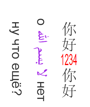
6.3. Selection is not a frame, but the text goes in all directions
People usually know that the main direction of the text can be left to right (English), right to left (Arabic), or top to bottom (Japanese).
So, here's a funny text for you:
Hello everyone بسم الله لا beep beep !!
If you select text on the desktop with the mouse from left to right, the selection becomes intermittent and somehow strangely twitches in the middle. This is because we mix text in one line from left to right and from right to left, which happens all the time.
First, the selection to the right increases the selection, but then decreases it until it suddenly starts to increase again. This is actually quite correct: the selection simply remains continuous on the actual line . Thus, you can correctly copy a piece of text.
You need to take this into account in your code to select text, as well as in the line break algorithm for layout.
But that's not all.
I hope you don’t have to deal with such things.
6.4. How to write what is impossible to write?
When there are no characters in the font, it would be nice to inform the user about it. The glyph “tofu” is intended for this. You can simply draw an empty tofu (rectangle) and limit yourself to that. But if you want to provide really useful information, you can write the value of the missing character to simplify debugging.
But wait, we use text to explain that we can’t output the text? Hm.
You can say that there should be a basic font in the system that will always show the characters 0-9 and AF, but this is an assumption for wimps. If the user really destroyed his tools with his tools, then Firefox offers a way out: a micro font!
Inside Firefox, there is a small hard-coded array of one-bit pixel art with a tiny atlas of exactly these 16 characters. So when drawing tofu he can forward these characters without worrying about fonts.

6.5. The style is part of the font (unless it is not)
High-quality fonts come initially with styles such as italics and bold , since there is no simple algorithmic way to beautifully display these effects.
However, some fonts come without these styles, so you still need a simple algorithmic way to make these effects.
The exact detection and processing of styles is highly dependent on the system and outside my area of expertise, so I cannot explain it well. I would just delve into the font handling code in Webrender .
In any case, you need a synthetic fallback. Fortunately, the implementation is actually quite simple:
Synthetic Italics: Tilt each glyph.
Synthetic bold: draw each glyph several times with a slight offset in the direction of the text.
Honestly, these approaches do pretty well! But users may notice that everything seems “wrong." Therefore, you can do better if you make an effort.
6.6. No perfect text rendering
Each platform has had its errors, optimizations, and quirks for so long that they have become aesthetics. Therefore, even if you firmly believe that certain things are ideal or important, there will always be a huge group of users with different preferences. A robust text visualization system supports these various preferences (when choosing reasonable defaults).
Your configuration should take into account the user's system, specific fonts, specific applications, and specific texts. You should also try to match the native “look” of each platform (such quirks).
It includes:
- The ability to disable sub-pixel anti-aliasing (some really hate it).
- The ability to turn off any anti-aliasing (yes, people do this).
- A ton of platform / format-specific properties, such as hinting, smoothing, variations, gamma, etc.
It also means that native text libraries should be used to match the aesthetics of each system (Core Text, DirectWrite and FreeType on their respective platforms).
7. Additional links
Here are a few more articles about the text rendering nightmare:
All Articles