Where and how to use multicolumns (CSS Columns)

With all the hype surrounding CSS Grid and Flexbox technologies, another layout method is often overlooked. In this article, I want to look at a multi-column layout - often referred to simply as “Multicol” or “CSS Columns”. You will find out for what tasks it is suitable and what nuances should be taken into account when using it.
What are multicolumns?
The main idea of multicolumns is that you can take a fragment of the content and place it in several columns, as in a newspaper. You do this with one or two properties. The
column-count
property sets the number of columns into which you would like to split the contents. The
column-width
property sets the ideal width, allowing the browser to determine how many columns fit.
It doesn’t matter which elements are inside the block that you turn into a multi-column container, all the elements remain in the normal stream, but are divided into columns. This makes CSS Columns unlike the other layout methods we have in browsers today. Flexbox and Grid, for example, take child elements of the container, and then these elements participate in the flex or grid layout. In the case of CSS Columns, you still have a regular stream, but not inside the column itself.
In the example below, I use
column-width
to make columns at least 14em wide. CSS Columns determines how many columns with a width of 14em fit in the container, and then allocates the remaining space between them. The columns will have a width of at least 14em, except in a situation where only one column is placed, in which case it may become narrower. CSS Columns was the first time we encountered similar behavior in CSS, creating columns that were responsive by default. There is no need to add media expressions and change the number of columns at different control points, instead we specify the optimal width and the browser will work with it.
Column styling
Column blocks created using CSS Columns properties cannot be selected for styling. You cannot select them using JavaScript or stylize a separate block to set its background color or to customize padding or margin. All speaker blocks will be the same size. The only thing you can do is add a dividing line between the columns using the
column-rule
property, which works like border. You can also indent between columns using the
column-gap
property, which has a default value of 1em, however you can change it to any other valid unit of length
This is the basic functionality of CSS Columns. You can take part of the content and divide it into columns. The content will fill the columns, creating them in a linear direction. You can control the gap between columns and add a dividing line by specifying the same values as border. So far, everything is going well, and all of the above is very well supported in browsers and for a long time, which makes this specification very safe for use in terms of backward compatibility.
There are features of CSS Columns functionality and some potential problems that should be considered when using a column layout in the web.
Speaker coverage
Sometimes you may need to split some content into columns, but then place one element across, covering blocks of columns. This can be achieved by applying the
column-span
property to the descendant of the column container.
In the example below, I made the
<blockquote>
element span the columns. Notice when you do this, the content is split into a set of fields above this element, then it starts a new set of columns below it. Content does not jump over the enclosing element.
Currently, the
column-span
property works by default in all browsers except Firefox. In it, it is still being developed and hidden behind the flag.
Keep in mind that in the current specification, the value of the
column-span
property can only be
all
or
none
. You cannot cover only some columns, but you can get such a result by combining the column layout with other typesetting methods. In the following example, I have a Grid container with two columns. The left column is 2fr wide and the right column is 1fr wide. In the left column, I wrapped the article in a column container with two columns that also have an enclosing element.
On the right is the content that is located in the second grid column. Playing with different types of layout methods available to us, we can precisely determine which one is best suited in a particular situation - do not be afraid to combine them.
Content Transfer Control
If the column container contains headers, you probably would like to avoid situations in which they break and part of the heading or text under the heading is transferred to the next column. If you have images with captions, it would be better if both the image and the caption remain intact, without a gap between the columns. Especially for such situations, CSS has properties for controlling the transfer of content.
By dividing the content into columns, you do what is called fragmentation. The same is true if you share your content between pages, for example, when you create styles for printing. Consequently, the columns are closer to Paged Media than to other markup methods on the web. Because of this, for several years, the way to control wrappers in content was to use the
page-break-
properties that were part of CSS 2.1.
-
page-break-before
-
page-break-after
-
page-break-inside
The CSS Fragmentation specification later defined properties that were designed for any fragmented context; the specification included details for Paged Media, CSS Columns, and the deferred Regions specification; Regions also fragment a continuous piece of content. By making these properties common, they can be applied to any future fragmented context, just as the alignment properties from Flexbox were moved to the Box Alignment specification so that they can be used in Grid and Block layouts.
-
break-before
-
break-after
-
break-inside
As an example, I used the
bread-inside: avoid
property for the
<figure>
element to prevent the caption from separating from the image itself. A browser that supports this property must keep the element intact, even if the columns appear uneven.
Unfortunately, support for these properties in CSS Columns is rather mixed. But even where they are supported, they should be considered as a proposal due to the fact that so many requests must be made to control the transfer, that the browser, in fact, can not do the transfer anywhere. The specification defines priorities in this case, however for you it can be even more useful to control only the most important situations.
Column problem on the web
One of the reasons why we do not see the massive use of CSS Columns on the web is because it would lead to a change in the reader’s interaction with the page, forcing it to scroll sideways rather than up and down. Agree, this is not very convenient.
If you fix the height of the container, for example, using the unit of measure of the viewport vh, and there will be too much content, then overflow will occur in the row direction and we will get a horizontal scroll.
This problem makes the use of CSS Columns on the web something that we must work with very caution in terms of the amount of content posted to it.
Block overflow speakers
For level 2 of the CSS Columns specification, we are looking at how to enable the method by which overflowing columns, which currently cause horizontal scrolling to appear, instead grow in the block direction.
This means that you can have a column container with a fixed height, and as soon as the contents create columns filling this container, a new set of columns will be created below. This would be somewhat similar to our example above with a spanning element, however, instead of spanning causing a new block of columns, it would be an overflow caused by a container with a constraint in the block dimension.
This functionality would make the columns significantly more useful on the web. Although we are still far from this, you can still follow up on this issue in the CSS working group repository . If you have additional examples of using this functionality, write about them, it really helps when new functionality is being developed.
How are multicolumns useful today?
With the current specification, it is not recommended to divide all contents into columns without taking into account possible scrolling problems. However, there are some situations where the speakers are perfect. There are enough examples worth considering when you are looking for design patterns.
Reduce small interface or text elements
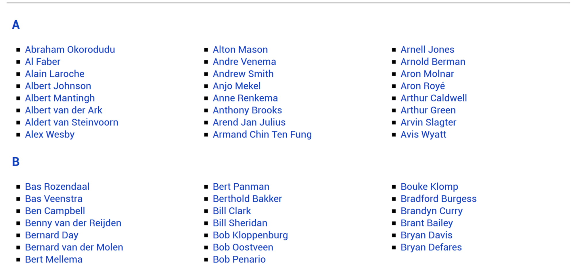
Multicolumns can be useful wherever there is a small list of items that should take up less space. For example, a simple list of checkboxes or a list of names. Often in such situations, the visitor does not read one column to the end, after which he returns up to the beginning of the next, but looks in the contents for a checkbox for clicking or a link for going. Even if a situation arises with the appearance of scrolling, this should not be a problem.
You can see an example of similar use of speakers on the DonarMuseum website

Pre-known small amount of content
There are situations when, when developing a site, we know in advance that the amount of certain content will be small and fit on most screens without causing unwanted scrolling. I used the columns on the presentation pages on Notist for an introduction.
Andy Clarke designed a great example for Equfund

To avoid scrolling situations on very small screens, remember that you can use media expressions to check the height of the viewport as well as the width. Turning on columns only at control points that have a minimum
min-height
greater than enough for the content can save users of very small devices.
Masonry-like content display
Another example where a column layout works fine is in situations where you want to display content in a Masonry style. Columns at the moment are the only layout method that will create this type of layout with elements of different heights. CSS Grid will not indent or stretch an element to strictly match a two-dimensional grid.
Veerle Pieters has a great example of using columns for these purposes on her inspirational page.

Grid and Flexbox Fallbacks
column-
properties
column-
also be used as a fallback for a grid or flex layout. If you specify one of the column properties for the container, then turn this container into a Flex or Grid layout using
display: flex
or
display: grid
any column behavior will be canceled. If you have, for example, a card layout that uses CSS Grid, and at the same time will be readable in several columns, you can use the columns as a simple fallback. Browsers that do not support CSS Grid will receive a column display, those that support will receive a Grid.
Do not forget about multicolumns!
Quite often, when answering questions about choosing between Grid or Flexbox, I recommend multicolumns instead. You may not be able to use them on every site, but when you come across a suitable task, they can become really useful. MDN has useful CSS Columns resources and related fragmentation properties .
If you use columns in your project, perhaps you should leave a mention of this in the comments to share other ways to use this functionality
All Articles