Drag - & - Drop components for blind users? Are you joking?
What brings Trello, Gmail, Aviasales, and Google Keep together? Each of them has Drag - & - Drop-components that can be dragged with the mouse. Using these components makes websites really convenient, because in real life we often use this pattern. It’s natural for us to move things around, so on the web we want to move elements around the screen from one place to another, like stickers on a blackboard or magnets on a refrigerator. Sorting todo lists, organizing dashboards, downloading files - we simply cannot imagine all these events without dragging and dropping elements on the page.

But there is a nuance. When we develop such components, we think that our users physically see the screen and elements, can catch on them with the mouse and drag them. Often it is, but we forget about the segment of users with vision problems. We create components that cannot be used by a large group of people who simply do not see them. How to make Drag - & - Drop components accessible to them too?
Sergey Krieger is a front-end developer at SinnerSchrader. In addition to front-end development, he is actively interested in the topic of web accessibility and will talk about some ways to increase it. Under the cut - a story about creating Drag - & - Drop-components for those who do not see the screen and use other devices to interact with the browser.
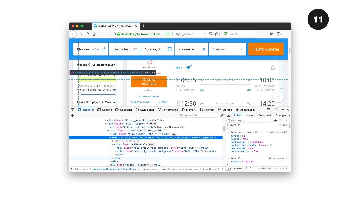
Let's start with a simple screen on the screen Aviasales site. We enter the point of departure, point of arrival, and the list of flights for selection appears on the screen. There can be many flights, they can be filtered by price, time and other parameters. Sliders are used to filter the results on the Aviasales website. They look great, they are convenient to use.

Our task is to imagine that we are the developers of this site. Let's try to recreate these sliders and see how they work in different cases.
The first thing to think about is whether native elements can be used for our functionality? If there is such an opportunity, we go this way, because native elements will save a lot of time.
Let's make a simple example: the slider moves along the track and the value of the slider changes. Move the slider to the right - the screen color changes from white to bright pink, if back - again to white.
The slider works simply - the slider slides along the track and the slider returns some value.
No one will use such a slider in production. No designer will allow him to use, because he looks weak. We, as developers, can solve this problem. There are a number of CSS properties with prefixes for each browser, where you can stylize individual elements of the slider and refine it.
You can use the properties manually, but this is not a trivial task. Properties work in different browsers, and testing will take a lot of time.
But there is a special tool that solves the problem - Daniel Stern website . You manually style the slider on it, copy the CSS code and everything works. The native slider is now an
HTML element with the type
, but works as before - by moving the slider.
To solve the problem to the end - we test. Further we will test not only the slider, but also other elements in three parameters.
Note: hereinafter it is more convenient to combine reading and viewing testing on video recordings - this is more obvious. A video segment with testing the slider will start from the right moment.
The mouse . We cling to the slider, pull to the right and left. If everything changes - great.
Keyboard Use the Tab key to go to the slider, and use the arrows to move it along the track.
Screen reader . It’s more complicated here. Imagine that we do not see the screen - turn off the light on the screen and turn on the screen reader. He says:
- VoiceOver is turned on in Chrome .
Using the Tab key, go to the slider.
- Zero. Stylized slider application.
Screen reader voices information: value, slider name and other related information, which may also be useful. We start to move the slider:
- One two three four five.
If we hear the countdown, everything works. Turn on the light and check the result. Testing is over.
It seems that we did not do anything, but simply stylized the slider. What is our work on accessibility? The fact of the matter is that there was no work - we used the native element.
Suppose that the native slider is not our option. Let's look at the Aviasales code and see that here are not the sliders that we just tested.
This is not an
with the type
, but a set of
styled as desired by the designer. It seems that there is no difference, everything works.
We’ll check this and similarly complicate the task by manually creating a slider. The key to moving the slider along the track is absolute positioning:
We absolutely position the slider relative to the track and, depending on its position, calculate the value of the slider.
To determine the moment of capture of an element with the mouse, we use the
event. To track the movement of the event -
, and
will tell us that we released the slider. For the touch screen, we will also use a number of events:
,
and
.
It seems that everything is simple. The slider will look the same as in the previous example, but in the code it is not a slider, but a set of stylized
, and JavaScript will be responsible for moving it. When working with a mouse, this will be imperceptible, but there is a nuance with the keyboard. So that the keyboard can catch such a slider, we give it the property to take focus with the
attribute and use JavaScript to track the click on the arrows.
With a screen reader it will be harder. Turn off the light, turn on the screen reader and try to change the value. Screen reader voices the actions, and if he says something strange, for example, “groups”, we think.
A “group” is what the screen reader voices when it reads a div or other element that has no semantic role. Any word that does not refer to the slider says that accessibility has not yet been achieved. To make the slider available, we use ARIA attributes:
We need to tell the screen reader that our usual style element is a slider. We will do this using
with the value
. Then we give the name to the slider using the
. We set the current value of the slider, the minimum and maximum value of the slider. Using these five ARIA attributes, we will animate the slider and make the screen reader say what we need.
Using markup, JavaScript, and ARIA elements, we made the custom slider available to all users.
Another approach to implementing Drag - & - Drop components is sorting. Often sites have lists of items that are good to sort.
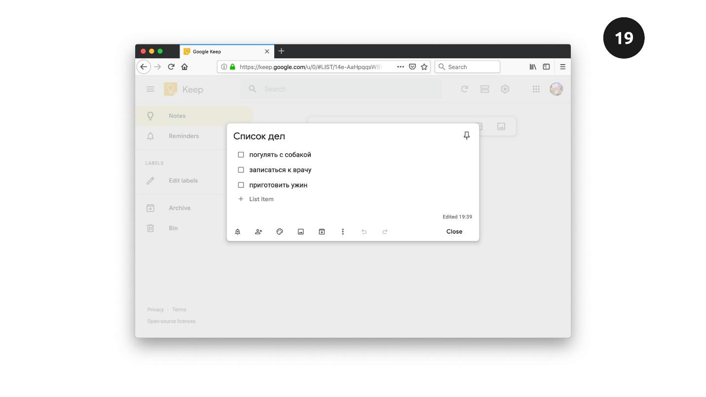
Above is a screenshot of the Google Keep website - this is a service that allows you to create to-do lists, to-do sheets. The to-do sheet has a name, a list of elements, the ability to mark each element, delete it, and add a new one. Our task is to recreate this functionality.
This is what the to do list widget looks like.
He has:
When we add a new item, such as “make dinner,” it is placed at the end of the list. This is a logical behavior - we added the item last. But let's assume that these lists have some sort of priority. For example, after a working day, dinner is more important than a walk with a dog. We would like to move it to the beginning - priority elements should be at the top of the list. How to solve this problem?
How to move elements at all, even without thinking about accessibility? We already know one way - using absolute positioning. Another way is to add the
attribute to the elements. If you add this attribute to
any element, it becomes draggable. You can grab it with the mouse and drag it to another location on the screen.
Only if we want to cancel this functionality will we put
with
.
There are two elements on the screen. On the left is a picture in which the
attribute is implied by default. On the right is an element with a dashed line. Our task is to drag the picture inside the dotted square, which I called “drop-zone”.
Grab the picture and drag it towards the drop-zone. This familiar functionality: we can enter the picture in the drag zone, exit when released - the picture is inside. We want the same functionality in our to-do list.

But before you look at how the to-do list works with this technology, we’ll figure out what happens when we drag an item from place to place. A list of events happens on each of these elements.
There are three events on a dragged item.
Dragstart , which happens once when we start the process of dragging an element. This is an important event, later we will find out why.
A drag that happens regularly every few hundred milliseconds. Depending on the browser, the value changes, but the event is frequent. Using this attribute, you can track the position on the screen of the element we are dragging.
Dragend - fires when we release an item with the mouse.
On an element that accepts other elements, four events fire.
Dragenter - alerts when we drag an item inside another item.
Dragover - says when we start moving it inside.
Dragleave - when we move an element beyond the boundaries of another element, without releasing the mouse.
Drop is the most important event that fires when we release the mouse inside the receiving element.
All these 4 events are only prerequisites for the movement of the element - they themselves do nothing. Using them, you can decide the movement of an element. We do it like this:
We can manually add data to the event that fires at the beginning on the element that we are dragging. Using the
method, we add the selector of the item we are dragging. In our case, this is
.
In the end, when the Drop event is fired on the receiving element, we get this data using the
method. It turns out that we will have the
element we want to move. Next, using ordinary JavaScript, select this element on the page and move it anywhere. We move by hand. To make it possible, we use events on the drag and drop item.
We can drag any element over any other element. Just drag the element across the page and point it at others. Moving does not mean that one element must accept another if it was not planned. Therefore, browsers work this way: by default, no element can accept others.
If we want to teach the element to accept others, we need to cancel this value using the
method on
and
, which fire on the
element.
I tested this combination in different browsers. For example, only
works in Chrome, so use both
and
for a cross-browser solution.
Let's see how it works on the to-do list.
Our task is to drag the last item in the familiar to-do list to the first position. Hover over an element and an element with 6 vertical dots appears on the left. In the UX world, this means that you can drag it.
We hover over it, and if it changes, then this is a signal that the element is ready to move. Pull up with the mouse and a pink indicator appears, which indicates where you can move the item. The rest of the technique is to place the object at the desired position.
Now we will teach the keyboard, and then the screen reader to correctly process what we just did.
With the keyboard, everything is not so complicated. With the keyboard, we use the same pattern as for the mouse: we find the element that we want to move, select, move, and then release, and it fits into place.
Press Tab, and a familiar 6-dot icon appears to the left of the first element, which says that you can drag and drop. By default, it is hidden, and its appearance means that it has taken focus. This is a signal that you can interact with this element.
We introduce the first element “cook dinner” into the “selection mode” by pressing “Enter”. Now this item is receiving additional options. The Up and Down arrows can move it to other positions. Press the down arrow, the element moves one position, again - to another. So we manually move the component. This is not the default in the browser - we write it manually in JavaScript.
When we want to remove the selection from the element, press "Esc" or any other key - the element loses the selection and remains in the right place.
Everything is clear with the keyboard. We almost solved the problem. It remains to teach the screen reader to pronounce actions. All that is needed is to add instructions so that the screen reader knows what is happening: where it is and what to do.
To control what the screen reader pronounces, we will use the Live region technology. This is a set of attributes that can be added to elements. Depending on the attributes, the screen reader pronounces different phrases.
I set the plain empty
the
attribute with a value of
, and the
with a value of
. For a screen reader, this is a signal to listen to an element. When you want the screen reader to say something, update the content using JavaScript, and the screen reader will say that content.
Let's see how it works.
Our task is to move the first element to the last position. Turn off the light on the screen, turn on the screen reader.
- VoiceOver is turned on in Chrome.
We begin to move the item. First, look for our widget - move through the headers. Screen reader voices:
- Heading level two. To-do list.
Found it. We continue to click the Tab key.
- Objects list 3. Press the “Enter” key to select the element “Walk with the dog”. Groups.
First, the screen-reader pronounces the number of elements in the list, so that users understand how many elements are in the list. Then he utters an instruction - what to do to select an item: “Press the Enter key and the name of this component. It became clear what to do - press the Enter key.
- The element "Walk with the dog" is selected. Use the Up and Down keys to move. Use the Esc key to deselect.
It was about these instructions that I spoke: when you select an element, the screen reader gives the instructions that we came up with. We update the screen reader and it pronounces the text that we placed in the Live region element. With the instructions, it is clear what to do - use the Up / Down and Esc keys to deselect. Move down one position.
- The element "Walk with the dog" is moved to position 2.
Again.
- The element "Walk with the dog" is moved to position 3.
The item is at the end of the list. Turn on the light and check whether the element is really in the last position.
Press “Esc” to deselect.
- The "Take a walk with a dog" item has been deselected.
Let's look at moving elements around the page using the Trello example. This is a task tracker with columns that indicate the status of tasks. Dragging and dropping tasks from one column to another corresponds to a change in the status of the task.

Simulate a simplified version of Trello to figure out how to make this component available. In my version there are three columns: “I will do”, “I do”, “Done”.
Tasks can be dragged from place to place: grab the component with the mouse, drag it to the next column, release it - it stays there.
Everything is simple with the mouse; we are familiar with the
attribute with the value
from the previous example. With the keyboard it was possible to make the same option - to move the task from column to column with arrows. But, if the columns are 5 or 8, then moving from the first to the last will take 5 or 8 presses of the Right key 5 or 8 times, which is inconvenient and will make it difficult to work with the component.
We will do otherwise. Press the Tab key, the focus moves to the first element. Press the key again, and a new element appears that was hidden until focus moved into it.
Three vertical dots mean that the item will have a menu. The icon may be different. The default browser behavior when working with the
element is clicking on the "Space", after which a menu appears.
We will solve the problem using JavaScript, but give users the opportunity to choose which column they want to move this or that task.
We move to the last column, press “Enter”, and everything worked - the element moved to where we wanted.
Add instructions for the screen reader. Using the regular
element gives a big advantage because it is available by default. Let's see what we can do.
Turn off the light on the screen, turn on the screen reader.
- VoiceOver is turned on in Chrome.
We pass to the first element. Screen reader says how many objects are in the list. We used the semantic element
, and the name of the element. Click Tab.
- “Make”: select the collapsed pop-up button of the “Play Football” button, groups.
Screen reader can pronounce strange words. He calls the column name “Make”, and “minimized pop-up” for the screen reader means that we will use the menu - for the user of the screen reader this will be clear. “Minimized”, “pop-up” and “button” will be pronounced differently in different screen readers, but we don’t need to worry much about it, because screen reader users are familiar with this behavior.
Our task is to select the desired column from the list.
- Not zero, do it. Select the column expanded pop-up, button. Your current position on the screen ... "Do." “Done” ... The item “Play football” has been moved to the “Done” column.
This is the text that we added manually to inform users that we did it. This is how our task board works.
File upload functionality is also found on sites, for example, to attach files to an email. Therefore, in my example, the email is Gmail.
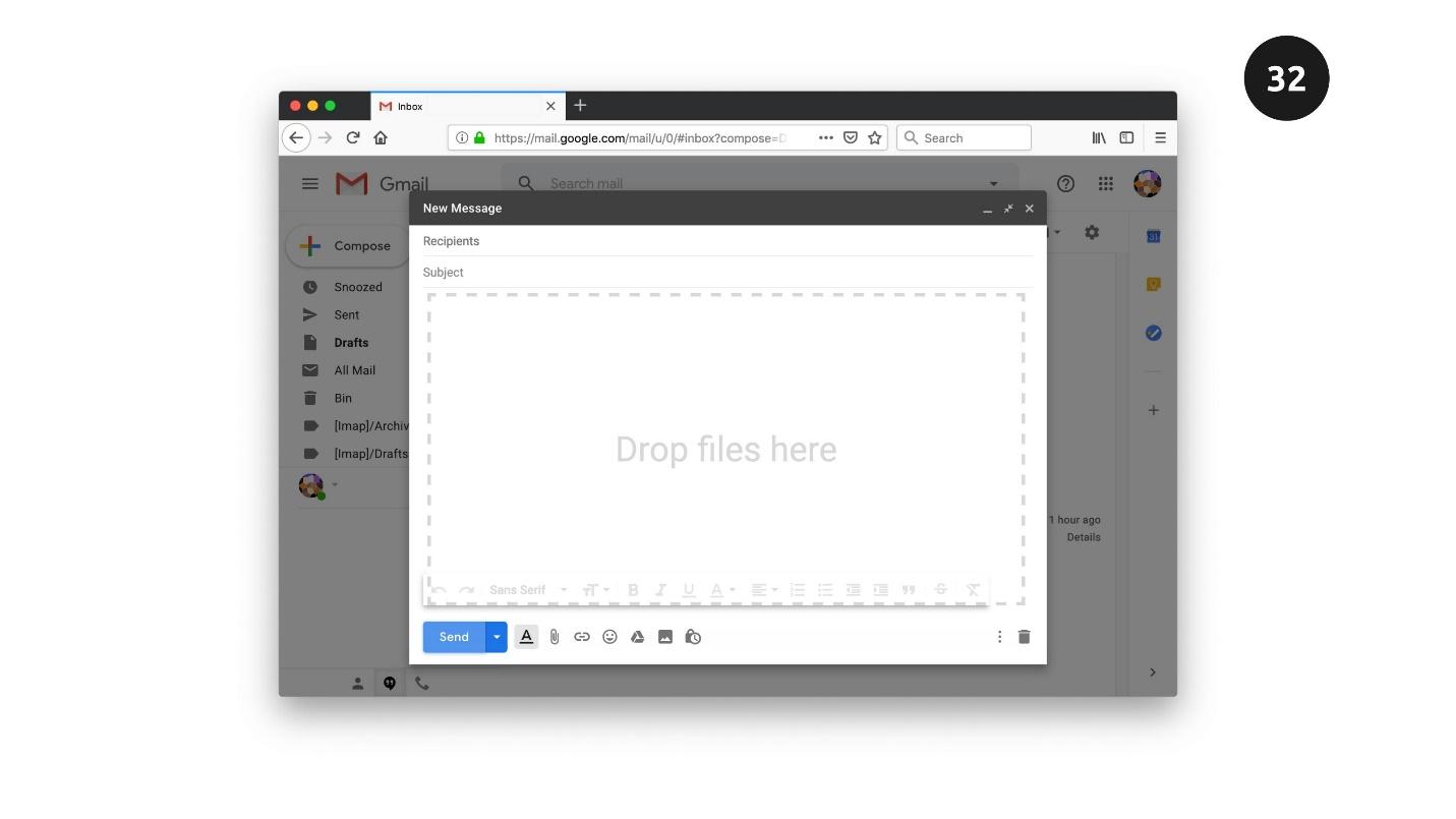
There is an element with a dotted line on the screen. This is where we will drag our files.
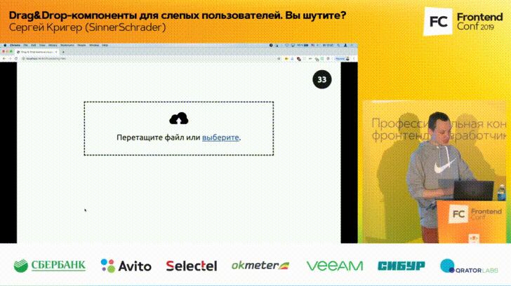
To do this, open the explorer where the files are located and drag the file with the mouse into the dashed zone. After dragging and dropping, the item changes state, release the file, the download starts. At the end of the download, we will notify the user that everything has been successfully downloaded.
With a keyboard, everything is solved simply. There is a semantic
element of type
. If you use it, then clicking on this element will automatically open the Explorer dialog box, where you can select files from the OS. Window styles can be set absolutely any, depending on the desires of your designer.
Click on the item, a dialog box opens. Since we used the native
element, you can also move to this element with the Tab key, press the spacebar and a dialog box will open. Elements are selected with the Enter key, and everything happens the same way.
Everything works with the mouse and keyboard. For the screen reader, you can do something that by default is not provided by native elements.
The “select” element will work and we can still open a dialog box with the OS. But when the load starts, we can do a very interesting thing to update the user’s screen reader about the download status.
Turn on the screen reader. Using the keyboard, go to the item to select files from the OS.
- Select button application.
Press the button with the screen reader.
- Press select button. The beginning of the dialogue ... Image image.png. March 31 ... 0% ... 16% downloaded ... 73% downloaded ... 100% loaded. Image.png file uploaded successfully.
What happened , , . , screen reader , . , , .
, screen reader . — 10%, 20%...100%. , , , .
Live region, . screen reader, , ARIA Live, screen reader . .
. — . , , screen reader. , , .
HTML + JavaScript + ARIA . Drag-&-Drop , JavaScript ARIA. , .
« » . , « »: , , , , .
. : , , .
, W3.org — . .
, , inclusive-components.design . . , , , , , .
. , , « ». — . .
. , — Medium . , . , . , , . . , .
But there is a nuance. When we develop such components, we think that our users physically see the screen and elements, can catch on them with the mouse and drag them. Often it is, but we forget about the segment of users with vision problems. We create components that cannot be used by a large group of people who simply do not see them. How to make Drag - & - Drop components accessible to them too?
Sergey Krieger is a front-end developer at SinnerSchrader. In addition to front-end development, he is actively interested in the topic of web accessibility and will talk about some ways to increase it. Under the cut - a story about creating Drag - & - Drop-components for those who do not see the screen and use other devices to interact with the browser.
Slider
Let's start with a simple screen on the screen Aviasales site. We enter the point of departure, point of arrival, and the list of flights for selection appears on the screen. There can be many flights, they can be filtered by price, time and other parameters. Sliders are used to filter the results on the Aviasales website. They look great, they are convenient to use.
Our task is to imagine that we are the developers of this site. Let's try to recreate these sliders and see how they work in different cases.
Native slider
The first thing to think about is whether native elements can be used for our functionality? If there is such an opportunity, we go this way, because native elements will save a lot of time.
Let's make a simple example: the slider moves along the track and the value of the slider changes. Move the slider to the right - the screen color changes from white to bright pink, if back - again to white.
The slider works simply - the slider slides along the track and the slider returns some value.
No one will use such a slider in production. No designer will allow him to use, because he looks weak. We, as developers, can solve this problem. There are a number of CSS properties with prefixes for each browser, where you can stylize individual elements of the slider and refine it.
: : -webkit-slider-runnable-track : : -webkit-sHder-thumb : : -moz-range-track : : -moz-range-thumb : : -ns-track :-ms-thumb : : -ms-fill-lower : : -ms-fill-upper
You can use the properties manually, but this is not a trivial task. Properties work in different browsers, and testing will take a lot of time.
But there is a special tool that solves the problem - Daniel Stern website . You manually style the slider on it, copy the CSS code and everything works. The native slider is now an
input
HTML element with the type
range
, but works as before - by moving the slider.
Slider testing
To solve the problem to the end - we test. Further we will test not only the slider, but also other elements in three parameters.
- The mouse . Testing the operation of a component with a mouse is exactly what we always do.
- Keyboard In addition to the mouse, we adapt the slider for people with vision problems. These users do not see the screen and use the keyboard to interact with the computer and browser
- Screen reader is a special device that reads information on the screen.
Note: hereinafter it is more convenient to combine reading and viewing testing on video recordings - this is more obvious. A video segment with testing the slider will start from the right moment.
The mouse . We cling to the slider, pull to the right and left. If everything changes - great.
Keyboard Use the Tab key to go to the slider, and use the arrows to move it along the track.
Screen reader . It’s more complicated here. Imagine that we do not see the screen - turn off the light on the screen and turn on the screen reader. He says:
- VoiceOver is turned on in Chrome .
Using the Tab key, go to the slider.
- Zero. Stylized slider application.
Screen reader voices information: value, slider name and other related information, which may also be useful. We start to move the slider:
- One two three four five.
If we hear the countdown, everything works. Turn on the light and check the result. Testing is over.
It seems that we did not do anything, but simply stylized the slider. What is our work on accessibility? The fact of the matter is that there was no work - we used the native element.
If your application has the ability to use native elements: slider, buttons, check-boxes, feel free to use them and save time. These elements already support keyboard and screen reader.
Custom slider
Suppose that the native slider is not our option. Let's look at the Aviasales code and see that here are not the sliders that we just tested.
This is not an
input
with the type
range
, but a set of
div
styled as desired by the designer. It seems that there is no difference, everything works.
We’ll check this and similarly complicate the task by manually creating a slider. The key to moving the slider along the track is absolute positioning:
position: absolute
We absolutely position the slider relative to the track and, depending on its position, calculate the value of the slider.
To determine the moment of capture of an element with the mouse, we use the
mousedown
event. To track the movement of the event -
mousemove
, and
mouseup
will tell us that we released the slider. For the touch screen, we will also use a number of events:
touchstart
,
touchmove
and
touchend
.
It seems that everything is simple. The slider will look the same as in the previous example, but in the code it is not a slider, but a set of stylized
div
, and JavaScript will be responsible for moving it. When working with a mouse, this will be imperceptible, but there is a nuance with the keyboard. So that the keyboard can catch such a slider, we give it the property to take focus with the
tabindex
attribute and use JavaScript to track the click on the arrows.
Testing Custom Slider
With a screen reader it will be harder. Turn off the light, turn on the screen reader and try to change the value. Screen reader voices the actions, and if he says something strange, for example, “groups”, we think.
A “group” is what the screen reader voices when it reads a div or other element that has no semantic role. Any word that does not refer to the slider says that accessibility has not yet been achieved. To make the slider available, we use ARIA attributes:
<div class="thumb" tabindex="0" role="slider" aria-labl="" aria-valuenow="5" aria-valuemin="0" aria-valuenax="10" ></div>
We need to tell the screen reader that our usual style element is a slider. We will do this using
role
with the value
slider
. Then we give the name to the slider using the
aria-labl
. We set the current value of the slider, the minimum and maximum value of the slider. Using these five ARIA attributes, we will animate the slider and make the screen reader say what we need.
Using markup, JavaScript, and ARIA elements, we made the custom slider available to all users.
Sorting
Another approach to implementing Drag - & - Drop components is sorting. Often sites have lists of items that are good to sort.
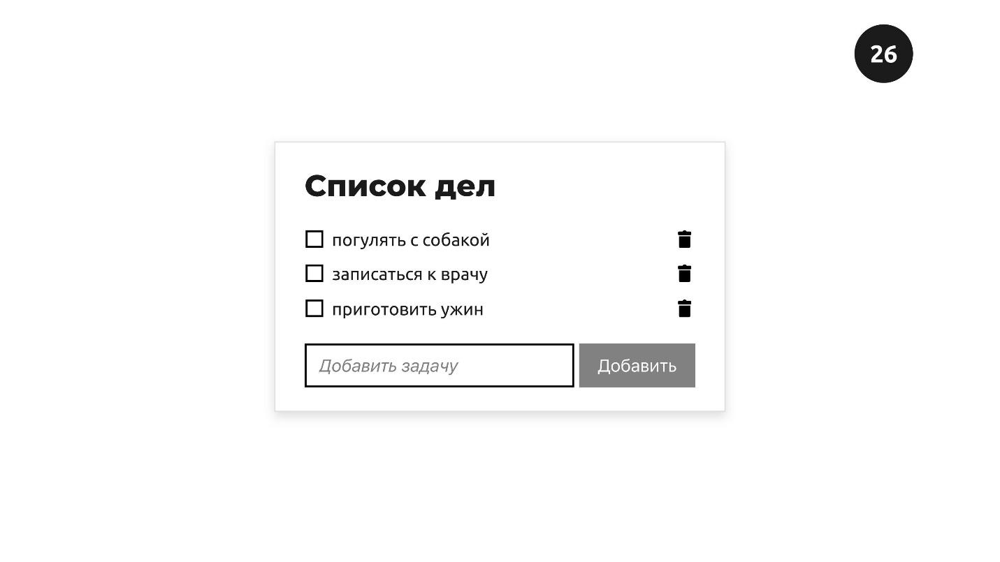
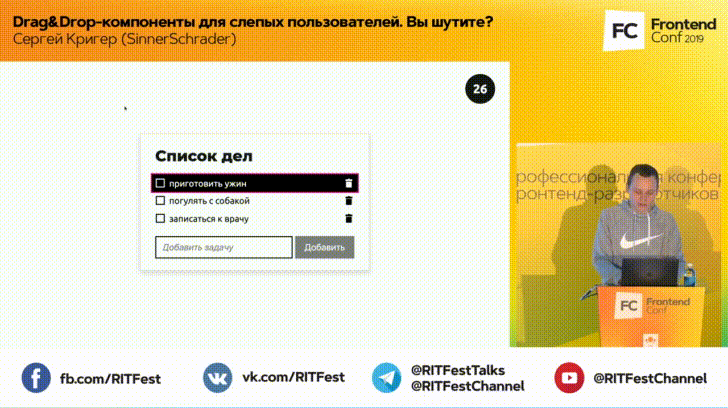
Above is a screenshot of the Google Keep website - this is a service that allows you to create to-do lists, to-do sheets. The to-do sheet has a name, a list of elements, the ability to mark each element, delete it, and add a new one. Our task is to recreate this functionality.
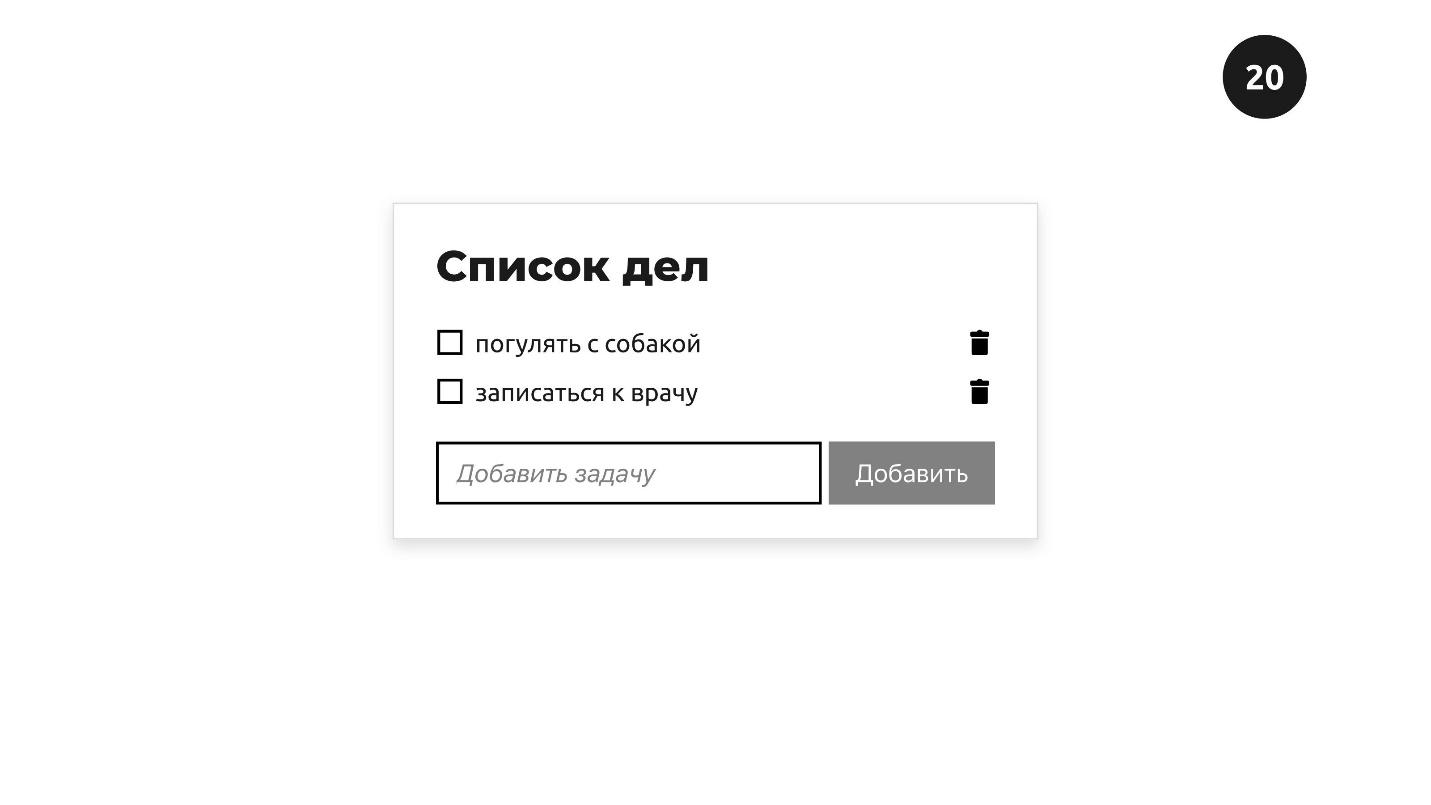
This is what the to do list widget looks like.
He has:
- name - to-do list;
- Elements: walk with the dog, make an appointment with the doctor, which can be noted or deleted;
- the ability to add new elements - add a task.
When we add a new item, such as “make dinner,” it is placed at the end of the list. This is a logical behavior - we added the item last. But let's assume that these lists have some sort of priority. For example, after a working day, dinner is more important than a walk with a dog. We would like to move it to the beginning - priority elements should be at the top of the list. How to solve this problem?
How to move elements at all, even without thinking about accessibility? We already know one way - using absolute positioning. Another way is to add the
draggable
attribute to the elements. If you add this attribute to
true
any element, it becomes draggable. You can grab it with the mouse and drag it to another location on the screen.
But not all elements need thedraggable
attribute. Images and links are not needed - they are drag and drop by default.
Only if we want to cancel this functionality will we put
draggable
with
false
.
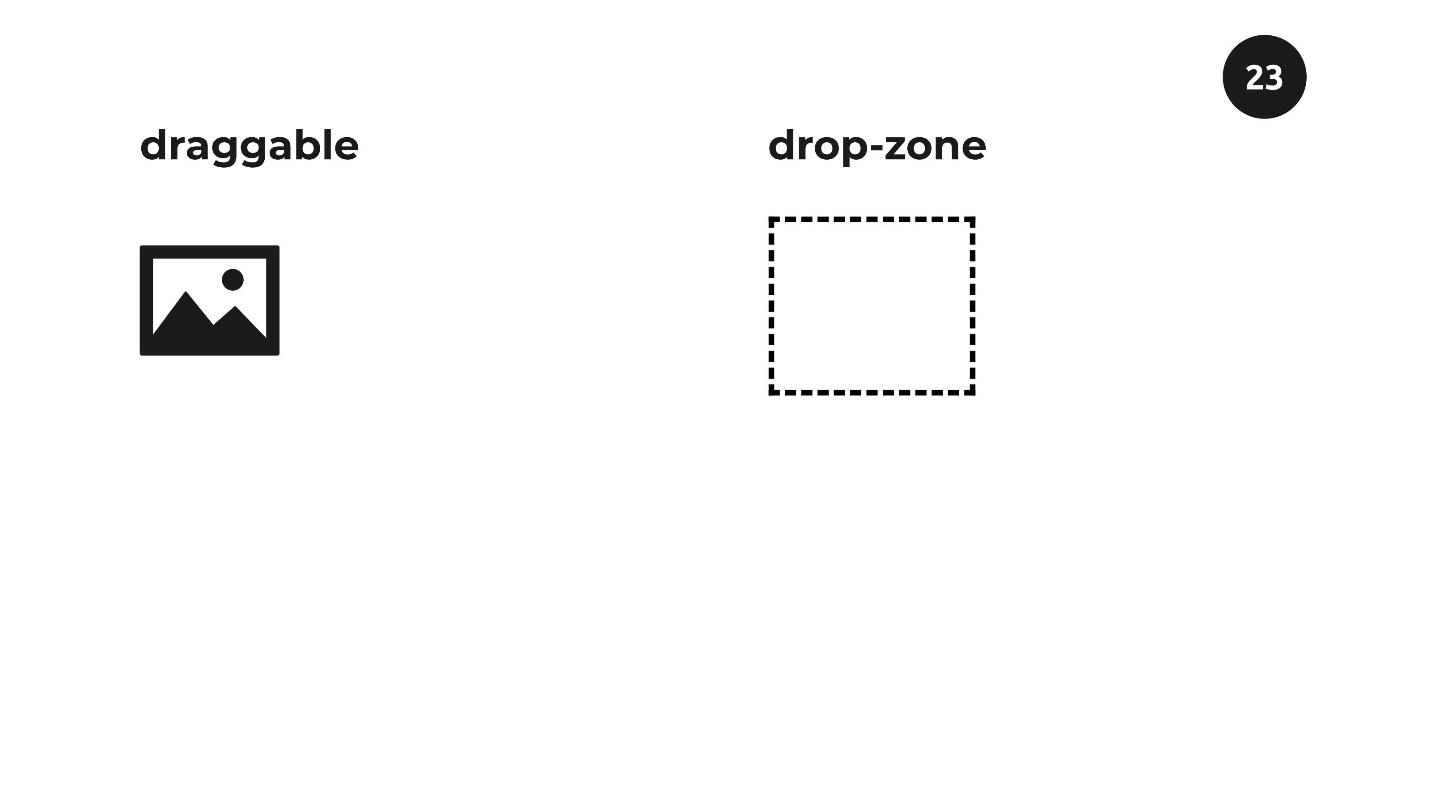
Data transfer
There are two elements on the screen. On the left is a picture in which the
draggable
attribute is implied by default. On the right is an element with a dashed line. Our task is to drag the picture inside the dotted square, which I called “drop-zone”.
Grab the picture and drag it towards the drop-zone. This familiar functionality: we can enter the picture in the drag zone, exit when released - the picture is inside. We want the same functionality in our to-do list.
But before you look at how the to-do list works with this technology, we’ll figure out what happens when we drag an item from place to place. A list of events happens on each of these elements.
There are three events on a dragged item.
Dragstart , which happens once when we start the process of dragging an element. This is an important event, later we will find out why.
A drag that happens regularly every few hundred milliseconds. Depending on the browser, the value changes, but the event is frequent. Using this attribute, you can track the position on the screen of the element we are dragging.
Dragend - fires when we release an item with the mouse.
On an element that accepts other elements, four events fire.
Dragenter - alerts when we drag an item inside another item.
Dragover - says when we start moving it inside.
Dragleave - when we move an element beyond the boundaries of another element, without releasing the mouse.
Drop is the most important event that fires when we release the mouse inside the receiving element.
All these 4 events are only prerequisites for the movement of the element - they themselves do nothing. Using them, you can decide the movement of an element. We do it like this:
draggable.addEventListener("dragstart", e => { e.dataTransfer.setData("text/plain", e.target.id); }); dropZone.addEventListener("drop", e => { const id = e.dataTransfer.getData("text/plain"); const el = document.getElementById(id); });
We can manually add data to the event that fires at the beginning on the element that we are dragging. Using the
dataTransfer.setData
method, we add the selector of the item we are dragging. In our case, this is
id
.
In the end, when the Drop event is fired on the receiving element, we get this data using the
dataTransfer.getData
method. It turns out that we will have the
id
element we want to move. Next, using ordinary JavaScript, select this element on the page and move it anywhere. We move by hand. To make it possible, we use events on the drag and drop item.
We can drag any element over any other element. Just drag the element across the page and point it at others. Moving does not mean that one element must accept another if it was not planned. Therefore, browsers work this way: by default, no element can accept others.
If we want to teach the element to accept others, we need to cancel this value using the
e.preventDefault()
method on
dragenter
and
dragover
, which fire on the
dropZone
element.
dropZone.addEventListener("dragenter", e => { e.preventDefault(); }); dropZone.addEventListener("dragover«, e => { e.preventDefault(); });
I tested this combination in different browsers. For example, only
dragenter
works in Chrome, so use both
dragenter
and
dragover
for a cross-browser solution.
Let's see how it works on the to-do list.
Our task is to drag the last item in the familiar to-do list to the first position. Hover over an element and an element with 6 vertical dots appears on the left. In the UX world, this means that you can drag it.
We hover over it, and if it changes, then this is a signal that the element is ready to move. Pull up with the mouse and a pink indicator appears, which indicates where you can move the item. The rest of the technique is to place the object at the desired position.
Now we will teach the keyboard, and then the screen reader to correctly process what we just did.
Keyboard
With the keyboard, everything is not so complicated. With the keyboard, we use the same pattern as for the mouse: we find the element that we want to move, select, move, and then release, and it fits into place.
Press Tab, and a familiar 6-dot icon appears to the left of the first element, which says that you can drag and drop. By default, it is hidden, and its appearance means that it has taken focus. This is a signal that you can interact with this element.
We introduce the first element “cook dinner” into the “selection mode” by pressing “Enter”. Now this item is receiving additional options. The Up and Down arrows can move it to other positions. Press the down arrow, the element moves one position, again - to another. So we manually move the component. This is not the default in the browser - we write it manually in JavaScript.
When we want to remove the selection from the element, press "Esc" or any other key - the element loses the selection and remains in the right place.
Screen reader
Everything is clear with the keyboard. We almost solved the problem. It remains to teach the screen reader to pronounce actions. All that is needed is to add instructions so that the screen reader knows what is happening: where it is and what to do.
To control what the screen reader pronounces, we will use the Live region technology. This is a set of attributes that can be added to elements. Depending on the attributes, the screen reader pronounces different phrases.
<div class="live-region visually-hidden" aria-live="polite" role="status" ></div>
const liveRegion = document.querySelector(".live-region«); liveRegion.textContent = ' ';
I set the plain empty
div
the
aria-live
attribute with a value of
polite
, and the
role
with a value of
status
. For a screen reader, this is a signal to listen to an element. When you want the screen reader to say something, update the content using JavaScript, and the screen reader will say that content.
Let's see how it works.
Our task is to move the first element to the last position. Turn off the light on the screen, turn on the screen reader.
- VoiceOver is turned on in Chrome.
We begin to move the item. First, look for our widget - move through the headers. Screen reader voices:
- Heading level two. To-do list.
Found it. We continue to click the Tab key.
- Objects list 3. Press the “Enter” key to select the element “Walk with the dog”. Groups.
First, the screen-reader pronounces the number of elements in the list, so that users understand how many elements are in the list. Then he utters an instruction - what to do to select an item: “Press the Enter key and the name of this component. It became clear what to do - press the Enter key.
- The element "Walk with the dog" is selected. Use the Up and Down keys to move. Use the Esc key to deselect.
It was about these instructions that I spoke: when you select an element, the screen reader gives the instructions that we came up with. We update the screen reader and it pronounces the text that we placed in the Live region element. With the instructions, it is clear what to do - use the Up / Down and Esc keys to deselect. Move down one position.
- The element "Walk with the dog" is moved to position 2.
Again.
- The element "Walk with the dog" is moved to position 3.
The item is at the end of the list. Turn on the light and check whether the element is really in the last position.
Press “Esc” to deselect.
- The "Take a walk with a dog" item has been deselected.
With the help of imagination, markup, JavaScript and ARIA attributes, we made available a widget that is difficult for users with vision problems.
Moving
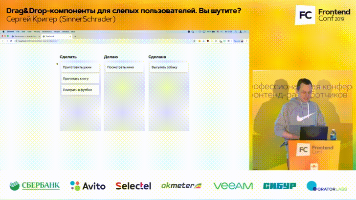
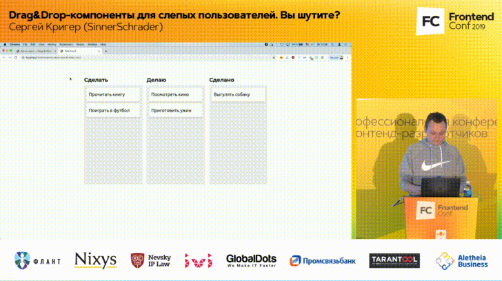
Let's look at moving elements around the page using the Trello example. This is a task tracker with columns that indicate the status of tasks. Dragging and dropping tasks from one column to another corresponds to a change in the status of the task.
Simulate a simplified version of Trello to figure out how to make this component available. In my version there are three columns: “I will do”, “I do”, “Done”.
Tasks can be dragged from place to place: grab the component with the mouse, drag it to the next column, release it - it stays there.
Keyboard
Everything is simple with the mouse; we are familiar with the
draggable
attribute with the value
true
from the previous example. With the keyboard it was possible to make the same option - to move the task from column to column with arrows. But, if the columns are 5 or 8, then moving from the first to the last will take 5 or 8 presses of the Right key 5 or 8 times, which is inconvenient and will make it difficult to work with the component.
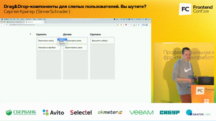
We will do otherwise. Press the Tab key, the focus moves to the first element. Press the key again, and a new element appears that was hidden until focus moved into it.
Three vertical dots mean that the item will have a menu. The icon may be different. The default browser behavior when working with the
select
element is clicking on the "Space", after which a menu appears.
We will solve the problem using JavaScript, but give users the opportunity to choose which column they want to move this or that task.
We move to the last column, press “Enter”, and everything worked - the element moved to where we wanted.
Screen reader
Add instructions for the screen reader. Using the regular
select
element gives a big advantage because it is available by default. Let's see what we can do.
Turn off the light on the screen, turn on the screen reader.
- VoiceOver is turned on in Chrome.
We pass to the first element. Screen reader says how many objects are in the list. We used the semantic element
, and the name of the element. Click Tab.
- “Make”: select the collapsed pop-up button of the “Play Football” button, groups.
Screen reader can pronounce strange words. He calls the column name “Make”, and “minimized pop-up” for the screen reader means that we will use the menu - for the user of the screen reader this will be clear. “Minimized”, “pop-up” and “button” will be pronounced differently in different screen readers, but we don’t need to worry much about it, because screen reader users are familiar with this behavior.
Our task is to select the desired column from the list.
- Not zero, do it. Select the column expanded pop-up, button. Your current position on the screen ... "Do." “Done” ... The item “Play football” has been moved to the “Done” column.
This is the text that we added manually to inform users that we did it. This is how our task board works.
Upload files
File upload functionality is also found on sites, for example, to attach files to an email. Therefore, in my example, the email is Gmail.
There is an element with a dotted line on the screen. This is where we will drag our files.
To do this, open the explorer where the files are located and drag the file with the mouse into the dashed zone. After dragging and dropping, the item changes state, release the file, the download starts. At the end of the download, we will notify the user that everything has been successfully downloaded.
Keyboard
With a keyboard, everything is solved simply. There is a semantic
input
element of type
file
. If you use it, then clicking on this element will automatically open the Explorer dialog box, where you can select files from the OS. Window styles can be set absolutely any, depending on the desires of your designer.
Click on the item, a dialog box opens. Since we used the native
input
element, you can also move to this element with the Tab key, press the spacebar and a dialog box will open. Elements are selected with the Enter key, and everything happens the same way.
Everything works with the mouse and keyboard. For the screen reader, you can do something that by default is not provided by native elements.
Screen reader
The “select” element will work and we can still open a dialog box with the OS. But when the load starts, we can do a very interesting thing to update the user’s screen reader about the download status.
Turn on the screen reader. Using the keyboard, go to the item to select files from the OS.
- Select button application.
Press the button with the screen reader.
- Press select button. The beginning of the dialogue ... Image image.png. March 31 ... 0% ... 16% downloaded ... 73% downloaded ... 100% loaded. Image.png file uploaded successfully.
What happened , , . , screen reader , . , , .
, screen reader . — 10%, 20%...100%. , , , .
Live region, . screen reader, , ARIA Live, screen reader . .
. — . , , screen reader. , , .
HTML + JavaScript + ARIA . Drag-&-Drop , JavaScript ARIA. , .
« » . , « »: , , , , .
. : , , .
Resources
, W3.org — . .
, , inclusive-components.design . . , , , , , .
. , , « ». — . .
. , — Medium . , . , . , , . . , .
. FrontendConf ++ . FrontendConf 2019 Leonie Watson — , W3C W3C -. Leonie screen reader. , , , , .
FrontendConf , . , .
All Articles