Two browsers enter the scrollbar somehow ...
 A scrollbar (scrollbar) is a simple but effective mechanism that acts as a primary means by which you can view large documents. But that's not all that scrollbars can do! These modest workhorses are also pretty good at telling users what the size of the documents they interact with is. As a result, scrollbars carry a double load. They help to work with various materials, and inform the user about the size of these materials.
The simple and understandable logic of scrollbars can be changed when implementing scrolling jacking mechanisms. This happens when the standard behavior of the scrollbar changes, which violates the expected by the user correspondence between the length of the document and the height of the scrollbar.
Moreover, programs for devices with touch screens have popularized the idea of hiding scrollbars. With this approach, scrollbars are invisible until the user starts scrolling an element that does not fit in a certain viewing area. As a result, it turns out that for the sake of visual appeal of applications, designers sacrifice the clarity of interfaces. The user may need some time to understand that the contents in a certain container can be scrolled. Such a container may look as if it does not support scrolling, or as if it simply does not need scrolling.
Classic desktop operating systems have embraced this mobile trend, trying to minimize the interference of traditional scrollbars in application design.
The material, the translation of which we publish today, is devoted to some features of the use of scrollbars in web applications.
Some terminology
Before we continue - let's define a couple of terms that we will use here. Namely, we distinguish two types of scrollbars:
- Fixed (obtrusive) scrollbars - those that occupy the screen space. They do not overlap the content you are viewing, but instead sit next to them.
- Non-fixed (unobtrusive) scrollbars - those that overlap content. They do not take away the screen space from what is in the containers to which they belong.
Standard behavior of modern scrollbars
By default, both iOS and Android scrollbars are unfixed.
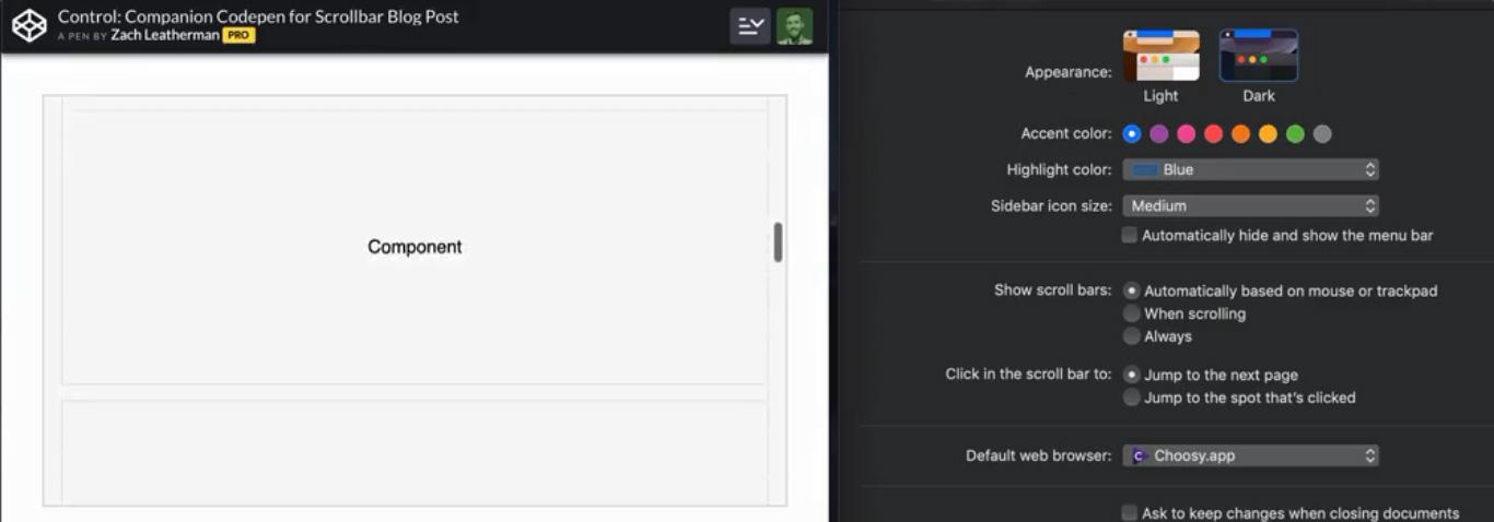
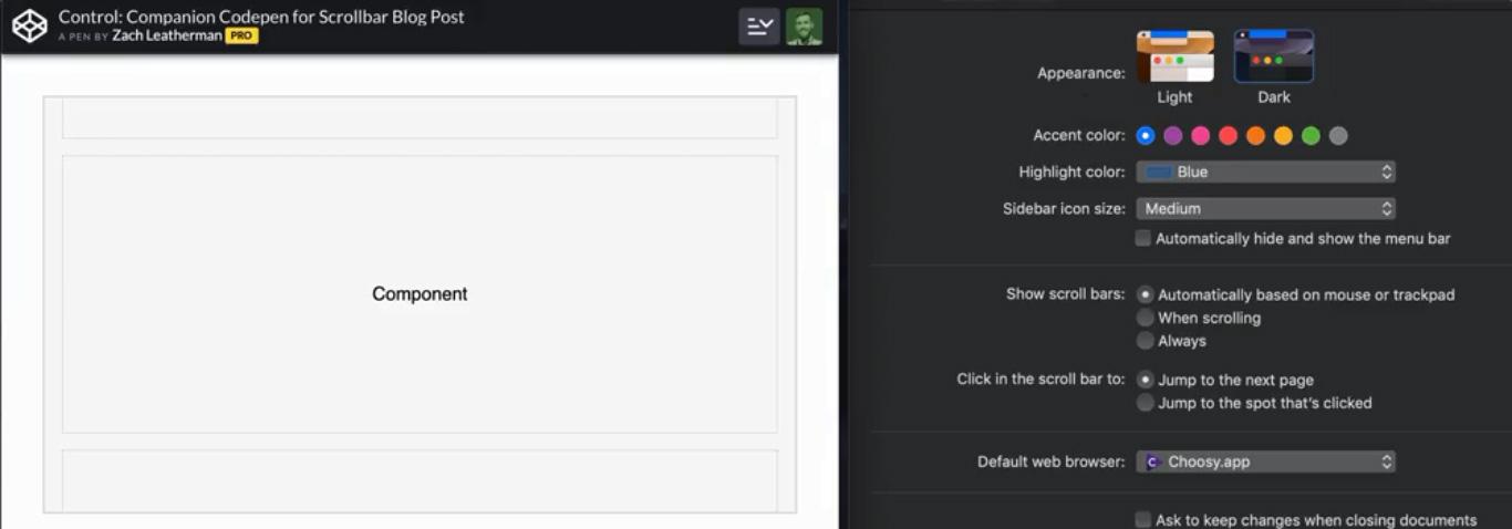
In macOS (in particular, we are talking about the actual macOS Mojave at the time of writing this material) scrollbars are hidden until the element starts scrolling. This is the standard behavior of the system in a situation when a mouse is not connected to the computer. There are three options for displaying scrollbars (the corresponding settings can be found at
General > System Preferences
).

Scrollbar settings in macOS Mojave
It was found out that these settings control the behavior of scrollbars in Chrome, Firefox, and in the new Edge based on Chromium.
Here's a video, which you can watch to learn about how the above settings affect scrollbars, and how scrollbars, in addition to allowing you to scroll content, affect it. Here are some extracts from this video.

The fixed scrollbar in macOS is always visible and takes up some screen space
MacOS non-fixed scrollbar overlays content while scrolling through a document
Unfixed scrollbar in macOS is hidden at the moment when the document is not scrolled
In Windows 10, at
Settings > Display > Simplify and personalize Windows
, you can find similar settings.
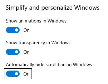
Scrollbar settings in Windows 10
Unfortunately, even when the
Automatically hide scroll bars in Windows
option is enabled, it does not affect Firefox, Chrome, Internet Explorer, and Edge. In the case of Edge, we are talking about both the browser variant based on Chromium and the variant based on EdgeHTML.
Task Overview
Here's what the page we saw above on macOS looks like on Windows.

Windows scrollbar page
Windows scrollbars are fixed by default. They, in addition, look pretty “heavy” in terms of design. They, in their standard version, are much wider than their counterparts from macOS. In addition, the color of scrollbars in Windows usually matches the system settings, and not the color palette of a web page.
Designers who are accustomed to the macOS environment, but who are developing web applications designed for different platforms, may find it difficult to make their projects look good in different OSs and do not spend too much system resources on rendering.
Project requirements
We want to develop a web application, the scrollbars used in which differ in the following features:
- They should look attractive when viewing pages on a desktop OS. This is especially important when displaying containers whose contents do not entirely fit into them. Scrollbars are displayed inside such containers, which means that the design of these scrollbars must be in good agreement with the design of the containers. We believe that in the case of scrollbars that allow you to scroll the entire page, this is not so important, but this is undoubtedly a controversial issue.
- We want to minimize the screen space that a scrollbar can occupy. In Windows, scrollbars, by default, are fixed and very wide.
- We want to focus on system settings. If the user selects a non-standard option in the settings that defines the behavior of scrollbars, we need to take this into account whenever possible.
- We are committed to avoiding the use of heavy JavaScript solutions (such as the very nice OverlayScrollbars plugin), designed to work with unfixed scrollbars. They create a considerable load on client computers.
How far can I go with CSS?
Here is the code for the container element to which the
overflowing-element
class is assigned, and also the CSS for styling it:
<div class="overflowing-element"></div> .overflowing-element { overflow-y: auto; -webkit-overflow-scrolling: touch; -ms-overflow-style: -ms-autohiding-scrollbar; }
If you need unfixed scrollbars in Internet Explorer and in Edge, based on EdgeHTML, this means that the
-ms-overflow-style: -ms-autohiding-scrollbar;
. With its use, everything will work as it should (it's simple enough - right?).
When iOS 13 came out, it turned out that the -webkit-overflow-scrolling: touch property might not be needed to improve the physics of scrolling. Although, if you need to support older versions of iOS, it is better not to refuse to use this property.
If we talk about CSS properties related to scrolling, then it may be useful to read about the overscroll-behavior property. It allows you to control the behavior of the system when reaching the border of the element that supports scrolling.
▍Firefox
The Firefox browser supports CSS properties without prefixes. This is scrollbar-color and scrollbar-width .
The following example uses CSS variables that are not supported in Internet Explorer 11 for clarity:
:root { --scrollbar-track-color: transparent; --scrollbar-color: rgba(0,0,0,.2); --scrollbar-width: thin; /* or `auto` or `none` */ } .overflowing-element { scrollbar-width: var(--scrollbar-width); scrollbar-color: var(--scrollbar-color) var(--scrollbar-track-color); }
▍Chrome and Safari, Chromium-based Edge browser, and other browsers
Webkit and Blink-based browsers support custom pseudo-elements designed to customize scrollbars:
:root { --scrollbar-track-color: transparent; --scrollbar-color: rgba(0,0,0,.2); --scrollbar-size: .375rem; --scrollbar-minlength: 1.5rem; /* ( , ) */ } .overflowing-element::-webkit-scrollbar { height: var(--scrollbar-size); width: var(--scrollbar-size); } .overflowing-element::-webkit-scrollbar-track { background-color: var(--scrollbar-track-color); } .overflowing-element::-webkit-scrollbar-thumb { background-color: var(--scrollbar-color); /* - :hover :active */ } .overflowing-element::-webkit-scrollbar-thumb:vertical { min-height: var(--scrollbar-minlength); } .overflowing-element::-webkit-scrollbar-thumb:horizontal { min-width: var(--scrollbar-minlength); }
Here is an example on CodePen, demonstrating the ability to customize scrollbars, performed exclusively by CSS. And here is an example that demonstrates the standard behavior of scrollbars. You can compare them.
It should be noted that the above code has one problem. It consists in the fact that when setting the
height
or
width
properties of the pseudo-element
::-webkit-scrollbar
in macOS, the non-fixed
::-webkit-scrollbar
is replaced with a fixed one (the standard settings are redefined). However, this is not difficult to fix with a small piece of JavaScript code.
CSS and a bit of JS
We can add a small amount of JavaScript code to the project, which allows us to find out whether the standard scrollbar is fixed or not. It looks something like this:
/* * . * body `layout-scrollbar-obtrusive` * , . */ var parent = document.createElement("div"); parent.setAttribute("style", "width:30px;height:30px;"); parent.classList.add('scrollbar-test'); var child = document.createElement("div"); child.setAttribute("style", "width:100%;height:40px"); parent.appendChild(child); document.body.appendChild(parent); // . // 30px, . var scrollbarWidth = 30 - parent.firstChild.clientWidth; if(scrollbarWidth) { document.body.classList.add("layout-scrollbar-obtrusive"); } document.body.removeChild(parent);
If the scrollbar is fixed, we add the
layout-scrollbar-obtrusive
class to the
body
document element. This class can be used to adjust the
width
and
height
properties of only fixed scrollbars. This avoids the above-described interference in the behavior of scrollbars. During this intervention, the scrollbars change and the project moves away from the system settings made by the user. Here is the style for the
layout-scrollbar-obtrusive
:
.layout-scrollbar-obtrusive .layout-scrollbar::-webkit-scrollbar { height: var(--scrollbar-size); width: var(--scrollbar-size); }
Here you can find an example of applying a technique that uses CSS and JavaScript together. Here , for comparison, an example that demonstrates the standard behavior of the system.
Results: a review of the solution to the problem
On devices with touch screens that use unfixed scrollbars (that is, on iOS and Android devices), we simply use the standard behavior of scrollbars.
In macOS, we have the opportunity to take into account the system settings made by the user. This means that we do not inadvertently switch between non-fixed and fixed scrollbars. We apply styles only to fixed scrollbars that are always visible. This allows us to bring the appearance of the pages in line with our design requirements for the project.
On Windows, namely, in Firefox and Chrome browsers, there are no standard unfixed scrollbars, but here, as in other cases, we can apply our approach, which uses exclusively CSS features. Due to the fact that we were able to come up with working examples of using scrollbars customizable with CSS, we were able to come to an agreement with our design team. We settled on a compromise and avoided using heavy JavaScript solutions.
Here are the demo projects, the essence of which was described above:
- Showing standard scrollbar behavior.
- A solution that uses only CSS. All scroll bars are styled.
- A solution that uses CSS and JavaScript. Only fixed scrollbars are styled.
Dear readers! How do you style scrollbars in your projects?


All Articles