How the browser draws. Yandex Report
Until recently, I worked in the Yandex.Browser team and made a presentation at the YaTalks conference in the wake of this experience. The report was about what the browser has under the hood and how your pages turn into pixels on the screen. Minimum frontend, only browser internals, only hardcore.
- Hello everyone, my name is Kostya. Surprisingly, now I work in the team of the Yandex.Cloud virtual network. Before that, I worked in the Browser team for more than five years, so today I will talk about things that are common to us and you.
As you might guess, I don't understand very well in the front end. If you talk to me about React or anything else like that, I probably won’t understand you. But I did a lot of things in the browser: video decoding, business logic. Including I spent a lot of time doing different things in rendering the browser. Today we will have such, say, educational program about the internal device of the browser. I will try to go through the most interesting things that we did in Yandex.Browser or Google in Chromium.

If we talk about rendering in the browser, then this is a very complicated thing, which consists of a large number of components. First of all, you must download resources to show them. Then you have to parse them, build a DOM tree, styles, layouts, etc. The first three points are most likely familiar to you. My report will be devoted more to the other three parts: Painting, Rasterization and Compositing - what happens under the hood when you have already written the layout. Only in words it may seem that it is about the same thing - in fact, these are completely different components.
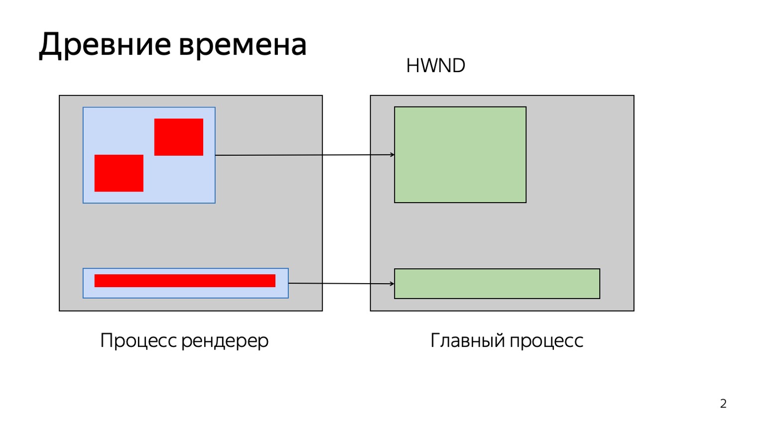

Let's start with Painting and Compositing. What is this all about? Let's go back many, many years ago, when the web was not as complicated as it is now, when there were no all kinds of 3D, CSS animations and other things. How then drew the browser? Imagine that you have your page, on it some wonderful elements, pictures, etc. The browser painted all this on one hefty texture, in a large block of memory. He knew how to draw each element, and if we had any changes, they are highlighted in yellow, then something like this happened.
The browser aggregated them in the areas indicated here in blue. There has been a change in this area, let's redraw it. Everything in this area was simply redrawn and copied to the texture.
It worked for itself. Then smart people came up with 3D CSS animations, other things. We could have a lot of renderings in different places. If we spin one spinner, redrawing the whole pie of elements that are located under it is not very effective.
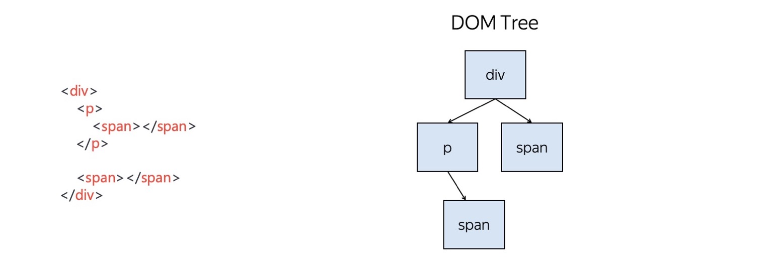
Then other smart people decided to redo it all a little. We have some kind of DOM tree, we built it in memory. These are plus objects, they are compared with what layout you wrote.
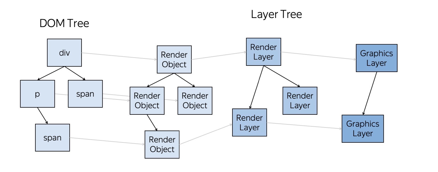
And then the magic begins to happen. The browser converts the entire DOM tree to a Render Object tree. This thing knows how to draw each specific DOM element. That is, she knows what needs to be done so that something appears on the screen instead of your tree or P-element.
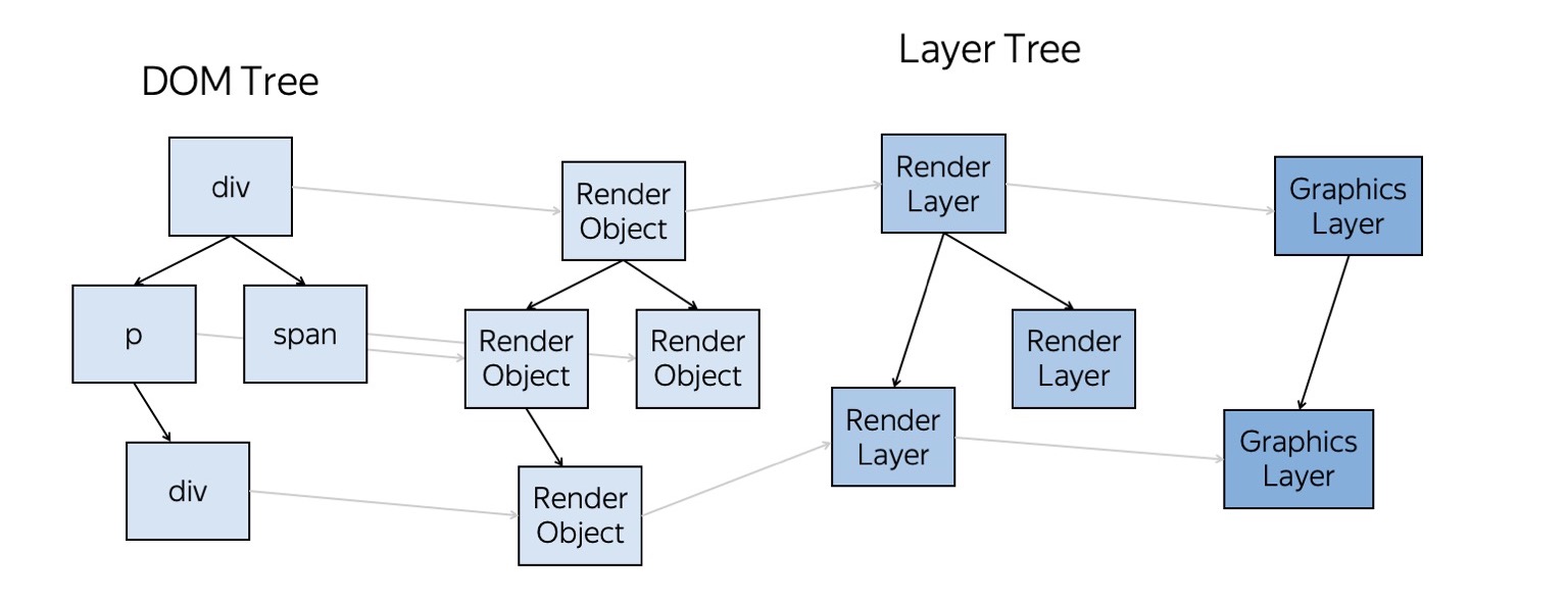
The next tree is the tree of layers. What is it? Each of our elements can be associated with any one layer, and one Render Layer can contain several objects at once. Why is this done? This is very well shown here. We generate a set of layers, each of them has certain elements. Now, suppose something changes on one of the layers - an animation occurs, a brand element flies. Then we redraw only one layer, and the rest, for example the background, remain unchanged. We then simply glue them into composites and at the output we get the final picture - the current frame of the animation.
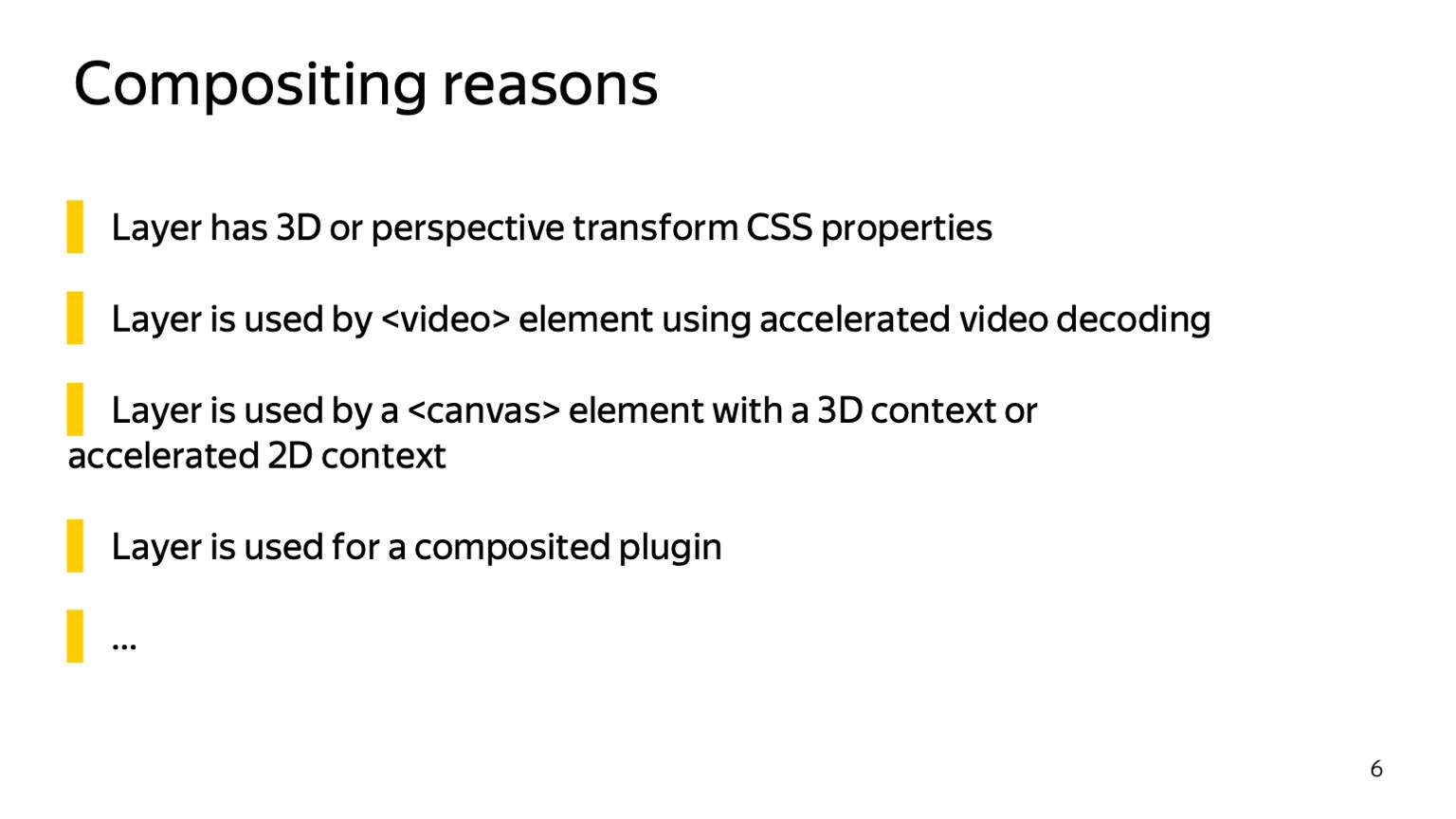
There are a fixed set of reasons for creating new layers. For example, a layer is created to render 3D CSS animation, a canvas, a video element on it - in general, something related to heavy animation, suitable for redrawing separately from all other content.
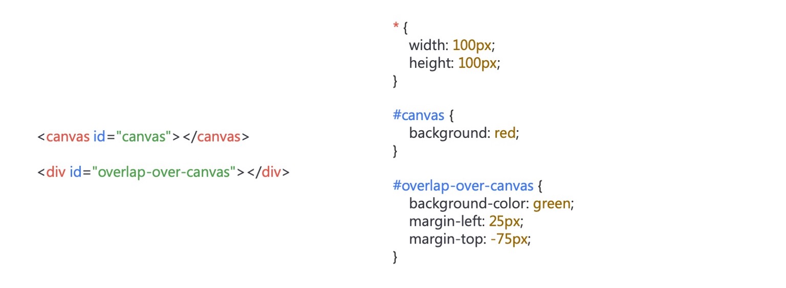
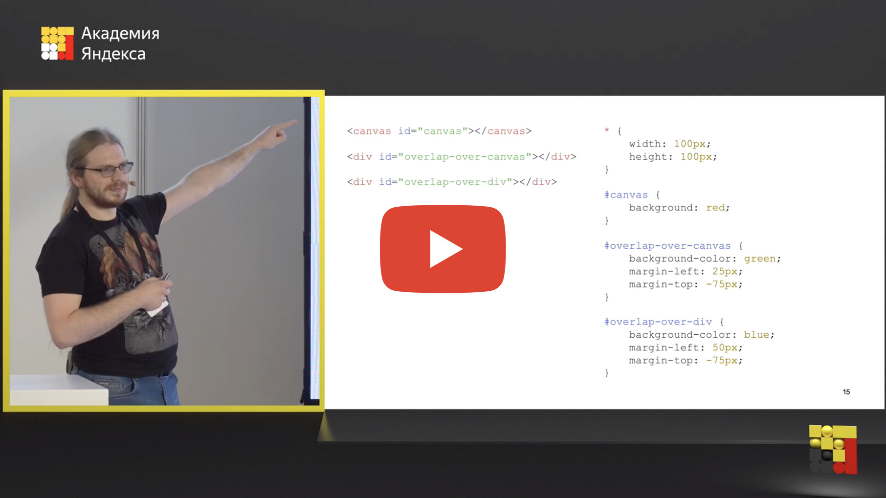
But this approach has several problems. Now you need to turn on the fuel. Think about what will be depicted here? There are only two elements.
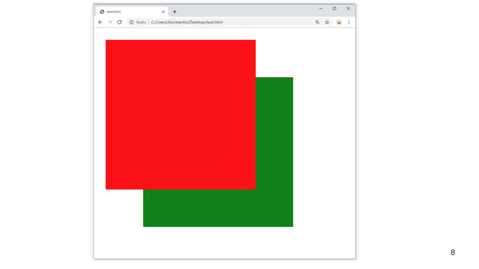
Here. Although, it would seem, the elements are located one by one. Why does canvas fly up? In our country, they are sequentially arranged; I did not set any order.
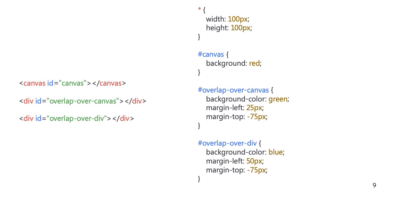
Let's complicate. Here we have another div, like this.
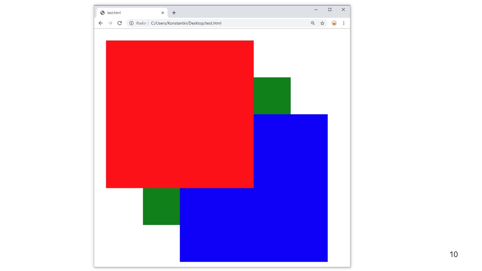
In general, the expected behavior. We have a div on top of the div, but canvas is for some reason on top. Magic! Ok, let's complicate this example again.
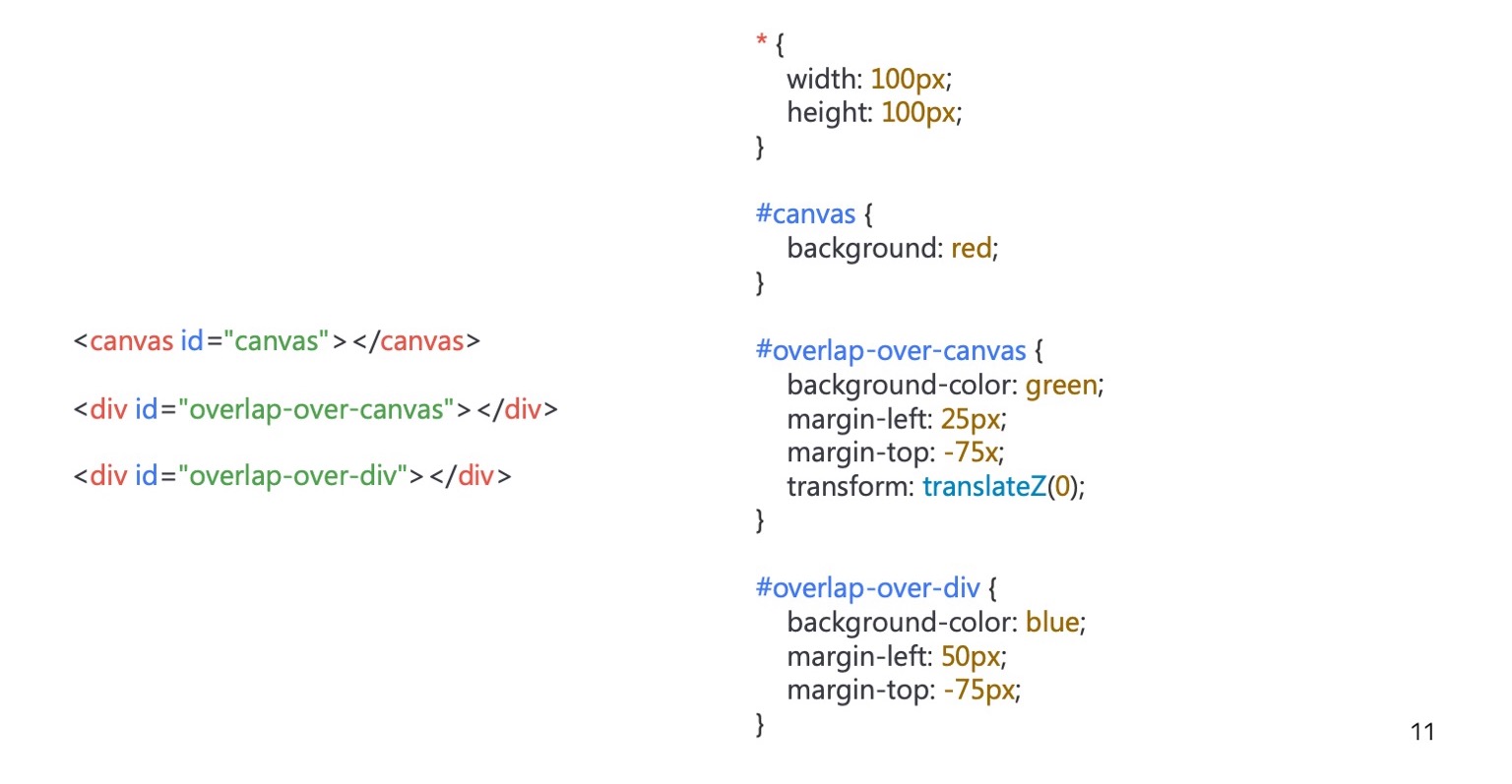
Exactly one line has changed, I added transform.
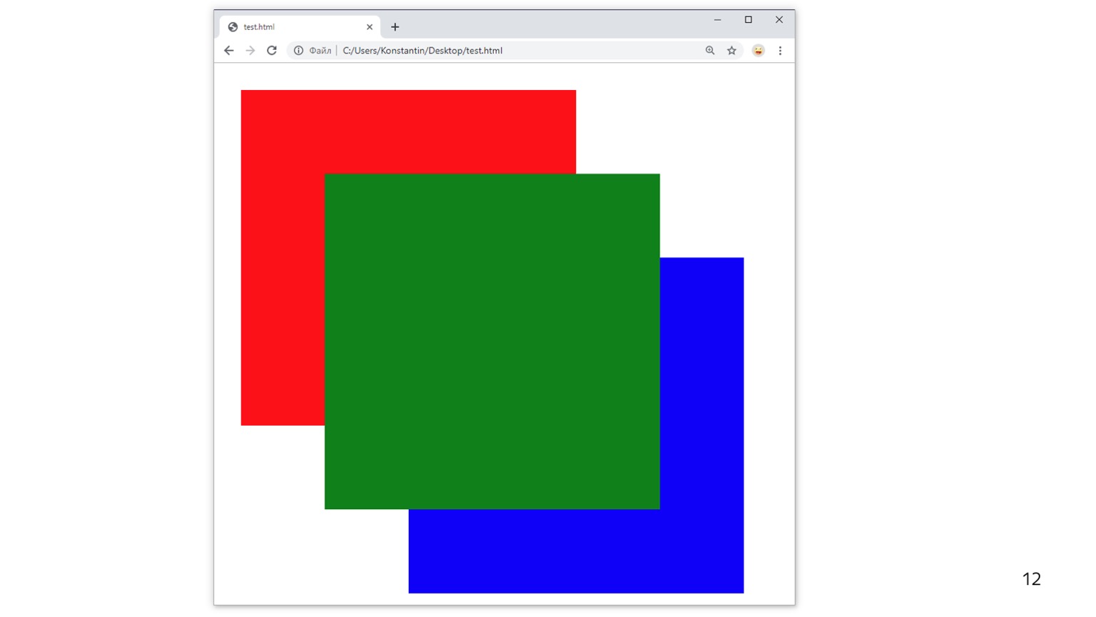
And now we have everything located correctly - at least in terms of canvas and div. But this div is still located below, although it was the next element in our layout.
This is the so-called fundamental compositing bug. If you look for the Chromium tracker, you will see a bunch of bugs that are linked to one ancient. He is called that.
So what happened? As I said, some elements are submitted to the Render Layer, some are not. Some are drawn together with others. Here the following happened: div elements remain in the same layer as the background. Canvas crashes to a separate layer. And z-ordering is carried out only between layers. Due to the fact that we have a background and div in one layer and canvas in another, we get a bug: canvas overlaps the div.
But as soon as we move this div element to a separate layer and it starts to use the z-order normally, it also begins to understand who is behind whom. And here everything is rendered "normal".
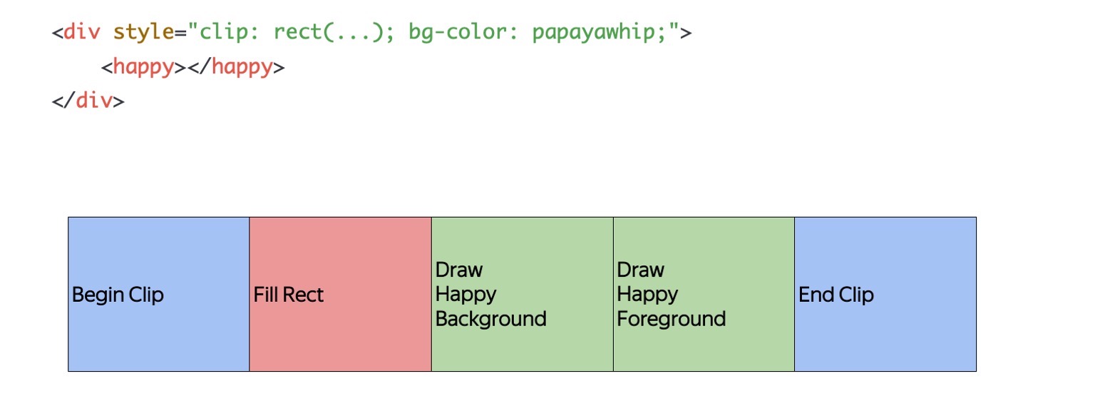
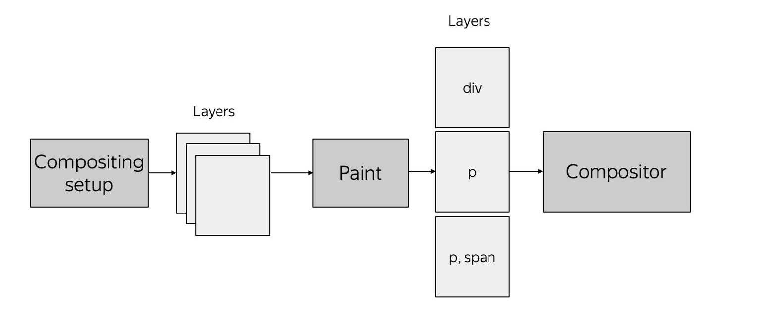
And one of the last initiatives that has been developing for several years is the so-called Slimming Paint, which should fix it. Its meaning is that we need to separate Painting from drawing out into layers, that is, understanding what needs to be done to draw these elements, from how to then compose them with each other. If we have such a simple layout, it turns into something like that. There is a simple list of commands that you need to do to get page content. And if we return to this example, it will look something like this.


That is, we said: here’s Paint for you, here’s the content for you - please give me something. It gives a list for rendering, which goes to Compositor, and Compositor understands how to divide all content into layers so that they are normally located relative to each other.
And if you haven’t noticed, this is a screenshot from Chrome. I made it about two weeks ago, that is, the bug is still alive. The project is not finished yet; it is now in the process of development.


That is, the Compositor from this list and some secret knowledge that plink passes can understand how to properly lay it all into layers.
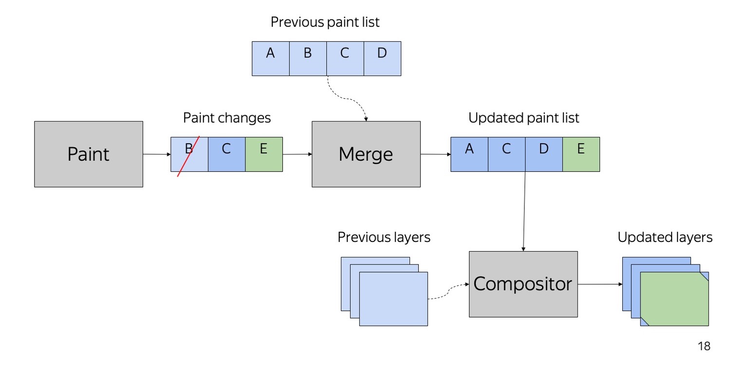

Besides the fact that this approach will basically fix this bug, we also get fairly cheap changes in rendering. Suppose we had a list of draw commands and changes occur - let's say element B leaves, element E is added. Then we can simply keep the two lists together without worrying about trees, etc. At the output we get a new list of elements for rendering, and, possibly, a new list of layers that will be compiled in the future.
This was a short story about what happens when the browser implements Paint, and what happens after it tries to compose layers.

Let's move on to another topic: Rasterization. Just in Rasterization in Yandex.Browser, a lot of things were done, and I also did this. What is the meaning of rasterization? At the output of the previous stage, when we did Paint, there is a list of commands that we must implement in order to get some kind of picture. Rasterization is the transformation of a list of commands into real pixels.

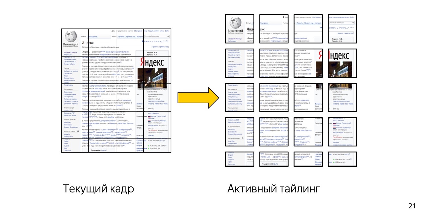
If you open the More tools → Rendering tab in the browser inspector, then there is a checkmark Layer borders. And you see just such a grid. What's going on here? When the browser draws the page, it actually doesn’t do the whole thing now. The browser takes and breaks each layer into a certain number of such small squares. Historically, they are 256 by 256 pixels in size. That is, each layer is divided into so many separate textures. The content of the current tile is then drawn onto each texture, and then they are all glued together into one large texture.
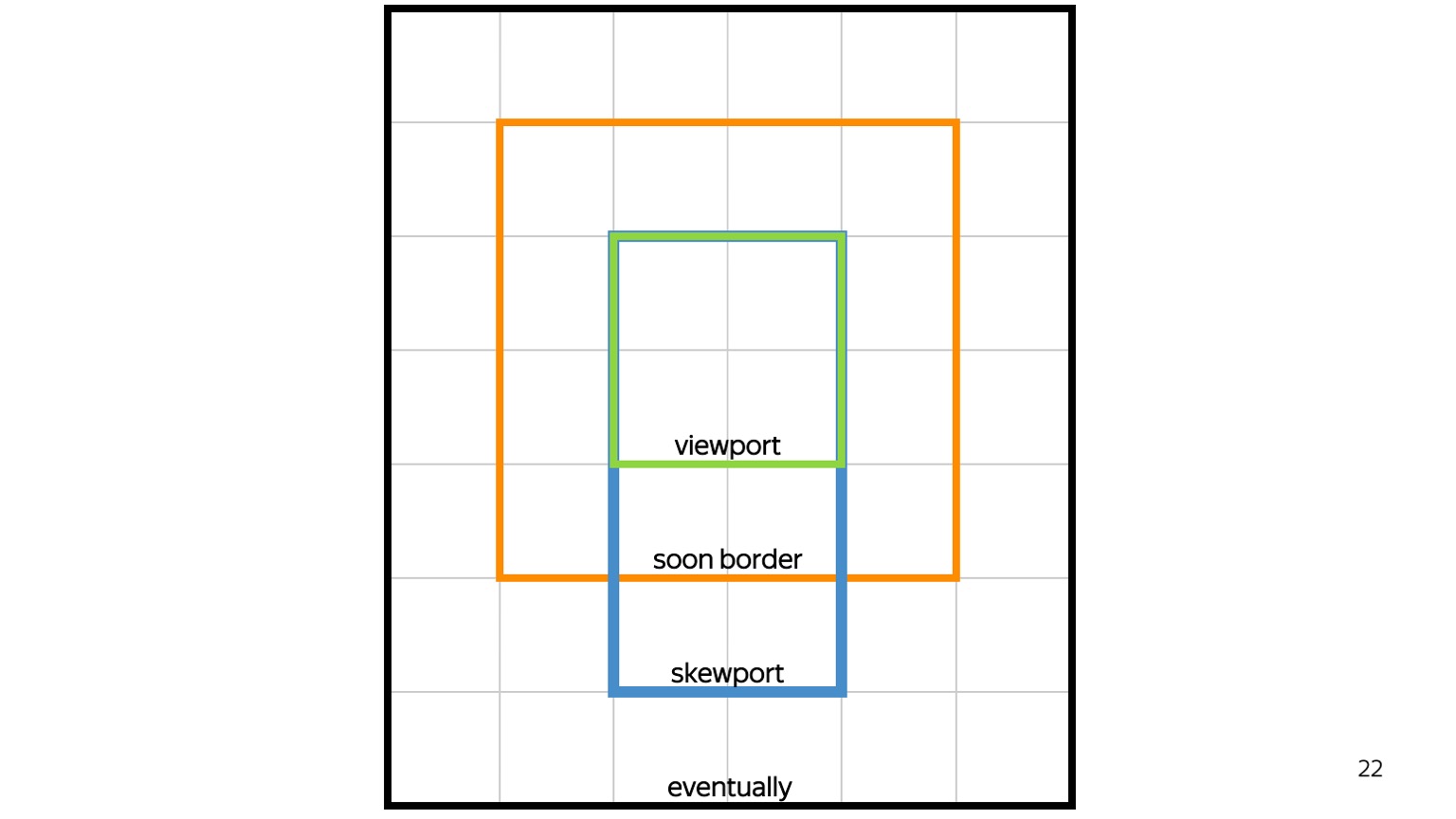
It helps a lot. First of all, we can redraw only those tiles that have changed. But it also allows us to prioritize rendering. That is, first of all, those tiles that the user sees, the so-called viewport, should be drawn. Then we have to draw soon border, this is what is around the viewport. Next is the direction of the scroll: if it is scrolled down, we draw as much down as possible. If up - draw as much as possible up. If we still have a memory quota, we will draw something else, but not the fact that it will remain at this point.
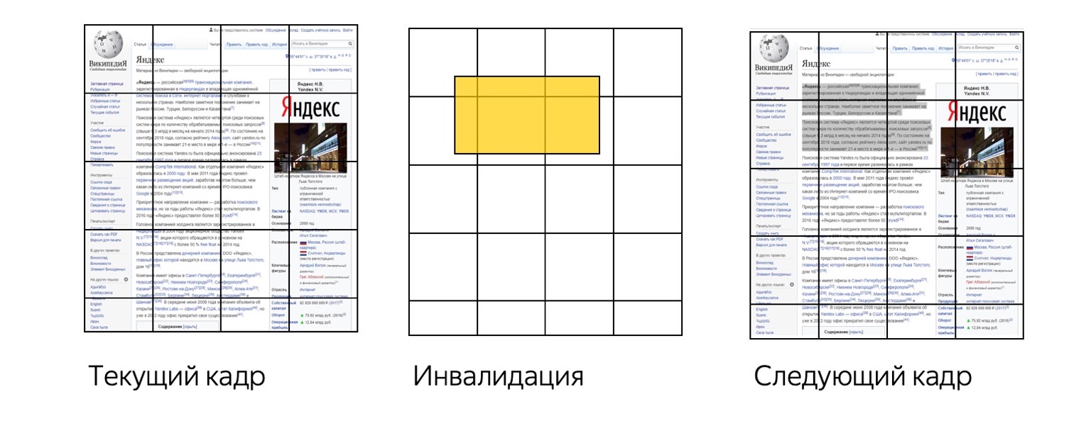
So we get a fairly cheap content update on the page. Suppose we took the current frame and the user disabled something - for example, highlighted text. Then we draw only those tiles that have changed.
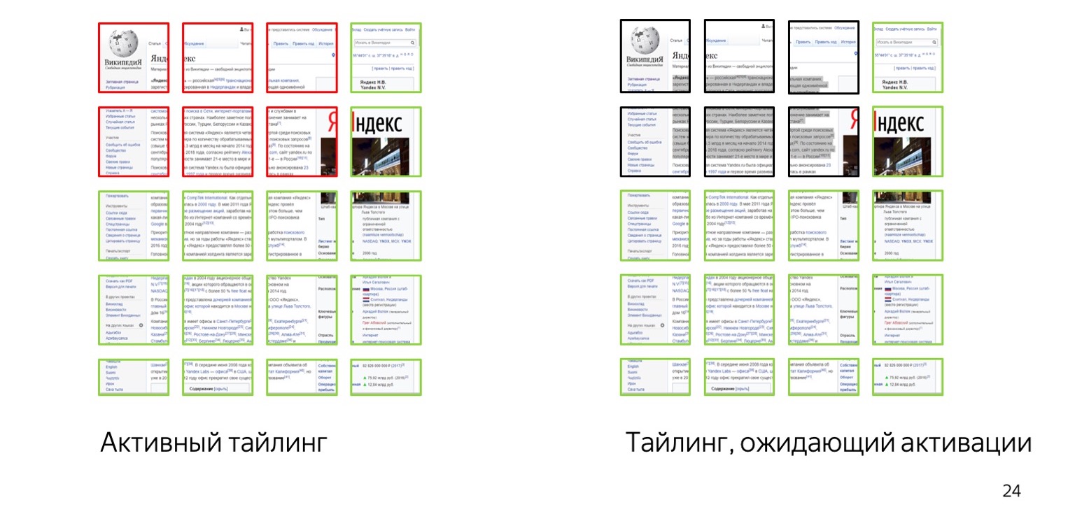
That is, green tiles are those that remain from the previous rendering, red ones that we redrawn. But this approach has other advantages.

We can do - and Chrome did it - the so-called optimization of small redraws. Suppose you have some kind of throbber, cursor, or something else like that doing a little redrawing in a small rectangle. Then we do not need to redraw the entire square. This is logical. For example, if the cursor blinks at us, then only it is redrawn. This greatly saves CPU.

The next optimization they have done. Where can there be inefficiency? Are the tiles shifted? Good idea, but I tend to another. Here is just a white rectangle. This is a white tile on which not a single pixel is drawn. But it is a texture. It occupies 256 by 256 by four bytes of memory.

Another optimization that was invented in Chrome: and let's take these tiles, one-color, and encode them not with a bunch of pixels, but, in fact, with the coordinators, size and color. The Internet is now full of pages with lots of monochrome areas for large monitors. And such pages, accordingly, are optimized, we get a lot of memory savings.
We at Yandex went a little further and decided to do a more specific experiment. Where do you think you can save more?
We have a tile. The content on it is located in some tiny area - a strip, the word Yandex. Why do we need to draw the whole thing if the content is very small and everything else is monochrome?
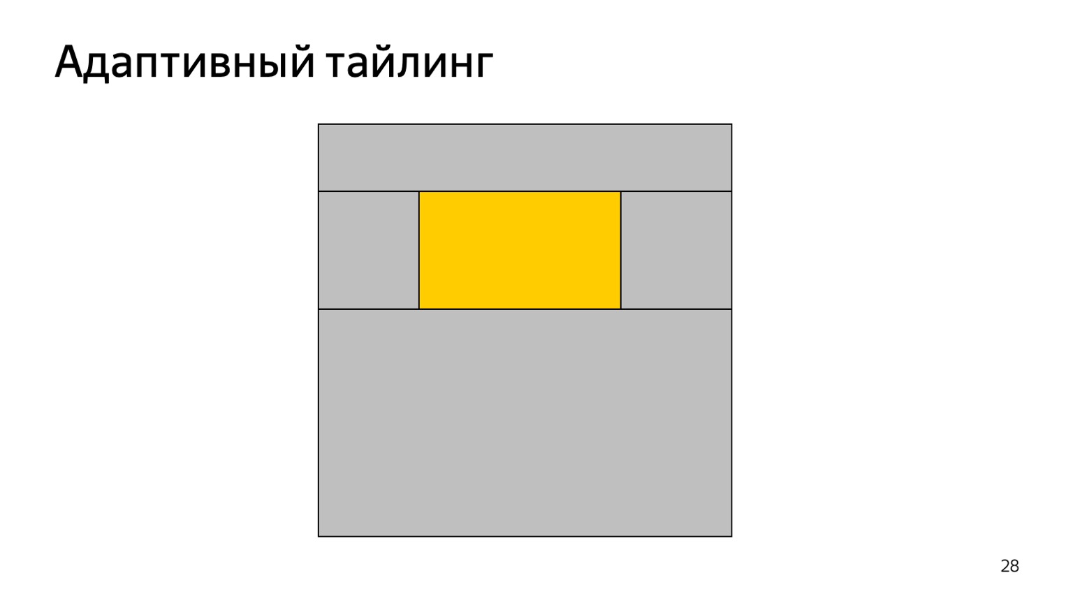
What have we done? This is what I specifically did. We divided each tile into five tiles. If the content in it is only in the middle, then we select the texture for this content only for what is done in the middle. Here is the red area. Everything else we code the same way - size, coordinates and color.

That is, specifically on this page, all these areas have now become non-texture. Not bytes in memory are used, but simply commands about what we need to draw here, fill with one color. This gave us an average savings of about 40% on GPU memory per user.
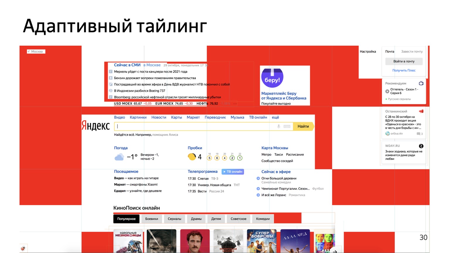
On more complex pages, it looks like this. Given that more complex pages use more layers, and each layer is a separate tiling, you can save a little on any layer.
If you enable this checkmark now, you will see not such a grid of rectangles, but this one.

What is it, why are tiles so wide here, and why are there few of them? The meaning here is as follows. In Chrome, they thought: why don't we do not only hardware compositing, but also hardware rendering. What are they doing? We have a list of commands on what needs to be done: draw a rectangle, fill with color, etc. All this goes to the GPU, and the GPU draws such a texture. Redrawing is very fast, so tiles can also be made large. Here is a little jackal video , but it shows very well the advantage that happened on the phones due to the fact that the rendering became hardware accelerated. I think the difference here is very, very noticeable.
Communication between browser developers and front-end vendors seems very useful to me. It does not happen very often, but it gives a lot of benefit. Therefore, when our colleagues from other departments come to us and ask how we can make layout faster and better, we try to help them and tell them about places where something is not optimal and you can speed up.
And I will not tire of repeating my advice. (I will not cite here, there was a separate large report on this subject. - author's comment.)
Here I have compiled a set of useful links about rendering and not only, but also a little about Yandex.Browser. Thank.

- Hello everyone, my name is Kostya. Surprisingly, now I work in the team of the Yandex.Cloud virtual network. Before that, I worked in the Browser team for more than five years, so today I will talk about things that are common to us and you.
As you might guess, I don't understand very well in the front end. If you talk to me about React or anything else like that, I probably won’t understand you. But I did a lot of things in the browser: video decoding, business logic. Including I spent a lot of time doing different things in rendering the browser. Today we will have such, say, educational program about the internal device of the browser. I will try to go through the most interesting things that we did in Yandex.Browser or Google in Chromium.

If we talk about rendering in the browser, then this is a very complicated thing, which consists of a large number of components. First of all, you must download resources to show them. Then you have to parse them, build a DOM tree, styles, layouts, etc. The first three points are most likely familiar to you. My report will be devoted more to the other three parts: Painting, Rasterization and Compositing - what happens under the hood when you have already written the layout. Only in words it may seem that it is about the same thing - in fact, these are completely different components.


Let's start with Painting and Compositing. What is this all about? Let's go back many, many years ago, when the web was not as complicated as it is now, when there were no all kinds of 3D, CSS animations and other things. How then drew the browser? Imagine that you have your page, on it some wonderful elements, pictures, etc. The browser painted all this on one hefty texture, in a large block of memory. He knew how to draw each element, and if we had any changes, they are highlighted in yellow, then something like this happened.
The browser aggregated them in the areas indicated here in blue. There has been a change in this area, let's redraw it. Everything in this area was simply redrawn and copied to the texture.
It worked for itself. Then smart people came up with 3D CSS animations, other things. We could have a lot of renderings in different places. If we spin one spinner, redrawing the whole pie of elements that are located under it is not very effective.

Then other smart people decided to redo it all a little. We have some kind of DOM tree, we built it in memory. These are plus objects, they are compared with what layout you wrote.

And then the magic begins to happen. The browser converts the entire DOM tree to a Render Object tree. This thing knows how to draw each specific DOM element. That is, she knows what needs to be done so that something appears on the screen instead of your tree or P-element.

The next tree is the tree of layers. What is it? Each of our elements can be associated with any one layer, and one Render Layer can contain several objects at once. Why is this done? This is very well shown here. We generate a set of layers, each of them has certain elements. Now, suppose something changes on one of the layers - an animation occurs, a brand element flies. Then we redraw only one layer, and the rest, for example the background, remain unchanged. We then simply glue them into composites and at the output we get the final picture - the current frame of the animation.

There are a fixed set of reasons for creating new layers. For example, a layer is created to render 3D CSS animation, a canvas, a video element on it - in general, something related to heavy animation, suitable for redrawing separately from all other content.

But this approach has several problems. Now you need to turn on the fuel. Think about what will be depicted here? There are only two elements.

Here. Although, it would seem, the elements are located one by one. Why does canvas fly up? In our country, they are sequentially arranged; I did not set any order.

Let's complicate. Here we have another div, like this.

In general, the expected behavior. We have a div on top of the div, but canvas is for some reason on top. Magic! Ok, let's complicate this example again.

Exactly one line has changed, I added transform.

And now we have everything located correctly - at least in terms of canvas and div. But this div is still located below, although it was the next element in our layout.
This is the so-called fundamental compositing bug. If you look for the Chromium tracker, you will see a bunch of bugs that are linked to one ancient. He is called that.

So what happened? As I said, some elements are submitted to the Render Layer, some are not. Some are drawn together with others. Here the following happened: div elements remain in the same layer as the background. Canvas crashes to a separate layer. And z-ordering is carried out only between layers. Due to the fact that we have a background and div in one layer and canvas in another, we get a bug: canvas overlaps the div.
But as soon as we move this div element to a separate layer and it starts to use the z-order normally, it also begins to understand who is behind whom. And here everything is rendered "normal".

And one of the last initiatives that has been developing for several years is the so-called Slimming Paint, which should fix it. Its meaning is that we need to separate Painting from drawing out into layers, that is, understanding what needs to be done to draw these elements, from how to then compose them with each other. If we have such a simple layout, it turns into something like that. There is a simple list of commands that you need to do to get page content. And if we return to this example, it will look something like this.


That is, we said: here’s Paint for you, here’s the content for you - please give me something. It gives a list for rendering, which goes to Compositor, and Compositor understands how to divide all content into layers so that they are normally located relative to each other.
And if you haven’t noticed, this is a screenshot from Chrome. I made it about two weeks ago, that is, the bug is still alive. The project is not finished yet; it is now in the process of development.


That is, the Compositor from this list and some secret knowledge that plink passes can understand how to properly lay it all into layers.


Besides the fact that this approach will basically fix this bug, we also get fairly cheap changes in rendering. Suppose we had a list of draw commands and changes occur - let's say element B leaves, element E is added. Then we can simply keep the two lists together without worrying about trees, etc. At the output we get a new list of elements for rendering, and, possibly, a new list of layers that will be compiled in the future.
This was a short story about what happens when the browser implements Paint, and what happens after it tries to compose layers.

Let's move on to another topic: Rasterization. Just in Rasterization in Yandex.Browser, a lot of things were done, and I also did this. What is the meaning of rasterization? At the output of the previous stage, when we did Paint, there is a list of commands that we must implement in order to get some kind of picture. Rasterization is the transformation of a list of commands into real pixels.


If you open the More tools → Rendering tab in the browser inspector, then there is a checkmark Layer borders. And you see just such a grid. What's going on here? When the browser draws the page, it actually doesn’t do the whole thing now. The browser takes and breaks each layer into a certain number of such small squares. Historically, they are 256 by 256 pixels in size. That is, each layer is divided into so many separate textures. The content of the current tile is then drawn onto each texture, and then they are all glued together into one large texture.

It helps a lot. First of all, we can redraw only those tiles that have changed. But it also allows us to prioritize rendering. That is, first of all, those tiles that the user sees, the so-called viewport, should be drawn. Then we have to draw soon border, this is what is around the viewport. Next is the direction of the scroll: if it is scrolled down, we draw as much down as possible. If up - draw as much as possible up. If we still have a memory quota, we will draw something else, but not the fact that it will remain at this point.

So we get a fairly cheap content update on the page. Suppose we took the current frame and the user disabled something - for example, highlighted text. Then we draw only those tiles that have changed.

That is, green tiles are those that remain from the previous rendering, red ones that we redrawn. But this approach has other advantages.

We can do - and Chrome did it - the so-called optimization of small redraws. Suppose you have some kind of throbber, cursor, or something else like that doing a little redrawing in a small rectangle. Then we do not need to redraw the entire square. This is logical. For example, if the cursor blinks at us, then only it is redrawn. This greatly saves CPU.

The next optimization they have done. Where can there be inefficiency? Are the tiles shifted? Good idea, but I tend to another. Here is just a white rectangle. This is a white tile on which not a single pixel is drawn. But it is a texture. It occupies 256 by 256 by four bytes of memory.

Another optimization that was invented in Chrome: and let's take these tiles, one-color, and encode them not with a bunch of pixels, but, in fact, with the coordinators, size and color. The Internet is now full of pages with lots of monochrome areas for large monitors. And such pages, accordingly, are optimized, we get a lot of memory savings.
We at Yandex went a little further and decided to do a more specific experiment. Where do you think you can save more?
We have a tile. The content on it is located in some tiny area - a strip, the word Yandex. Why do we need to draw the whole thing if the content is very small and everything else is monochrome?

What have we done? This is what I specifically did. We divided each tile into five tiles. If the content in it is only in the middle, then we select the texture for this content only for what is done in the middle. Here is the red area. Everything else we code the same way - size, coordinates and color.

That is, specifically on this page, all these areas have now become non-texture. Not bytes in memory are used, but simply commands about what we need to draw here, fill with one color. This gave us an average savings of about 40% on GPU memory per user.

On more complex pages, it looks like this. Given that more complex pages use more layers, and each layer is a separate tiling, you can save a little on any layer.
If you enable this checkmark now, you will see not such a grid of rectangles, but this one.

What is it, why are tiles so wide here, and why are there few of them? The meaning here is as follows. In Chrome, they thought: why don't we do not only hardware compositing, but also hardware rendering. What are they doing? We have a list of commands on what needs to be done: draw a rectangle, fill with color, etc. All this goes to the GPU, and the GPU draws such a texture. Redrawing is very fast, so tiles can also be made large. Here is a little jackal video , but it shows very well the advantage that happened on the phones due to the fact that the rendering became hardware accelerated. I think the difference here is very, very noticeable.
Communication between browser developers and front-end vendors seems very useful to me. It does not happen very often, but it gives a lot of benefit. Therefore, when our colleagues from other departments come to us and ask how we can make layout faster and better, we try to help them and tell them about places where something is not optimal and you can speed up.
And I will not tire of repeating my advice. (I will not cite here, there was a separate large report on this subject. - author's comment.)
Here I have compiled a set of useful links about rendering and not only, but also a little about Yandex.Browser. Thank.
All Articles