How to make friends a designer, layout designer and “Figma” using a design system, crowbar and some kind of mother ™
Hi, Habr. Recently, I showed off in the comments and promised to answer in detail the question of how the design system simplifies the relationship and neutralizes conflicts between designers and layout designers (developers). Plus talk about some options for standardizing layer naming. So I answer. In detail . About the grid. About the components. About the icons. About the language. About BEM. About the “figmin” slash and its plugins. About artboards and viewports. About typography. About styles and palettes. About the effects. About exporting a raster. About the "multiplayer." About the distribution of duties. Well, a little "about life, the universe and in general." Caution, traffic: there are a lot of pictures inside, there are gif-animations. And a lot, really a lot of boring text. I warned.
Disclaimer, to save you time:
The author is an absolute no-name and has no experience in large, pretentious organizations. Everything described is a purely personal opinion, not supported by any scientific research. All my subjective experience was gained while working on relatively small projects with a humanoid resource of up to 10 people, plus from volunteering in a couple of foreign projects from those community-driven. I am not ready to bear responsibility for your lost time, possible losses or lost profits. And I will not return your best years to you if you spend them on me :) What I have, I’m sharing it. Go.
Design system as a means of conflict resolution
Some designers think that a design system is a library of styles. The agreement that “we make the buttons red, the dice blue, and we write the text with Helvetica.” Some people think that this is a set of blanks from which models are assembled. Like, this should look like a modal window, and like this - a product card. Front-end tenders go further and include technical implementation in the concept. Say a component library on React. All this is true in its own way. But this is particular. If you dig it, the main function of the design system is to develop standards for the interaction of people who work on the project. Therefore, it was originally intended to eliminate conflicts. At least I believe in it and I want to justify, having walked through all the main sick corns.
The first conflict. Distances, sizes and indents
The bottom line. The designer sculpts the sizes inaccurately; the layout designer constantly stumbles upon heterogeneous and fractional values. It is not clear which of them are correct and which are wrong. "Figma" does not allow to measure distance with a ruler.
Typical “solution”. Everybody kicks the designer, trying to make him be more attentive and thoroughly target pixels. Result: a twisted evil diz spends hours trying to move hundreds of blocks on a hundred artboards by 1-2 pixels. The result is still not perfect, the layout designer is still dissatisfied, the deadlines are leaving, the client is losing money, everyone is quarreling and scattered complaining about each other in profile forums.
The real solution. Create a design system and accept it. To think over or gradually develop convenient grids, unify layouts (in the technical sense), and use style libraries and components correctly. Result: designer Akela still misses regularly, but the layout designer can determine most distances even by eye without looking at the properties of the block. In addition, the farther, the more both ready-made components and styles / mixins accumulate, which are simply copied from project to project.
If you have well-designed grids and use the component approach, then all numbers are either unified or calculated by elementary arithmetic. In order not to be unfounded, for an example below I will show one of the grid systems on which the lion's share of my projects are collected. This is a personal bike, but using similar principles, you can invent as many of your own for every taste.
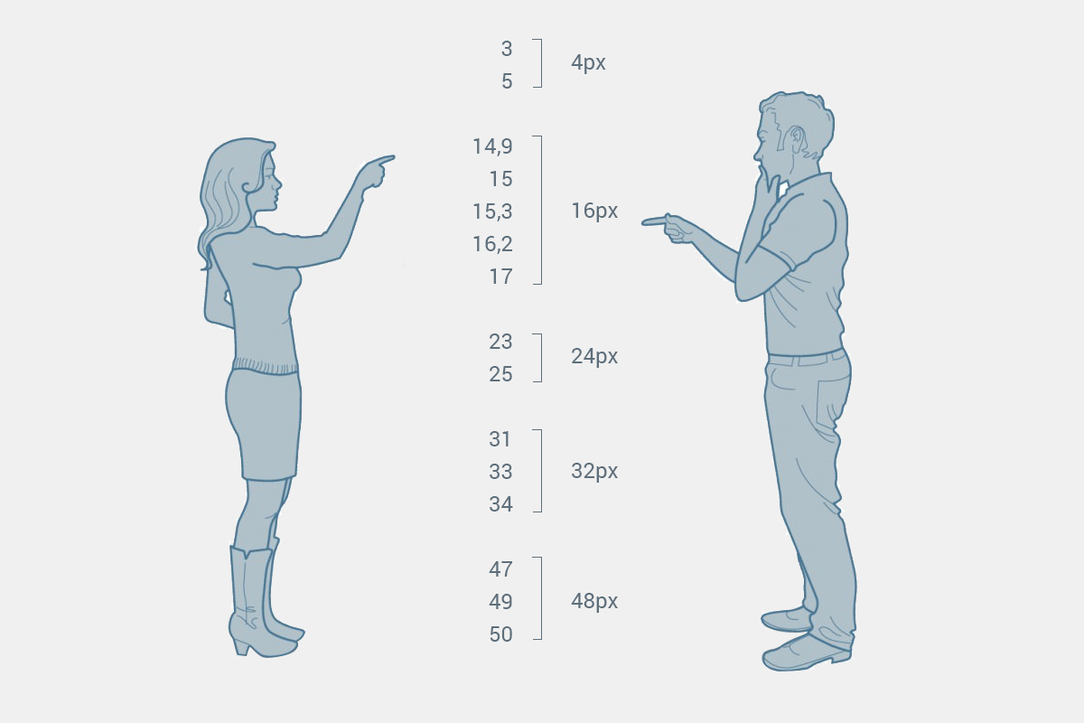
4px. Multiplicity - Sister of Talent
The first mesh layer is always the same: 4px grid. In fact, I work with “scale pixels”, which are 4x4 ordinary. As a result, any element of the layout, except for lines (strokes, borders, offline lines, hr, etc.) always has a size that is a multiple of four.

This automatically removes all questions about random offsets, fractional pixels, etc. If the layout designer sees something completely different from four in the layout and without additional comments, then with a probability of 99% this is just a jamb - he can safely replace the number with the nearest multiple, without even going into details.
This does not mean that you can relax and sculpt the models with your left heel past the net. Accidents are inevitable, but the presence of a system allows the layout designer to distinguish between jambs and intentional changes.
Why exactly 4?
Because. In principle, it can be any number: at least 5, at least 3, at least 10. The only criterion: ease of use. Even numbers are more convenient, since the sizes of the viewports and carriers are almost always expressed in even numbers (and often multiple of four). In addition, there is still interpolation when scaling the raster, but this is not so important.
The main thing is that the number 4 is small enough to be universal, and large enough to significantly reduce the scatter of all kinds of values in the layout. If you take more, it will be difficult to typeset small elements. For example, with a base of 10px, the padding inside the input fields would be pretty horseish, and the choice of leading for the text would be scarce. This is an unnecessarily large step, I want a smaller one. Empirically, everyone has long tried 4px, and you are unlikely to invent something more universal. But you decide.
Vertical rhythm
Basic Leading
Now you need to determine the basic leading - the height of the line , which will create a vertical rhythm and will subsequently affect the height of most elements. As a result, we “lined” the layouts vertically.
(If you are not familiar with the concepts of vertical rhythm, basic font and module, again, look at the article about grids - it says even more boring than here, but there you have it).
Leading may vary in different projects. But most often I use either 16px or 24px . You can come up with something of your own, keeping in mind that the numbers should be multiples of your base pixel grid.
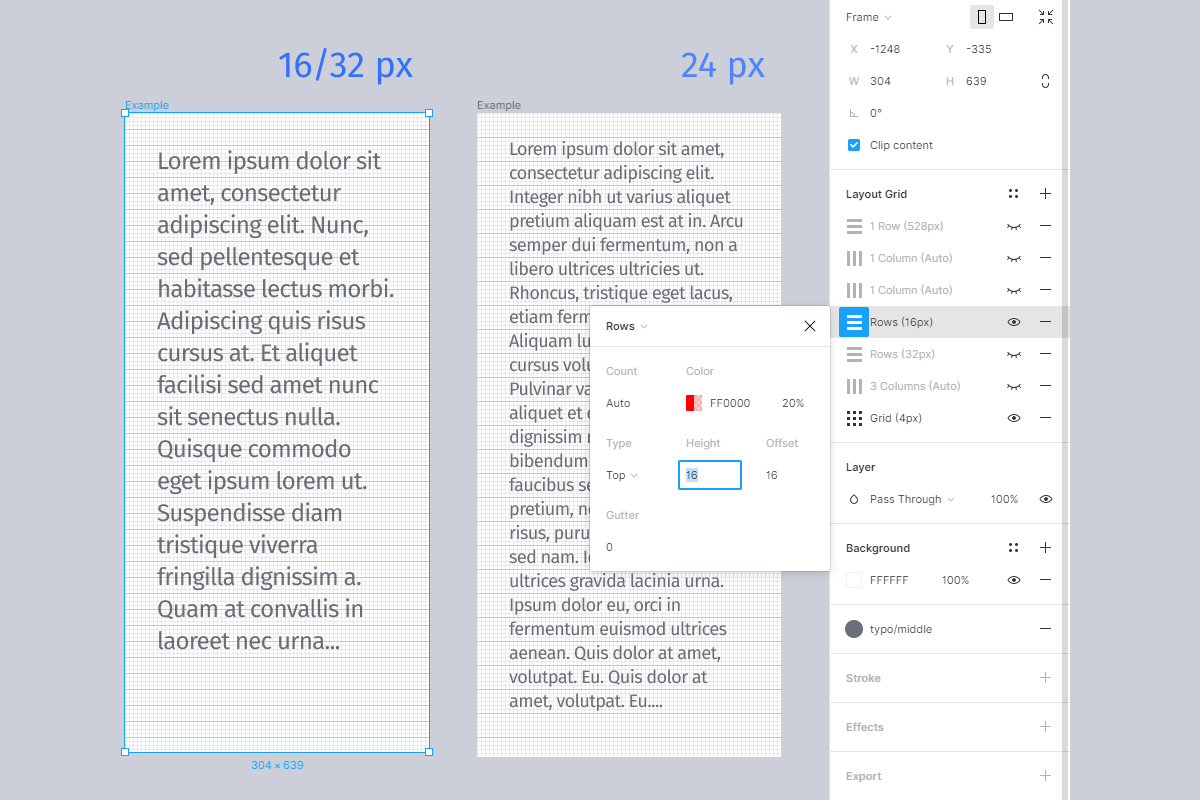
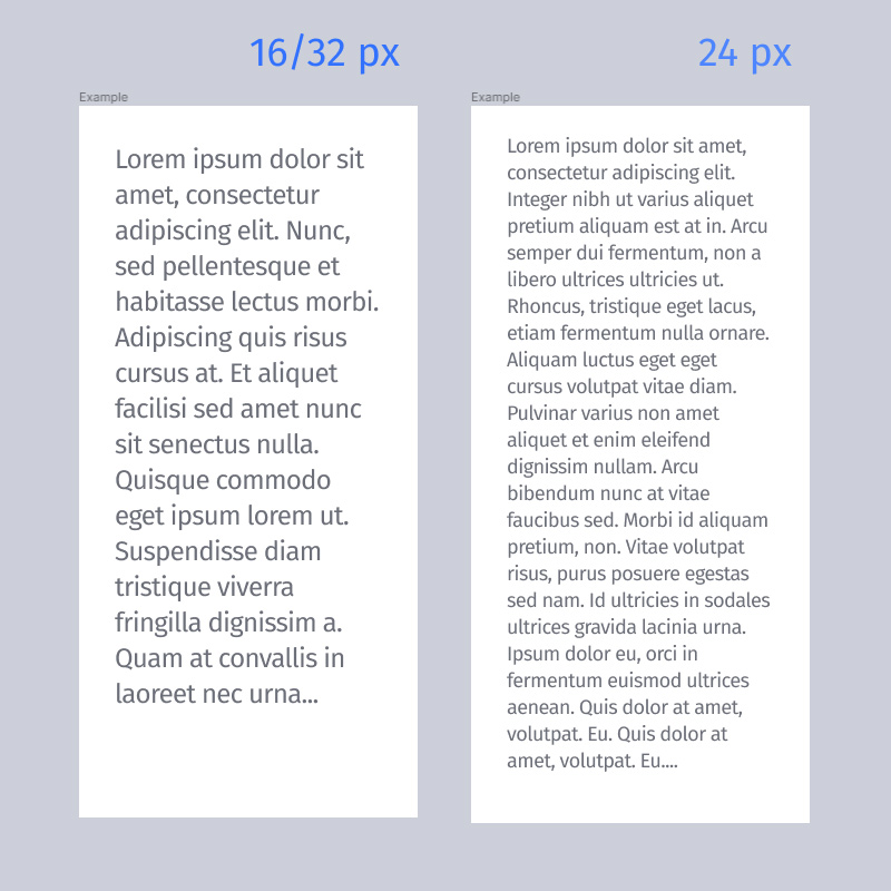
Please note that at 16px the text actually takes up not one line, but two. So formally we use 32px lead. But in terms of rhythm, this is one and the same. Just split each line in half to make it easier to work with small elements.
Standard heights
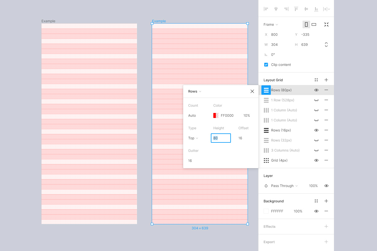
As a result of ruling, a number of “magic” numbers are obtained, which will be considered as standard vertical block sizes. We do not forget about the possibility of using half and one and a half intervals for intermediate cases, such as paddings or small text. This is a common practice since paper typesetting.

In case of problems with loading pictures and arithmetic:
| Leading | Whole intervals | Fractional intervals |
|---|---|---|
| 16px / 32px | 32px, 48px, 64px, 80px, 96px, ... | 8px, 24px, ... |
| 24px | 24px, 48px, 72px, 96px, ... | 12px, 36px, ... |
Another reason to love precisely these two rulers is that they are proportional to each other: three 16px lines are equal to two 24px lines (16 * 3 = 24 * 2). This allows you to drag some components between them without losing the overall rhythm. For example, 48x48 icons fit perfectly on both grids. As you might guess, all numbers that are multiples of 48: 96, 144, 192, etc. will be universal.
No need to be afraid of the darkness of unusual numbers. In practice, after 2-3 projects, they enslave your brain and firmly imprint themselves in the subcortex.
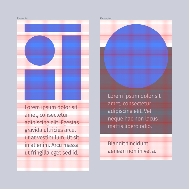
Module and gatter height
I note that standardization does not mean total uniformity. We adjust the baseline, yes. But no one bothers to vary the proportions of the module as you like. Here are two examples for comparison:
On the left, we made the module height equal to two lines and got a very “flat” grid, which is convenient for typesetting forms, tables, list interfaces, and other similar things. And on the right, the module is higher, 5 lines. Suitable in those layouts where there are a lot of galleries, horizontal cards, banner blocks, pictures.
Gutter Gutter - “gutter”, “groove”] - this is what is commonly called intermodular distance . Its height is also always done as a multiple of the base lead. Most often it will be 1 line. But if, for example, the layout is pathetic and consists mainly of huge pictures, you can separate them with a high gatter in several lines.
As you can see, we are still creating quite a variety of grids, but they are all combined with each other and component libraries, because they have a common rhythmic base.
It is important that from the point of view of layout there is practically no difference. All numbers are still multiples of the basic leading (16px) and are part of our "magic" standard. So the module is just a visual proportion, which helps to quickly sketch elements on the layout and calculate their dimensions by eye.
Let's test with a small example. So, there are 2 standard meshes with 16px leading. Gatter height - 1 line (16px). The height of the module in the left layout is 2 lines, in the right - 5 lines. Can we now determine the correct vertical sizes / indents of elements without looking at their properties?
I think we can. There is nothing particularly complicated: estimate the number of lines and multiply by the basic leading. Everything. Moreover, these numbers are guaranteed to be included in the "standard" series. That is, as practice arithmetic is quickly brought to automatism. Is the Photoshop line required here? I think not either. Even if something is difficult to count in the mind, then peeking into properties is not a problem.
Now let's imagine that the designer is mistaken somewhere by a pixel or even two. Does this affect the layout designer? No, it does not. The layout designer sees the grid, the layout designer collects the project on it. Point. And God bless him, with the tremor of the designer. No problem , no conflict)
Horizontal rhythm: gatter, speakers, fields
Gatter
Similarly, select the horizontal gatter size multiple of 4px. Most often I make the gatter square (16x16). But if you need wider indentation between the columns, you can take any other value: 20px, 24px, 28px, 32px ... etc.
In this case, the gatter becomes the basis for horizontal distances by analogy with the leading. If you make its width equal to 20px, then the entire "magic standard" for contour lines will change to "10, 20, 30, 40 ...". But, frankly, these are inconvenient numbers, small paddings and all that will be sorely missed. In general, I would recommend not to be smart and make the gatter either square or multiple leading. It’s easier to work with one set of standard numbers than with two.
Columns and their responsiveness
Having decided on the "magic standard", we configure the columns in accordance with the size of the canvas or breakpoints, which we will talk about below.
The grid can be made completely responsive, then the columns will be rubber: the width is "stretch", the number is arbitrary - for example, 12.

Or you can manually set the column width to get a different number of columns on different viewports (classic: 4 on mobile, 8 on “tablets”, 12 on desktops, 16 on wide screens). In the grid settings, it looks like this: the number of "auto", the width is an arbitrary number, which is selected based on the size of the artboard and gatter.

At the same time, at the layout level, the columns can be both rubber and fully fixed. In the latter case, the “ears” appear in the layout - fields that are not used by the content, but, as a rule, overlap with the general background of the page. If desired, this can be shown due to the “margin” setting with central alignment of the columns.

Who decides how the grid behaves
Ideally, a designer. If it is UI / UX. Therefore, the design is often adaptive , and not just rubber, and it is desirable that there is some uniform behavior of the entire layout. But it is important that the layout designer received information in advance about which of the schemes you decided to apply in a particular project, and could express his opinion if necessary.
In practice, there are situations when it is better to make a decision for the layout designer. For example, if the use of some framework, such as bootstrap or something else, is agreed upon in advance. Anything can happen: the client’s demand, legacy, a time limit or even the ability of the layout designer himself. This must be taken calmly. We are not all gods, everyone has a limit to the possible. In such cases, the designer is already repelled by the requirements of the layout designer, ensuring the conformity of the layout. There is nothing criminal, because we are engaged in applied tasks, not pure art.
So, having an idea of the size of the gatter + the principle of partitioning the columns + the “magic standard”, we, again, can determine the horizontal sizes of elements with pure arithmetic. There should no longer be any special conflicts here.
Breakpoints and sizes of main frames
Another possible stumbling block: what size layouts should be, how to choose breakpoints, which viewports to draw, and where “everything is clear already.”
In the era of Photoshop, and even just a year ago, this was a problem for many:

With Figma, it has become an order of magnitude easier because the canvas is responsive. In vernacular, "rubber" stretches. But some of the questions still remained.
Someone takes the standard screen resolutions directly from the “Figma”. Someone adjusts artboards to the default values of “Bootstrap”, someone pushes away from the content. I’m a little cyclist in this matter. I adjust the sizes of the canvases so that they clearly fit into the grid and always work with the same "magic" numbers.
Why do artboards of arbitrary sizes
First of all, I don’t think it’s right to draw a rubber layout exactly under the viewport. A couple of years ago I read the excellent article “ The 100% correct way to do CSS breakpoints ”. He chewed for a long time, but in the end he accepted the point of view of the author. In short: in the usual approach, at breakpoint points, all layout elements are in extreme states (minimum width or maximum width), while for popular viewports I would like to get “normal” average values, more natural. Therefore, breakpoints are best placed between the popular screen widths, and not exactly on them. Accordingly, the minimum width of the layout is taken slightly less than the viewport, and it stretches a little further. It sounds confused, but it makes sense.
Secondly, I almost do not encounter bootstraps and there are no problems with manual layout, so I do not have to strictly focus on any external standards.
Thirdly, contrary to stereotypes, those typesetters with whom I work more often ask for explanations for wide screens than for narrow ones. That is, they themselves are able to adapt layouts to the viewport. They are more concerned about how and how we will fill the "extra" area.
Thus, it is more convenient to put the artboard exactly on the grid, which clearly demonstrates the principles of scaling and all distances, than riveting strictly the size of the viewports and then messing around with fractional clumsy numbers of column and element widths. This is the solution to the conflict.
Calculation of the optimal width of the layout
- Determine the approximate desired width for the nearest viewport. For example, as a minimum screen, any width in the range of 290-320 px suits me, and for the desktop, say 1100-1300px. Interested mainly in the lower bar, because Stretching columns in plus or adding “ears” is not a problem.
- We estimate the desired number of columns. For mobile, I usually take 3 or 4 (from the content, which is even there: even or odd), and for the desktop - 12. (In the article about grids, I already talked about an interesting 24-column version, but it is specific, for simplicity we don’t take it in payment).
- Subtract all the gatters and fields from the desired width (there will be 1 less gatters than the columns, and two fields - Cap's note).
- The remaining number is divided by the number of columns, we get the approximate required column width.
- Round the approximate column width to the nearest standard “magic” number. We get a convenient column width.
- We consider the optimal breadth of the layout: all convenient columns + all gatter + fields.
As a result, the breadth of the layout is always a multiple of the base, all the columns and indents lie exactly on the guides, everything is convenient and understandable.
Most often, for the web I use 80px wide columns . And a square gatter of 16px. As a result, the typical width of artboards will be: 304px, 592px, 1168px, 1552px. Naturally, each layout easily extends upwards. Background bitmap images are prepared with a margin. Quite conveniently, there are usually no complaints about this.
Additional mesh layers
Sometimes, additional guides are superimposed on top of the usual grid, which help to control distances more flexibly or show some kind of restrictions. For example, one of my standard mobile artboards (304px) includes 16px and 48px indentation “rails” to make icons and text more comfortable. A relatively safe area of the "first screen" is marked by a green horizontal line.

The principle is the same: to design patterns and grids so that for all typical situations, solutions and components there is a ready place.
Icons
Icons are stored on a separate grid and are collected through an intermediate wrapper component. The icons themselves are scaled. Sometimes it is necessary to use some of them as an illustration, bullet, etc. But the wrapper always captures their size and provides security margins. When the icon component (wrapper) is pulled, the icon itself remains normal, because inside the wrapper, everything is aligned to “center”, not “scale”. Wrappers can be of several sizes.

This approach allows you to adjust the optical dimensions of the icons without breaking the components, plus it is easy to change the icons inside any component by simply selecting them from the list.

(How to group - see the section on naming layers).
There is no need to put something in the net
Obviously, there are exceptions to all the “beauties”. For example, there is no reason to measure the indentation between inline menu items if their length itself varies (“grow horizontally”). These distances are calculated automatically both at the “Figures” level (when you use “Arrange -> Ditribute horizontal spacing”) and at the layout level (flex, for example). That is, no one needs their exact values at all. The only thing required is to somehow make it clear to the layout designer what kind of behavior you expect from these items. There are comments for this. (Or labels in the names of the layers, or cover letters, or just preliminary agreements - the main thing is that the communication channel is accepted by everyone).

Since Figma is not perfect, some things are easier to do at the layout level, without bothering to draw them. Therefore, comments take precedence over what is drawn. For example, in the layout the menu looks like space-between, but I write space-around. In an ideal world, the layout designer will take this into account. In imperfect - it may not be noticed, but then it will be fixed later at my request, because I use the comment feed as a checklist. Again, no conflict.
How to use components so that everyone is happy
- You must assign the correct behavior to each layer (alignment and scaling method). Check the behavior by pulling back and forth not only the component itself, but the entire artboard (there are nuances with groups). This removes most of the questions regarding the responsiveness of the layout, plus it helps to find problem spots both in the design itself and in the architecture of the components.
- Do not try to drive everything into components. In any project, there are specific things that are used once or have the risk of dying in battles with customer edits - do not tie parent library components on them so as not to depend on unreliable and too atypical nodes.
- - () — , . -, .
- -. ( , ). , -, .
- , -. - (, , ).
The general sense is that random blemishes and visual crutches do not fall into the layout. For example, I can experiment in a separate layout with the font of the component, and then just forget to return everything back. If the typesetter will study each copy separately, then he will probably collect 3-5 versions of any component from a hundred screens) Therefore, it is easier to adhere to the inverse principle: what is not consciously listed in the list of components does not exist in nature and is a hallucination) Or, for example, “Cheating” - an idealized case for presentation design, which has nothing to do with combat typesetting.
The second conflict. Naming (layers, artboards, styles, files)
The bottom line. The designer does not bother with naming the layers or names them from the bulldozer. It is difficult for the layout designer to find the necessary layers in lists of the form “Rectangle1, Rectangle2, ...”. Projects are not structured or poorly structured. It is not clear where to look for a particular screen or component.
Decision. Agree on the most general principles (language, page structure). Choose one of the existing existing naming systems (for example, BEM). Use the capabilities of "Figs" and plugins to group, search and rename. Assemble design on components.
English, Latin
If you have a more or less English-speaking team, I strongly recommend that you name everything in English and avoid Cyrillic. Even if you are currently working only in the domestic market.
Firstly, it allows you to bring layouts closer to layout: synchronize component names with classes, and styles with mixins.
Secondly, it will help a lot if you someday in the future want to share your experience with a wider audience or, for example, it becomes necessary to show some kind of case on an international resource.
I understand the counterarguments, but I came to this in practice. It's like that joke: "No one thinks a toilet paper is a perfect gift until they need one."
Naming. BEM Notation
BEM naming convention.
Why exactly it?
- (CSS), «» , , CSS- GUI.
- . , , . ( , ; , . — , . , , - ).
- «» ( ., . ).
- «» ( , , ..).
- : , , .
The important thing is that we are not looking for an ideal system, but a universal one . Such layer naming does not make sense in terms of exporting CSS: we still cannot convert them to ready-made markup. But we do not achieve this.
We need the designer (s) and layout designer (s) to simply understand each other and work on the same wavelength. That the menu does not fall out on 10 layers or components with the same name. So that when he saw “nav-menu-item_active” in the correspondence, the typesetter immediately understood which particular component was in question. So that people do not have to rack their brains, coming up with their names for the same things. In order for the components in the Figma library to coincide with the component library in the assembly sources, at least for key positions. In short, standard, not ideal.
You can try to invent something else, more “simple”. But most likely, in the end you will still come to something similar. Although you decide, of course. If you have a run-in alternative solution, the comment form is at your complete disposal :)
How approximately does it look in practice

Do not be confused by slashes and other strange icons. It is not as difficult as it looks.
I borrowed ampersands (&) from the syntax of Stylus (sass / less), where they are equivalent to the parent selector. Bundle "__ &" it means that the layer is " E lementom" (in terms of B E M). This is absolutely not a prefix, it’s just more convenient and familiar to me because in Stylus the block structure looks similar:
.widget-heading &__title … &__icon-menu …
Each component in terms of B EM is considered a B lock. Therefore, only hyphens and Latin are used in the title if you use the classic syntax.
A single underscore ("_") in the same classic syntax of BE M is used to denote the M odifier. For example, “block_hover” is the “block” component in the state: hover, and “widget_collapsed” is the widget component in the minimized state.
Of course, the structure of the layers in Figma does not exactly match the layout. Therefore, some things are pretty arbitrary. For example, a component with modifiers has to be wrapped in a new component - an extra nesting appears, while in the layout these classes are assigned to the block together, they are on the same level. But, again, there is no purpose to accurately emulate layout.
Slashes are symbols reserved by the Shapes that allow you to group components. See below. I insert them so that it is convenient to switch the states of the elements (hover, focus, etc.).
Well, the square brackets are just a technical mark, which says that this layer is a visual crutch (such as rounding corners at the background) and that it does not need to be added to the markup.
What and when to name and what to score
Theorists recommend naming each layer at creation. In reality, this would be a meaningless piece of work. Layers in projects are constantly added and disappear, glued and transferred back and forth. Therefore, my principles are simpler.
Strictly referred to:
- Artboards (root level frames).
- Master components.
- All layers that are part of the master component. (Life hack: this is not done at the stage of creative search, but at the time of component creation, when you have already played enough and more or less finally decided on the structure).
- Styles of text, effects, named colors - that which is structured by the "Figure" or used in preprocessors as variables or mixins.
- Those layers whose meaning is important but not clear from the context. For example, if you want to put a giant letter on the background or use “x” as an icon (such as yourself) - it is better to name this layer meaningfully, because it is a special markup element, not just a single letter text.
- Content-containing layers that are directly used for export and layout: bitmap images, SVG, etc.
- Frames that must be included in markup during layout (flex wrappers, logical parts of layouts, such as sidebars, aside, section, etc.).
Not generally named:
- Visual crutches that are not included in the components and are implemented by styles and CSS-properties without additional. markings (all kinds of erosion plugs, dies).
- Text layers that are not part of the master components.
- "Fish" and decorative layers that do not need to be exported. Type stock photos in simulations of the content page.
- All kinds of wrappers and artboards that are needed only for convenient organization of space or the demonstration of some technical notes.
- Inner layers of SVG graphics, shapes in union paths and frames, component parts of icons, etc. They are not considered independent layers, therefore only parent objects are named. (If you plan to implement inline and, for example, animate, then it is better to prepare such graphics in separate artboards).
- Copies of the component in large sets (such as items in the list) - they inherit the common name from the master component, and it makes no sense to individualize them.
“I can’t, I have paws”
Sometimes designers are too lazy to delve into the technical part.
In my personal opinion, a UX designer should, if not be able to layout, at least understand the basic principles and processes. BEM, among other things, helps you learn how to think in components, systemically . So it makes sense to spend time studying not even for the sake of some layers, but just to be able to make a technologically robust design that is easy to transfer from project to project and “resell” over and over again.
But I note that I myself am a rather mediocre designer: square-nested and far from art. Perhaps my position is due to a lack of talent. So if you are a great creator and freelance creator who is far from technical details, but who tolerate you at the same time, perhaps you don’t need all this. Although I will venture to suggest that even in this case, you still have some loyal techno-hand at hand who patiently brings your progressive ideas into line with a stack of ordinary mortal coders. In this case, you can simply give this article to him and continue to soar in empire.
Chips and plugins
It is assumed that you are familiar with " Best practices: components, styles, and shared libraries ". And that you are already an adult boy / girl enough to score and ride on two bicycles on many of them.
Grouping components, styles, and effects
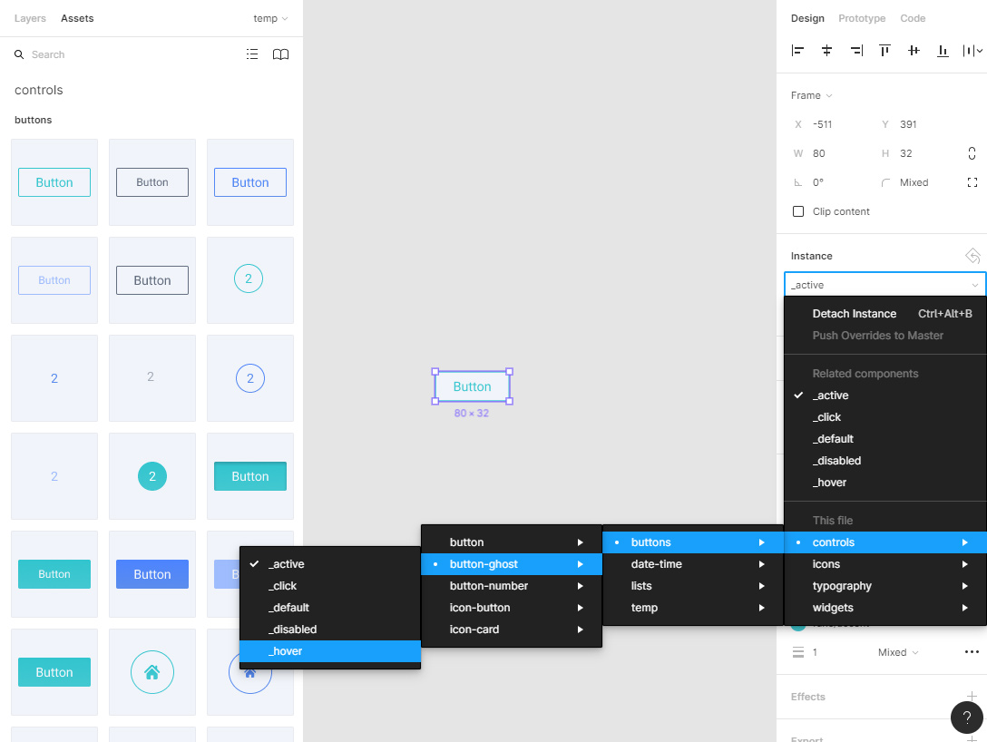
In any case, we always take slashes from “Figma”. Slashes are our everything:
To make finding and selecting styles easier, you can also organize your styles into groups by naming them with a slash naming convention. In the Styles menu, you will see your Local Styles and any Styles shared via the Team Library. Styles will be ordered alphabetically by Team name, then File name. ( Source )
So, the slash separates the "group" and the actual "name".
[The exception is Slash Hudson, who divides Gun's & Roses into a group and his own name, but then changes his mind].
For example, the “buttons / ghost” and “buttons / cta” layers declare the named group “buttons”, and “mobile / paragraph” and “mobile / h1” declare the “mobile” group. In principle, if you are very smart, this system can be called taxonomy, and groups - taxa. Then you will not confuse all this with the usual grouping of layers, which is made simple by “Ctrl / Cmd + G”.
Groups created by naming are automatically pulled into the interface, turning into drop-down lists (for components) or sections in pop-up layers-windows (for styles and effects).
Naming in plugins
With the advent of plug-ins, there has been a certain trend when layer names are also used as sample data for all kinds of filters.
A vivid example is the Google Sheets Sync plugin, which is powerful in appearance, which allows you to pull data from open Google tables into different component layers (!). That is, we take a dozen instances of the component with a dozen layers, name everything in accordance with the requirements of the plugin, and it pulls up the values from the table in them sequentially: texts, numbers and even pictures. The syntax is simple: the lattice (okay, octotorp) + the name of the layer. I have not used this plugin yet, but it looks very cool and promising. Immediately solves a lot of problems with manual filling of product cards, user profiles and other repeating "fish". In principle, he does not break my system, because adding a grid to the beginning of a line is easy.
There are plugins for working with (re) naming of layers: Rename it , Layer names transform , various numerators, etc. I can’t handle them here, and I haven’t used all of them yet. But it’s obvious that with the open API, we will very soon get a lot of automation tools. I’ll say more, everything that I have done here about grids and the rest, in principle, can be embodied in the form of a single plug-in that will generate the corresponding frames and styles based on a dozen settings.
Plugins have appeared recently, from the strength of a couple of months, but there are already a lot of things that make life easier at times. At the same time, the open API will certainly lead to the emergence of new aspects of naming, etc. Therefore, I strongly recommend that you look at this section from time to time.
Pages and Frames
Component hierarchy
The names of pages and frames, among other things, are included in the component hierarchy. On some of the screenshots taken from the prototype of my design system (which I’ll probably never finish, because instead I am writing this endless article instead), it can be seen that the components there are arranged in pages.

The first level of nesting in this chain is taken from the page, the second from the root frame, the third from the name of the component before the slash, and the fourth after the slash. Thus, a local hierarchy is obtained inside a single file, even without connecting external libraries. All this can be taken into account when developing a naming system.
Page Prefixes
As already mentioned, I use square brackets as labels - where I need to show that something does not directly relate to the main context and is some technical point. This also applies to page prefixes. They are different: [figma], [draft], [components], [prototype], etc. Each of them means something to a layout designer.
For example, “[draft]” (draft), means that the page is not finished - everything can change at any time, which means that its contents need to be ignored for now. “[Prototype]” usually contains a bunch of the same type of frames that demonstrate the logic of a single node (basket, user account, registration system, etc.) using the built-in “Figures” tools for prototyping.
And “[Figma]” means that this page is needed solely for compatibility with some pieces of the “Figma” itself. Usually in the first place I have the “cover” of the project - a page called “[figma] cover”. From there, a thumbnail of the file in the general list is taken + sometimes something pretentious is done there for presentation to the client.
Names without prefixes correspond to the pages (or templates) of the site. For redesigns, I take them directly from the link structure of the source. If the structure is complex or clumsy, sometimes I duplicate the whole chain in the name, separating the levels with something understandable and rarely used, such as an arrow:

Root frames
The same story is with frames. what's with the components. The names use "block" + "modifier". For example, in the screenshot above “cart”, “cart_empty”, “cart_thanks”, etc., because logically the basket is a block for me, and the rest of the screens are its modified states. Viewport frames are called without a hitch: mobile, tablet, desktop, desktop + and are usually stored on the same page. There are exceptions, but these are already too deep particulars.
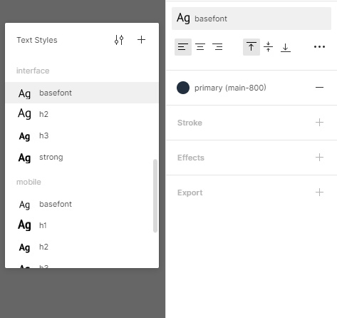
Typography (text styles)
Again, slash. I group in three main sets:
- desktop - typography proper for regular desktop content;
- mobile - guess;
- ui are text styles that are used in specific interface elements and are not dependent on the viewport (well, for example, stopwatch digits or input font).
Accordingly, the names look like “desktop / paragraph”, “mobile / h2”, “ui / timer”, “ui / basefont”, “ui / widget-heading_active”, etc.
Color Picker, Effect Styles

I have the following palettes:
- theme - style-forming colors, the main gamma;
- neutral - conditional gray shades that are used for text, dice, borders;
- functional - colors that have a functional meaning (“error”, “success”, state of links and buttons);
- additional - a set of possible various shades, more or less combined with the main gamut, which is used in the interfaces for marking statuses, indicators, highlighting any list elements, banners, etc.
- gradients - sometimes gradients and backgrounds are allocated in a separate group, just so as not to confuse them with the usual fill and it is more convenient to put them in CSS variables.
The naming is the same: group + slash + name + modifier. For example, “theme / primary”, “theme / page-background”, “func / link_visited”, “func / warning_light”.
Effects are grouped by type. I use not so much, for the most part, the shadows of two or three kinds of depths “shadow / _depth_deep” (pop-ups), “shadow / _depth_minimal” (small shadows of buttons, etc.), “shadow / _depth_mid” (medium drop-down lists, panels). An inset modifier is added for inner shadows.
By the way, the second modifier is always separated by a plus ("block / _mod1 + _mod2 + _mod3"), so as not to get confused with the standard construction "_modifier_value". But, in general, such pornography is best avoided. If the project has a lot of such things, then you can replace a bunch of modifiers with one common meaningful name. A la "shadow / _active-button".
Things to Avoid Carefully
- It is highly recommended not to bind the names (identifiers) of colors to specific color values ("red", "fleshly", "azure", etc.). The name should reflect the function or scope, not the actual shade. The color value can change at any time: redesign, rebranding, a new manager at the client. Therefore, names like "button / red" or "bg / yellow" do not roll in most cases.
- No need to use colors from one palette for another. For example, if you have white in the brand and the same white in the neutral gamut, technically it should be two different colors (two variables). Now they match, yes. And in a year? And in a dark subject?
- It is also advisable not to allow brand colors to match functional ones. No need to “brand” links - leave them with classic blue and blue, adjust only the shade. If the gamut of the brand still coincides with something (the red brand and the red error message), it is advisable to maximize their shades at least in terms of saturation and brightness.
The third conflict. Unstable Styles and Effects
The bottom line. The designer creates colors and gradients by applying effects or changing transparency. As a result, the layout designer gets confused, is forced to check everything himself, take the colors with a pipette, etc.
Decision. Only those values that are submitted to the “official” library of styles and effects fall into the layout. If there is any gag in the layout without clear comments, you need to notify the designer. If there is no reaction, the layout designer uses the closest style from among the standard ones. Moreover, the responsibility for this lies with the designer. The general principle is this: if the designer didn’t work, then he gave it up to the layout designer. And the layout designer has the right to use any tool from the accepted standard.
How the design system helps here
In general, this happens to everyone, since transparency is the most convenient way to “dilute” a color or gradient. And since you rarely manage to pick up the shade the first time, you sketch out the options, and then you roll back a few steps forward and backward - you miss somewhere, the “consequences of the experiments” remain.
But. When you know for sure that only fixed styles will go into layout, you involuntarily become more attentive. The number of variations in shades is reduced to adequate. Yes, flaws can remain somewhere in copies, on some separate artboards, but the exported style itself is usually brought into an acceptable form. If necessary, the check can simply be included in the checklist. Then, before putting the layout into layout, the designer goes through the entire list of styles and corrects the roughness.
The layout designer, again, works with the finished palette. He is not concerned about particular anomalies, unless they are specifically agreed upon (but in this case, the probability of error is minimal).
Styles “Figures” are the larvae of variables for assembly
Palettes and effects can be used as variables in the assembly. In this case, they are transferred to some appropriate configuration file and pulled into component styles in some way, depending on the structure of the project. That is, there should ideally be no colors / gradients / effects besides the “standard” ones in CSS rules. It turns out, something approximately similar to this:
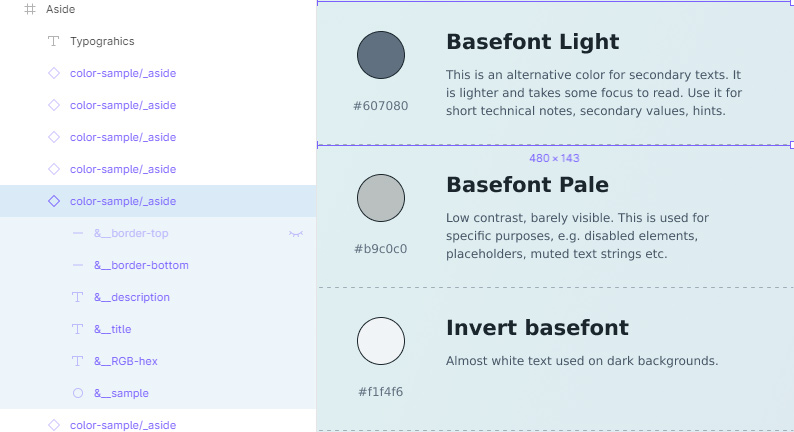
// named colors $clr-aqua = #057f99 $clr-aqua-light = #3ebca6 $clr-aqua-dark = #006B81 $clr-violet = #89288f $clr-violet-deep = #361946 $clr-white = #fff $clr-white-alt = #f1f4f6 $clr-gray-lightest = #e0f1f1 $clr-gray-light = #dde9f0 $clr-indigo = #5f2d7b $clr-purple-pink = #a93897 $clr-purple = #89288f // default theme palette $clr-primary = $clr-aqua $clr-primary_light = $clr-aqua-light $clr-primary_dark = $clr-aqua-dark $clr-secondary = $clr-violet $clr-secondary_dark = $clr-violet-deep $clr-bg-primary = $clr-white $clr-bg-primary_interlaced = $clr-white-alt // typography $clr-basefont = #1b262d $clr-basefont_mid = #465666 $clr-basefont_light = #607080 $clr-basefont_pale = #b9c0c0 $clr-basefont_invert = #f1f4f6 $clr-link = #1383B4 $clr-headings = $clr-violet-deep // gradients $grad-primary = linear-gradient( -45deg, $clr-primary-light 0%, $clr-primary 50%, $clr-primary-dark 100% ) // Transparent main gradient is used as an overlay $grad-primary_overlay = linear-gradient( -45deg, rgba($clr-primary-light,.5) 0%, rgba($clr-primary,.5) 50%, rgba($clr-primary-dark,.5) 100% ) // shadows $shadow-glow_mid = 0px 8px 16px rgba($clr-primary-dark, 0.3) //...
As you can see, the prefix system is slightly different, so as not to lengthen even more selectors, etc. But the color identifiers still appear, so the system is saved.
Another point: there are "named colors" that take a hex value, and then are assigned to "standard" colors. This is done just for clarity, in order to “see” the current color scheme of the project / theme in the context of the file. Those named colors, in principle, can be safely used somewhere and directly for some specific purposes, because their hex values never change. But for the same reason, it is better not to produce them.
About imperfection and perfectionism
In general, my palettes are still poorly combed, for historical reasons: I did not immediately come to the current system, there are many transitional projects. If someone suddenly read this carefully, then he might notice that on the screenshots there are differences in the names and wordings that do not quite coincide with the text. Ce la vie. Basically, I do not lick, so that no one will have unnecessary illusions. The design system will not always be perfect. It solves many problems, but just because you use it does not mean that unicorns and butterflies flutter in the mock-ups. There are still legacy, time pressure, the human factor, and more. But coders with designers, at a minimum, stop dogging for nothing.
In general, in my opinion, if everything is very comfortable in the work, right, simple and logical, then the script should do it. A person is good because he can handle unforeseen exceptions without falling out of the blue screen. In addition, the share of healthy indifference saves the practical perfectionist from becoming pathological.
The fourth conflict. Graphics Export
The bottom line. The designer gives the layout, but the layout designer is unable to pick out the necessary graphic materials from there (bitmap illustrations, backgrounds, icons). Figma does not allow you to pick up the source, only processed export, which is sometimes not enough.
Decision. The designer opens the source folder and uploads the full-size original pictures (without compression) into the project directory on the working server (or in the cloud) of the team. The typesetter opens a daddy, finds the necessary materials by name and generates from them everything he needs: dimensional variations, sprites, etc.
I came to this relatively recently, when it turned out that the figure does not give the source of jpeg / png files, which I upload there from the screw. Sometimes they are needed.
Where does the designer get the "daddy with source"
The designer takes it from the place in which he prepared the graphics. Raster pictures from the raster editor. Stock vector - from stock vector. It doesn’t matter which one, this is the designer’s business. Another thing is important: full-size files should be. Even if something is done in the same “Figma” with the help of image tuning, you need to export it from there and save it as a file. Vector too, just in case - let it lie in the cloud. It is not difficult.
And why is the designer suddenly exporting?
Because it is his competence, he is stronger in it (we will talk about this below). Firstly, he has access to the source. Secondly, he knows his layout better and understands where it comes from (versions, stocks, copyright licenses, etc.). Thirdly, if somewhere somewhere something was incorrectly cut off, superimposed, blurred, flattened - the designer knows all this. The visual part on it.
And why is it that a layout designer has to compress pictures himself?
Because it is his competence, he is stronger in it. Well, yes, now this is more of a rhetorical question, for symmetry. Who we have in the assembly, Ale. Who, if not a layout designer, knows the requirements of all platforms and can automate everything in the world with his mighty “Gulp”? Of course, these are his questions. The designer does not need to go there unnecessarily.
How to simplify your life a little and here
- It’s good to design the structure of projects in the cloud so that everyone understands.
- Set up sync. The designer saves everything to his daddy for export, it automatically flies to the cloud, and from there the layout designer pulls it into his assets or somewhere else there. This is implemented, if desired, even on Google.Drive.
- [] — semver . , — , — , — . .. .
. «»: ,
. . «» («»). , - .
.Isolate the master components (put them on a separate page that was forgotten and forgotten by God and lock them with “locks”), and prepare “reference copies” instead of them for the layout designer — copies checked by cheklists that he can easily dissect. Well, either "as always": give the link so that the layout designer copies the file to his own drafts using the "Duplicate to drafts" button, which is free and removes questions about adding an "editor". A shy designer by the same principle works quietly in his local files, and when ready, dumps the changes into a public file. Owners of the team pro-accounts of “Figma” (as far as I heard about these oligarchs :) have the opportunity to use the component libraries for all projects and configure access to each, so the problem is removed there.
Naturally, all these approaches are not without drawbacks, but if you use a grid system and the other described above, then the layout designer’s work in “Figma” becomes much easier. And despite all the talk about bygone days and complaints about times and customs, making up a layout assembled on components by a design system is in any case more convenient than 99% of the chaos that came before in .psd-shahs.
Yes, by the way, there’s another moment for layout designers who are migrating from Photoshop who haven’t tried out the Figma and are experiencing problems with labor productivity. I heartily recommend: study its hot keys, especially those that are designed to navigate through layers and components. This is not a whim in this case. I remember very well that in the first days of getting to know Figma, it was most annoying that it was the need to “push deep into” the components in order to highlight a specific embedded layer. He climbed right on the wall. But later, when I got used to “Ctrl / Cmd + Click”, “Enter”, “Shift + Enter” and more, everything became much more comfortable and convenient. Here hotkeys are an absolute must have.
The conflict is the sixth. Who should do this or that?
The bottom line. The designer is trying to blame work on the layout, in the hope that he will clean the tails and eliminate flaws. And the layout designer imposes his needs and lives in the hope that the designer will “retrain” and begin to live and think like a techie.
Decision. (In addition to everything above). Separate areas of responsibility, but unite interests.
Initially, everything is often the opposite: people cross their spheres of responsibility, but they highlight personal interests. That is, both are constantly striving to get into each other's processes and football tasks back and forth, but at the same time not to take responsibility for these very processes, because "this is not my job." This can be changed if you adhere to a couple of principles and understand that:
The friendship of designer and layout designer is inevitable
Because ultimately they are very dependent on each other. It doesn’t matter where the “controversial” task came from. It is important that it will hang over both and slow down the processes of both. And the faster it closes, the better for both . The designer and layout designer are always in the same team, their interest is 80% in common: terms, edits, income (if there is% from the transaction), and even portfolio - everything is interdependent.
The only thing that can prevent these people from working together (in addition to organizational jambs of the leadership) is a misunderstanding or fragmented understanding of the specifics of each other's work.
It is significant that if the layout designer has more or less noticeable applied design experience, and the designer has layout, then there is almost no conflict between them. They better understand each other's opportunities and problems, therefore they are looking for the optimal solution, and do not require the conditionally impossible.
The task is performed not by the one who “should” or “blame”, but by the one who is more comfortable and easier to achieve the desired result
If you need to visually re-roll the document structure, moving the blocks back and forth, swapping them, etc. - This is done by the designer in his editor, because it is easier than reversing the layout. If you need to play around with numerical values, compress a large pack of jpegs, or, say, experiment with animation timing, this is done by the typesetter, because CSS / JS is more convenient.
A classic far-fetched problem from the series “who should export the icons” from full-fledged specialists turns into “So, let me export everything quickly now, and you have finished that crap so that we can pass everything by the weekend”. This is a typical layout. I already forgot the last time I was cursing with coders, although I yell at customers regularly (a joke with a fraction of a joke :)
Competency is proactive
Nobody likes when someone intervenes in his affairs. That in itself is great motivation. If you do not want the layout designer to “spoil” your ingenious design, make it so that he has to interact with him as little as possible. And vice versa, if you’re a really made-up typesetter, do not fool the designer with your troubles - you will make candy from any piece of peat faster than diz will understand what you wanted from him) So what is the reason for conflicts?
How does this logic work?
Example No. 1
Suppose Figma is my tool. I decided to do a project in it. If the coder does not stick together with her, then he has the right to ask me how to get out of the situation. And it is precisely I who will have to find a solution for him. If necessary, flipping through the appropriate manuals, googling and even testing. Why is that?Yes, because this is my "diocese." It is assumed that of the two of us, it is I in her king of God. And that means the responsibility for this side of communication is on me.
And the flip side of the coin: the layout designer shouldn’t even care how I draw the models: in the Figma, in the Chandelier, in the Paint or poop on the walls. This is my creative process. But at the same time, I must ensure compliance between my process and some universal standard that will suit it.
Spheres are divided, common interests - no conflict.
Example No. 2
True story.Once I decided to become an exemplary pioneer and went to one good typesetter with a question: how can I better structure layouts for him. Like, what do you need, older. Ask what you want. I quote the answer verbatim (sorry): “Yes, fuck. At least I’m making up from a peengashka. You, most importantly, draw. " And then I admired the wisdom of the holy elder and left, enlightened.
Spheres are divided, interests are common - there is no conflict.
I think the examples will explain why it’s wild for me to hear layout designers ’complaints that their designer somewhere there didn’t measure a couple of pixels with a micrometer. Or vice versa: the nagging of the designers that the evil workbench made them rename “Rectangle 1” to “Button”.
Total
The principles of a design system for resolving conflicts:
- We use "magic" standards for numerical values.
- We name everything correctly.
- We fix styles and palettes.
- We store source images.
- Isolate the master components (if necessary).
- We share competencies.
(Yes, I rolled it into several tens of screens. But it didn’t work out otherwise).
Thanks to everyone who mastered at least a part. I hope you will be able to derive some benefit from this for yourself.
I have nothing to advertise, but if you certainly want to follow the link in the description, then go, for example, to these people:
kamushken - articles about the design system and “Figmu”;
mkoloskov - articles about BEM;
vasyay - articles about studio management.
PS If the article was useful to you, do not hesitate to say so in the comments - they will help to understand if there is any sense in writing such Talmuds for Habr.
Good luck!
All Articles