For several consecutive years, React has not lost ground and is one of the three most beloved libraries of professional developers around the world, with every reason to be.
Have you ever faced the need to improve your application with analytical and visual functions and get an idea of the data?
In order not to get lost in the variety of tools, I present you an overview of libraries for React, which can be easily integrated into your website or application.
Victory
Victory is a React reusable charting platform. Immediately striking is their style, interactivity and smooth animation.
Components can be modified, packaged, or created from scratch. The experience with documentation seems convenient and intuitive, and developers who prefer to customize everything will fall in love with this library.
Starting a visualization project is easy - you need to import the Victory library into your project, add data and embed the component in a web page, and in addition, it has an additional version for React Native.
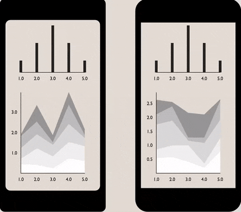
React vis
Uber excels not only in the field of passenger transportation, but also in the development of visualization systems. React-vis is a library that offers a large collection of diagrams for React applications. Its components work similarly to the usual React components we are used to. To create your first visualization, install the library using npm , import the necessary CSS styles and components, visualize them on the page and voila! Among all the diagrams, the strong graphical side is what impressed me the most.

Charting tools are good for self-use, but even better if they are connected to aggregated data. Judging from my experience, charts and pivot tables give cool results if you combine them in the form of a toolbar.
So, now let's move on to tools that help you create reports right in your React project.
WebDataRocks Pivot Table
WebDataRocks is a JavaScript pivot table component that is compatible with React and other frameworks. It supports connection to remote / local JSON and CSV data sources. What makes it special is that it is completely free and customizable. With WebDataRocks, you can take advantage of the classic reporting features: aggregation, filtering, sorting, slicing and splitting data. To complete the report, I recommend selecting cells using conditional formatting to emphasize the most important values.
To start the first reporting project, several steps are required: adding dependencies to the React project, displaying the component on the web page and filling it with data. Everything is simple.

Flexmonster Pivot Table & Charts
Flexmonster is a more advanced pivot table component and an enhanced version of WebDataRocks. It serves as an embedded BI (Business intelligence) for startups and enterprise-level projects.

What attracts attention is the variety of data sources available: CSV, JSON, OLAP cubes, SQL / NoSQL data, and Elasticsearch. The functions of aggregation, filtering, sorting, detailing and grouping are always available on the toolbar. During testing, I was pleasantly surprised by the performance of the component - it processed large amounts of data from the MongoDB database and used grid rendering. From the developer's point of view, the integration process with the React project is quite smooth, as is the process of connecting to the database.
I sincerely hope this review has been helpful. Feel free to share your suggestions in the comments below. What other React libraries do you use for your application?