This list has been compiled based on several of my articles and notes about creating a user experience in VR. The material was created as a kind of set of additional recommendations for new Modum Lab specialists who are engaged in the creation of interaction systems in VR projects (mainly for HTC Vive and stand-alone solutions). First of all, it was necessary to analyze such topics as the use of controllers, moving systems, the specifics of developing interface elements, visualization of avatars, and immersion issues in general.
Introducing VR
1. Add a pause at the very beginning of the simulation - let the user do nothing for a few seconds in the scene. This will allow a person to adapt to a new environment and navigate in space, and after that he will be able to concentrate on the task. No need to immediately require the user to do anything - it's about the lack of notifications, and voiceover, and any animations. The very appearance of the scene can be shown gradually. For example, leaving the fade, assembling from fragments around the user, and so on are options when the virtual environment does not immediately appear before your eyes.
2. New users can be hard pressed to take the real first step in VR. Therefore, along with training in working with the movement system, for example, teleportation, you can add the task of the usual physical movement in the scene.
3. At first, users may not very well determine the position of objects by depth, so at the start it is better to place interactive elements so that they are always at arm's length or, conversely, much further than the person’s original position, so that it is clear that several steps need to be taken to the object.
Moving
4. In the vast majority of cases, if users are sick with a project, then the developer is to blame. There are many discussions on this topic, a large number of variations of the movement systems in the virtual space have been created, including various niche solutions, for example, for technology and developers continue to explore this issue.
Pay attention to the study of this topic, since for different tasks you can choose the most suitable way to move in space. In this case, the most common option at the current time is moving using teleportation, that is, instantly moving the user in space through indicating a point to move using the controller or the direction of view. The second popular mechanics is all kinds of flight variations.
Justification for the use and options for implementing teleportation in various projects:
5. The use of teleportation in the project can be beaten narratively, as well as generally build the gameplay around such a “limitation”.
6. There are actually many types of teleportation itself - this is free teleportation within a certain area of the scene, teleportation to given points, instantaneous and through effects (through shading, frame sequence, through quick movement in a straight line to a given point), etc. . It all depends on the specific project where the movement process is implemented.
Zone-based teleportation also works and can be perceived much easier than classical teleportation. This is when the user can not move to any point in space, but to a specific set of defined zones. But these are not just points, namely, areas of space that correspond to the tracking zone and the user's position in it (which leads to a number of difficulties in the design of scenes).
7. When creating a teleportation system, it is worth limiting the maximum distance of movement using a teleport. Due to the fact that when using VR glasses for the first time, users often get confused in the buttons of the controller, they can accidentally move long distances, which will cause constant disorientation in space - “where am I and how did I get here?”
8. If you decide to implement a free movement system - the classic way to control the movement of the camera using the buttons on the controller, then make an alternative for the part of the audience whose vestibular apparatus will not be ready for such.
9. With a free movement system, you can reduce the effect of motion sickness by building the structure of the scene or game level so that the user mainly moves forward.
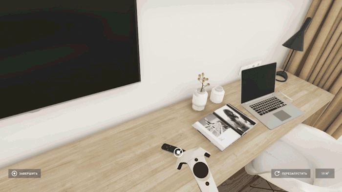
Sample project using a free movement system
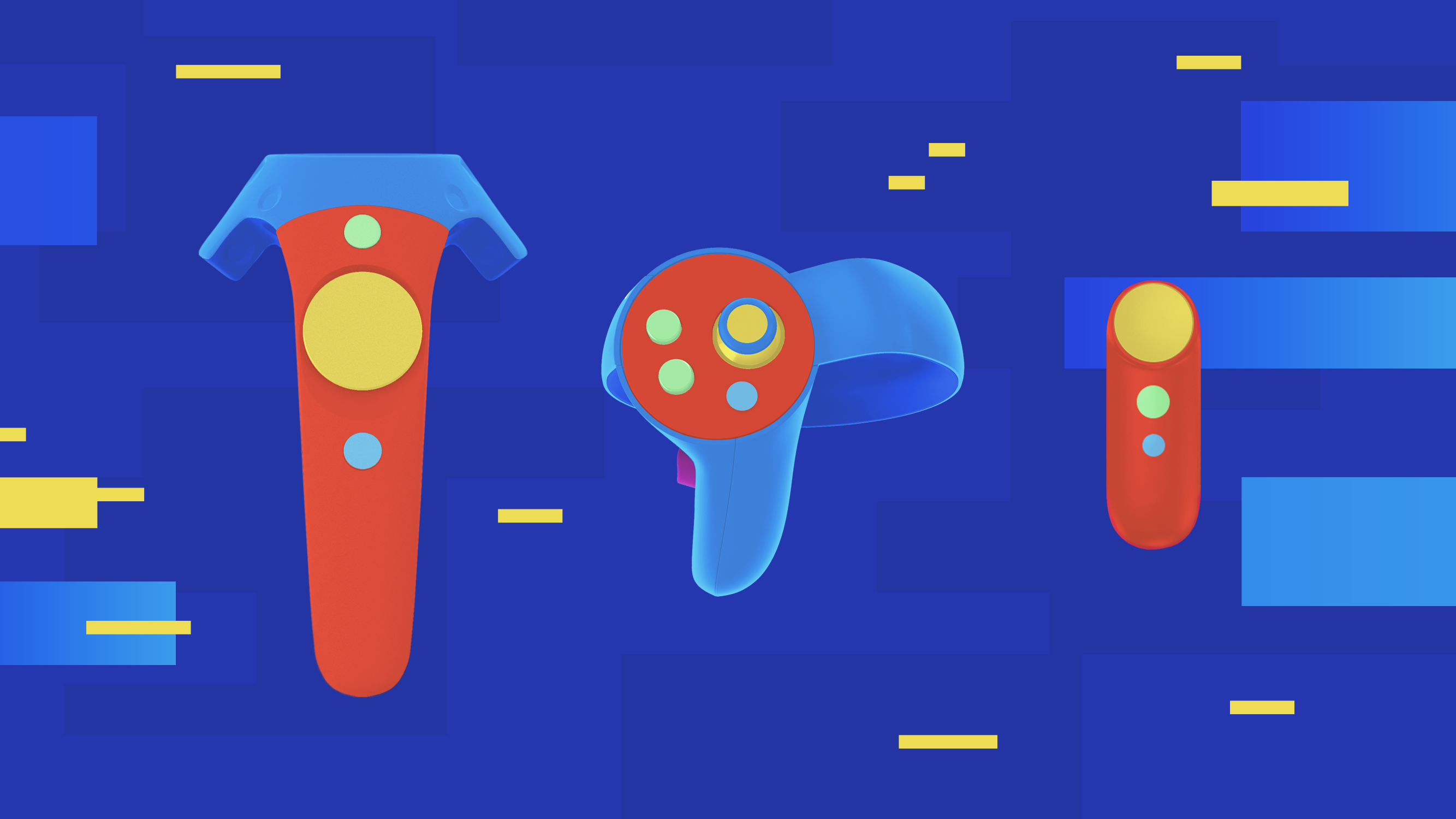
Controllers, hands and display interactive content
10. If the controller / hand touches the interactive object, then the object at this moment can be highlighted, indicating that it is already possible to go to the next step - take it.
11. When taking an interactive object, the controller / model of the hand is usually hidden. You should not visualize the controller, which is half immersed in the geometry of the object with which the user interacts.

Virtual showroom project for Pioneer Group of Companies (hereinafter)
12. If the interaction occurs with the help of hand models and when you take an object, the hands remain visible, then you need to develop a unique set of brush positions for different objects so that each object or category of objects looks organically in the hand. It must be taken into account that this will require certain time and financial costs with a not entirely obvious advantage over the previous option, when the controller or hand disappears during the capture of the object (a slightly different situation may be with Oculus Touch due to their ergonomics).
I like the option with constant visualization of the hands more from the position of relating yourself to a specific image of a virtual avatar. Even simply through the display of hands, you can indicate that you are offered a role, for example, a robot or a ghost. And if the hands do not disappear when interacting with objects, then this connection is constantly present. But I'm not sure that this affects the feeling of our own hands in VR somehow stronger than if we only visualized objects that we hold with our hands. For example, what Job Simulator developers think about it - youtu.be/hjc7AJwZ4DI?t=1795
13. The side buttons of the HTC Vive controller should be used only when absolutely necessary, but it is better not to use it at all. These are quite unobvious controls in this system.
14. The less controller buttons involved in the project, the better. For example, you can use the zone-based capture method to interact with objects with just one controller button. This works in some cases, when you need to move objects in a limited area (the mouse on the rug on the table, which can be moved within the rug in the Job Simulator).
In other cases, you need to develop separate cases for this condition. For example, an entity is introduced in the project - the area of taking and returning an object. When there is a separate zone where the object is taken by pressing the trigger and replaces the controller, after which subsequent use of the trigger triggers the logic of this object. Upon returning to the return zone through a click, the object remains in this area, and the controller is visualized again. This approach will reduce the number of buttons used for similar types of actions (activation of an object - capture and use). Otherwise, it is necessary to place the object capture functional on one button, and use on the other, which will raise questions about how to deal with other actions, which also require buttons, for example, for teleportation.
15. If you visualize your hands, it’s better to beat their ending - go into transparency, or use the “empty gloves” effect when creating a glove that takes the shape of a hand, but there is nothing inside if you look from the side of the cuff.
An example of a conventional slice of geometry without any styling
Using the fade (leaving in transparency)
Glove example
16. Do not make realistic visualization of the hands, it almost always does not look very nice.
Pay attention to the kind of hand taking the key
17. The transparency of the hands solves the problem of "ephemerality" - when the user can pass through the geometry of the scene with his hand. Also, at the moment of crossing the geometry with an ordinary opaque hand, you can beat the cutoff border using any effect (a hologram, going into transparency near the cutoff line, etc.), this will also smooth out the feedback problem.
18. The current generation of motion controllers for VR has one very powerful advantage over classical input devices - a low input threshold due to the simplicity of the device controllers and how they are used in projects. We are talking about natural gestures and body movements. For example, we take a donut by the controller, bring it to our mouth, play the animation of biting off a piece, and fill the character’s life. Or reloading a gun when you need to pull out a magazine and install a new one. Or start the game through the installation of a cassette with saving to a tape recorder and pressing the Play button. In addition to the fact that such actions are very understandable, since they are used in the real world, they also become a more substantial part of the gameplay, and of the new user experience as a whole.
But there is one interesting problem of such solutions, not so much in the field of games in VR, but in the non-gaming direction - this is speed.
It is necessary to correlate the pros and cons of various approaches within the framework of the user interaction system with the interactive environment in specific projects.
In some cases, speed will be a decisive factor (clicking on a donut using a laser beam coming from the controller), in another, the process of physical interaction transferred from the real world will be important (approach, raise the donut with your hand and bring it to your face so that the eating animation plays) . For example, the transition to more abstract control methods can be justified by the frequency of such interactions.
19. Users want to interact with everything in reach, if it looks like an object that seems to be able to be taken or pressed. It is important to meet their expectations, bearing in mind this specificity when designing and filling objects with a scene. For example, to place only interactive objects in the reach zone, not to place static and interactive objects in one area, etc.
Another way to solve this issue is to set a clear visual indication for interactive objects (animated markers that appear on interactive objects at arm's length).

20. At the moment you hold down the teleport button, you can make visible various indicators of points of interest in areas that the user has not yet visited.
21. The solution to the problem of raising objects on the floor so that users do not hit real controllers on the real floor - if the object fell on the floor, it flies up a bit when a hand reaches out to it. It is important to create an additional visual indication of the process of “levitation” of the object so that this does not disorient the user.
Another option is to make it possible to “magnetize” fallen objects when the controller beam is hovering over them.
The classic version for simulations where movement with the object is not supposed is to reset the position when, when falling to the floor, the object appears in the place where it was originally located.
Tips
22. One incentive to focus the user on the desired area in the scene may not be enough, it is better to use several tools at once - animation in the area itself, light, indication of the area of the characters, voice and text, and so on. It is also worth considering that the behavior of objects (animations) in a scene attracts more attention than voice or text.
23. Instructions for complex manipulations with controllers are difficult to perceive if the controller itself and the buttons to be pressed are not visible. Therefore, at the first stages of acquaintance with management it is better to show them in one form or another. For example, the user's hands appear in the model, replace the brush, the controllers are visualized in the space next to the hand / object taken.
24. Moving popups work well when a window in one place for picking up an object in your hand visually moves to another place where this object needs to be installed / moved.
Placement of controls, main menu
25. The main menu is the first thing a user sees in a project, it cannot be placed in a void on a black background, it is better to spend a little time on an abstract environment, which will already be better than the complete absence of any space.

Immersive Simulations Platform loading scene without interface elements
But this, too, is not always enough. The menu can reflect the concept of the project, in the literal sense of the lobby before going directly to the simulation. In games, this has long been used , but in all kinds of services, this aspect is given too little attention.
26. If the load between scenes lasts a long time, it is better to allocate time to create a “waiting room” - a space that can be visually and conceptually associated with the main menu or other scenes in the project where the user is waiting for the level to load.
27. Associate the interface with the scene space. Even if this is the main menu panel hanging in space, justify its existence in the environment - it can be a projector that displays a hologram in the scene, reflection or light from the hologram on the elements of the environment, and so on.
The concept of diegetic interfaces is ideally suited for VR, enhancing the effect of the authenticity of what is happening around through spatial placement and narrative justification.
28. When creating a user’s workspace for long-term interaction with interface elements, one should forget about stereotypes from science fiction films such as “Minority Opinion” - do not place interactive elements for interaction with controllers at the eye level — this is very tiring for arms and shoulders. Break the space into the information area at the level of the upper body and the interaction area at the user's abdomen, where in the first case all kinds of status screens, notifications, input fields will be located, and in the second - interactive blocks, keyboards, menu items and so on.
29. Just in case, it’s better to clarify - avoid attaching interface elements to the user's camera. In this case, you can place such elements at a small distance in front of the camera and set the possibility of moving behind it with some inertia.
30. It is far from always appropriate to visualize buttons and other tools in the form of any real objects in the scene space, such as physical three-dimensional buttons, levers, etc. In virtual panels, there is nothing wrong if high-quality feedback is configured on user actions: buttons respond to guidance, pressing, for example, are highlighted, shift in depth, responding to pressure, and so on.
The controls are conveniently placed around the controllers, as is done in Tilt Brush , the way to present the interface in the form of an analogue of a tablet in hand, where the usual 2D interface is located, is even more intuitive and understandable for the user.
The relevance of a solution depends on the specifics of the project.
31. Often you can find a solution with placing controls on your wrist in the form of a hologram or some kind of panel similar to a smart watch. It is important here not to overload the functionality of such an interface unit - it is hard to keep your hand on the weight for interacting with interactive elements. This solution is great for all kinds of notifications and simple sets of actions.
First person avatars
32. When it comes to visualizing a user’s avatar in the first person in any realistic style, the standard way is still to partially display the avatar when only those parts of the body that are displayed are displayed, that is, essentially only hands are visualized. This allows you to solve the problem of the mismatch of the position of the real and virtual body of the user during movement.
33. There are projects where the avatar is in a static position - for example, in racing and other simulators. In this case, it is possible to visualize the entire avatar body without any special difficulties - the user himself can adjust to the position of the virtual character, “synchronizing” the real and virtual bodies.
34. Yes, there are projects without additional body tracking systems, where the entire body of the avatar is visualized. In some of these projects, this is not even done so terribly (often these are action games where inconsistencies are smoothed out due to the dynamics in the game). If you nevertheless decided to visualize the entire body of the avatar in the first person, then you should think about styling the avatar itself - characters like robots, cartoon characters here can smooth the situation.
A narrative will also help here - if the tracking system does not allow the virtual avatar to repeat the movement of the entire real body, as is the case with glasses from Oculus, Sony and HTC, then you can go the other way. Those. Do not try to prove to the user that his virtual body is real, but to designate the avatar, for example, as part of the remote control system with which the user interacts, having beaten it visually and narratively.
It can be a robot controlled by a player or some living creature, but in which, according to the plot, it “takes over”, taking the body under control and so on. Thus, the lack of accurate synchronization of the real position of the body and the virtual one will be justified in the user's perception, which will allow not only to preserve the effect of immersion and presence, despite any inconsistencies, but in theory even strengthen it in the presence of certain tracking inaccuracies.
35. While customizing your avatar, no one has yet come up with a better solution, like using a virtual mirror . But there are other alternatives, ranging from the use of wardrobe items or PPE in safety simulations on conditional “mannequins” during the selection of the correct set within the framework of the regulation, ending with classic panels with inventory objects. In any case, it is recommended to add sound support when using the item - the sound of fabric, protective gloves, helmets, etc.
Avatars and networking
36. The first-person user sees only their hands, but other users in the scene can see the fully visualized avatar of their interlocutor, since the mismatch between the movement of the real and virtual body is not as critical for the observer as for the owner of the virtual body.
37. If we talk about the style of avatars for network interaction, it is better to abandon the realistic image of people in order to smooth out a possible problem with the “Sinister Valley” due to a conflict of realistic movement due to the tracking system and the lack of tracking of facial expressions, eyes and other parts of the body. The use of non-photorealistic visual styles is more appropriate here. But this will not always be .
It is important to distinguish between the concept of realism and reliability. An object (not only avatars) can be unrealistic, but behave reliably. And this may be enough for the user to believe what is happening around him. Thanks to the tracking of body movements and the voice positioned in space, you will recognize your friend, and since his appearance is simplified due to the chosen visual style, there will be no contradictions that would create a photorealistic image in the absence of the required amount of animation.
A separate topic is the visualization of network avatars in training simulations, but it requires substantive discussion in each specific case.
38. In addition to exaggerated visualization, developers often try in various ways to beat the moment with faces and facial expressions of user avatars, hiding their faces with glasses, masks, spacesuits. This is done both to save resources and to compensate for the impossibility of tracking facial expressions. If it fits into the concept of the project, of course.
39. If there are user avatars with the possibility of voice communication, there should be a lip-link or its analogue for visualization of speech when the avatar has a mouth hidden or its animation is not supposed. One of the options is to make a highlight (again, if the style allows) or display an additional indicator as a UI element, which is often duplicated even in the presence of a lip-link.
40. There are many ways to enhance the effect of social presence by working on user avatars:
- Add blinking animation to your avatars - this will greatly enliven the characters in the scene.
- Additional animations of accessories that respond to body movement work well.
- This is more complicated, but not least - if the avatar’s eyes are visible, it’s better to develop a system of viewing direction animation, this will enhance the effect of presence if implemented correctly. Or it will completely destroy it, if it cannot be realized at the right level, when the avatar will constantly look at the interlocutor, the relationship between the direction of the gaze and the turn of the head will be incorrectly worked out and so on.
41. You can not disrupt the process of movement of user avatars. If body tracking is used - users see how other people’s avatars move depending on the position of the controllers, then you cannot intercept movements in this process to play any additional animations of the avatars' bodies unconnected with a real person - this will work to destroy the effect of social presence.
42. If the main functionality in a project with network interaction is communication between users (chat analog) and the moving system as a whole is not required in this simulation, then the most effective option is to place avatars at a table where all the communication tools are located at arm's length .
miscellanea
43. If the transition from one scene to another is initialized by the user, then various metaphors are often used for this. For example, the sphere of levels that the user takes with the controller and brings to the head, essentially penetrating into their space. Another example is virtual reality glasses inside virtual reality, which are needed to move to another space.
This is, on the one hand, a reasonably clear justification for the transition, and on the other, an immersive technique.
44. The user can freely move in the real space of his room and with a high degree of probability cross virtual objects. One of the options to beat this situation is to remove the “materiality” of the intersected geometry so that it does not seem solid and stylize the moment of intersection itself so that the slice of the geometry does not read like a bug:
This is similar to the situation with a slice of the geometry of the hand model when intersecting with objects in the scene.
You can also optionally use stylization by showing the internal structure of the object. Not necessarily realistic, possibly exaggerated and comical, if the setting allows.
45. Sometimes users go beyond the boundaries of the scene itself, for example, through the wall of a virtual room. In such cases, most often the picture is simply taken to the fade, sometimes the user is automatically teleported back, and this may not be a very good option due to the loss of orientation in space.To avoid this, there is a rather interesting solution from HUGE ROBOT as part of the Freedom Locomotion System project.
At the moment of intersection, the grid of the tracking system is visualized in space, showing the physical area for moving and highlighting the silhouette of the object inside which the user has got.
But going beyond the boundaries of the scene can be beaten as part of the narrative, setting, or even become part of the game mechanics.
For example, you can place additional scene geometry behind the walls of the game level, styling the level itself as a decoration. Or you can create the effect of moving to another space while going out of the scene, or you can punish a player while going out of the virtual space after some time (if he wasn’t accidentally behind the wall and trying to circumvent the game rules) - the only question is the relevance of the data receptions in a specific project.
46.A special case of the topic with an interactive environment concerns the development of cases for closed doors, since there is an unspoken agreement with the user that if a door has a handle, you can try to open it. A handle falls off at the door, the door opens, but there is a brick wall or a stylized grid of three-dimensional space without detail and so on (if such techniques are consistent with the project concept).
These little things are an example of the necessary level of attention to user experience that enhances immersion.
47. If you decide to use the already-classic image of a robot bot flying in space as an accompanying user assistant, here are some tips on how to make it more attractive and lively:
- ;
- (, );
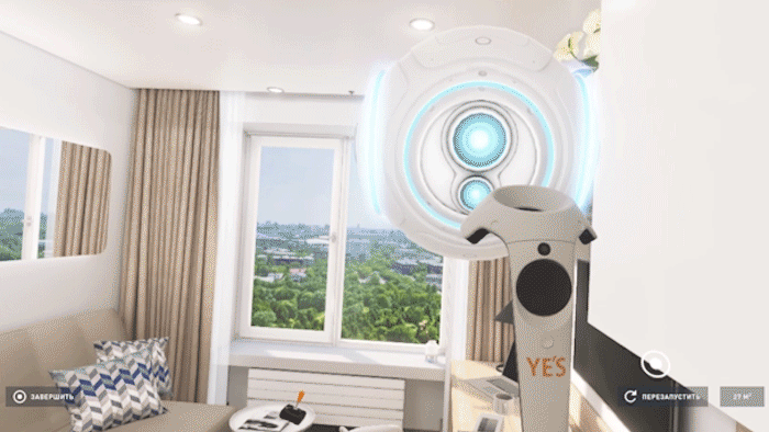

- , , - , ;
- , , .
48. The user in virtual reality remains himself, playing for a character is a role-playing game, and in this virtual environment he can either try on the role of the character, for which he needs to be prepared beforehand, or get a reasonable explanation of how he, being himself myself, I ended up in virtual space - I wrote about this in a separate note about breaking the fourth wall in virtual reality.
This possibility of the complete destruction of the fourth wall can be used in some projects to enhance immersion in the simulation - create a connection between the real world and the virtual environment, explain how the user ended up in this space, beat the existence of VR glasses narratively and visually.
49.In third-person projects in VR, it is convenient to build a classic system of movement and combat during the movement of the character when the player is an invisible observer, who is directly inside the virtual environment. Here, the problem with motion sickness also disappears with the character’s active actions in the scene. Switching to the first person in such projects can occur in special cases - in dialogs or when interacting with the environment, for example, solving any puzzles, as is done in the exclusive for Oculus Rift Chronos and similar games.
Another rather unusual example relates to non-game development . We implemented the transition from first person to third in the project of network interaction for Vive when teleporting the user avatar to the chairs in the scenes.
During teleportation to a virtual chair, we placed a user avatar on it, and the virtual camera - the point of view - was displaced behind the character model at the same height as the user's real head, but turning the camera so that it looks at the back of the head for an avatar. In this mode, the user can move separately from his virtual representation, which does not respond to his movements, until the user decides to teleport from the chair somewhere in the scene - then the synchronization between the character and the camera / user will be restored.
This simple way does not break the synchronization of the camera with the actual position of the head and preserves the existing functionality of the possible location of virtual characters in chairs.
This is a rather interesting effect, which is not present in projects with predominant third-party control with switching to the first - here you get used to perceiving a virtual scene directly from the character’s eyes, as if you separate from your virtual body and begin to perceive it from the side, being behind in the avatar chair. In this case, there is no disorientation in space, as it might seem - at once everything becomes clear - who you are, where you are and who the character is in front of you. Although in addition we still discussed a separate indicator above the user's avatar, that it was he who, in general, to remove any risks of losing focus.
50. Separately, about sound a small set of recommendations in one block.
- , — , , — .
- . , , , , . , .
- — .
- Sound can work together with guiding elements, moving in the scene space to focus the user on the desired area.
PS Initially, the article was posted on a corporate blog, but I think here in thematic hubs it can also be interesting for those who are familiar with the topic of developing interaction systems for VR.