In September of this (2019) year, the election of the Governor of St. Petersburg was held. All voting data is publicly available on the website of the election commission, we won’t break anything, we simply visualize the information from this website www.st-petersburg.vybory.izbirkom.ru in the form that we need, we will conduct a very simple analysis and identify some "Magic" patterns.
Usually for such tasks I use Google Colab. This is a service that allows you to run Jupyter Notebooks, and having access to the GPU (NVidia Tesla K80) for free, it will significantly speed up data parsing and further processing. I needed some preparatory work before importing.
%%time !apt update !apt upgrade !apt install gdal-bin python-gdal python3-gdal # Install rtree - Geopandas requirment !apt install python3-rtree # Install Geopandas !pip install git+git://github.com/geopandas/geopandas.git # Install descartes - Geopandas requirment !pip install descartes
Further imports.
import requests from bs4 import BeautifulSoup import numpy as np import pandas as pd import matplotlib.pyplot as plt import geopandas as gpd import xlrd
Description of used libraries
- requests - module for requesting connection to the site
- BeautifulSoup - module for parsing html and xml documents; allows you to access directly the content of any tags in html
- numpy - a mathematical module with a basic and necessary set of mathematical functions
- pandas - data analysis library
- matplotlib.pyplot - module-set of construction methods
- geopandas - module for building an election map
- xlrd - module for reading table files
The time has come to collect the data itself, parsim. The election committee took care of our time and provided reporting in the tables, it’s convenient.
### Parser list_of_TIKS = [] for i in range (1, 31): list_of_TIKS.append(' №' + str(i)) num_of_voters = [] num_of_voters_voted = [] appearence = [] votes_for_Amosov_percent = [] votes_for_Beglov_percent = [] votes_for_Tikhonova_percent = [] url = "http://www.st-petersburg.vybory.izbirkom.ru/region/region/st-petersburg?action=show&root=1&tvd=27820001217417&vrn=27820001217413®ion=78&global=&sub_region=78&prver=0&pronetvd=null&vibid=27820001217417&type=222" response = requests.get(url) page = BeautifulSoup(response.content, "lxml") main_links = page.find_all('a') for TIK in list_of_TIKS: for main_tag in main_links: main_link = main_tag.get('href') if TIK in main_tag: current_TIK = pd.read_html(main_link, encoding='cp1251', header=0)[7] num_of_voters.extend(int(current_TIK.iloc[0,i]) for i in range (len(current_TIK.columns))) num_of_voters_voted.extend(int(current_TIK.iloc[2,i]) + int(current_TIK.iloc[3,i]) for i in range (len(current_TIK.columns))) appearence.extend(round((int(current_TIK.iloc[2,i]) + int(current_TIK.iloc[3,i]))/int(current_TIK.iloc[0,i])*100, 2) for i in range (len(current_TIK.columns))) votes_for_Amosov_percent.extend(round(float(current_TIK.iloc[12,i][-6]+current_TIK.iloc[12,i][-5]+current_TIK.iloc[12,i][-4]+current_TIK.iloc[12,i][-3]+current_TIK.iloc[12,i][-2]),2) for i in range (len(current_TIK.columns))) votes_for_Beglov_percent.extend(round(float(current_TIK.iloc[13,i][-6]+current_TIK.iloc[13,i][-5]+current_TIK.iloc[13,i][-4]+current_TIK.iloc[13,i][-3]+current_TIK.iloc[13,i][-2]),2) for i in range (len(current_TIK.columns))) votes_for_Tikhonova_percent.extend(round(float(current_TIK.iloc[14,i][-6]+current_TIK.iloc[14,i][-5]+current_TIK.iloc[14,i][-4]+current_TIK.iloc[14,i][-3]+current_TIK.iloc[14,i][-2]),2) for i in range (len(current_TIK.columns)))
So, this is what was discussed. Data in Google Colab is collected smartly, but not so much.
Before building various graphs and maps, it’s good for us to have an idea of what we call a “dataset”.
Analysis of the data of the election commission
In the city of St. Petersburg there are 30 territorial commissions; to them, in the 31st column, we refer digital polling stations.

Each territorial commission has several dozens of PECs (precinct election commissions).

The main thing that interests us is the appearance at each polling station, and what kind of dependencies we can observe. I will build on the following:
- dependence of turnout and the number of polling stations;
- dependence of the percentage of votes for candidates on the turnout;
- Dependence of the turnout on the number of voters in the precinct.
From the bare data table it’s quite difficult to trace how the elections went and draw some conclusions, so the charts are our way out.
Let's build what we came up with.
### Plots Data #Votes in percent (appearence) - no need in extra computations #Appearence (num of voters) - no need in extera computations #Number of UIKs (appearence) interval = 1 interval_num_of_UIKs = [] for i in range (int(100/interval+1/interval)): interval_num_of_UIKs.append(0) for i in range (0, int(100/interval+1/interval), interval): for j in range (len(appearence)): if appearence[j] < (i + interval/2) and appearence[j] >= (i - interval/2): interval_num_of_UIKs[i] = interval_num_of_UIKs[i] + 1
### Plotting #Number of UIKs (appearence) plt.figure(figsize=(10, 6)) plt.plot(interval_num_of_UIKs) plt.axis([0, 100, 0, 200]) plt.ylabel('Number of UIKs in a 1% range') plt.xlabel('Appearence') plt.show() #Votes in percent (appearence) plt.figure(figsize=(10, 10)) plt.scatter(appearence, votes_for_Amosov_percent, c = 'g', s = 6) plt.scatter(appearence, votes_for_Beglov_percent, c = 'b', s = 6) plt.scatter(appearence, votes_for_Tikhonova_percent, c = 'r', s = 6) plt.ylabel('Votes in % for each candidate') plt.xlabel('Appearence') plt.show() #Appearence (num of voters) plt.figure(figsize=(10, 6)) plt.scatter(num_of_voters, appearence, c = 'y', s = 6) plt.ylabel('Appearence') plt.xlabel('Number of voters registereg in UIK') plt.show()
Dependence of turnout and number of polling stations

Dependence of the percentage of votes for candidates on the turnout
- “Green” - votes for Amosov
- “Blue” - for Beglov
- “Red” - for Tikhonov

Dependence of turnout on the number of voters in the precinct
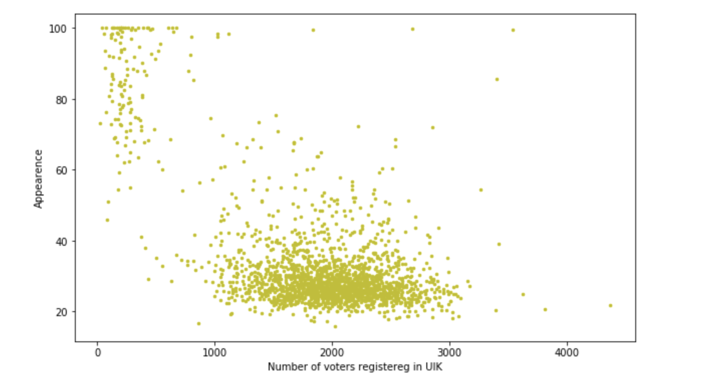
The constructions are quite tolerable, but during the course of the work it turned out that on the average 400 people and a percentage for Beglov from 50 to 70, but there are two sections with a turnout> 1200 people and a percentage of 90 + -0.2. It is interesting that this happened in these areas. Did some fantastic agitators work? Or just drove 10 people buses and forced to vote? One way or another, we are excited, a small such investigation is being obtained. But we still have to draw cards. Let's continue.
Visual representation and work with geopandas
### Extra data for visualization: appearence and number of voters by municipal districts current_UIK = pd.read_html(url, encoding='cp1251', header=0)[7] num_of_voters_dist = [] num_of_voters_voted_dist = [] appearence_dist = [] for j in [num_of_voters_dist, num_of_voters_voted_dist, appearence_dist]: j.extend(0 for i in range (18)) districts = { '0' : [1], # '1' : [2], # '2' : [18], # '3' : [16, 30], # '4' : [10, 14, 22], # '5' : [11, 17], # '6' : [4, 25], # '7' : [5, 24], # '8' : [23, 29], # '9' : [9, 12, 28], # '10' : [13], # '11' : [15], # '12' : [21], # '13' : [20], # '14' : [19, 27], # '15' : [3, 7], # '16' : [6, 26], # '17' : [8] # } for i in districts.keys(): for k in range (1, 31): if k in districts[i]: num_of_voters_dist[int(i)]= num_of_voters_dist[int(i)] + int(current_UIK.iloc[0,k-1]) num_of_voters_voted_dist[int(i)] = num_of_voters_voted_dist[int(i)] + int(current_UIK.iloc[2,k-1]) + int(current_UIK.iloc[3,k-1]) for i in range (18): appearence_dist[i] = round(num_of_voters_voted_dist[i]/num_of_voters_dist[i]*100, 2)
### GeoDataFrame SPb_shapes= gpd.read_file('./shapes/Administrative_Discrits.shp', encoding='cp1251') temp = pd.DataFrame({' ': num_of_voters_dist, '':appearence_dist }) temp[''] = SPb_shapes[['']] temp['geometry'] = SPb_shapes[['geometry']] SPB_elections_visualization = gpd.GeoDataFrame(temp)
### Colored districts SPB_elections_visualization.plot(column = '', linewidth=0, cmap='plasma', legend=True, figsize=[15,15])
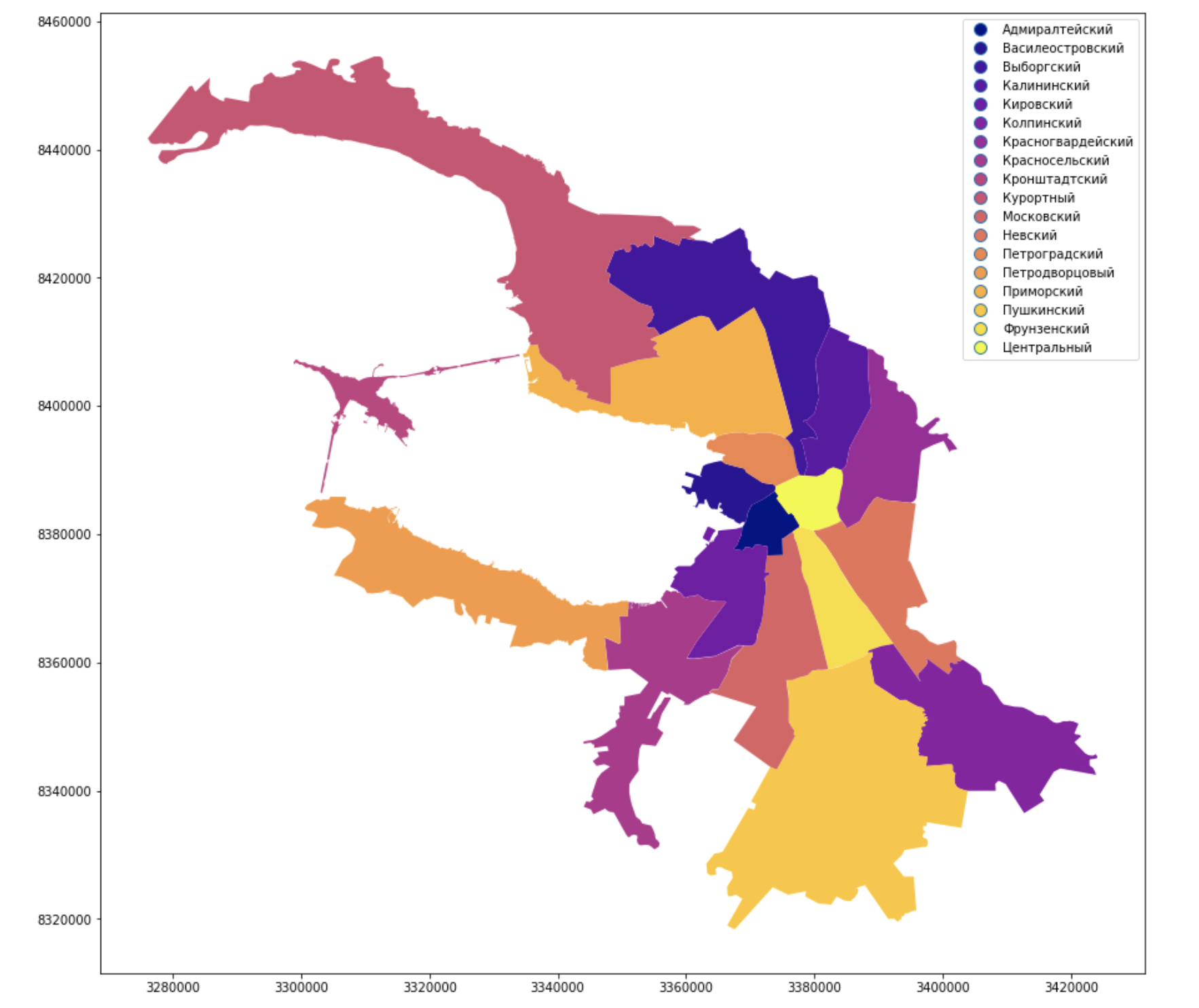
They painted the administrative districts of the city and signed them, it looks familiar, it looks like Peter, but the Neva is still missing.
Number of voters
### Number of voters gradient SPB_elections_visualization.plot(column = ' ', linewidth=0, cmap='plasma', legend=True, figsize=[15,15])

Turnout
### Appearence gradient SPB_elections_visualization.plot(column = '', linewidth=0, cmap='plasma', legend=True, figsize=[15,15])

Conclusion
You can have fun with the data for a long time, use it in different fields and, of course, get some benefit, for this they exist. Simple and sophisticated geolocation visualization tools can do great things. Write about your success in comments!