CSS allows you to create dynamic layouts and interfaces on the Internet, but as a markup language it is static - you cannot change it after setting the value. The idea of chance is not discussed. The generation of random numbers at runtime is JavaScript territory, not CSS.
Or not? If we allow for a little user interaction, we can actually generate some degree of randomness in CSS. Let's take a look!
Randomness in other languages
There are ways to get some “dynamic randomization” using CSS variables, as Robin Rendle explains in an article on CSS tricks . But these solutions are not 100% CSS, as they require JavaScript to update the CSS variable with a new random value.
We can use preprocessors such as Sass or Less to generate random values, but as soon as the CSS code is compiled and exported, the values are fixed and randomness is lost.
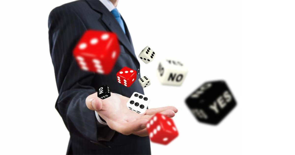
Why am I concerned about random values in CSS?
In the past, I developed simple CSS-only applications such as Quiz , CS Simon's game , and Magic Trick , but I wanted to do something more complex.
* I will leave a discussion of the validity, usefulness, or practicality of creating these snippets in CSS only at a later time.
Based on the fact that some board games can be represented as state machines (FSM), then they can be represented using HTML and CSS.
Therefore, I began to develop the game "Leela" (it is also "Snakes and Ladders").
This is a simple game. In short, the goal of the game is to advance the chip from the beginning to the end of the board, avoiding snakes and trying to climb the stairs.
The project seemed feasible, but I missed something, yeah sure - dice!
Throwing dice (in other games, throwing coins) are generally accepted methods for obtaining random values. You roll dice or toss a coin, and each time you get an unknown value. Everything seems simple.
Simulation of a random throw of bones
I was going to overlay layers with labels and use CSS animation to “rotate” and share what layer was on top. Something like that:

The code to simulate this randomization is not too complicated and can be achieved using animation and various animation delays:
/* z-index - */ @keyframes changeOrder { from { z-index: 6; } to { z-index: 1; } } /* */ label { animation: changeOrder 3s infinite linear; background: #ddd; cursor: pointer; display: block; left: 1rem; padding: 1rem; position: absolute; top: 1rem; user-select: none; } /* , */ label:nth-of-type(1) { animation-delay: -0.0s; } label:nth-of-type(2) { animation-delay: -0.5s; } label:nth-of-type(3) { animation-delay: -1.0s; } label:nth-of-type(4) { animation-delay: -1.5s; } label:nth-of-type(5) { animation-delay: -2.0s; } label:nth-of-type(6) { animation-delay: -2.5s; }
The animation was slowed down to simplify the interaction (but still fast enough to see the obstacle explained below). Pseudo-randomness is also clearer.
<label for="d1">Click here to roll the dice</label> <label for="d2">Click here to roll the dice</label> <label for="d3">Click here to roll the dice</label> <label for="d4">Click here to roll the dice</label> <label for="d5">Click here to roll the dice</label> <label for="d6">Click here to roll the dice</label> <div> <input type="radio" id="d1" name="dice"> <input type="radio" id="d2" name="dice"> <input type="radio" id="d3" name="dice"> <input type="radio" id="d4" name="dice"> <input type="radio" id="d5" name="dice"> <input type="radio" id="d6" name="dice"> <p>You got a: <span id="random-value"></span></p> </div>
@keyframes changeOrder { from { z-index: 6;} to { z-index: 1; } } label { animation: changeOrder 3s infinite linear; background: #ddd; cursor: pointer; display: block; left: 1rem; padding: 1rem; position: absolute; top: 1rem; user-select: none; } label:nth-of-type(1) { animation-delay: 0s; } label:nth-of-type(2) { animation-delay: -0.5s; } label:nth-of-type(3) { animation-delay: -1.0s; } label:nth-of-type(4) { animation-delay: -1.5s; } label:nth-of-type(5) { animation-delay: -2.0s; } label:nth-of-type(6) { animation-delay: -2.5s; } div { left: 1rem; position: absolute; top: 5rem; width: 100%; } #d1:checked ~ p span::before { content: "1"; } #d2:checked ~ p span::before { content: "2"; } #d3:checked ~ p span::before { content: "3"; } #d4:checked ~ p span::before { content: "4"; } #d5:checked ~ p span::before { content: "5"; } #d6:checked ~ p span::before { content: "6"; }
But then I came across a certain limitation. I got random numbers, but sometimes, even when I clicked on “dice”, the field did not return any value.
I tried to increase the animation time, and it seemed to help a little, but I still had some unexpected values.
It was then that I did what most developers do when they find obstacles that they cannot solve - I popped up for help on StackOverflow. I recommend.
Fortunately for me, there will always be people willing to help, in my case it was Temani Afif with his explanation .
If you try to simplify, the problem was that the browser fires a click event only when the element is in the active state (when the mouse is clicked), in other words, it is the same element that is active when the mouse button is pressed.
Due to the changing animation, the top layer (label) when the mouse was pressed, in fact, was not that top layer (label) when the mouse was pressed, unless I did it fast enough, well, or slowly, so that the animation is already managed to go through all the values of the cycle. This is why the increase in animation time has hidden this problem.
The solution was to apply the “static” position to break the stack context, and use a pseudo-element such as :: before or :: after with a higher z-index to take its place. Thus, the active label will always be on top when you mouse over.
/* label */ label:active { margin-left: 200%; position: static; } /* z-index */ label:active::before { content: ""; position: absolute; top: 0; right: 0; left: 0; bottom: 0; z-index: 10; }
Here is the code with a solution with faster animation time:
After making this change, it remains to create a small interface for drawing pseudo cubes that can be clicked with the mouse, and the CSS game Snakes and Ladders has been completed.
This technique has some obvious disadvantages.
- Interaction with the user is required - it is necessary to click a label to cause "generation of random numbers".
- The method does not scale well - it works great with small sets of values, but it is a pain for large ranges.
- This is not a real Random, but still a pseudo randomness, and the computer can easily determine what value will be generated at each moment.
But on the other hand, it is 100% CSS (there is no need for preprocessors or other external helpers), and for a person it can look 100% random.
And, yes, this method can be used not only for random numbers, but also for random everything. In this case, we used it to “randomly” select a computer in the game “Rock-Paper-Scissors”.