In this article, we will try to study the general standard of modality in user interfaces, and discuss the reason why there are only two main types of screens, and also to analyze how applications and websites fail when converting information architectures and user flows to intuitive user interfaces .
We begin this study with the following bold statement:
There are two types of screens:
- Modal screens
- Modeless screens
Now let me explain this statement. Almost every screen that we can imagine falls into one of these two categories. To understand the difference between a modal screen and a modeless screen, we first need to move on to defining the concept of a modal screen.
What is a modal screen?
Modal screens can be found in its various forms and representations, for example, one of the following listed:
- Full Screen Modal Views
- Popup windows
- Pop ups
- Lightboxes
Both modal screens and non-modal screens are child views, that is, they are subordinate to one main application window. However, there is one important difference:
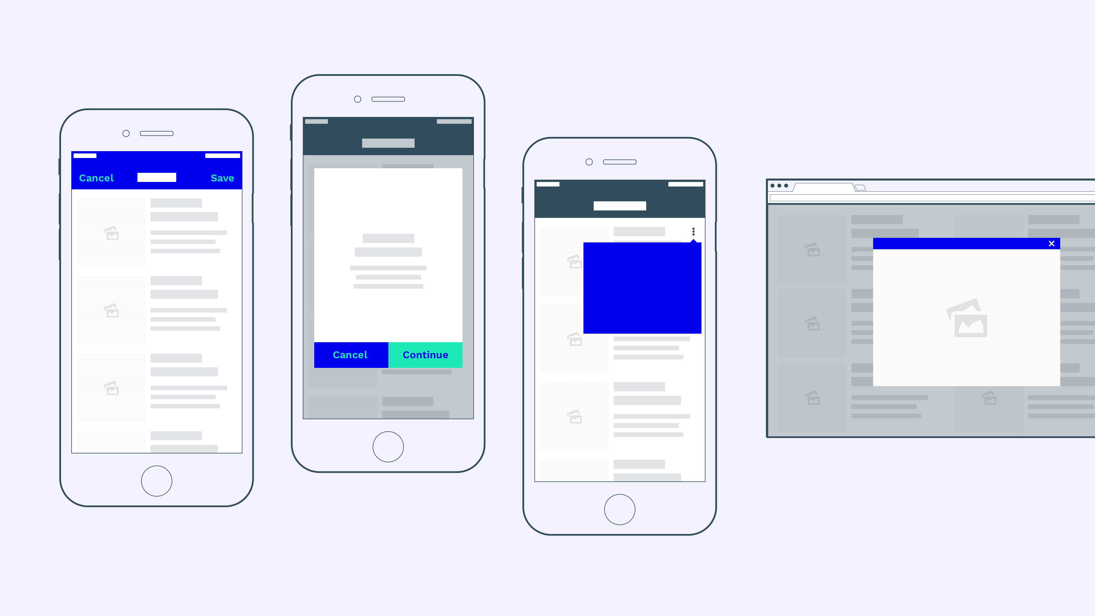
“The modal window creates a mode that disables the main window, but keeps it visible with the modal window as a child window in front of it. Users must interact with the modal window before they can return to the parent application ”- WikipediaMost modal windows, especially in desktop applications, can be easily identified because they visually overlap the main window. This is true for pop-ups that disappear from the main window in the background, pop-up menus and dialogs, pop-up lightboxes, alerts, etc.
However, the use of the modal window on mobile devices is limited, since many modal screens on mobile devices occupy the entire screen of the device. They no longer keep the main window visible to the user, and therefore more difficult to distinguish from modeless windows :
IOS example: modal windows on mobile devices often completely hide the main application window.
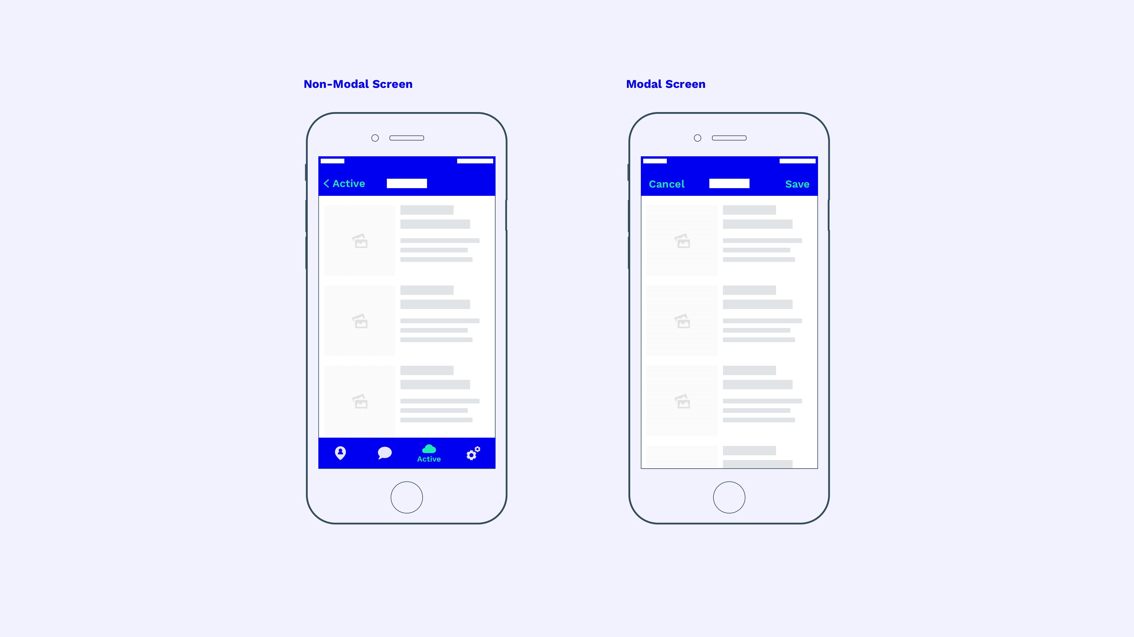
The main difference is the way you interact with each of the windows. While a modeless screen allows users to return to the parent screen, the modal screen requires users to complete a certain action before returning to the main window (such as clicking the “Save” button in our example) or undo the current action that caused the modal window.
The most striking visual indicator for modeless windows is navigation (the tab bar in our example). Modeless screens allow users to jump back and forth at the main level of application navigation.
The modal screen, however, requires users to close the window before they can again use the main navigation of the application (the “Save” or “Cancel” buttons in our example).
Why should you use modality?
Modal screens solve a simple problem. And it consists in the following - users are easily distracted, so sometimes you have to draw their full attention to a specific block of information ( source ). The modal screen does just that - it requires people to focus on one task before continuing to work in the main application thread.
“Modality creates focus by preventing people from doing other things before they complete the task or reject the view called up in the modal window.” - Apple
When should modality be used?
Now that we know what a modal screen looks like. How to compare it with a modeless screen and what is its purpose? First of all, we must ask ourselves: “In what situation should we use it?”
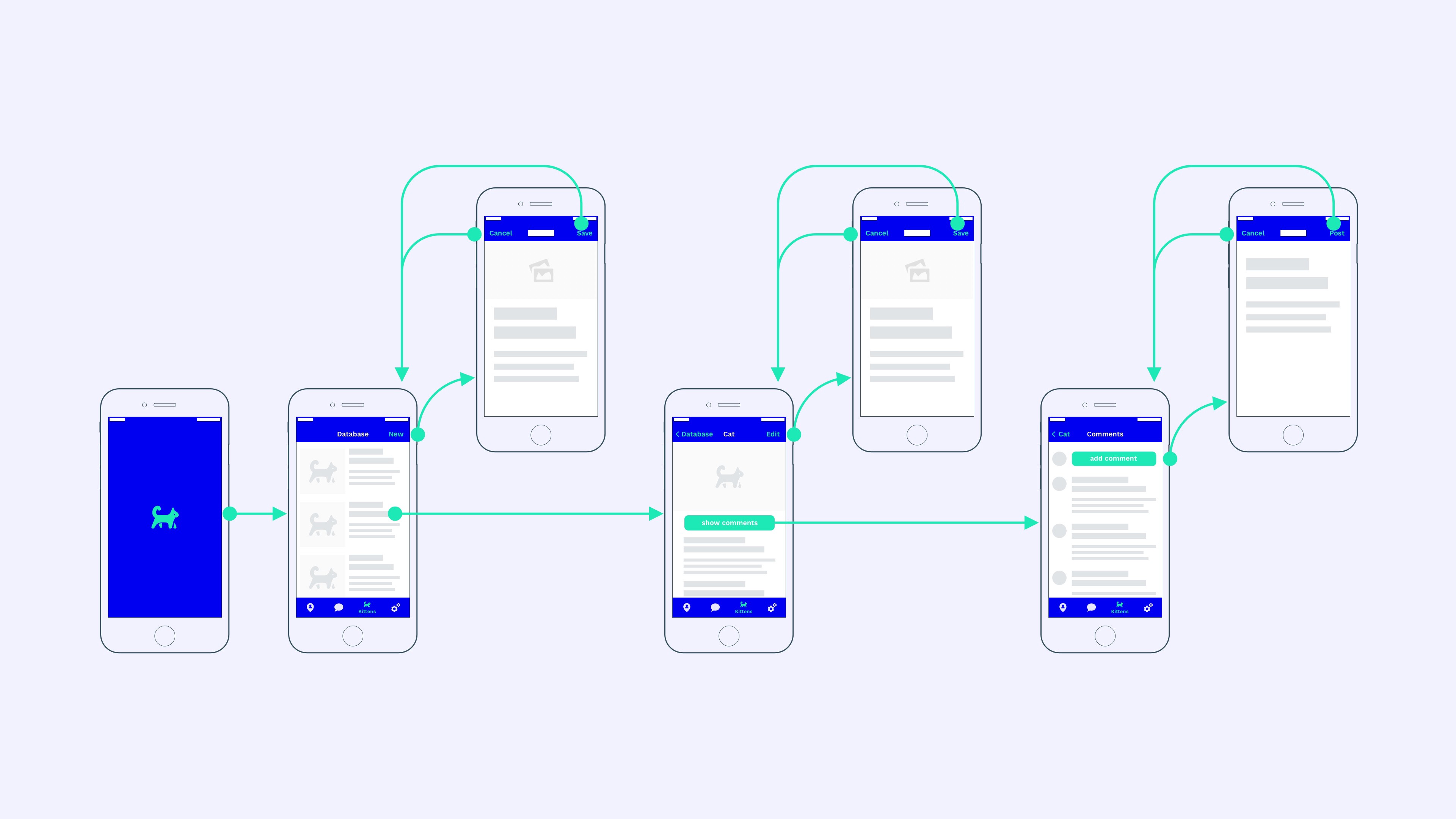
Let's imagine that we are creating a “brilliant and innovative” startup called “Purrrfect”. This is a kittens database that allows users to upload, view, and comment on GIFs of cute kittens.

The simplified user flow of our application may look like this: the user opens the application and enters one of several available tabs (our kittens database), then clicks on one of the kittens (enters a detailed view of one kitten) and then clicks on the comments section ( included in the comments section of the kitten).
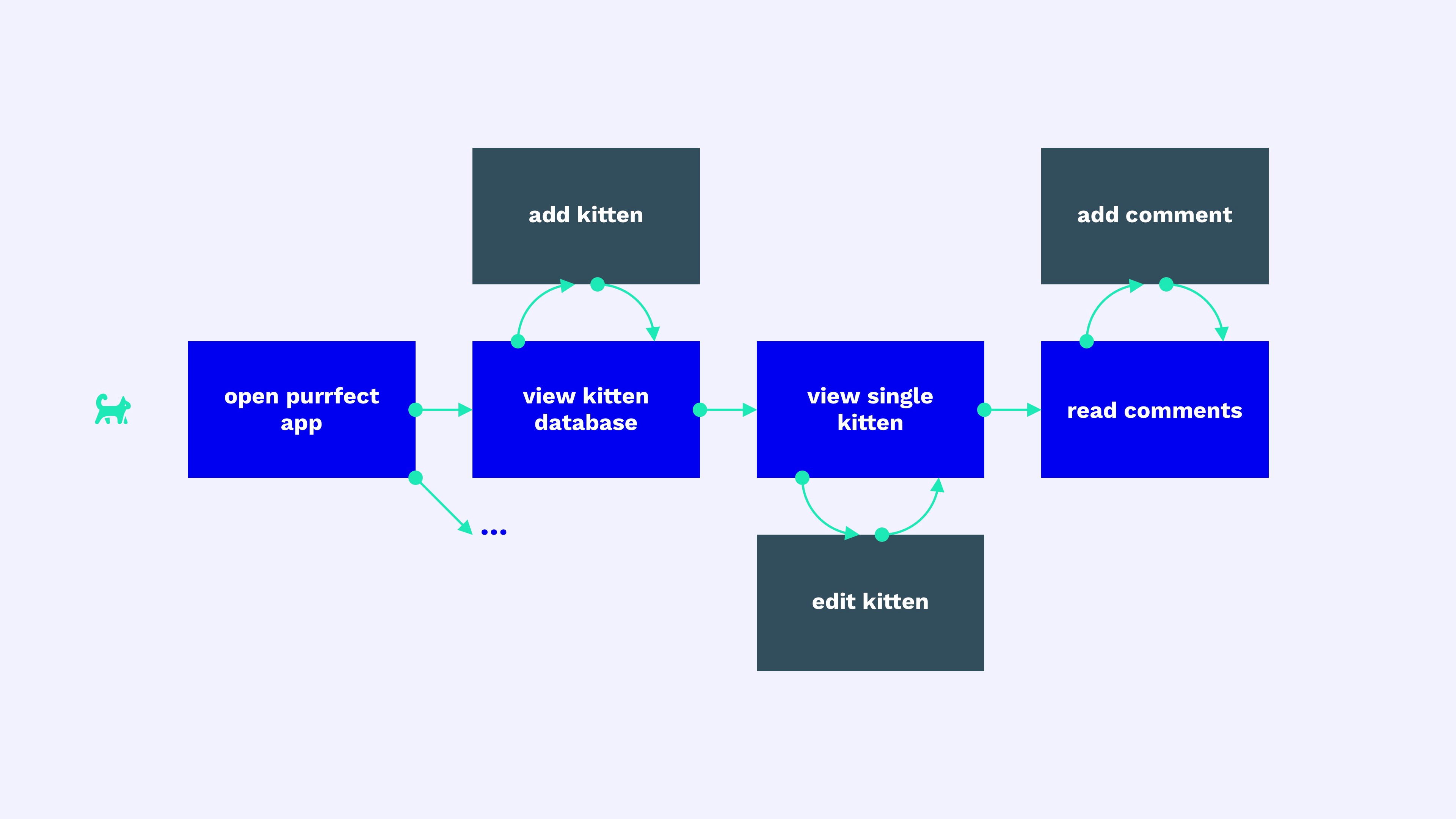
Purrrfect Application User Stream
In addition, the user can perform additional actions at each stage. For example, he can add another kitten to the database on the kittens list screen. Or he can edit the data on the kitten details screen.
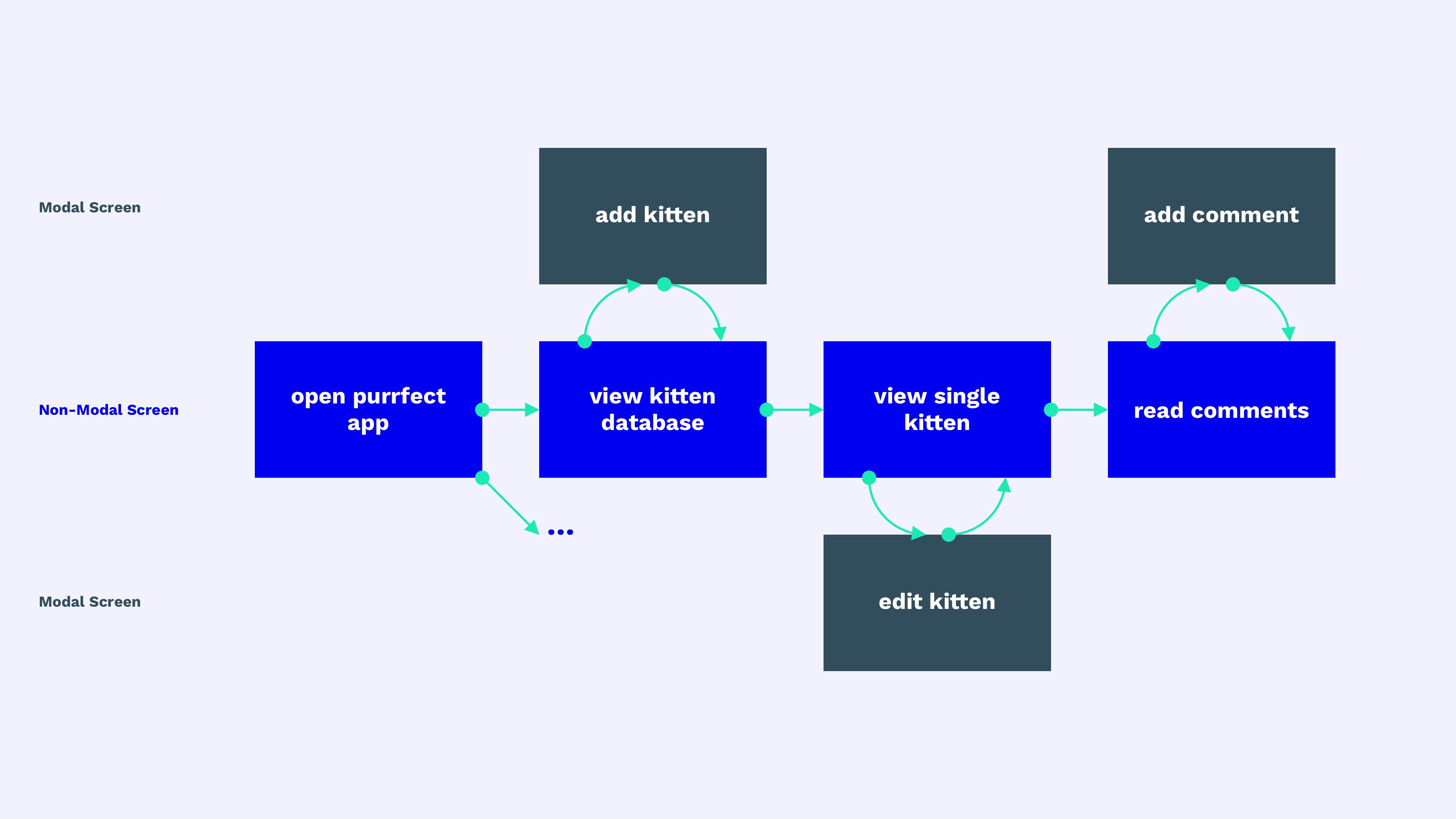
Now you need to understand which of these screens is modal and which is not? Classification in this case is difficult, but here is my personal rule of thumb:
Use modal screens for stand-alone processes, and non-modal screens for everything else.An “autonomous process” is a specific action that has a clear start and end point in the process.
For a limited period of time of this action, he removes the user from the user's general flow, allowing him to concentrate on the action and then returns him to the point in the flow where he started this action.
Google formulates this rule as follows:
Use modal screens (dialogs) to display “critical information that requires a specific user task, its solution or confirmation” - Google
In the case of our Purrrfect application, this means that the main user stream (used to examine the application) is not modal. However, special time-limited actions, such as adding kittens, editing kittens, and writing comments, are modal.
All modal actions can be canceled or successfully completed before the user returns to the main stream. For this reason, modal screens use the Cancel and Save buttons (or other similar confirmation actions) instead of the Back button. If your “Back” button simultaneously launches the save action on a modeless screen, you can consider switching to the modal screen by adding the “Cancel” and “Save” buttons.
However, the following statement is also true: if two different actions, such as Cancel and Save, do not make sense on your modal screen (because they will cause the same action), you can switch to a modeless view. In this case, the main navigation (for example, the tab bar) should also remain visible on the screen.
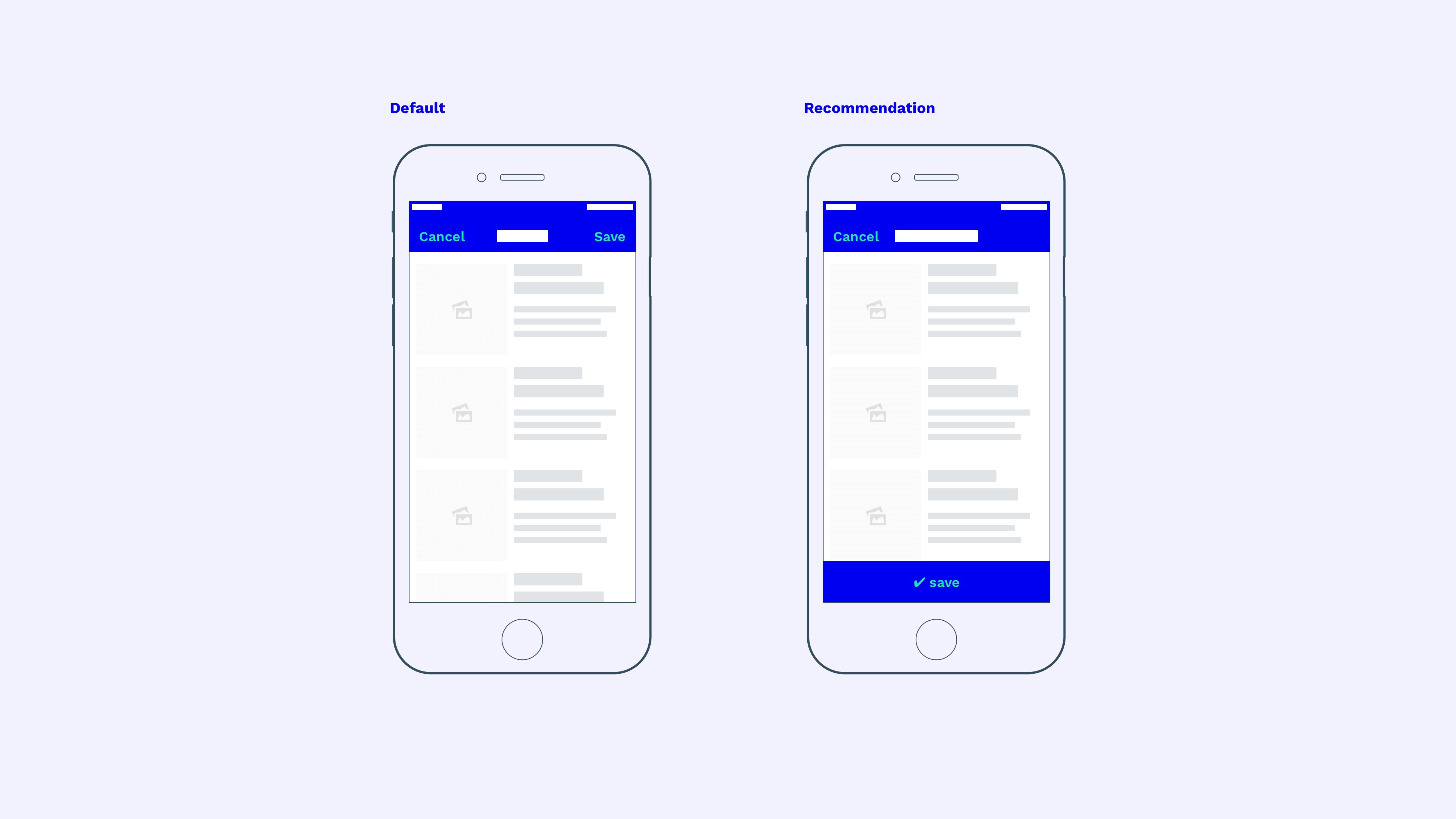
Let's get back to our application. A possible interface for Purrrfect might look like this:
Purrrfect User Interface
In the real world, the distinction between modal and non-modal screens is often less obvious. For example, the full-screen view of the image is modal in most applications, although this is not a process or dialogue. A modal screen may also make sense in other special situations when you need to generate user focus on a specific block of information. If our kitten’s detailed screen (in the center) was the end point without other actions, such as editing or comments, we could use modality (full-screen viewing). But since it allows users to go deeper through the information architecture and perform various additional actions (show comments, edit, etc.), it no longer has a clear endpoint, and therefore it is part of the main stream. Therefore, this is a modeless representation.
The developer must evaluate whether the action is autonomous or part of the overall process of the application flow, and decide whether to make the screen modal or not. If in doubt, recall this quote:
Minimize the use of modality. As a rule, people prefer to interact with applications in non-linear ways. Consider creating a modal context only when it’s important to get someone’s attention, when the task needs to be completed or stopped in order to continue using the application or to save important data. - Apple
Of course, an interface can work just fine without a strict distinction between modal and non-modal representations. However, the concept of modality is deeply embedded in the interface ecosystems of Apple, Google, Microsoft and other companies that have developed the appropriate expectations for their regular users.
How should modality be used?
By now, I hope that there is a common understanding of when to use modality. Only one question remains: "How do we design a modality?" Here is a quick checklist for using modal screens:
- Always show the close / hide button of the modal window (or “cancel”, “cancel”, “minimize”) in the top navigation bar. When the user is lost, he can easily close such a window and return to the application level from where the modal window was called.
- The cancel buttons on iOS and Android are most often located in the upper left of the navigation bar. Android prefers the “X” close icon, while iOS prefers the “Cancel” button. However, icon buttons are also quite common in iOS.
- Confirmation buttons on the modal window in iOS and Android are by default located in the upper right part of the navigation panel. However, this placement may not be available to the user on devices with a large diagonal. Therefore, a fixed floating location at the bottom of the screen or at the end of the page can be a good alternative solution.
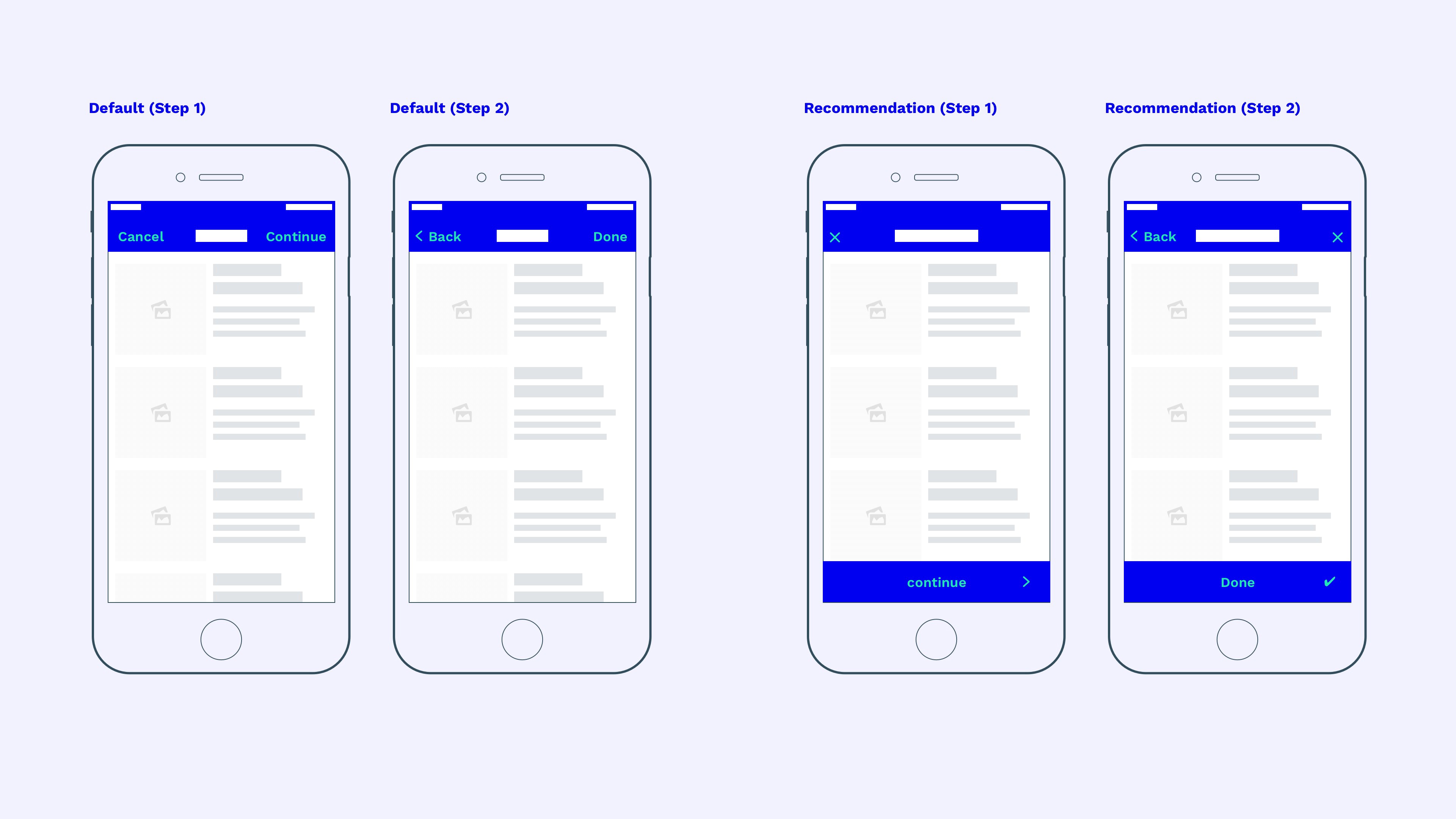
Multistage modal windows
Things get more complicated as soon as the modal dialog box consists of several steps or child screens. By default, the continue button is displayed in the upper right corner. The screen of the second step will not open a new modal screen, but instead remains inside the first modal screen and is displayed as a modeless child screen (since it cannot be canceled) of the existing modal overlay as the first step of the modal window.
When placing the main action (“save”, “apply” or “continue”) in the lower part of the screen (as recommended earlier) in the upper right area of the second step of the modal block, the space for an additional cancel button is always freed up. Although moving seems more logical from left to right, this placement is still better for a modal window than the inability to close the modal screen on child (previous) screens.
Conclusion
Many designers develop products based on their feelings. And sometimes intuition is more important than the norm, because this is often the essence of creativity. However, it makes sense to know the general standards of modality, so that at the right time to adjust them to the main user stream in the application.