To date, a sufficient number of web developers and designers are still not fully aware that ignoring or misusing microinteractions in design can cost their customers very much. Attention to detail is what distinguishes an exceptional site from the average. That's why micro-interactions pump the overall design.

What is microinteraction?
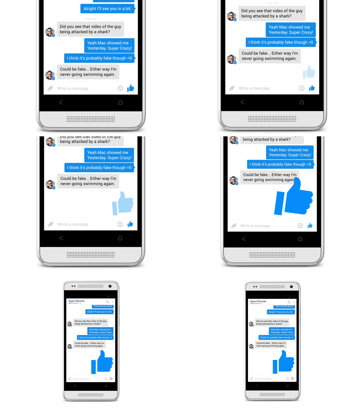
Microinteractions in design are found in almost all applications on your smartphone or computer. Their main task is to make the user experience with your application enjoyable and create a sense of joy, attractiveness and, of course, the “humanity” of the design. Take a look at the interaction below.

This microinteraction is a good example because it has three important functions:
- Reporting the status of the process and providing feedback to the user.
- Enhancing the feeling of direct user exposure to the application.
- Assistance in understanding by the user the result of their actions with the application.
Components of microinteractions
Any microinteraction has four components:
- Triggers Initiate microinteraction. Triggers can be initiated by the user or the system. In a user-initiated trigger, the user must initiate an action with a specific action. In a system-initiated trigger, the software detects that certain steps in qualifying the action are satisfied, and then the system initiates the action.
- Rules. Determine what happens when microinteraction is triggered.
- Feedback. Allows users to find out what is happening. Everything that the user sees, hears or feels during microinteraction is feedback.
- Modes. The meta-rules for microinteraction are determined. What happens to microinteraction when conditions change?
Why are microinteractions so important?
If microinteractions are almost the smallest design elements, why bother with them at all?
The fact is that microinteractions perform the following useful functions:
- Improve application navigation
- simplify user interaction with your application;
- they provide instant and relevant feedback on the performed action to the user;
- allow informative advice to the user;
- transmit information about the status of certain elements, for example, whether they are interactive or not;
- make the user experience much more useful;
- increase the likelihood of a positive user mood when working with application content;
- Concentrate users on the right block of information;
- and finally make your website or application more emotional.
Well-designed and engineered microinteractions are a clear sign of user care. The user receives information about what he needs to do and whether his action was correct and approved by the system - the application or website provides immediate visual feedback and teaches the user to work correctly with the system.
When microinteractions are done right, they can give positive feedback about your brand and influence user actions, often without even realizing why. If you like or dislike one aspect of the product, you have a positive or negative predisposition to the product as a whole. This so-called halo effect ( cognitive distortion, the result of the influence of the general impression of something (phenomenon, person, thing) on the perception of its particular features ), which can play both for and against you. In the right hands, this knowledge can help improve user feedback, because by giving proper attention to the details, you can leave your users happy.
In the UI / UX world, microinteractions are touted as an energy source when it comes to communicating with the user.
Examples of using
Swipe
A swipe gesture often replaces a familiar tap and is also an interactive and smooth visual element. This helps the user quickly switch between tabs with the corresponding information sections and get more information about the product. In addition, swipe is a very common gesture and directs users to move around the application subconsciously.

Data input
We all know the occasional problems with setting up a password or creating an account. In the process, you can easily and easily lose your temper. Despite the fact that warning messages and rules or recommendations on the reliability and use of a password simplify further actions for the user, some interactive interactions during data entry also help users get involved in the process and allow them to more quickly and easily achieve their goals.

Animation
Microinteractions make the animation look better, embodying a good design. Their presence may not be noticed, but the absence is accurate. They allow designers to make simple processes interesting and exciting. But you should be very careful, as they are more likely to attract users, and not to distract; the delay in processing microinteractions or the introduction of a new style on the site can lead to confusion.

Current system status
It is important to inform the user about the current status of the process occurring on the site or in the application. If users are not informed about the current status of the process, it is likely that they will be annoyed and close the application. Micro-interactions allow the user to know exactly what is happening, how long it will take to complete the process, etc. Even error messages can be executed in a relaxed, but effective enough style so that you can maintain user confidence.

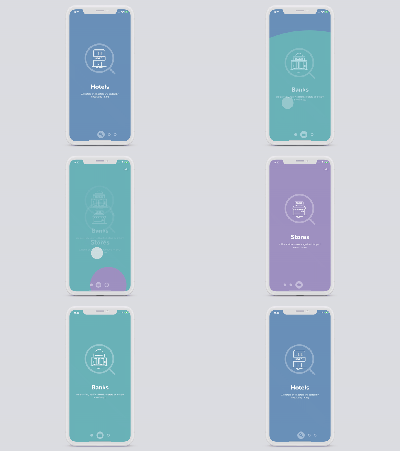
Training and onboarding
Make app training and onboarding interesting. All users are constantly looking for information. Programs in which the tutorial is implemented using microinteractions help users to work with the application, simplifying and highlighting the main functions and important controls to facilitate understanding.

Call to action
Microinteractions push the user to the direct interaction of the user with the application or website. A call to action instills a sense of achievement, as well as an empathy factor in user behavior, and the best way to get your user to interact with a call to action is to attract the user's interest through appropriate microinteraction.

Animated Buttons
In this context, microinteractions play the role of an information manager, letting the user know how it passes through your application or site. Be sure to pay attention to color, shape, animation, layout and texture so that the user experience looks unified and integral.

All people are often looking for instant gratification, and the general tendency is to ignore microinteractions in a wider context when we talk about design, but it’s worth noting, however, that they are very important in order to attract the attention of users. As the saying goes, the devil is in the details. Small features and design features, such as switching between screens or isolating a function, the appearance of a new notification, can be of great importance for improving the interaction of the application with the user.
How to design micro-interactions?
Creating micro-interactions is an interesting and creative activity for the designer, because here you can safely experiment with new design solutions and look for new ways to surprise users. But at the same time, you, as a designer of microinteractions, should keep several things in mind at once:
- Put yourself in the place of users and use everything you need to figure out how they use your application and where microinteractions can be useful.
- Create functional animations. that is, those animations that not only look beautiful, but are also able to improve the user experience by solving a specific problem.
- Entertain your users. The user's feelings when he uses your application are the reason that he continues to use it. If the user enjoys the experience and finds it enjoyable, he will return to it again.
- Do not bother. Excessive animations and microinteractions have the opposite effect. In this case, users will be annoyed and will try to stay away from your application.
- Use human language, not technical. An amusing microinteraction entering the user's position and mitigating the negative effect can for a moment forget about how frustrating the user is a blank page in the application in case of an error.