Space organization is the key to a solid and beautiful design. Spatial systems, layout grids and layouts actually provide rules that give your projects a constant rhythm, limit the adoption of unnecessary decisions and help teams stay on the same level of understanding of project design. These fundamental concepts are a must for all design systems. In this guide, we will go through the basics of defining basic spatial units, creating relationship rules using grids, and combining them to create modern user interface layouts.

What is a spatial system?
Designers make spatial decisions daily, ranging from determining the height of a button or the area around an icon. A spatial system is a set of rules for measuring the parameters and space of your elements in the user interface. Uniformity at the spatial level allows your product to be more consistent and allows you to better communicate within your team, reducing the number of decisions that designers must make throughout the day. One example of a spatial system is the 8pt grid. However, there are many options and configurations from which you can always choose.
The picture below shows how the login form looks when a spatial template is not applied to it. For users, design may seem “cheap,” inconsistent, and generally unreliable. While the predictability of rhythm is visually pleasing, that’s what you expect from trusted brands.
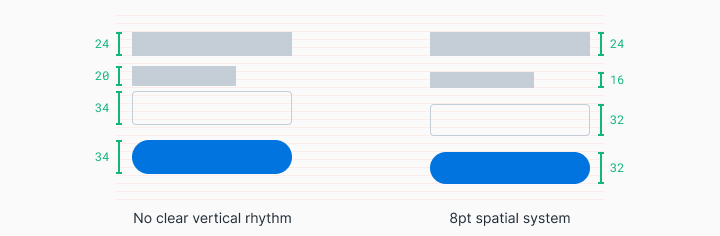
When this form of login is configured in accordance with the 8pt spatial system, the rhythm becomes predictable and visually pleasing. For users, this behavior is predictable. This increases brand confidence and affection.
Regardless of who works on the design, there is always a constant spatial language, and the number of choices you can make is greatly reduced. You can easily determine what another designer has stopped at, or work comfortably with him in parallel. Since these solutions are also displayed in the source code, time is also saved for developers.
How to start working with a spatial system?
It is worth starting with the definition of the base unit - this will allow you to create a scale of the supported sizes in your spatial system. When browsing various products on the Internet, you will see several different approaches to this. You may come across systems like 4pt, 5pt, 6pt, 8pt, 10pt. There is no wrong choice until you figure out what each of these systems contributes to or what solutions it prevents.
My preferred method is an 8pt linear scale for elements with a 4pt half-step for interval icons or small text blocks. I prefer the 4pt base grid for my typography, which means that the line height of my font selection will always be divided by 4. This system is designed to reduce confusion, and is also easy to implement.

When creating your own spatial system, think about the following things:
1. User needs
Think about the users of your design and the general aesthetics of the brand you are striving for. Do you want a spacious user interface with large font styles and a limited number of actions? Do you need to create information density using complex data tables and many actions for the technical user? Examine your existing projects and create mudboards (a set of images, materials, text fragments, designed to evoke or design a specific style or concept) to bring clarity and coherence to the actions of your team.
2. The number of variables
Choosing a smaller base unit, such as 4pt, 5pt, or 6pt, can create too many variables on your system. As a result, it will become increasingly difficult to observe the difference between 12pt and 16pt, which may complicate the consistency in the team's actions. I find that an increment of 8pt is the right balance for visual distance with a reasonable number of variables. In addition, a half-unit of 4 dots is used to place icons or customize small text blocks.
3. Odd numbers
Introducing odd numbers, such as 5pt, into spatial rules can make it difficult to center elements without pixel separation. For example, centering text and icons in a button 25 pixels high can create blurry pixels on screens for some users. Similarly, scaling the user interface for different mobile and desktop screens that require a 1.5x zoom will also result in blurry pixels.
How to apply a spatial system?
Applying spatial scale to user interface elements can take the form of indentation, margins, heights, and widths. Below you will see examples that show that sometimes your indentation cannot be applied at the same time with a clearly defined height.
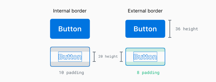
In this example, you can see that the line height of this text is 20px, but if I used 8px indents above and below, the button will have a height of 36px. In which case, what measurement should be given priority? There are two ways to solve this problem:
1. Priority Element (strict definition of the size of the element)
With this approach, the size of the elements takes precedence when comparing with a given spatial system. This includes things like buttons and form input. These elements are likely to have predictable content and are key to creating rhythm in the overall composition.
2. Priority Content (strict internal filling)
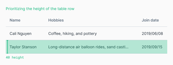
When the content is less predictable, and we care about its display, it is worth applying strict internal indents and setting the sizes of elements depending on their content. The dimensions of these elements may still comply with the rules of your spatial system, but this is secondary to the space around the content. This is useful for tables with an undefined amount of user content.

You can always change the code endlessly to the “perfect pixel”, but at the same time you can sacrifice simplicity and extensibility if you do not agree with the team for the implementation of the plan.
What is a layout system?
Spatial systems determine the rules for determining sizes and intervals, while a layout system helps to structure your content structurally. Early print designers used grids to organize text blocks and images into pleasing visual hierarchies that contributed to readability for the user. As design progresses, the same basic principles apply to the two-dimensional organization of visual information.
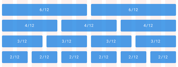
Column Based Layout System
Such a layout system helps you organize content into evenly spaced vertical columns. The space between the columns is called the “gutter size”. Applying the rules of your spatial system to these “gutters” will help give your project a consistent rhythm. A typical example is a grid of 12 columns, because it allows you to divide this area into 2, 3, 4 or 6 parts.
Modular layout system
The modular layout system considers columns and rows to organize content into a matrix structure. Modular grids are ideal for a strict format such as a book, but may not work when using responsive web layout. Keep in mind that such a layout system does not have to cover the entire design layout. Modular grids are primarily an organizational tool. You decide where such a grid begins and where it ends in a complete layout.

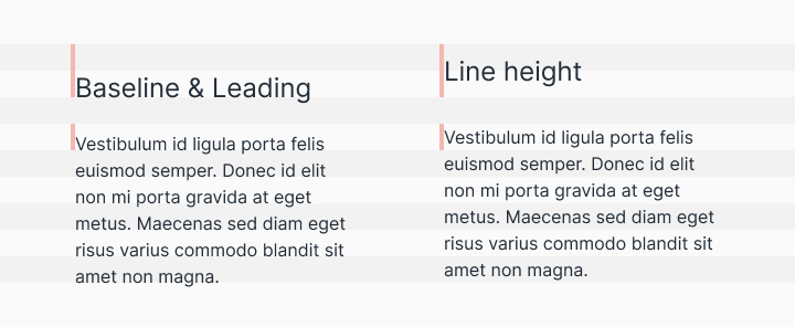
Basic layout system
Traditionally, in graphic design, the basic layout system was used to set the transition from one line of text to another. However, on the Internet we place text in line height instead of the baseline. Although this is a small difference, you should be aware of this when designing for different device platforms. Regardless of how your typography is measured, the same basic principle applies - installing typography on a sequential grid will be easier to organize, while creating a vertical rhythm and leaving a pleasant aesthetic effect.
Layout Creation
Layouts are the culmination and combination of certain spatial rules and the organization of content in one composition. Combining your content into thoughtful structures is the easy part, and the difficult part is to compose everything together with a clear hierarchy in the bottomless ocean of daily changing platforms and screen sizes.
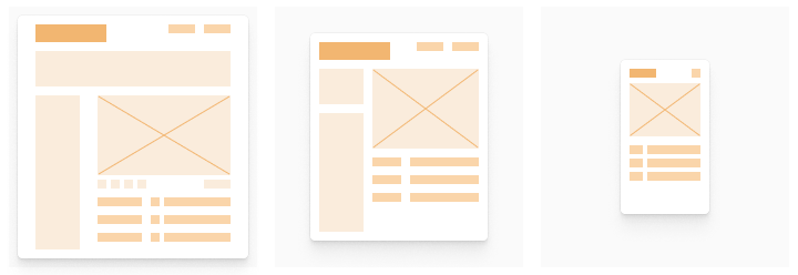
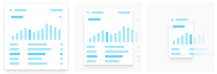
Defining content scaling logic is a must for web applications. Screen sizes and scales can vary from desktop to mobile device. There are three main types when creating a design layout, each of which can scale gracefully in its own way. Some design projects can use all of these concepts at the same time.
Adaptive
The responsive layout changes completely depending on the format in which it is displayed. At the same time, the downloadable interface is adapted for desktop computers, tablets and mobile devices. This provides a more individual approach to the user's device, but the task of rebuilding the same functionality in several formats at the same time can become very expensive and time-consuming.
Responsive
Responsive layout is flexible and can adapt to the changing size of the screen format. This is a common practice on the Internet that has become a necessity for native applications as the screen size increases. This allows you to create a function once and expect it to work on all screen sizes. The disadvantage is that the behavior of touches on touch screens and the behavior of mouse movements are very different, and taking all devices and use cases into account can be expensive.

Strict
Such a layout will not change its size when changing the screen size. Fixed layouts are often used to continue a certain interaction with the information structure, which may be distorted if its size is reduced. On data tables and graphs, they often create a scrollable strict layout with a certain size, because legibility and interactions with such information structures will be significantly impaired if the layout rules described above are applied to them.
How to implement a spatial system on an existing set of design projects
Starting from scratch is easy for any project. The challenge to the challenge is to modernize the existing design.
The first step is to involve all interested parties in this process. Convincing team members and stakeholders to change the current product development process can be difficult, especially if you do not disclose the value of their role in this process. At the same time, developers want more clear requirements and spend less time with fussy designers telling them how and where to reduce indentation. Managers want user and business logic to be provided to end users as quickly as possible. Designers want their projects quickly and effectively translated directly into an understandable and clear user experience. All these things can be achieved by investing the forces of all participants in the process in a single spatial system.
Start small. Rebuilding everything that can fit into a newly defined spatial system may seem like a complicated process. Look for simple components to transform, such as buttons, and then distribute them to more general elements, such as form fields. Set a common understanding vector along with your team along the way. Maintaining order in the design system is the same as grazing cats (note - the task is almost impossible). To simplify the process, empower people, such as developers, who will directly implement, maintain, and implement the design system.
Make informed decisions. Demonstrate to stakeholders how this work will reduce design and technical debt to technology and increase design speed. After completing part of the work, such as organizing a workflow with icons, starting from design and ending with implementation, take a little time to get an idea of the team about the “before and after” moments by interviewing the participants in the process.
Continue in the same spirit. Once you get started, keep in mind the time frame within which you translate the changes into reality. If you are stuck with half of your work adhering to a spatial system, and the other half are in limbo - this is bad practice. Such things make the process of creating new values for your users more difficult. It is worth compiling a roadmap with clear milestones, making the implementation process of this map transparent for the whole team, and remember to share success with each other along this difficult path.