Over the past few months, we have worked closely with the Google Chrome team on this project and are happy to share updated controls that will be available for Microsoft Edge Insider builds or other browsers on Chromium.
More modern look
These changes provide an improved appearance for the controls and help ensure continuous design and usability with the rest of the browser. We work closely with the Google Chrome development team to find a balance between our ideas about design, and not to forget about modern realities. All this will make you feel at home in various browsers on Chromium. The following is a comparison of the default controls in Chromium today, compared to the updated controls we are working on:
| Current | Upcoming | |
| Radio |  |  |
| Check box |  |  |
| Text |  | 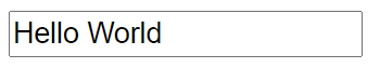 |
| Buttons | 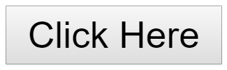 | 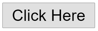 |
| The choice | 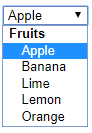 |  |
| Password | 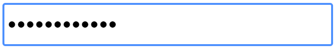 | 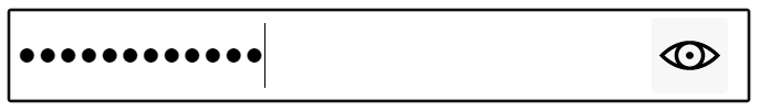 |
| Colour |  | 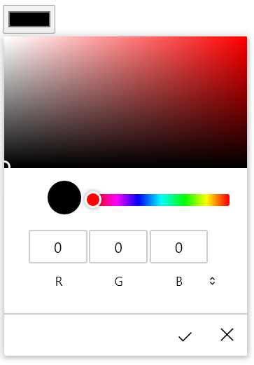 |
| Counter |  | 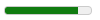 |
| Progress | 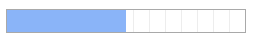 |  |
| Range |  |  |
| date |  | 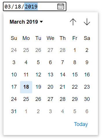 |
| Time | 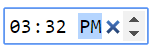 |  |
Enhanced Touch Support
Windows devices have a wide range of form factors and input methods, including traditional desktop and laptop PCs, 2-in-1 devices, and other tablets and pen devices. We heard your feedback on how best to work with touch input in our early Chromium Preview builds, and we intended to take an inventory of the controls to identify opportunities to improve touch interaction.
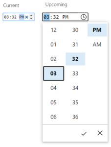
A good example of touch input improvements is time input; Chromium currently provides text input, a clear button, and a spinner. Our research showed that with a large fingertip size, it can be difficult to accurately use small controls that are too close to each other, so the recommended control size of 23 × 23 pixels (13 × 13 DLU) is a good minimum size for an interactive control for any input device. In contrast, rotation controls with a resolution of 15 × 11 pixels are too small to be used effectively when touched.
More accessible controls
Another area that we examined is the focus rectangle that surrounds the control when the user focuses on it. This is an important feature as it allows the user to keep track of where he is, especially when navigating with the keyboard.
Our team identified three different potential focus metrics that matched Microsoft's design language, guaranteed high contrast with any background content, and provided a clean and aesthetically pleasing appearance.
We then conducted interactive user studies to determine the best option compared to the current default Chromium focus rectangle as the base model. We found that although preferences were different, one option was a clear leader in terms of accessibility. We chose this option as the new focus rectangle in Microsoft Edge, which you can see below:

In addition, all these controls now support Windows High Contrast, which allows the user to highlight specific colors to enhance visual perception. All sites that use the built-in controls will benefit from these updated controls whenever the user is in high contrast mode, without any additional action by web developers. However, web developers can adjust these styles if they want, using the new CSS property forced-color-adjust and the prefers-contrast request.
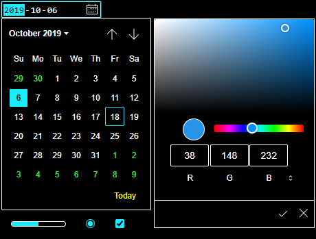
We also updated our implementation to provide excellent keyboard support for each control. For example, in a new color input, you can move one value using the arrow keys; If you hold down the Ctrl key on Windows (Cmd key on Mac), you will move 10 values, which allows you to quickly navigate through the color funnel.
Finally, we updated the mappings for the controls to match the HTML accessibility API mappings specification to provide convenience for users using assistive technologies (such as screen readers).