How we made the new Rosbank website, and what came of it
Hello! I am Vitaliy Mazurevich, Head of Digital Banking for Retail Business Customers at Rosbank. We are starting a big and new business - a corporate blog, so we decided to open it with an article about something big and new - about a site.
Updating the site of a large company is not an easy and quick business. But very important. We recently went this way. And not only passed, but also received very good results. Today I will tell you how we did it and what problems we had to face.
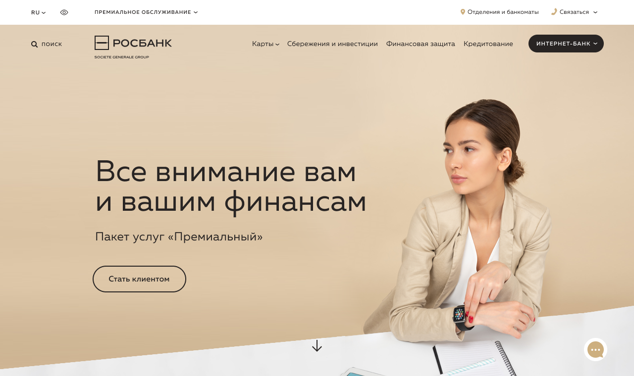
The project to launch a new bank site arose in 2017. The main point was to put the site on digital rails as part of the project on the general digitalization of the bank. And, as the site becomes an entry point in the funnel of attracting customers, it was necessary to make it very “friendly” in terms of user experience.
The site used to be a business card rather than a selling tool. We decided to make its new version more modern, we applied the most advanced technologies from the front-end point of view (ReactJS). On the back, everything is more or less standard: YII 2.
The project lasted a long time. We needed not only to make a full replica of the current site, but also to redesign it so that the portal was modern, fast and selling. We took into account the fact that now the behavior of people on the network is completely changing, and not least this is due to an increase in the share of mobile traffic. At the time the site was launched, it was 48%, literally six months later it grew to 52% and continues to grow. This suggests that the user experience is changing. Firstly, these are other requirements for the interface - it should fit on the screen of a mobile phone. Secondly, the requirements for texts are changing: they should be concise, simple and understandable. And in general, if you are at home, using a computer with stationary Internet, this is one thing, but if you are going on the subway, they push you, but you persistently try to send a loan application - this is a completely different user experience. That is why the mobile first approach was chosen. Almost everyone declares its widespread use, but so far in most cases it does not go beyond talking. And we put this approach at the forefront: starting from the prototypes that we drew only with the permission of mobile phones, and ending with the choice of technologies and architecture on the back so that the site is fast. Speed has become for us the main technological metric, which is now becoming a business metric. We tried to speed up any process and “facilitate” the site as much as possible. Personally, I have such an understanding of design: a good design is not one in which there is nothing more to add, but one from which there is nothing more to remove. I looked at each element and asked myself the question: if we remove it, will everything fall apart? And if he answered negatively, we removed this element.
The moment came when the whole Rosbank began to be transformed, and the site needed to emphasize that we were “ahead of the rest”. We understood that it should not just correspond to trends, but be ahead of them. If you declare that you are cool and outstanding, and you get in the line with everyone else, the question arises: why did you get into it so late?
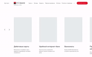
Rosbank is a universal bank and combines many divisions and services for different categories of customers, all information about which is available on one site. The new site design is not only convenient for customers, but also flexible for the bank itself: when new products appear, with the help of the designer you can create a stylish responsive page in a short time, which can then be quickly brought to the site.
In addition to aesthetic and navigational value, we added airiness, focus on typography, which make it possible to stand out among competitors. Flying bank cards is my personal little fetish.
The process took place in two stages: first, we placed a new site via a separate link, and it was available in parallel with the old one. We gave the users a new link selectively, then posted an invitation on the site: “If you want to try a new site, go ahead.” All this time we looked at the performance of the new site: are there usability problems, is it holding the load. And when they realized that everything was fine (this happened on June 5), they rolled out a new website on all the customers on the bank’s domain name.
You need to understand that the main audience of banking sites is new customers, about 75% of them. For older customers, the main route is to go to the Internet bank (the site is used as an entry point) or look at branches and ATMs. For them, the product history is not important, they rarely use the site to see maps and deposits, all this information is in the mobile application and the Internet bank.
New customers solve other problems: quickly understand what kind of product, whether it is interesting to them. And, if interested, arrange.
The site should be as convenient as possible for both.
Now the main scenario for receiving banking products through the site is a callback application. Previously, the form consisted of four fields - name, phone number, region and time of the call. This is a lot. We reduced to one - phone numbers: the region is pulled up by IP-address, the name can be found by the first question, and in the “Call time” field according to statistics, more than 95% of customers indicate “as soon as possible”. As a result, we received a surge in both requests and attracted customers.
At the time of the start of the project, we had practically no design and development competencies inside. We used the services of several contractors, or more precisely, four: one was involved in collecting requirements and creating a high-level concept, the second in design, and two more in development.
At the same time, inside the bank there was a project team to launch the site, as well as the current site support team, which was not engaged in a new one, but continued to support the current portal at that time.
After the launch, we decided to assemble our team and develop internal competencies. Five bets were allocated for this: two backends, two fronts, one designer. Now we are actively recruiting them for the state.
When looking for developers, we emphasize that people understand that they will come to someone else's code. They should have the determination and courage to rewrite everything, and not just say that everything is bad. In my life I have never met a single developer who would come to someone else’s code and say: “Damn, how cool he is, I would not be better off writing myself!” Claims will certainly be, and this is normal.
I always watch how much a person is ready to develop, learn something new, read literature. I ask what books he read, which conferences he attended. In the field of digital, things are changing very quickly. It is important that a person understands current technologies, knows what interesting solutions are on the market.
We have a very responsible work: about 200 domestic customers and only 10 people, taking into account open rates. Therefore, it is important for me that there are inquiring minds in my team. I give them freedom in choosing technology, the result is important to me.
Also, I asked all developers what UX is, and what do they think, does this topic concern developers? I am a staunch supporter of the fact that this is not just a separate competency within a team owned by one, but the rest just saw the code and draw pictures. After all, UX is not only how much the picture catches, but also how quickly the site works, how errors are processed on the site, how well the animation is done. For example, if you make a comparison with a car: not only the dashboard and wheels are important, all the characteristics are important. It happens that you liked the car in everything, but did not like it, for example, the smell in the cabin. And that’s it: User Experience is spoiled. It is very important for me that all team members, and especially the developers (after all, they have always been kept on the sidelines before), understand that they affect the final result no less than designers. It turns out that the developer is responsible for UX, and therefore for business performance. That his metrics can be business metrics, and not just the speed of tasks.
For me, to be honest, the fact that the market for IT professionals is now significantly overheated was an unexpected revelation. An experienced developer is three years of experience. Often, people with experience a year come for interviews and ask for such conditions that we are ready to offer experienced specialists. I am sincerely sure that ambition is great, you cannot go far without them, but it is important to objectively evaluate your capabilities and competencies. Therefore, when forming the team, we decided to make a pair of back- and frontend specialists: an experienced lead developer + young and “hungry”.
I believe that the project to launch a new bank site turned out to be quite successful. There is growth on the site, and very significant. Compared to last year, over the summer we grew by 50% for unique visitors. This is usually not how sites grow. This, of course, has a lot of influential factors (this is brand recognition, and campaigns on TV and on the Internet), but the simplicity and stable operation of the site undoubtedly contributed.
By the way, in terms of reliability, we had a very interesting moment. The site is built on the principle of DR - Disaster Recovery - servers are spaced into two geographically different data centers. If one of them breaks down, the site quickly switches to the second and continues to work there.
Naturally, according to the most immutable of existing laws, Murphy’s law, exactly on the day the new site was launched, a serious failure occurred in one of the data centers. Thus, quite by accident, we conducted a successful security test on the very first day of the new portal, which no one except us and the data center noticed. Which, I believe, gives the right to think that the test was successful.
In the framework of the project, the first task for us was to create a replica of the current site in terms of functionality, but with a reliable platform that can be developed in the future. We succeeded, now we can develop.
Updating the site of a large company is not an easy and quick business. But very important. We recently went this way. And not only passed, but also received very good results. Today I will tell you how we did it and what problems we had to face.
The project to launch a new bank site arose in 2017. The main point was to put the site on digital rails as part of the project on the general digitalization of the bank. And, as the site becomes an entry point in the funnel of attracting customers, it was necessary to make it very “friendly” in terms of user experience.
The site used to be a business card rather than a selling tool. We decided to make its new version more modern, we applied the most advanced technologies from the front-end point of view (ReactJS). On the back, everything is more or less standard: YII 2.
Our approach - mobile first
The project lasted a long time. We needed not only to make a full replica of the current site, but also to redesign it so that the portal was modern, fast and selling. We took into account the fact that now the behavior of people on the network is completely changing, and not least this is due to an increase in the share of mobile traffic. At the time the site was launched, it was 48%, literally six months later it grew to 52% and continues to grow. This suggests that the user experience is changing. Firstly, these are other requirements for the interface - it should fit on the screen of a mobile phone. Secondly, the requirements for texts are changing: they should be concise, simple and understandable. And in general, if you are at home, using a computer with stationary Internet, this is one thing, but if you are going on the subway, they push you, but you persistently try to send a loan application - this is a completely different user experience. That is why the mobile first approach was chosen. Almost everyone declares its widespread use, but so far in most cases it does not go beyond talking. And we put this approach at the forefront: starting from the prototypes that we drew only with the permission of mobile phones, and ending with the choice of technologies and architecture on the back so that the site is fast. Speed has become for us the main technological metric, which is now becoming a business metric. We tried to speed up any process and “facilitate” the site as much as possible. Personally, I have such an understanding of design: a good design is not one in which there is nothing more to add, but one from which there is nothing more to remove. I looked at each element and asked myself the question: if we remove it, will everything fall apart? And if he answered negatively, we removed this element.
Design choice
The moment came when the whole Rosbank began to be transformed, and the site needed to emphasize that we were “ahead of the rest”. We understood that it should not just correspond to trends, but be ahead of them. If you declare that you are cool and outstanding, and you get in the line with everyone else, the question arises: why did you get into it so late?
Rosbank is a universal bank and combines many divisions and services for different categories of customers, all information about which is available on one site. The new site design is not only convenient for customers, but also flexible for the bank itself: when new products appear, with the help of the designer you can create a stylish responsive page in a short time, which can then be quickly brought to the site.
In addition to aesthetic and navigational value, we added airiness, focus on typography, which make it possible to stand out among competitors. Flying bank cards is my personal little fetish.
Rolling out a new site
The process took place in two stages: first, we placed a new site via a separate link, and it was available in parallel with the old one. We gave the users a new link selectively, then posted an invitation on the site: “If you want to try a new site, go ahead.” All this time we looked at the performance of the new site: are there usability problems, is it holding the load. And when they realized that everything was fine (this happened on June 5), they rolled out a new website on all the customers on the bank’s domain name.
New and old bank customers
You need to understand that the main audience of banking sites is new customers, about 75% of them. For older customers, the main route is to go to the Internet bank (the site is used as an entry point) or look at branches and ATMs. For them, the product history is not important, they rarely use the site to see maps and deposits, all this information is in the mobile application and the Internet bank.
New customers solve other problems: quickly understand what kind of product, whether it is interesting to them. And, if interested, arrange.
The site should be as convenient as possible for both.
Now the main scenario for receiving banking products through the site is a callback application. Previously, the form consisted of four fields - name, phone number, region and time of the call. This is a lot. We reduced to one - phone numbers: the region is pulled up by IP-address, the name can be found by the first question, and in the “Call time” field according to statistics, more than 95% of customers indicate “as soon as possible”. As a result, we received a surge in both requests and attracted customers.
Own team or outsourcing?
At the time of the start of the project, we had practically no design and development competencies inside. We used the services of several contractors, or more precisely, four: one was involved in collecting requirements and creating a high-level concept, the second in design, and two more in development.
At the same time, inside the bank there was a project team to launch the site, as well as the current site support team, which was not engaged in a new one, but continued to support the current portal at that time.
After the launch, we decided to assemble our team and develop internal competencies. Five bets were allocated for this: two backends, two fronts, one designer. Now we are actively recruiting them for the state.
Find the perfect developer
When looking for developers, we emphasize that people understand that they will come to someone else's code. They should have the determination and courage to rewrite everything, and not just say that everything is bad. In my life I have never met a single developer who would come to someone else’s code and say: “Damn, how cool he is, I would not be better off writing myself!” Claims will certainly be, and this is normal.
I always watch how much a person is ready to develop, learn something new, read literature. I ask what books he read, which conferences he attended. In the field of digital, things are changing very quickly. It is important that a person understands current technologies, knows what interesting solutions are on the market.
We have a very responsible work: about 200 domestic customers and only 10 people, taking into account open rates. Therefore, it is important for me that there are inquiring minds in my team. I give them freedom in choosing technology, the result is important to me.
Also, I asked all developers what UX is, and what do they think, does this topic concern developers? I am a staunch supporter of the fact that this is not just a separate competency within a team owned by one, but the rest just saw the code and draw pictures. After all, UX is not only how much the picture catches, but also how quickly the site works, how errors are processed on the site, how well the animation is done. For example, if you make a comparison with a car: not only the dashboard and wheels are important, all the characteristics are important. It happens that you liked the car in everything, but did not like it, for example, the smell in the cabin. And that’s it: User Experience is spoiled. It is very important for me that all team members, and especially the developers (after all, they have always been kept on the sidelines before), understand that they affect the final result no less than designers. It turns out that the developer is responsible for UX, and therefore for business performance. That his metrics can be business metrics, and not just the speed of tasks.
Create team
For me, to be honest, the fact that the market for IT professionals is now significantly overheated was an unexpected revelation. An experienced developer is three years of experience. Often, people with experience a year come for interviews and ask for such conditions that we are ready to offer experienced specialists. I am sincerely sure that ambition is great, you cannot go far without them, but it is important to objectively evaluate your capabilities and competencies. Therefore, when forming the team, we decided to make a pair of back- and frontend specialists: an experienced lead developer + young and “hungry”.
Results and plans
I believe that the project to launch a new bank site turned out to be quite successful. There is growth on the site, and very significant. Compared to last year, over the summer we grew by 50% for unique visitors. This is usually not how sites grow. This, of course, has a lot of influential factors (this is brand recognition, and campaigns on TV and on the Internet), but the simplicity and stable operation of the site undoubtedly contributed.
By the way, in terms of reliability, we had a very interesting moment. The site is built on the principle of DR - Disaster Recovery - servers are spaced into two geographically different data centers. If one of them breaks down, the site quickly switches to the second and continues to work there.
Naturally, according to the most immutable of existing laws, Murphy’s law, exactly on the day the new site was launched, a serious failure occurred in one of the data centers. Thus, quite by accident, we conducted a successful security test on the very first day of the new portal, which no one except us and the data center noticed. Which, I believe, gives the right to think that the test was successful.
In the framework of the project, the first task for us was to create a replica of the current site in terms of functionality, but with a reliable platform that can be developed in the future. We succeeded, now we can develop.
All Articles