UX Mobile Game Design Guidelines

For more than 10 years I have been working as a game designer in very successful companies (senior game designer at Matific, leading game designer at TabTale, owner of Lookandfeel Games), and all this time I had the privilege and ability to use data received from hundreds of millions of users from all the world. It is time to share my knowledge with the world.
For a long time, game designers used data from playtesting, usability testing sessions and reports to ensure maximum usability for their players and products. Work in large gaming companies is good because you have a specialized department for analyzing game data, reporting on the pros and cons, giving advice and introducing trends.
"It's a pity to disappoint you, but your idea did not work."
Disappoint? Why on earth! Thank you for giving me the opportunity to rethink my design so that I am not mistaken in its correctness. How else could I cultivate? How else to achieve mastery? Thanks to data analysis, good ideas are duplicated and applied in my next projects, and “test balls” are improved or discarded in accordance with it. Here are the "bibles" of my recommendations with lessons learned from over 250 games. The evidence confirms that they increase monetization, player retention, gameplay, and engagement.
UI Location
If we consider mobile games and take into account that most players are right-handed, then depending on the orientation of the device it has convenient and hard-to-reach areas:
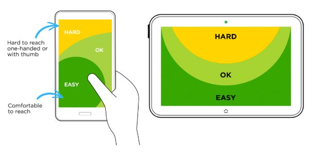
Take a look at examples taken from various mobile games:

As you can see, in the most easily accessible area, it is best to place interactive elements that lead to monetization:
 Store Button
More apps
Advertising
Store Button
More apps
Advertising
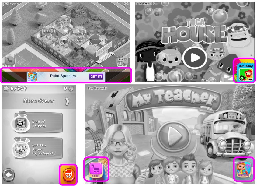
Users are likely to interact with these elements, alas, sometimes even by mistake. We call such errors “black UX” (dark-UX), but it is proved that it increases profit. Please note. that in the case of advertising, at the bottom of the screen you need to add a border between advertising and interactive content with a height of at least 10 pixels in order to meet the advertising requirements of most platforms.
Sliders
As space on the screen is limited, and game content is becoming more and more, the sliders turn into a very convenient component that allows users to show more options for additional content without having to leave the main scene.
Here are five examples of slider designs, including horizontal or vertical scrolling used to select a world, a store, a choice of landscape / object category, a choice of portrait / object categories, and an avatar setting:
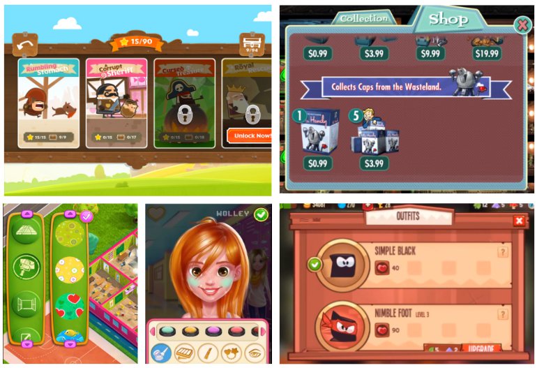
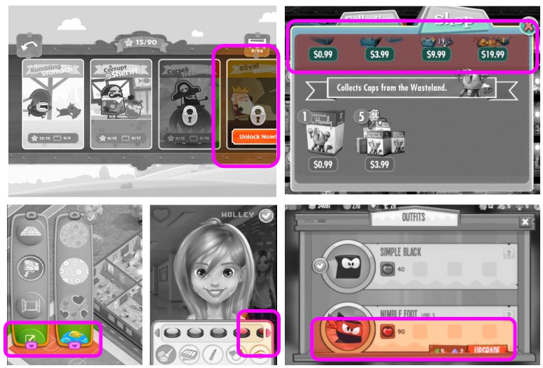
Since the content of the sliders extends beyond the screen, we need to help users understand that there are other content inside. Here are the recommendations for the sliders:
- Partially visible elements: make the content that extends beyond the borders of the screen partially visible on the screen so that users can understand that there is more of it.
- At launch, animate the slider from beginning to end: for the first time showing the slider to users (either in an automatic or user-initiated event), scroll to the end of the content, and then automatically scroll to the beginning of the slider content. If the slider contains a lot of content (for example, from the beginning to the end you need to take 10 complete steps), then you can simply start from the "third step" of the slider, and then animate the scroll to the "first step". This will show users that there is other content outside the screen.
Popup windows
Pop-ups are a good component of games used to send players abstract and informational messages. Useful recommendations for their use:
- Associate the visible UI with the invisible UI using animations: at the moment of opening the pop-up window caused by pressing the user on the interactive element / button, animate the launch of the window from the button that calls it (for example, increase the pop-up window of the store from the store button, and when closing, minimize the store window to the button ) Thanks to this, users will better associate pop-ups with their initiators.
- Put a translucent darkened background on the pop-up windows: since they often require user actions and can occupy most of the screen, this should help users understand that the game session is paused, but you can still return to it. Pop-ups should be located on top of the darkened background so that users can see the part of the session under it (the darkened background should be animated by the gradual appearance in parallel with the opening of the pop-up window and the gradual disappearance in parallel with the closing animation).
- Avoid the X: in many pop-ups, the “X” is used as the close button. Many users perceive this “X” button as a pattern of “annoying content” and instantly close the pop-up window. If the pop-up window contains valuable content for the user, and you want to increase the likelihood that he will read it, then make the "Close" button so that it looks like one of the choices for the player, and not like the "X" button. Note: do not create duplicate options in the same pop-up window with the same value (for example, “X” and “Close”; users simply click on “X”).
Advice:
- Touching a darkened background should close the pop-up window similar to pressing the "Close" button, unless it is a pop-up window of the store - then the store should close only when you click on "X".
- Pop-up windows with a lot of text (for example, with an introduction to the plot) should display the “X” or “Continue” button only after 2 seconds. Due to this, users are more likely to read the important contents of the pop-up window, and not close it immediately.
User selection (via pop-ups)
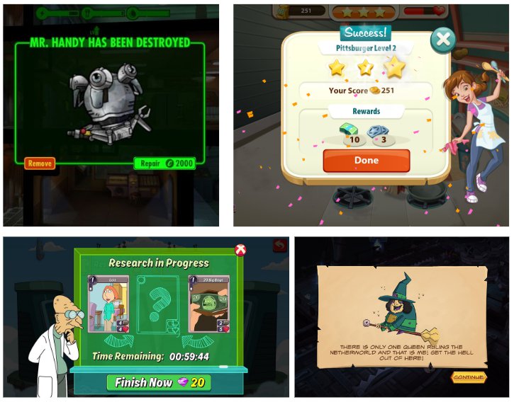
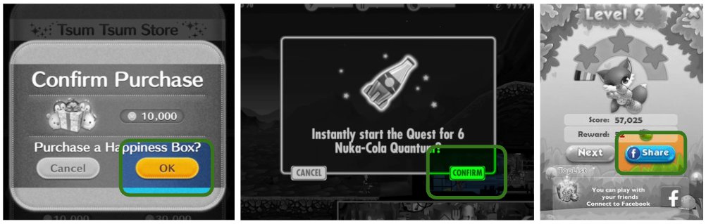
As I said above, many pop-ups require user action because they offer users a decision. Here are some examples of pop-ups asking users what to do next - do you see the pattern?
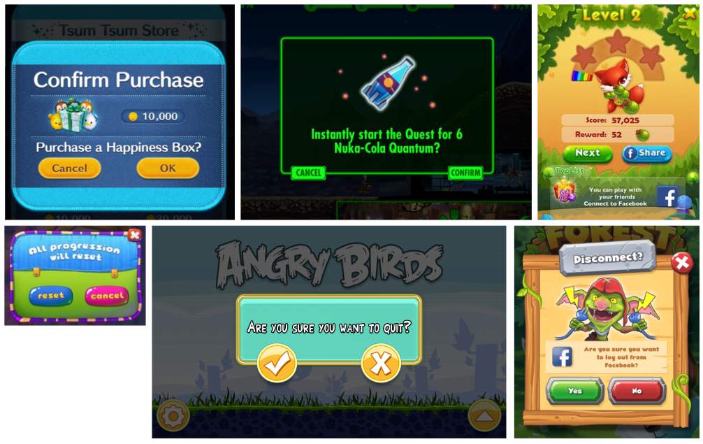
As you can see, this rule is used here:
The user's decisions, which are good for the game, are located on the right side of the pop-up window - as game designers, we want players to confirm the purchase, share the game, spend in-game currency, etc.:
The user's decisions, which are bad for the game, are located on the left side of the pop-up window - as game designers, we DO NOT want players to exit the game, disconnect, reset progress, etc.:
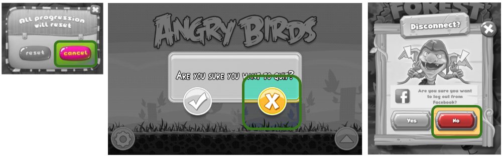
Although you might think that this is dark UX, in fact, this principle greatly helps the user - we don’t want users to accidentally reset their progress? Be that as it may, the main goal here is to lead users to the solution you need, which is good for KPI games (in-game purchases (IAP), retention, engagement, virality, user posts on social networks (sharing ) and so on).
Tip: associate the color of the button with its function (negative - red, positive - green, neutral may be blue).
Reward video
In recent years, promotional reward videos have become the industry standard as part of the freemium mobile gaming model. They increase profits and are seen as a win-win situation (users who agree to watch an ad will receive an in-game reward in exchange).
The icon representing the video advertisement for the reward should look like a cinematic clapperboard with a playback symbol (we tested many different icons and this turned out to be the best).

Here are some examples of offers to watch reward videos from different mobile games:
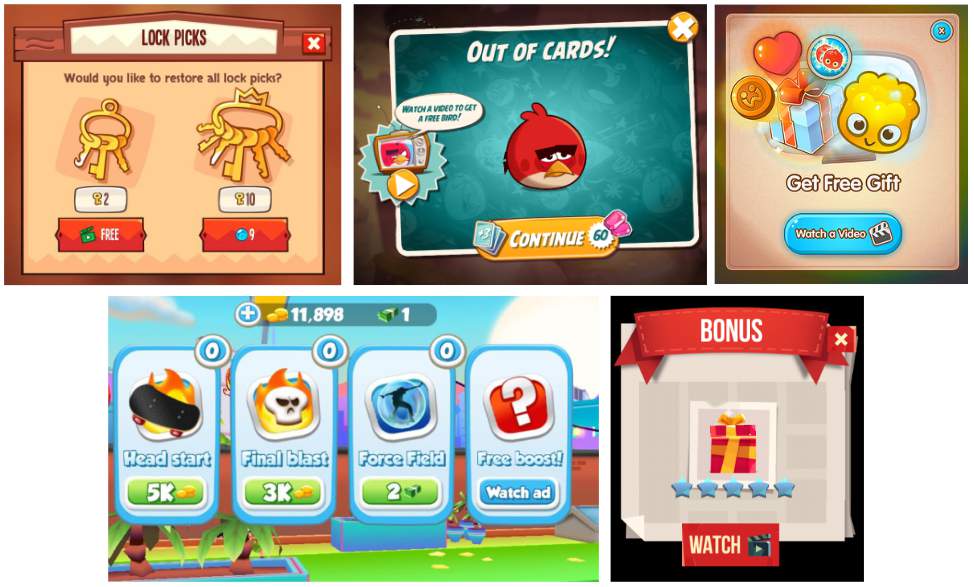
As a game designer, you should carefully consider what the prize will be, how to reward the user, and "how long." Key strategies:
 Permanent - after watching the commercial, users receive a prize for an unlimited time (for example, an item that is added to inventory and stays there permanently).
For the session - after watching the commercial, users receive a prize and it is available for use within the current session. If you exit the game and return to it later, the prize will be lost. This can be useful for increasing session time.
On the scene - after watching the video, users receive a prize and it is available only at the current level (for example, it can be a bonus or “another life”).
Permanent - after watching the commercial, users receive a prize for an unlimited time (for example, an item that is added to inventory and stays there permanently).
For the session - after watching the commercial, users receive a prize and it is available for use within the current session. If you exit the game and return to it later, the prize will be lost. This can be useful for increasing session time.
On the scene - after watching the video, users receive a prize and it is available only at the current level (for example, it can be a bonus or “another life”).
The prizes for the video should be significant, not a “trifle”, otherwise users will not want to spend their time on advertising. A game designer should think about what users in your game want.
Tip: Do not tell users what reward they will receive to make it more exciting (stimulate their curiosity and desire to be surprised and increase the likelihood that they will watch ads).
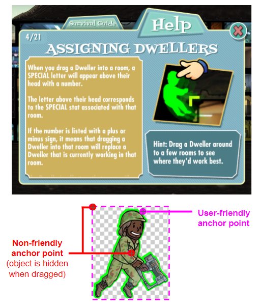
Draggable objects
For mobile platforms, “dragging and dropping an object” is an intuitive game mechanic, however, there are often cases of its incorrect implementation that harm the game process. When exporting game resources, such as PNG files, their design can be very creative, but "inside" the device they are all rectangles with transparent areas.
The standard anchor points for the rectangles are either the upper left corner or the center of the image. You, as a game designer, must demonstrate to the player how the object should be dragged, as if it were dragged in the real world, and where the point should be located for which the user should drag the element:

Standard anchors are often located outside the draggable object (in the upper left corner). Even if the point is moved to the center, dragging in most cases will seem illogical to the user.
Here are some important guidelines for working with draggable objects:
Set the draggable objects for their own anchor point offset so that the user's finger does not hide them: most often, the standard anchor points need to be changed and create their own offset so that the draggable element is visible despite the user's finger.
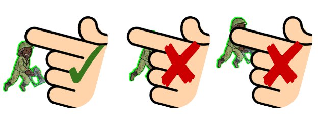
- The "grab" area of small draggable objects should be larger than the size of their bounding box.
- When moving, the dragged object must be on top of other objects (in terms of the Z-index). In special cases (for example, when inserting an object into another object), this must be configured manually.
- Use flickering or a dashed outline to indicate areas where you can drag objects. Do not expect the user to immediately understand where the dragged item should be. It is best to create an intuitive “discharge zone" (for example, an object-food needs to be dragged into the mouth) - in this case, you do not need to highlight the mouth, it is enough to animate its opening when dragging food. Users will understand what needs to be done.
Tip: pulling is usually easier than pushing (i.e. right-handed drag and drop from left to right is easier than from right to left). If the game is intended for children, then in design it is better to make the user pull, rather than push.
Rate App Dialog Boxes
Many game designers use the Rate us dialog box too early, urging users to evaluate the game’s experience even before they make an opinion about it. With proper implementation, the “Rate the game” window helps in obtaining good ratings in stores and promotes organic promotion. How to implement it correctly? Users should see this window in the following situations:
- After completing a serious step or after an important moment (for example, after defeating a boss, completing a level, winning an important match, etc.).
- After performing several small steps (for example, after winning 10 medals).
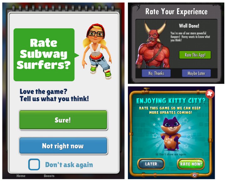
To maximize the likelihood of users evaluating the game, the "Rate the game" dialog should have the following design:
- It must be adequate to the situation of the hero, looking at the player.
- The Rate button should have a positive color (for example, green) and be more visible than the Later button. In addition, if you carefully studied the recommendations from the “Player Selection” section, you should know that you need to position it on the right.
Tip: never use the phrase "5 stars" - this violates Apple's rules.
Store Dialog
Dialog box design is critical for sales. Often in the store’s dialog box, along with other in-game purchase options, there is a “Full Version” item. Here are some examples:
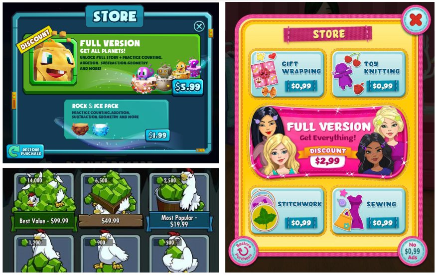
To maximize the number of purchases of the full version, you can use the following recommendations:
- Make sure that the button “Full version” has a hero from the game with clearly visible eyes (it is preferable that he looks at the user).
- The “Full Version” button should be brighter, larger and more attractive than other in-game shopping offers.
- Add the “breathing” animation to the button of the full version (increase the scale to 104%, then return to 100%, repeat twice, then pause for 6 seconds, after which the animation repeats).
- The button title of the full version should be larger than the internal content.
- Add a noticeable strip “Discount” or “Best Deal” to the button of the full version.
Tip: if you are selling content like additional levels, worlds, etc., then allow users to access the blocked content screen, and only then open the store’s dialog box with a darkened background below it (and don’t open the store window “outside” when you click to blocked content on the level selection screen).
Conclusion
I am glad that I had the opportunity to share knowledge with the community and I hope that this information will be valuable to many game designers, game developers and product owners. This "bible" of recommendations for UX game design was formed on the basis of big data (and they are really BIG - only one TabTale had more than 2 billion downloads, and the company itself was in the Top 10 publishers of the world for several years in a row). I also watched how these tips worked in real life for more than 500 users (Matific has the opportunity to watch how more than 500 users play my games at major events of the Israeli Ministry of Education, where children from all over the country compete on annual mathematical Olympics). I want you to remember - these are not some kind of “rules”, but real advice developed from experience. I recommend you master them to use as a foundation, but do not expect them to magically transform your game into the next big hit.
All Articles