Splatter tiles: how to create tiles for games without much fuss

I am the only artist in our game studio, which means that I have to deal with animation, UI, advertising materials, resources for social networks, characters, objects and environments. Everything that needs at least some art falls on my shoulders. I often feel the entire burden on me, so I wonder:
Is it possible to somehow accelerate all this ?!
In this article, I will talk about how we develop 2D environment tiles for games such as Levelhead and Crashlands, and show a technique that allows us to save a little time and increase the versatility of graphical environment resources. This method also simplifies the creation of organically looking terrain types that blend well with each other. I do not suggest using this method when creating environment tilesets, but it will become a good replenishment of a set of tools for any artist.
This method is called SPLATTER TILE!

The problem of traditional tiling
I am always looking for ways to work faster and with more flexibility. I work with traditional tiling methods like 9-slices and tile cards, and often find that the results are too harsh. We get a grid that sticks to the surroundings in such a way that I cannot change anything.
After delving into the creation of such tile environments, I found out that the best way to create more lively and organic tilesets is not to change the technique, but to increase the number of drawn tiles. I quickly switched from simple 9-slice to more and more wide tilesets that conveyed all the bends and bends of the terrain. To see how many tiles are required to create a sense of liveliness and flexibility, look at this example from craftpix.net :
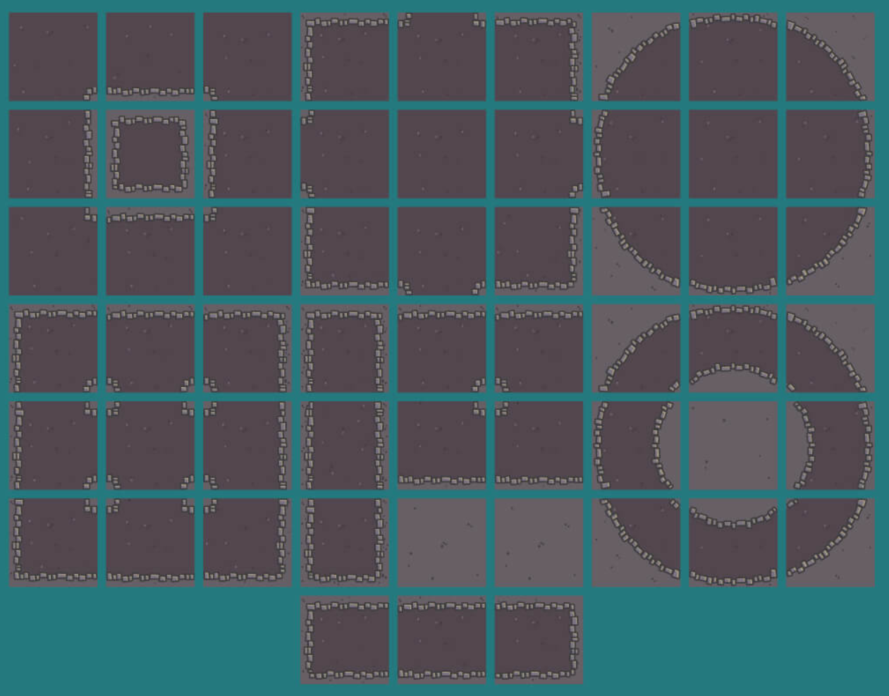
Now, when creating a level, the designer can choose from 57 separate tiles. From the point of view of creating graphics, if you delete all duplicates and mirrored tiles, you get about 17 unique tiles.
Having worked in this style, I found that I needed to make a change to one of these tilesets and began to tear my hair out because I had to change all these 17 tiles. It made me think !
How to create tiles that look natural in the world and do not look like a grid? And is there any way to do this without the monotonous process of converting these tiles to seamless with all the variations cut into pieces?
It turned out that these two issues are related. In short, to create very organic tilesets you need to either draw a large number of traditional tile resources, or completely change the methodology.
At the heart of this technique is the difference between the actual border of the tile and the graphics themselves, and this is what is the foundation of Splatter Tiles. Let's look at them from the inside.
Anatomy Splatter Tile
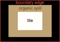
- Tile Space (TILE). This is the actual grid space that the computer uses. If you create tiles that stop at these borders, then the artist will get traditional resources with a clearly visible lattice structure.
- Organic Strip (ORGANIC SPILL)! This is where the magic happens. We will expand the tile into this space to create forms resembling the tile that we want to represent - if it is a stone, we will make it “blocky” along the edges. The land is bumpy and spotty, the grass is sharp and has many sharp edges, etc. (below we will consider all this).
- Boundary Line (BOUNDARY LINE)! This is the border of the tile from the point of view of the artist. If you cross this line, then parts of the current tile will be drawn when rendering the neighboring tile , which looks ugly. The entire tile must be inside.
Brief example
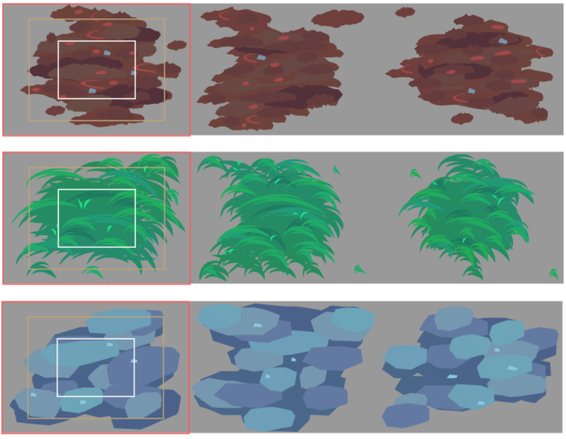

You may notice that splatter tiles allow you to get a feeling of organic chaos very quickly and without much difficulty. Although the reticence of the environment is still noticeable, the merging of the figures due to their blurry nature makes it much more lively.
More detailed example
If you take another step forward, then the set of splatter tiles, as in the case with the traditional tileset, can be used to create a variety of organic forms that are even less like a grid. In our latest Levelhead game, which is still in early Steam access, we use a set of splatter tiles for each biome and for every aesthetic tileset that players can use. For example, here are the jungle splatter tiles:
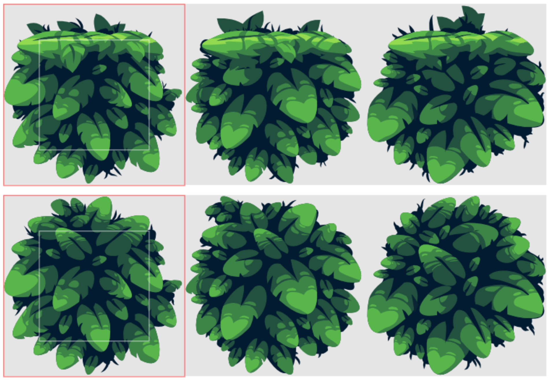
And here is how they look in the game:

And here is the Asteroids mushroom biome and its corresponding splatter tiles:
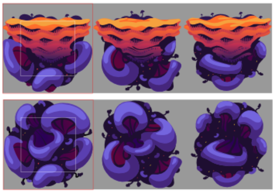
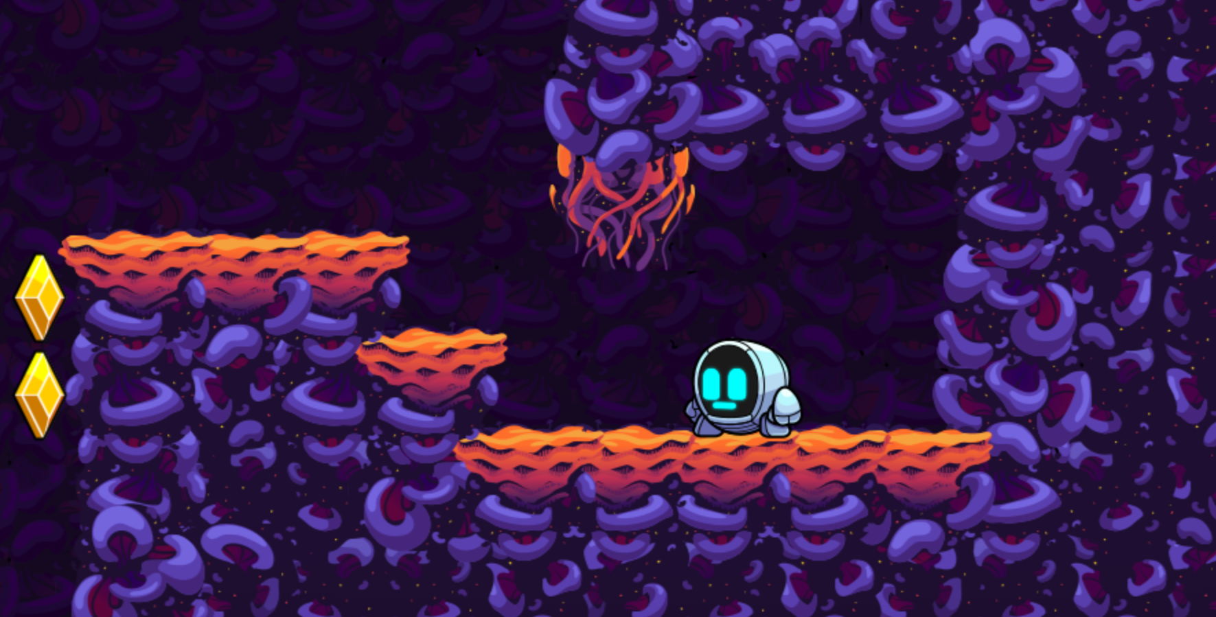
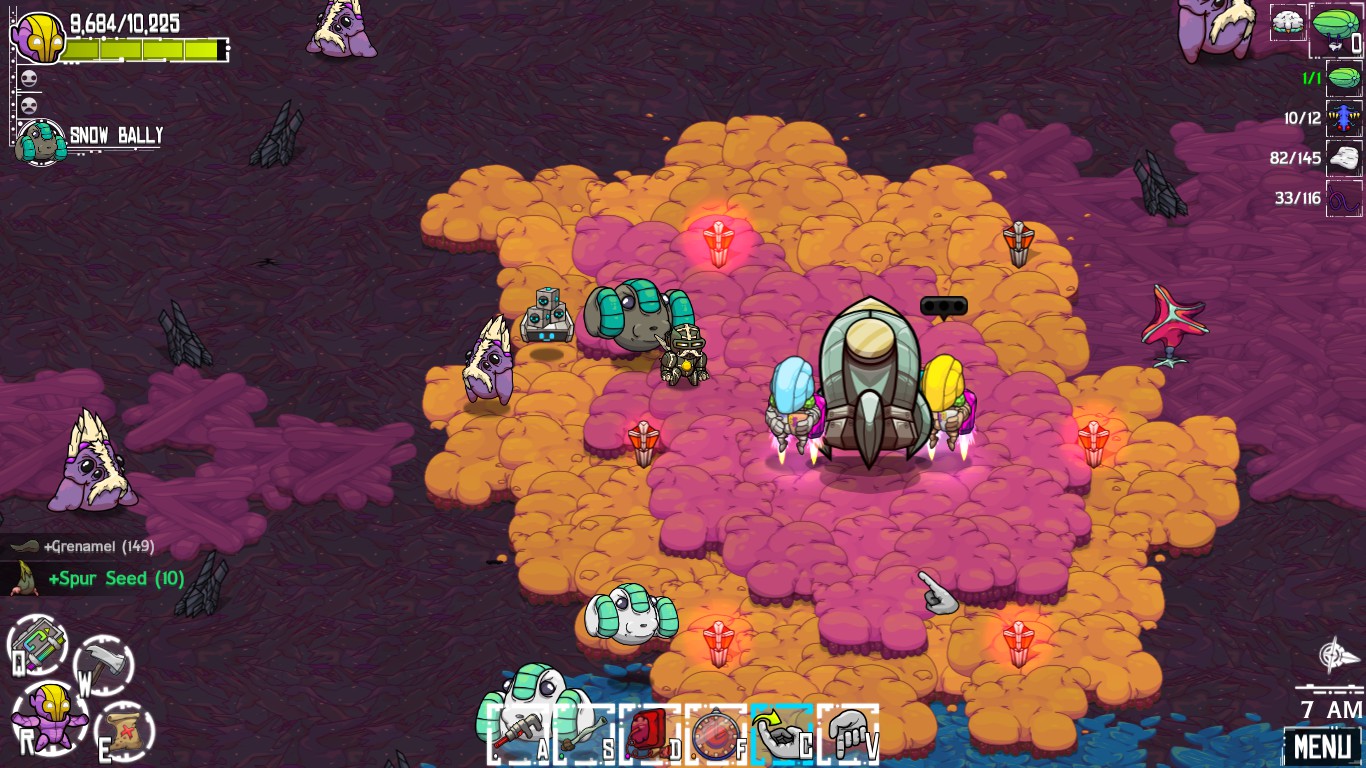
Here is an example from our Crashlands open-world RPG:
Tips for creating splatter tiles efficiently
- Create wild base shapes for tiles. This is how you can get away from the feeling of "mesh".
- Use all colors near the borders of the tile. The shading at different points of the border should be high and low so that when the border connects to another splatter tile, they can mix seamlessly at individual points.
- Test it! Understand how to quickly notice changes made in the right context. You can use clones, a hot reboot, or some kind of template system - this stage, regardless of the methodology, is always the most important when working with environments.
- Choose your colors in advance. Splatter tiles will overlap each other, so you need to make sure that the colors blend harmoniously and do not irritate the eye.
- Set the depth of the tile. For example, the earth is always under the grass. A stone is between them. This allows you to create interesting patterns in which different tiles overlap each other.
Splatter tiles are usually best suited for games with a top view, where the player’s life or death does not depend on the exact edge of the tile. However, if you get comfortable with them, you can adapt them to a wide range of different genres, including such an active platformer as Levelhead!
“But Sam! Don't you have to draw a bunch of tiles anyway? ”
… heck!
And here again we are faced with a brutal reality: to create an interesting and dynamic 2D environment, a decent amount of graphics is required. The technique that I proposed simply allows you to achieve an organic feel faster, so it’s worth exploring along with the development of traditional tiles.
All Articles