Towards accessibility

Friday is the end of the working day. Bad news always comes on Friday at the end of the day.
You are about to leave the office, "jin" a new letter about the next reorganization has just arrived in the mail.
Thanks xxxx, yyy from today you will report to zzzzOh no! Why did I deserve it? Do they want me to leave? Tune in to an ungrateful hard work and try to fix other people's mistakes. This is probably a failure ...
...
And the Hugh team will make our products accessible to people with disabilities.
That was accessibility a few years ago. Some poor people got the job of “cleaning up” the user interface to try to make it accessible to people with disabilities.
What this actually meant was rather vague - probably if you could see the focus indicator and move around the fields using tabs, have some alternative text and a couple of descriptions for the fields, it would be considered that your application is available ...
But suddenly, “bugs” began to multiply at the speed of an avalanche.
Different screen readers ( English Screen Readers) and browsers behaved in completely different ways.
Users complained that the application is not suitable for use.
As soon as the error was corrected in one place, another appeared in another.
And, just changing and fixing user interface errors required a titanic effort.
I was there. I survived, but we did not “succeed” - technically we cleared a lot, added a lot of descriptions to the fields, roles, and reached some level of compliance, but no one was happy. Users still complained that they could not navigate in the application. The manager still complained about a constant stream of errors. Engineers complained about the incorrect formulation of the problem, without a clearly defined “right” solution that would work in all cases.
On my way to understanding accessibility, some overtly frank moments came up.
Perhaps the first was the understanding that adding accessibility functionality on top of the finished product was difficult. And it’s even harder to convince managers that it’s incredibly difficult! No, it’s not just “added some tags” and the user interface will work just fine. No, it is impossible to finish in three weeks, even three months will not be enough.
My next moment of truth came when I saw firsthand how blind users actually use our application. This is SO different from viewing error messages.
I will come back to this again and again, but almost all of our “assumptions” about how people used our application were erroneous.
Navigating through a complex user interface using the
Tab/Shift+Tab
keys sucks! Need something better. Keyboard shortcuts, headers.
Loss of focus when changing the UI is this not a big problem? Think again - this is insanely confusing.
I continued, worked on various projects for some time, and then we started a new project, with a complex user interface and a clear installation, to finally get the right accessibility this time.
So, we took a step back and looked at how we can implement it differently and succeed, and so that the work process itself is not boring!
Pretty quickly we came to some conclusions:
- We did not want people developing the user interface to bother with aria labels / roles and, naturally, with the HTML structure of the components. We needed to provide them with the right components, in which accessibility is implemented right out of the box.
- Availability == Ease of use - i.e. it is not only a technical task. We had to change the whole design process and make sure that accessibility is taken into account and discussed before starting the design of the user interface. It is necessary to initially think about how users can find any functionality, how they will move and how the “right-click” of the mouse will work from the keyboard. Accessibility should be an integral part of the design process - for some users, it is something much more than just the appearance of the application.
- From the very beginning, we wanted to receive feedback from blind and other users with disabilities about the ease of use of the application.
- We needed really good ways to catch accessibility regression.
Well, from an engineering point of view, the first part sounded pretty fun - the development of architecture and the implementation of a library of components. And indeed it was.
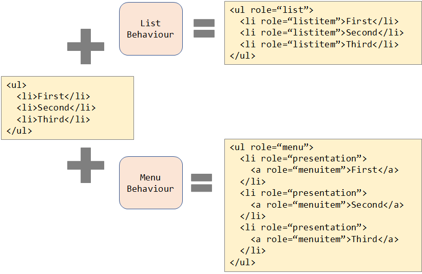
Taking a step back, looking at ARIA examples and thinking of it as a design problem, rather than the “adapt” problem, we introduced some abstractions. The component has a 'Structure' (consists of HTML elements) and a 'Behavior' (how it interacts with the user). For example, in the snippets below, we have a simple unordered list. When adding “behavior” to the list, appropriate roles are added so that it acts like a list. Similarly, we do for the menu.

In fact, not only roles are added here, but also event handlers for navigation using the keyboard.
It already looks more neat. If we could get a clean separation between them, it would not matter how the structure was created, we could apply Behaviours to it and get the right accessibility.
In action, this can be seen at https://stardust-ui.github.io/react/ - the React UX library, which is designed and implemented with accessibility in mind from the very beginning.
The second part - the change in approach and processes around design initially scared me: modest engineers trying to push organizational changes did not always end well, but this turned out to be one of the most interesting areas where we made a significant contribution to the process. In a nutshell, we had the following process: the new functionality was developed by one team, after which our group of managers analyzed / iterated this proposal, and then, after approval, as a rule, the design was transferred to the team of engineers. In this case, the engineering team in fact “owned” the availability functionality, since it should eliminate all the problems associated with it.
At first it was a rather difficult job - to explain that accessibility and usability are inextricably linked and that this must be done at the design stage, otherwise it would lead to big changes and redefinitions of some roles. However, with the support of management and key players, we brought this idea forward and put it into action so that designs pass the test of accessibility and usability before they are presented to management.
And these reviews were extremely valuable to everyone - it was fantastic, like an exercise in sharing knowledge / transmitting information about how users interact with web applications, we identified numerous problem areas of the user interface before they were built, the development teams in currently have much better specifications not only of the visual, but also of the behavioral aspects of design. Real discussions are fun, energetic, passionate discussions about technical aspects and interactions.
We could make this work even better if at these (or subsequent) meetings with us there would be blind users and users with disabilities - it was difficult to organize, but now we really work with local organizations of the blind and with companies that provide external testing to verify the flow of work in the early stages of development - both at the component level and at the level of the workflow.
Engineers now have fairly detailed specifications, available components that they can use for implementation, and a way to check the flow of execution. In part, experience taught us what we constantly missed - how can we stop the regression. Similarly, people can use integration or end-to-end tests to test the functionality we need to detect changes in interactions and threads — both visual and behavioral.
The definition of visual regression is a rather definite task; very little can be added to this process, except perhaps checking whether focus is visible when navigating using the keyboard. More interesting are two relatively new technologies for working with accessibility.
- Accessibility Insights is a set of tools that can be run both in the browser and within the build / test cycle to identify problems.
- Checking the correct operation of screen readers was a particularly difficult task. With the introduction of accessibility to the Accessibility DOM , we finally got the opportunity to take snapshots of the application in terms of accessibility, very similar to how we do them for visual tests, and check them for regression.
So, in the second part of the story - we moved from editing HTML code to working at a higher level of abstraction, changed the design development process and introduced rigorous testing. New processes, new technologies and new levels of abstraction completely changed the idea of accessibility and what it means to work in this area.
But this is only the beginning.
The next “understanding” is that blind users promote advanced technologies - it is they who get the most benefit not only from the changes we described earlier, but also that new approaches and ideas are made possible with the help of ML / AI. For example, Immersive Reader technology allows users to more easily and clearly present text. It can be read aloud, the sentence structure is divided grammatically, and even the meanings of words are displayed graphically. This absolutely does not fit into the old understanding of “making it available” - it is a usability feature that will help everyone.
With ML / AI, completely new ways to interact and work are emerging, and we are pleased to be part of the next steps in this advanced path. Innovation is driven by a change in thinking - humanity has been around for millennia, cars for hundreds of years, websites for several decades, and smartphones are even smaller, technology must adapt to people, and not vice versa.
PS The article was translated with a few deviations from the original. As a co-author of this article, I agreed on these digressions with Hugh.
All Articles