CSS overflow and data loss
In this article, Rachel Andrew discusses situations in which you may run into overflows in the layout of sites, and explains how CSS evolved to create more efficient layout methods in situations where the volume of content is not known in advance
CSS was designed to be readable. If you are viewing an HTML document that is marked up with headings and paragraphs (without using CSS), it is displayed in a browser in an easy-to-read form. The headings are large and bold, and between the paragraphs there remains a space that is controlled by style sheets built into the browser. However, as soon as you need to change the layout of the page, you will begin to take control of the design into your own hands. In some situations, this will mean that you take over the work with overflowing elements.
In this article, I am going to consider different situations in which we may encounter overflow on the web. We will see how new markup methods and new CSS values can help us deal with overflows and create less fragile designs. I will also explain one of the fundamental concepts underlying CSS design - preventing data loss.
What do we mean by overflow?
If you go back a few years (before the advent of layout methods such as Flexbox and Grid), think about how you would implement the example shown below. A very simple layout of three blocks having a different amount of content, but the lower border of which should be on the same line.

Using float, this seemingly simple task was impossible. When a block becomes streamlined (float), it does not interact with its neighbors; this means that there is no way to know what the next element is higher and increase the current to the same height.
Sometimes, trying to line up elements in a single line, developers set a fixed block height, trying to predict the amount of possible content to make the height the same. Of course, the web is not so simple, and when the amount of content was different, or the text size became larger, the text began to go beyond the bottom of the block. This was an overflow.

Sometimes people ask how they can prevent too much content from reaching the site. Technical support of my CMS was contacted by users who asked how to limit the content for this very reason. They said that this additional content “breaks the layout”. For those of us who understood that the impossibility of knowing the height of the elements was the fundamental nature of the layout, we were forced to create layouts that hid the lack of blocks of equal height. A common solution was to add a gradient with the effect of disappearing content that goes beyond the boundaries. We would avoid using background colors and block frames. Or we would use artificial column techniques to make the elements height the same.
This inability to control the height of one element relative to others, therefore, influenced web design - a technical limitation changed the way websites were designed. I'm glad that with the advent of Flexbox and Grid, this problem not only disappeared, but by default, the behavior of these new layout methods stretches the blocks to the same height. The initial value of the
align-items - stretch
property
align-items - stretch
, due to which the blocks are stretched to the height of the Grid-area or Flex-container.
In addition, CSS Grid gives us a good way to give elements a certain size, but allow them to grow if they need it. If you set the size of the track (column or line) using the minmax () function, you can see its minimum and maximum size. Setting the lines to
minmax(200px, auto)
means that the track will always be at least 200px, even if the grid elements are empty. However, if the content of the grid element is greater than 200px, thanks to the value of
auto
this element can grow. You can see it in the example below. The first line is 200px, since there are no elements to increase it. The second line contains a grid-element, the contents of which do not fit and the
auto
value starts to work, due to which the line becomes more than 200px.
The
minmax()
function gives you the ability to create interfaces as if they were a perfect fixed size. In an ideal world (when the amount of content meets expectations), you get these beautiful, identical lines. However, if you add additional content, there will be no overflow, as if you set the fixed line height to 200px. The string will expand; it may not be exactly what you, as a developer, would like, but it will not be unreadable.
Line overflow
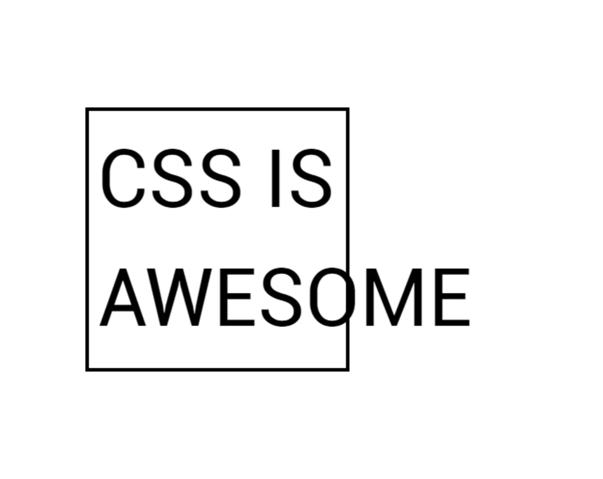
The risk of overflow occurs whenever we limit the size of elements. In the example above, I describe a constraint in a block dimension that users with horizontal language will perceive as height. However, we can also get overflow if we limit the width of the block. This is what we see in the CSS is Awesome meme.
The author of this meme commented on a CSS-Trick post about this, saying:
Now I understand the concept of overflow a little better, but at that time my brain was simply blown away by the incomprehension of why someone thought that the default behavior should just push the text to the right of the block, instead of making the block bigger like the tables always did .So why does CSS push text outside the box instead of increasing the size of the block itself?
In the meme, an overflow in the line direction is obtained. The word awesome is greater than the width applied to the block, and therefore overflows it. CSS reasonably reasonably assumes that if you give a block a certain width, you need a block of just that width. Perhaps he should put in a layout that breaks if the blocks suddenly become larger than what was set.
This particular problem (that is, the need to set dimensions for all layout elements and make sure that they do not exceed the available container space in total) is the problem that modern layout methods solve for us. If we imagine that our block has such a specially selected size to fit in a row with other blocks in a float grid, today you can choose to use Flexbox instead.
Using a float layout, you should set the size of each element - perhaps before you know what its content will be. In this case, you may find that large content will be in small containers, and small content will have extra space around.

However, if we use Flexbox, we can let the browser calculate how much space to give to each element. Flexbox will provide larger items with more space, while smaller ones will get less. This flexible size distribution means that the block that contains the word “awesome” will increase to accommodate all the content and the text will not go beyond it. Overflow problem resolved; this behavior is exactly what Flexbox was created for. Flexbox does a great job with elements of different sizes and organizes them into the most appropriate layout for them.
Outside of Flexbox, we can say that our unit should be as large as necessary for the content and no more. The min-content keyword can be used as a value for the width or inline-size property when working with boolean properties related to the stream. Set width: min-content and the block will grow enough to accommodate the word "awesome".
Data loss prevention
The reason the block overflows (as in the example with the word extending beyond the block boundary) is because the
overflow
property has a default value of
visible
. You can (if you want) control overflows differently. For example, using
overflow: auto
or
overflow: scroll
could give your block a scroll bar. This may not be what you would like in this situation, but there may be situations where a block with a scroll bar will be appropriate.
You could also assume that you were ready to trim the overflow using
overflow: hidden
. You might have thought that hiding overflows would be better by default, however, the fact that CSS chose to make the overflow by default visible (rather than hidden) is the key to the core value of CSS development. In CSS (as in many other technologies), we try to avoid data loss. When we talk about data loss in CSS, we usually talk about the part of the content that will not be visible. In the case of
overflow: hidden
, the content that overflows the parent block disappears. This means that we have no way to get to it, to find out what part we lost.
In certain situations, this can be a serious problem. If you managed to make the layout so fragile that the button on your form went beyond the visible area, your users will not be able to submit the form. If the last paragraph of the text is cut off, we will never know how the story ended. Also, the problem with disappearing elements is that it is not always obvious that they are gone. As a developer, you may not notice the problem, especially if this only happens with certain viewing area sizes in a responsive design. Your users may not notice the problem - they simply will not see the call to action, or they will think that the problem on which they cannot place an order is in their device and they simply leave. However, if the elements overflow where they shouldn't, you will most likely notice this. Or, in the worst case scenario, someone who visits the site will notice this and let you know.
That is why in CSS elements are overflowing sloppy and quite noticeable. By explicitly seeing the overflow, you are more likely to correct the error than if the excess content is simply hidden. However, with the help of the overflow property you get the opportunity to make your own decisions about what should happen. If you would like the overflow to be clipped (which might be the right solution in certain situations), use
overflow: hidden
.
Data loss and alignment
The best leveling tools we've received over the past few years can also lead to data loss. Consider a column of flex items that are at the edge of the viewport and have different sizes. When aligned with the
flex-start
value, the elements protrude to the right. However, when centered with
center
, the wider element will go beyond the bounds of the viewport. Therefore, alignment can lead to data loss.
To prevent accidental data loss caused by alignment, CSS now has several new keywords that can be used in conjunction with alignment properties. They are defined in Box Alignment, a specification that deals with alignment in all design methods, including Grid and Flexbox. They are currently only supported in Firefox. In our example above, if we set
align-items: safe center
, the last element will be left-justified, not centered. This will prevent data loss caused by centering the element and therefore push it out of the viewport.
If you need alignment (even if it leads to overflow), then you can specify
unsafe center
. In this case, you requested that the browser perform the alignment of your choice, regardless of what happens to the content. If you have Firefox, then you can see two examples: the first with safe alignment, and the second with unsafe.
In the report , on the basis of which I wrote this article, I described the layout as a constant struggle with overflow . One of the design truths for the web is that it is very difficult to know how big the element that contains the text will be. However, as I showed above, we have never had so many ways to control overflows or overflows. This means that our layout can be much more sustainable and we can create templates that will work with different amounts of content. This may seem like only small changes, but I think that the opportunities that they open for us are enormous.
All Articles