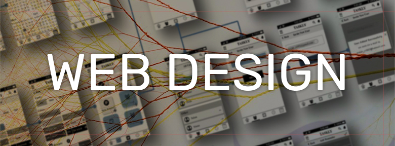
How to create a layout for the site and not stay extreme
Below I will give a brief overview of the mandatory points that you need to pay attention to when creating a web layout for further transfer to layout.
They will help you:
- think deeper your layout
- avoid unnecessary questions
- get a better result
- stay friends with frontend developer
General
- Naming layouts (Pages, frames - required) must clearly convey the essence and purpose and be tied to the logical pages of the site or other large entities.
(Example: “home - tablet”, “main - mobile”, “buttons”)
[screen-example] - It is necessary to observe the structure of the document when working with layers, groups, components and screens, give them comprehensive names
(Example: main-background, settings, button, registration-page-mobile)
(Bad example: frame 1, group 45, iphone XR)
[screen-example] - If you need a mobile version , then a 320px wide (iPhone SE) layout should be developed for each screen, in addition to which you can create high-resolution layouts.
[screen-example] - Icons (svg, ...) should be downloadable and open correctly in the browser. The size of the svg artboard must match the content and flow. You can collect icon sets on individual art boards.
[screen-example] Pictures (graphic content) must be uploaded. Have a resolution of at least 2x. Unloaded without pre-processing. (Such as: rounded edges, transparency, shadow). Except where such processing has been explicitly requested.
[screen-example]
- It is necessary to take into account the size of the content area and the fact that this size varies from resolution to resolution. Thus, the “attachment point" should be thought out.
- Content images should be uploaded as a single image.
(For example: We have a rectangular block with [background] that will change. Accordingly, the picture should be unloaded completely with the background, as in the example above.)
- Font colors should not contain an alpha channel (transparency), unless the font is used on different backgrounds (gradients or images) and therefore should have this logic.
- A complete list (zip.archive) of the fonts used in the project should be provided first of all (before starting work on the front).
- Also, it does not hurt to choose a safe font (which is available on all Windows, Mac, Linux, etc.), similar to the custom font used, so that it can be substituted in case of a custom font loading error
(Example: 'Roboto', sans-serif) - If we are dealing with a custom icon font , then the icons should be handled accordingly, namely: you need to align them along the baselines so that several icons in the row are not of different sizes and with different indents. Also, the number of faces, the base thickness of the faces, the level of detail must be preserved from icon to icon, otherwise they will look heterogeneous, as if from different sets of fonts.
- In the absence of special requirements for the logic of behavior , blocks in the stream must maintain the sequence of their location when adaptive at those resolutions that are reflected in the requirements.
- Logic should be reflected in the design . For example, several identical cards, in each of which to display a different amount of content, different images, different states, etc., so that it becomes possible to trace the dependence.
- In addition to the layout, a textual description of the operation of the elements is welcome.
- Specify the behavior of elements during text overflow
(For example, crop long text with ellipsis in a block, etc.) - Leave comments and description (in any way) on animated elements and elements whose behavior cannot be uniquely determined only by layout.
- Page 404 , 500, and other standard screens should be present.
All of the following items on the guide and grids can be drawn on the styles page, where all this will be structured.
Guide, GUI, UI-kit, Style Guide
- Description and layouts of the blocks connected by common functionality are given in one section of the document.
(For example, all pop-ups have a white background and rounded corners of 10px, buttons ...) - Typography should be described and drawn additionally on a separate artboard.
(Example: All headings of the first level are 24px indented below 40px. All headings of the second level ..., paragraphs ..., etc.) - All links, buttons, checkboxes and other interactive elements should be drawn in a passive, induced, active state. Similarly, there should be states for the cell phone (touch devices) - passive, moment-pressing. States: (link, hover, active, focus, visited, disabled, process).
[Checkbox-example]
[Buttons-example] - Breadcrumbs should be drawn in all states (active, previous, blocked, ...) and taking into account line breaks.
- Pagination should be rendered in all states (at the first, last, intermediate step) And with a different number of steps (1, many), taking into account a large (3+ characters) number of digits.
- Inputs (input fields), forms should be drawn in all states: by default, with focus, when pressed, locked, error message, correctness message, etc.
[Input-example] Limit the number of colors and shades used
[Color-level-example] .
- All colors used must be made a guide.
(Any new color in the layout will be considered a mistake and will be equated to the nearest of the guide) - Colors that are unique in terms of functionality should be described or tied to the essence.
(For example, a halloween stock widget with a single orange background: orange is the color for halloween stocks)
- All colors used must be made a guide.
Grid
- Indent and element sizes must be a multiple of the same value.
(2px, 4px, 8px, 5px ...)
[screen-example]
[post-example] - The grid (if any) should be described and not contradict
layouts. Sizes of columns, their quantity, etc. - The dimensions of the container should be described on each of the presented
permissions. - The values of breakpoints should be described.
- The vertical padding of blocks in the stream should be standardized. (similar to typography)
Letters, mail, mailing lists, mail
- You need to make writing design as simple as possible . It is important to understand how layout and the <table> tag work . Letters are made up on tables. (display: block, flex, position absolute - cannot be applied in the letter). The adaptive is as simple as possible without blocks changing their position in the stream. The usual “rubber” and 1 set of styles are desirable
- Do not use custom fonts in the letter
Of course, if you draw for a "dribble", etc. you can do what you want, but for a serious project, these items are 100% necessary.
All Articles