Everything You Need to Know About CSS Margin
One of the first things that many of us learned when we learned CSS was the peculiarities of the different components of a block in CSS, described as the “CSS Block Model”. One of the elements in the block model is margin (outer margin), a transparent area around the block that repels other elements from the contents of this block. The
,
,
and
properties were described as early as CSS1, along with the abbreviated margin property for simultaneous setting in all four properties.
Margin seems pretty straightforward, however, in this article we will look at some points that people stumble upon when using it. In particular, how margins interact with each other and how collapse of outer margins actually works.
As with all articles about the components of the CSS CSS Block Model, we must determine what we mean by this and how the model was classified in different versions of CSS. The block model refers to how the different components of the block — content (pad), padding (padding), border (frame) and margin (padding) —are located and interact with each other. In CSS1, the block model was depicted using the ASCII diagram shown in the image below.
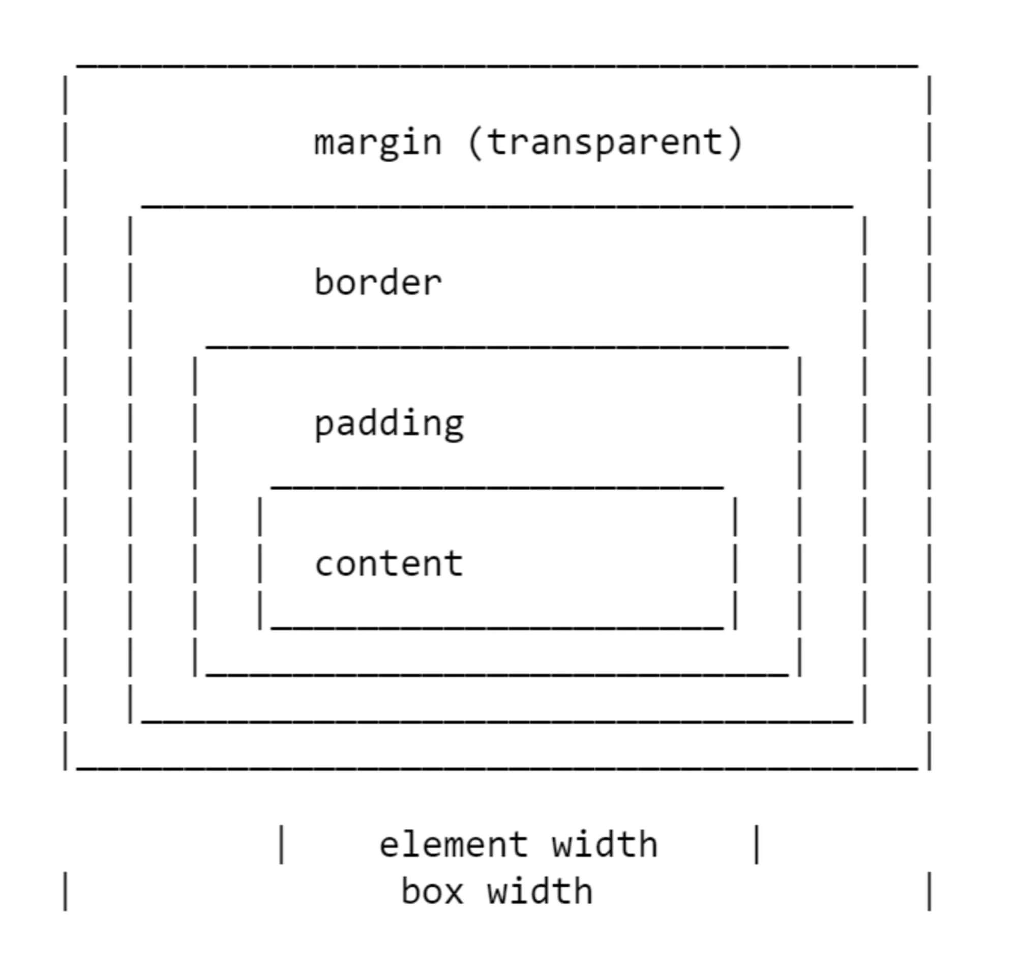
All four properties for each side of the block and the abbreviated margin property were defined in CSS1.
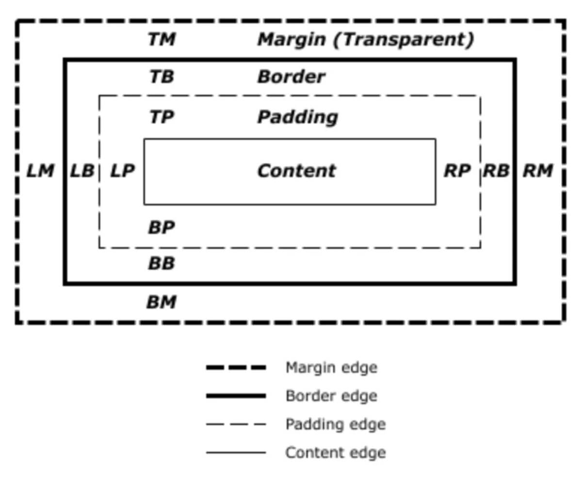
The CSS2.1 specification has an illustration to demonstrate the block model and also defines terms that we continue to use to describe different blocks. The specification describes content box, padding box, border box, and margin box, each of which is defined by the boundaries of content, padding, border and margin, respectively.
There is currently a specification for the Block Model 3 version as a working draft. When defining the Block Model and margins , it returns us to CSS2, so throughout the article we will use the definition from CSS2.
The CSS1 specification defined not only margin, but also their collapse. This behavior has become a source of many disappointments. Collapsing margin makes sense when you consider that in those days, CSS was used as a markup language for text documents. Collapsing margin means that when a heading with a lower margin is followed by a paragraph having a top margin, these two indents do not add up, creating a huge gap between the elements.
When two margins collapse, the space between the elements becomes equal to the larger of the two indents. The smaller indentation actually ends inside the larger
Margin collapse in the following situations:
I will begin the description with a demonstration of how margins collapse between adjacent siblings. Except as noted below, if you have two elements displayed one after another in the normal stream, the lower margin of the first element will collapse with the upper margin of the subsequent element.
In the CodePen example below, there are three
elements. For the first element, the upper and lower margin are 50px, for the second - 20px, for the third - 3em. The margin between the first two elements is 50px, since the lower margin of the lower element is absorbed by the higher margin of the upper element. The margin between the second two elements is 3em, since 3em is larger than 20 pixels at the lower margin of the second element.
If the block is empty, its upper and lower margin can collapse with each other. In the following CodePen example, the second element with the
class (not visible, because it is empty) has a 50px upper and lower margin, however, the space between the first and third elements is not 100 pixels, but 50. This is a result of the collapse of two margins.
Adding something to the block (even padding) will cause the upper and lower margins to be used, not collapsed.
This margin collapse scenario puzzles people more often than others, as it is not intuitive. In the next CodePen, we have a
with the class
(wrapper), and I set this
property of red, so that its borders can be seen. All three children have a margin of 50 pixels. However, the first and last elements are adjacent to the borders of the wrapper element; there is no indentation of 50 pixels between the element and the wrapper.
This is because the margin of the child collapses with any margin of the parent in such a way that it ends outside the parent. You can see this if you test the child using the developer browser panel. The area highlighted in yellow is margin.
The final example also highlights something about collapsing margin. In CSS2, only the vertical (upper and lower) margins were designed to collapse. Therefore, in the example above, margins on the left and right do not collapse and end inside the wrapper.
Note: It is worth remembering that margin collapse only in the direction of the block, for example between paragraphs.
Margin does not collapse if the element is set to absolute positioning or the
property. However, if you are in a situation where the margin collapse, how can this be prevented?
Collapsing margin does not occur in a situation when something is in between.
For example, the upper and lower margins of an empty block do not collapse if the block is set to a border or padding. In the example below, I added a 1px padding block. Now at the top and bottom of the block there is a margin of 50px.
This is the logic: if an empty block has no border or padding, it becomes virtually invisible. For example, it could be an empty paragraph placed in the markup of your CMS. If your CMS added superfluous paragraph elements, you probably would not want them to cause large indents between other paragraphs because their margins are taken into account. Add something to the block and get these indents.
Similar behavior can be seen with the margin of the first or last child whose margin extends beyond the parent. If we add a border to the parent, the margin of the child will remain inside.
And again, there is logic in this behavior. If you have wrapper elements for semantic purposes that are not displayed visually, you probably do not want them to create large indentation when displayed. This was more useful when the web was mostly text. And this behavior is less useful when we use layout elements.
The new “Block Formatting Context” (BFC) will prevent margins from falling out of the parent element. If we look again at the example with the first and last children whose margins fall outside the bounds of the wrapper element and set the wrapper to
, thus creating BFC, the margin of the children will remain inside.
To learn more about
, read my article " Understanding CSS Layout And The Block Formatting Context ". Changing the value of the
property to
will have the same effect, since it also creates a new BFC, although it can lead to scrollbars that are not needed in certain cases
Flex and Grid containers set the Flex and Grid formatting context for children, so they have different block layout behavior. One of these differences is that margins do not collapse:
Due to collapse, a good solution would be to offer a consistent way to work with margin on your site. The simplest thing you can do is make it a rule to set margin only on top or bottom of elements. In this case, you should not encounter collapse problems too often, since the side on which the margin is set will always be adjacent to the side of the other element without margin.
Note : Harry Roberts has an excellent publication detailing the reasons why setting margin in one direction only is a good idea, and not just because of solving collapse problems.
This approach does not solve the problem of margin falling out of child elements beyond the parent you may encounter. This particular problem is usually less common and understanding why this is happening can help find a solution. The ideal solution is to set the components that require this to
, and with a fallback (fallback) for older browsers, you can use
to create a BFC (block formatting context); turn the parent into a flex container; or even set padding to 1px. Remember that you can use the browser support request for properties to determine if the
property is supported so that only older browsers get a less optimal solution.
I believe that in most cases, understanding why margins collapse (or not) is the key. This will allow you to determine how to deal with this in each case. Whatever method you choose, share this information with your team. Quite often, the collapse of margin is a little mysterious, so the ways to deal with it are not always obvious. A comment in your code may be appropriate - you can even include a link to this article in it and help share knowledge about collapsing margins.
I decided that I would supplement this article with some additional data related to margin.
When you use percentages in CSS, it should be percentages of something. Margin (as well as padding) set in percent, will always be calculated relative to the width of the parent element. This means that when using percentages, you will always have equal margin from all sides around the element.
In the CodePen example below, I have a wrapper with a width of 200px, inside which is a block having margin = 10%. On all sides, margin is 20px, which is 10% of 200px.
Throughout this article, we talked about vertical margins, however, modern CSS, as a rule, thinks about the location of elements relative to the stream more than relative to the physical sides. Therefore, when we talk about vertical margins, we are actually talking about margins in the block dimension. These margin can be upper or lower in horizontal writing mode, or right or left in vertical mode.
After working with logical directions relative to the flow, it becomes easier to talk about the beginning and end of the block than about the top and bottom. To make this easier, a specification of Boolean Properties and Values was introduced in CSS. It replaces physical properties with properties related to flow.
If we talk about margin, this gives us the following alternatives (if we work with English or any other horizontally recorded mode with the direction of the text from left to right).
We also have two new abbreviated properties:
In the following CodePen example, I used stream-related keywords and then changed the block spelling mode. You can see how margins follow the text stream, rather than being tied to the physical sides.
You can read more about logical properties and values on MDN or in my article “ Understanding Logical Properties And Values ” on Smashing Magazine.
Now you know most of what you should know about margin. Briefly:
margin-top
,
margin-right
,
margin-bottom
and
margin-left
properties were described as early as CSS1, along with the abbreviated margin property for simultaneous setting in all four properties.
Margin seems pretty straightforward, however, in this article we will look at some points that people stumble upon when using it. In particular, how margins interact with each other and how collapse of outer margins actually works.
CSS block model
As with all articles about the components of the CSS CSS Block Model, we must determine what we mean by this and how the model was classified in different versions of CSS. The block model refers to how the different components of the block — content (pad), padding (padding), border (frame) and margin (padding) —are located and interact with each other. In CSS1, the block model was depicted using the ASCII diagram shown in the image below.
All four properties for each side of the block and the abbreviated margin property were defined in CSS1.
The CSS2.1 specification has an illustration to demonstrate the block model and also defines terms that we continue to use to describe different blocks. The specification describes content box, padding box, border box, and margin box, each of which is defined by the boundaries of content, padding, border and margin, respectively.
There is currently a specification for the Block Model 3 version as a working draft. When defining the Block Model and margins , it returns us to CSS2, so throughout the article we will use the definition from CSS2.
Collapse margin
The CSS1 specification defined not only margin, but also their collapse. This behavior has become a source of many disappointments. Collapsing margin makes sense when you consider that in those days, CSS was used as a markup language for text documents. Collapsing margin means that when a heading with a lower margin is followed by a paragraph having a top margin, these two indents do not add up, creating a huge gap between the elements.
When two margins collapse, the space between the elements becomes equal to the larger of the two indents. The smaller indentation actually ends inside the larger
Margin collapse in the following situations:
- Adjacent siblings (single parent)
- Empty blocks
- Parent and first / last child
Adjacent Nursing Elements
I will begin the description with a demonstration of how margins collapse between adjacent siblings. Except as noted below, if you have two elements displayed one after another in the normal stream, the lower margin of the first element will collapse with the upper margin of the subsequent element.
In the CodePen example below, there are three
div
elements. For the first element, the upper and lower margin are 50px, for the second - 20px, for the third - 3em. The margin between the first two elements is 50px, since the lower margin of the lower element is absorbed by the higher margin of the upper element. The margin between the second two elements is 3em, since 3em is larger than 20 pixels at the lower margin of the second element.
Empty blocks
If the block is empty, its upper and lower margin can collapse with each other. In the following CodePen example, the second element with the
empty
class (not visible, because it is empty) has a 50px upper and lower margin, however, the space between the first and third elements is not 100 pixels, but 50. This is a result of the collapse of two margins.
Adding something to the block (even padding) will cause the upper and lower margins to be used, not collapsed.
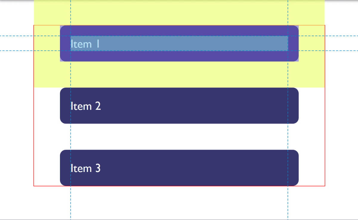
Parent and first / last child
This margin collapse scenario puzzles people more often than others, as it is not intuitive. In the next CodePen, we have a
div
with the class
wrapper
(wrapper), and I set this
div
outline
property of red, so that its borders can be seen. All three children have a margin of 50 pixels. However, the first and last elements are adjacent to the borders of the wrapper element; there is no indentation of 50 pixels between the element and the wrapper.
This is because the margin of the child collapses with any margin of the parent in such a way that it ends outside the parent. You can see this if you test the child using the developer browser panel. The area highlighted in yellow is margin.
Collapse only margin
The final example also highlights something about collapsing margin. In CSS2, only the vertical (upper and lower) margins were designed to collapse. Therefore, in the example above, margins on the left and right do not collapse and end inside the wrapper.
Note: It is worth remembering that margin collapse only in the direction of the block, for example between paragraphs.
Collapse prevention
Margin does not collapse if the element is set to absolute positioning or the
float
property. However, if you are in a situation where the margin collapse, how can this be prevented?
Collapsing margin does not occur in a situation when something is in between.
For example, the upper and lower margins of an empty block do not collapse if the block is set to a border or padding. In the example below, I added a 1px padding block. Now at the top and bottom of the block there is a margin of 50px.
This is the logic: if an empty block has no border or padding, it becomes virtually invisible. For example, it could be an empty paragraph placed in the markup of your CMS. If your CMS added superfluous paragraph elements, you probably would not want them to cause large indents between other paragraphs because their margins are taken into account. Add something to the block and get these indents.
Similar behavior can be seen with the margin of the first or last child whose margin extends beyond the parent. If we add a border to the parent, the margin of the child will remain inside.
And again, there is logic in this behavior. If you have wrapper elements for semantic purposes that are not displayed visually, you probably do not want them to create large indentation when displayed. This was more useful when the web was mostly text. And this behavior is less useful when we use layout elements.
Creating a “Block Formatting Context”
The new “Block Formatting Context” (BFC) will prevent margins from falling out of the parent element. If we look again at the example with the first and last children whose margins fall outside the bounds of the wrapper element and set the wrapper to
display: flow-root
, thus creating BFC, the margin of the children will remain inside.
To learn more about
display: flow-root
, read my article " Understanding CSS Layout And The Block Formatting Context ". Changing the value of the
overflow
property to
auto
will have the same effect, since it also creates a new BFC, although it can lead to scrollbars that are not needed in certain cases
Flex and Grid Containers
Flex and Grid containers set the Flex and Grid formatting context for children, so they have different block layout behavior. One of these differences is that margins do not collapse:
A flex container sets a new flex formatting context for content. This is the same as setting a block formatting context, except that flex markup is used instead of block markup. For example, floats do not work inside a flex container, and the margin of a flex container does not collapse with the margin of child elements.If we take the example above and wrap it with a Flex container, indicating the direction of the main axis of flex-direction: column, it becomes clear that now the margin of the children does not go beyond the wrap. Additionally, margins between adjacent flex items do not collapse, so we get a distance of 100 pixels between flex items, which is the sum of the top and bottom margins, which are 50px each.
- Flexbox Level 1
Margin strategies for your website
Due to collapse, a good solution would be to offer a consistent way to work with margin on your site. The simplest thing you can do is make it a rule to set margin only on top or bottom of elements. In this case, you should not encounter collapse problems too often, since the side on which the margin is set will always be adjacent to the side of the other element without margin.
Note : Harry Roberts has an excellent publication detailing the reasons why setting margin in one direction only is a good idea, and not just because of solving collapse problems.
This approach does not solve the problem of margin falling out of child elements beyond the parent you may encounter. This particular problem is usually less common and understanding why this is happening can help find a solution. The ideal solution is to set the components that require this to
display: flow-root
, and with a fallback (fallback) for older browsers, you can use
overflow
to create a BFC (block formatting context); turn the parent into a flex container; or even set padding to 1px. Remember that you can use the browser support request for properties to determine if the
display: flow-root
property is supported so that only older browsers get a less optimal solution.
I believe that in most cases, understanding why margins collapse (or not) is the key. This will allow you to determine how to deal with this in each case. Whatever method you choose, share this information with your team. Quite often, the collapse of margin is a little mysterious, so the ways to deal with it are not always obvious. A comment in your code may be appropriate - you can even include a link to this article in it and help share knowledge about collapsing margins.
I decided that I would supplement this article with some additional data related to margin.
Interest margin
When you use percentages in CSS, it should be percentages of something. Margin (as well as padding) set in percent, will always be calculated relative to the width of the parent element. This means that when using percentages, you will always have equal margin from all sides around the element.
In the CodePen example below, I have a wrapper with a width of 200px, inside which is a block having margin = 10%. On all sides, margin is 20px, which is 10% of 200px.
Margin in a flow dependent world
Throughout this article, we talked about vertical margins, however, modern CSS, as a rule, thinks about the location of elements relative to the stream more than relative to the physical sides. Therefore, when we talk about vertical margins, we are actually talking about margins in the block dimension. These margin can be upper or lower in horizontal writing mode, or right or left in vertical mode.
After working with logical directions relative to the flow, it becomes easier to talk about the beginning and end of the block than about the top and bottom. To make this easier, a specification of Boolean Properties and Values was introduced in CSS. It replaces physical properties with properties related to flow.
If we talk about margin, this gives us the following alternatives (if we work with English or any other horizontally recorded mode with the direction of the text from left to right).
- margin-top = margin-block-start
- margin-right = margin-inline-end
- margin-bottom = margin-block-end
- margin-left = margin-inline-start
We also have two new abbreviated properties:
- margin-block
- margin-inline
In the following CodePen example, I used stream-related keywords and then changed the block spelling mode. You can see how margins follow the text stream, rather than being tied to the physical sides.
You can read more about logical properties and values on MDN or in my article “ Understanding Logical Properties And Values ” on Smashing Magazine.
In conclusion
Now you know most of what you should know about margin. Briefly:
- Margin may collapse. Understanding when this happens and when not will help you solve any problems that they may create.
- Installing margin in only one direction solves many problems associated with them.
- As with any CSS situation, share the decisions you make with your team and comment on your code
- Taking into account block and line measurements instead of the physical sides, top, right, bottom, and left will help you, as the web is moving towards becoming independent of the writing mode
All Articles