Food Design Digest August 2019
The digest has been collecting fresh articles on interface design, as well as tools, patterns, cases, trends and historical stories since 2009. I carefully filter a large stream of subscriptions so that you can upgrade your professional skills and better solve work tasks. Previous issues: April 2010-July 2019 .

Analysis of the new user meeting interface in the Superhuman email service.

Shopify's Virginia Start takes apart the difference in address data forms around the world. She provides options for both individual fields and their groupings.

Andy Clarke continues a series of experiments with an interesting magazine layout on the web.
Tony Moreno from IBM writes about a vicious circle of inefficient corporate systems. They are inconvenient, so it takes time to grind them. At the same time, the employee spends a lot of energy fighting the system and does not stay in place for long, so you have to look for a new one and spend time again on his training.

Anna Kaley of the Nielsen / Norman Group parses the rules and examples of creating a good contact information page on the site.
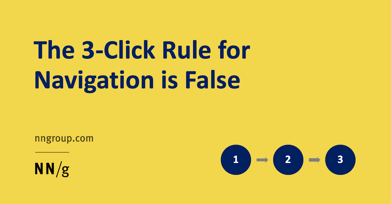
Page Laubheimer of the Nielsen / Norman Group refutes the old myth of the availability of any task in three clicks. It offers a set of techniques of information architecture that will help improve any navigation.
Analysis of the new user meeting interface in the Hopper reservation service.
Analysis of the new user meeting interface in the Tinder dating service.
The chic alphabet of creating design systems from Mike Dick from Survey Monkey. Tips for the management of the system as a project and product.

Framework for design systems on React.
The Vox Media team talks in sufficient detail about the phased implementation of support for users with disabilities. On the part of design and development.
The VMWare Clarity Design System team talks about the process of implementing support for users with disabilities.
The creators of Storybook made their own design system for working on the framework. Repository and story about it .
Uber's Marco Paglia talks about how the design team uses the Base design system.
Katarzyna Dziaduś from Netguru talks about creating a single style of illustration and plot designer for him.
The service generates a set of tokens for the design system based on the site or layout in Figma, Sketch or Adobe XD. Produces a file for preprocessors. True, such a code can hardly be used in a live product.
About Jay Freestone writes that the term “responsive design” is gradually losing its meaning. In the era of design systems, components themselves adjust to the size of the screen and there will be less and less need to set logic at the top level. He calls it intristic design.
Heroku's Ariana Escobar talks about systematically improving the contrast of colors in their design system.
Allen Huang and Rohan Shah of the Android team talk about research that has made the new approach with gesture navigation the main one . The trade-off seems controversial (for example, it will be more difficult to push the side menu), but it’s a gadget. What can be done with the top and bottom panels .
Kara Pernice of the Nielsen / Norman Group describes text reading methods that users practice in different situations. About some of them, they published separate detailed articles.

Kara Pernice of the Nielsen / Norman Group talks about the “layer cake” pattern with which users scan information on the screen. This is a more advanced version of the F-pattern, because it is based on a competent hierarchy of information.
Caroline Jarrett and Janice 'Ginny' Redish describe problems with formulas for evaluating text readability. They often contradict each other and solve the wrong problem - they simplify the delivery of words, not the meaning of the text.
An amusing experiment that clearly shows the nuisance of computer response delays when printing text.
A little confirmation that it is more convenient for users to solve complex problems behind a large screen of a computer or laptop. Computations from a Nielsen / Norman Group study by Kate Moran and Kim Flaherty.
Instruction by Sarah Gibbons from the Nielsen / Norman Group on creating cognitive maps with users. They allow you to better understand their idea of a topic or subject area.
The tool for working with a grid of repeating elements, familiar from Figma and Adobe XD, appeared - you can change the distance between columns and rows. In beta, the size of characters like buttons finally changes automatically when changing text and other content.
August update . Redesigned plugin panel, editing in Photoshop, advanced code export and other interface improvements.
There was an import from Figma and a dark theme.
The new version has components. Redesigned interface and refreshed brand.
A tool for illustrators and animators in virtual reality from Facebook.
The service makes a beautiful screenshot of the code for any social network.
Dropbox Adam Noffsinger talks about how the team set up the templates .
Philippe Hong tips - hotkeys and slightly less obvious features.
Skew : Makes a version of the layout in the projection for promotions and submission to the portfolio.
New color palette generators appear approximately every 10 minutes. Muzli collected the most useful of them (and this is more than fifty).
Brendan Mahony has put together a dozen smart Chrome extensions for designers.
The best article on the implementation of the knowledge base and insights from Etienne Fang from Uber. She talks about the prerequisites, the first steps and mistakes, the organizational features of rolling - so far no one has written more practical.

Prepare and conduct usability testing yourself . A memo on usability testing for beginners from Emilia Gorodovyh from Contour.
UserFocus David Travis compares the level of automation of user research methods now and 16 years ago. He divides their data into “thin” (quantitative data) and “bold” (observations and stories).
Good Jeff Sauro tips for choosing dependent metrics for custom research. In a previous article, he described the types of variables .
Simple UX Lab Configuration by Michael Margolis of Google Ventures.
Jeff Sauro reviewed the interface peer review methods that have emerged over the past 30 years.
Sensible Dan Brown tips from EightShapes on catch-up questions in interviews with users and customers. They allow you to find more insights.
Facebook's Stephanie Guaman talks about unusual user research techniques.
Eric Bailey talks about the limitations of devices and programs for users with disabilities working with the Internet. As well as problem areas layout for them.
Experiments with the implementation of unusual grids on the web and layouts in general from Jen Simmons.
Jeff Sauro is looking at how much the number of answer options that the readiness to recommend scale uses. A smaller scale means worse data quality, although there is a slight increase in speed. Judging by his other analysis of the simplified NPS scale , the increase in speed is illusory.
Jeff Sauro describes the features of the NASA TLX (Task Load Index) metric, which measures the load on the user.
Jared Spool describes an interesting approach to improve overall design literacy at a company. The designer held daily design criticism sessions for developers, who gradually improved their understanding of the basic techniques of interface design.
How does the Instacart design team work?
Scott Strubberg from IBM talks about his list of interface designer tools, which helps different departments of the company correctly allocate a budget for the purchase and generally justify it.
Rockwell Automation's Jonathan Walter for regular product design criticism sessions. The second part with a description of the methods.
Intercom's Emmet Connolly talks about the process of introducing new methods and practices to the design team. A significant part of the article is devoted to general philosophical issues, but in the last third it is just the most interesting.
Microsoft's Jon Friedman briefly talks about a dark topic in MS Office. A bit of content, but the video is gorgeous.
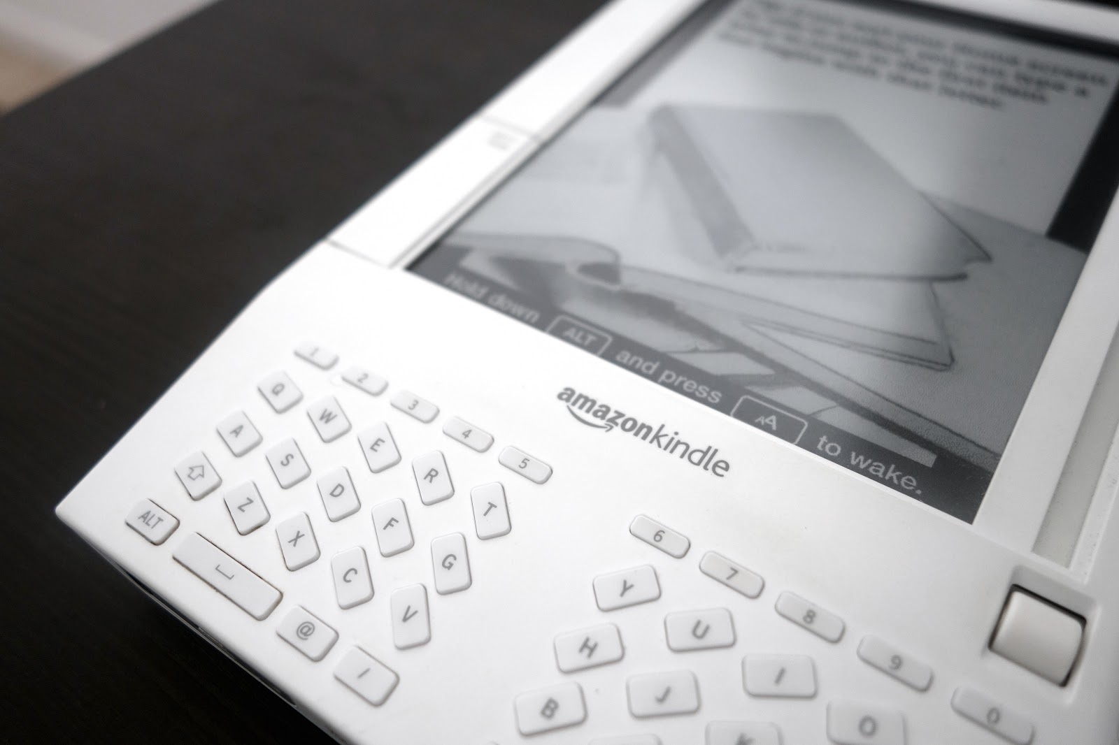
Overview of the interface of the first Amazon Kindle.
Alen Faljić is trying to justify the profession of “business designer”. This is a very specific area, imitating a modern product manager in consulting companies. We can say that this is another attempt to repack design thinking, only now with a (quite superficial) entry into the business strategy. There are conferences on the topic .

12.3M - supplies of smart watches in the world
26.1M - supply of smart speakers in the world .
Alibaba's Luban Robot Designer helps make banners. The seller chooses the style and target sizes, then all the necessary options are generated. They write that almost all advertising graphics on Tmall are done with it. Another review .

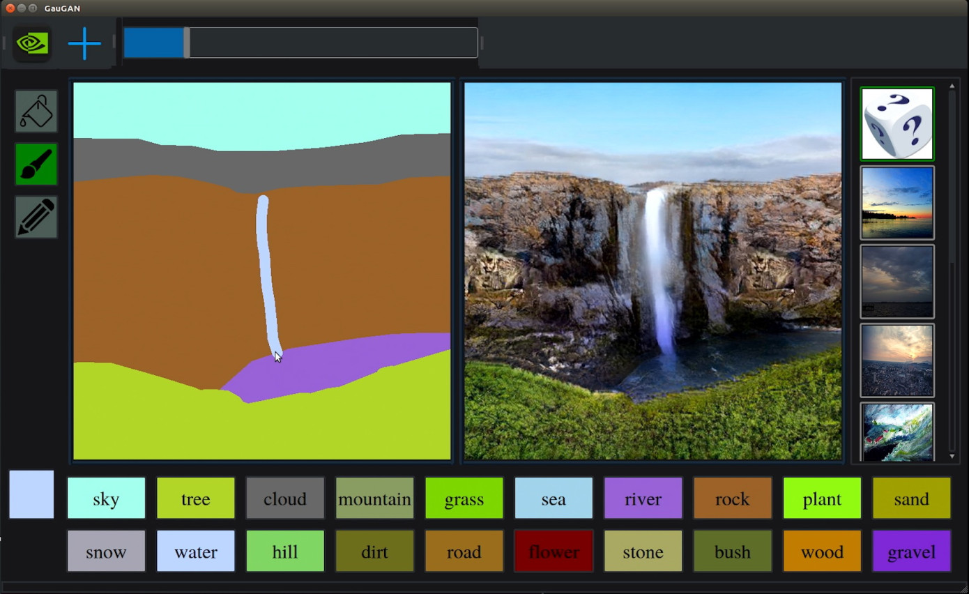
Another example of vicious magic - Nvidia's experimental solution turns the sketch into a photograph of the natural landscape.
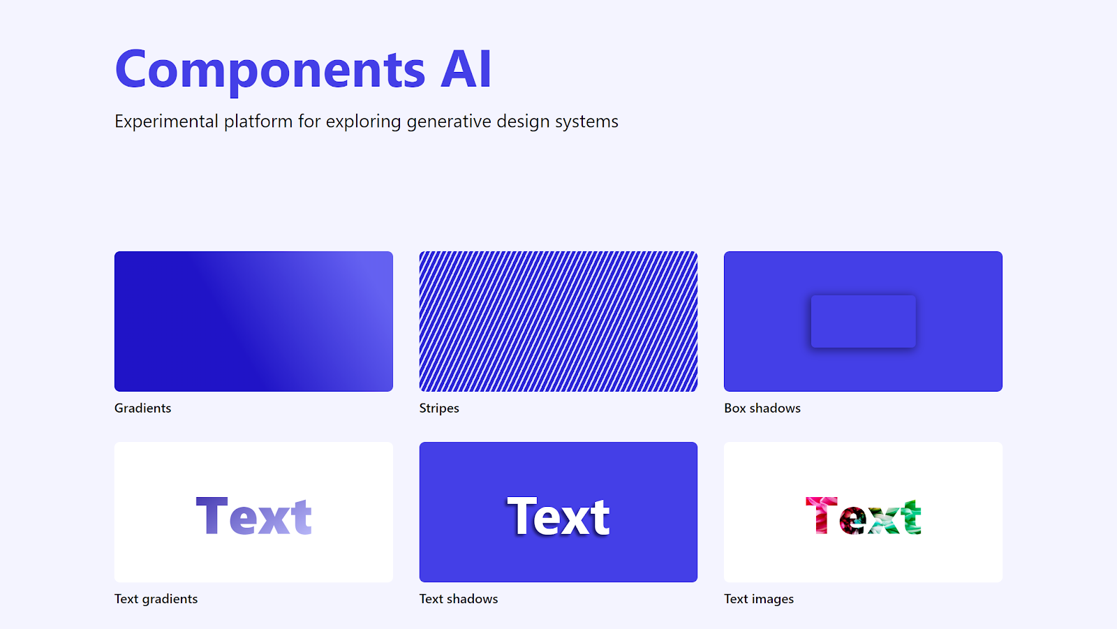
Another former Grid employee has launched an experimental algorithmic design tool. It generates tokens of the design system. His other experiment on this topic .
An experimental design tool that allows you to finish painting a photo with ready-made objects - for example, add a tree or a cloud.
An experiment from researchers at the University of Washington and Facebook allows you to animate a character from a regular photo.
Samsung domestic researchers experiment creating a video of a talking character based on a photo or picture.
Adobe's second research project identifies processed photographs. Video story .

There are so many credible face generators that even “Hot or Not” has appeared for them.

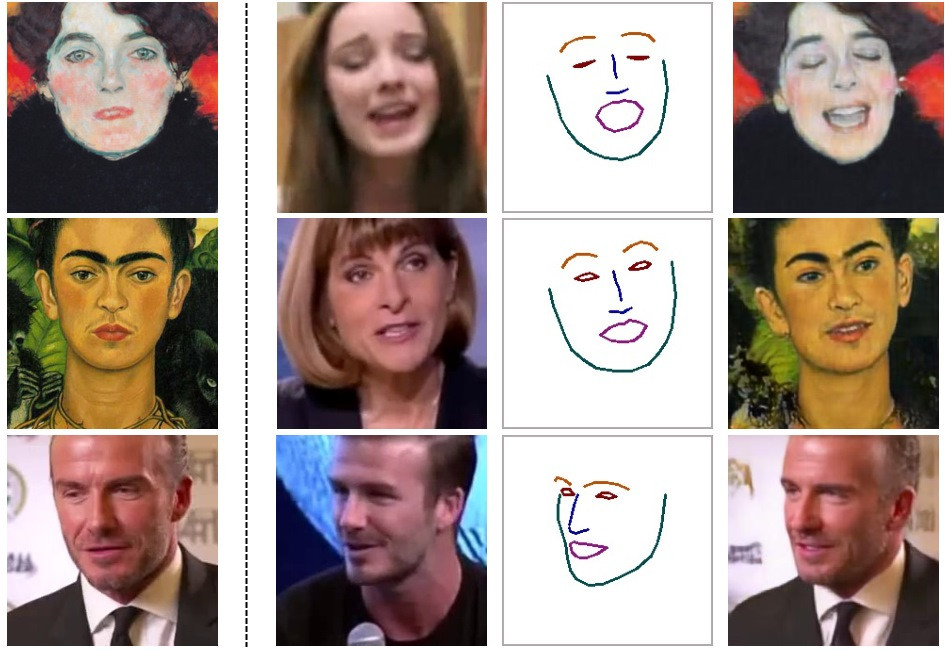
An experimental service turns a photo into a classic portrait. A few words about him .

An experimental service turns a photo into a classic portrait. A few words about him .
A collection of fantastic anime interfaces.

US warships will reduce the number of touch screens after a recent collision with a civilian ship.
Fabricio Teixeira and Caio Braga address the challenges of the product genre article series. There are countless them and often they are stereotyped, they do not solve the main problem - that the author is hired. They give examples of successful cases and give advice to designers.

Explore book / interface design course by Christopher Murphy. Served as sharpened to work in Adobe XD, but the first published chapters apply to any tool.
To the piggy bank is too exalted reaction of users to simple changes that do not break user scenarios or recognition in any way. Snapchat changed the thickness of the stroke inside the application icon and grabbed a lot of negative. People are threatening to uninstall the application.
Browse documentaries and TV shows for designers and artists on Netflix.
A good analysis of how the creators of design tools build a community around them. The opinions of their creators and examples in each of the areas of work.

Website of the Intercom design team. Articles and an overview of the work process. For example, positions and requirements for them , the process and principles of design , the influence of the designer .

Typeform Interface Writers Team Blog.
The SmashingConf Toronto 2019 conference was held June 25-26 in Toronto. The organizers published a video of the performances. Part of the development, but there are stories about the design system.
Patterns and best practices
Superhuman's Secret Onboarding UX
Analysis of the new user meeting interface in the Superhuman email service.
Designing address forms for everyone, everywhere
Shopify's Virginia Start takes apart the difference in address data forms around the world. She provides options for both individual fields and their groupings.
Inspired Design Decisions - Ernest Journal
Andy Clarke continues a series of experiments with an interesting magazine layout on the web.
Five problems caused by dysfunctional workflows and the implications of fixing them
Tony Moreno from IBM writes about a vicious circle of inefficient corporate systems. They are inconvenient, so it takes time to grind them. At the same time, the employee spends a lot of energy fighting the system and does not stay in place for long, so you have to look for a new one and spend time again on his training.
'Contact Us' Page Guidelines
Anna Kaley of the Nielsen / Norman Group parses the rules and examples of creating a good contact information page on the site.
The 3-Click Rule for Navigation Is False
Page Laubheimer of the Nielsen / Norman Group refutes the old myth of the availability of any task in three clicks. It offers a set of techniques of information architecture that will help improve any navigation.
Permission Request UX: How Hopper Perfectly Nails It During Onboarding
Analysis of the new user meeting interface in the Hopper reservation service.
How Tinder Design Hooks You Up
Analysis of the new user meeting interface in the Tinder dating service.
Baymard Institute Research
- Edward Scott writes about problems with a promoblock calling to install the application on mobile websites of online stores . Thoughtless implementation overrides the buying process and drops the conversion.
- Rebecca Hugo writes about the importance of working with negative reviews in online stores.
Design systems and guidelines
The abcs of design systems
The chic alphabet of creating design systems from Mike Dick from Survey Monkey. Tips for the management of the system as a project and product.
Atomize React - Design System for React JS
Framework for design systems on React.
Update on accessibility improvements we're making to Chorus
The Vox Media team talks in sufficient detail about the phased implementation of support for users with disabilities. On the part of design and development.
A Commitment to Accessibility
The VMWare Clarity Design System team talks about the process of implementing support for users with disabilities.
Storybook design system
The creators of Storybook made their own design system for working on the framework. Repository and story about it .
Uber Design Platform
Uber's Marco Paglia talks about how the design team uses the Base design system.
How We Keep Brand Consistency in Our Visual Language - A Design System for Illustrations
Katarzyna Dziaduś from Netguru talks about creating a single style of illustration and plot designer for him.
Superposition - Use the design system you already have
The service generates a set of tokens for the design system based on the site or layout in Figma, Sketch or Adobe XD. Produces a file for preprocessors. True, such a code can hardly be used in a live product.
Should we still be selling responsive web design?
About Jay Freestone writes that the term “responsive design” is gradually losing its meaning. In the era of design systems, components themselves adjust to the size of the screen and there will be less and less need to set logic at the top level. He calls it intristic design.
Designing for Accessibility: Contrast Ratio
Heroku's Ariana Escobar talks about systematically improving the contrast of colors in their design system.
Material design
Allen Huang and Rohan Shah of the Android team talk about research that has made the new approach with gesture navigation the main one . The trade-off seems controversial (for example, it will be more difficult to push the side menu), but it’s a gadget. What can be done with the top and bottom panels .
User understanding
Text Scanning Patterns - Eyetracking Evidence
Kara Pernice of the Nielsen / Norman Group describes text reading methods that users practice in different situations. About some of them, they published separate detailed articles.
The Layer-Cake Pattern of Scanning Content on the Web
Kara Pernice of the Nielsen / Norman Group talks about the “layer cake” pattern with which users scan information on the screen. This is a more advanced version of the F-pattern, because it is based on a competent hierarchy of information.
Readability Formulas - 7 Reasons to Avoid Them and What to Do Instead
Caroline Jarrett and Janice 'Ginny' Redish describe problems with formulas for evaluating text readability. They often contradict each other and solve the wrong problem - they simplify the delivery of words, not the meaning of the text.
Typing delay experiment
An amusing experiment that clearly shows the nuisance of computer response delays when printing text.
Large Devices Preferred for Important Tasks
A little confirmation that it is more convenient for users to solve complex problems behind a large screen of a computer or laptop. Computations from a Nielsen / Norman Group study by Kate Moran and Kim Flaherty.
Information architecture, conceptual design, content strategy
Cognitive mapping in user research
Instruction by Sarah Gibbons from the Nielsen / Norman Group on creating cognitive maps with users. They allow you to better understand their idea of a topic or subject area.
New Interface Design Tools
Sketch 57 and Beta Sketch 58
The tool for working with a grid of repeating elements, familiar from Figma and Adobe XD, appeared - you can change the distance between columns and rows. In beta, the size of characters like buttons finally changes automatically when changing text and other content.
Adobe xd
August update . Redesigned plugin panel, editing in Photoshop, advanced code export and other interface improvements.
Flinto
There was an import from Figma and a dark theme.
Protopie 4
The new version has components. Redesigned interface and refreshed brand.
Courses
- Ruslan Sharipov at Udemy as a screencast on prototyping practice c. 3,5 hours about the basics and not only on the example of an integral project.
- Meng To also launched the course .
Quill 2.0
A tool for illustrators and animators in virtual reality from Facebook.
Codeimg
The service makes a beautiful screenshot of the code for any social network.
Figma
Dropbox Adam Noffsinger talks about how the team set up the templates .
Philippe Hong tips - hotkeys and slightly less obvious features.
Plugins
Skew : Makes a version of the layout in the projection for promotions and submission to the portfolio.
Color Tools For Designers 2019
New color palette generators appear approximately every 10 minutes. Muzli collected the most useful of them (and this is more than fifty).
10 best Chrome extensions for designers
Brendan Mahony has put together a dozen smart Chrome extensions for designers.
User research and analytics
The Power of Insights - A behind-the-scenes look at the new insights platform at Uber
The best article on the implementation of the knowledge base and insights from Etienne Fang from Uber. She talks about the prerequisites, the first steps and mistakes, the organizational features of rolling - so far no one has written more practical.
Prepare and conduct usability testing yourself . A memo on usability testing for beginners from Emilia Gorodovyh from Contour.
The future of UX research is automated, and that's a problem
UserFocus David Travis compares the level of automation of user research methods now and 16 years ago. He divides their data into “thin” (quantitative data) and “bold” (observations and stories).
Picking the Right Dependent Variables for UX Research
Good Jeff Sauro tips for choosing dependent metrics for custom research. In a previous article, he described the types of variables .
How to build a simple UX lab anywhere
Simple UX Lab Configuration by Michael Margolis of Google Ventures.
Understanding Expert Reviews and Inspection Methods
Jeff Sauro reviewed the interface peer review methods that have emerged over the past 30 years.
The Definitive Guide to Asking Follow-up Questions
Sensible Dan Brown tips from EightShapes on catch-up questions in interviews with users and customers. They allow you to find more insights.
Getting Creative with UX Research
Facebook's Stephanie Guaman talks about unusual user research techniques.
Visual programming and design in the browser
Truths about digital accessibility
Eric Bailey talks about the limitations of devices and programs for users with disabilities working with the Internet. As well as problem areas layout for them.
Web Design Experiments by Jen Simmons
Experiments with the implementation of unusual grids on the web and layouts in general from Jen Simmons.
New scripts
- Wave generator in SVG for promotional sites. They have a plugin for Figma .
- Mini-navigation on the site page in the corner of the screen .
- Screen layout examples on React .
- How to make animation of variable fonts (a word or phrase smoothly changes the style).
- A script for interesting text animation .
Browser Updates
- Chrome 76 supports a dark theme at the browser level . If the site has it, it will turn on automatically.
- Chrome 76 supports lazy loading out of the box .
Metrics and ROI
Is a Three-Point Scale Good Enough?
Jeff Sauro is looking at how much the number of answer options that the readiness to recommend scale uses. A smaller scale means worse data quality, although there is a slight increase in speed. Judging by his other analysis of the simplified NPS scale , the increase in speed is illusory.
10 Things to Know about the NASA TLX
Jeff Sauro describes the features of the NASA TLX (Task Load Index) metric, which measures the load on the user.
Design Management and DesignOps
The Powerful Ritual of Daily Design Review
Jared Spool describes an interesting approach to improve overall design literacy at a company. The designer held daily design criticism sessions for developers, who gradually improved their understanding of the basic techniques of interface design.
We are the Instacart Design Team
How does the Instacart design team work?
Enter the Design Toolbox
Scott Strubberg from IBM talks about his list of interface designer tools, which helps different departments of the company correctly allocate a budget for the purchase and generally justify it.
Prioritizing Design Critique, Part 2
Rockwell Automation's Jonathan Walter for regular product design criticism sessions. The second part with a description of the methods.
The tools we use: Challenging dogma in the design process
Intercom's Emmet Connolly talks about the process of introducing new methods and practices to the design team. A significant part of the article is devoted to general philosophical issues, but in the last third it is just the most interesting.
Cases
Designing dark mode
Microsoft's Jon Friedman briefly talks about a dark topic in MS Office. A bit of content, but the video is gorgeous.
Story
The Original Kindle Was Crazy
Overview of the interface of the first Amazon Kindle.
Trends
What Is Business Design and How Do I Become a Business Designer?
Alen Faljić is trying to justify the profession of “business designer”. This is a very specific area, imitating a modern product manager in consulting companies. We can say that this is another attempt to repack design thinking, only now with a (quite superficial) entry into the business strategy. There are conferences on the topic .
Market Statistics for 2019Q2
12.3M - supplies of smart watches in the world
26.1M - supply of smart speakers in the world .
Algorithmic Design
Alibaba LuBan - AI-based Graphic Design Tool
Alibaba's Luban Robot Designer helps make banners. The seller chooses the style and target sizes, then all the necessary options are generated. They write that almost all advertising graphics on Tmall are done with it. Another review .
Nvidia AI turns sketches into photorealistic landscapes in seconds
Another example of vicious magic - Nvidia's experimental solution turns the sketch into a photograph of the natural landscape.
Components AI
Another former Grid employee has launched an experimental algorithmic design tool. It generates tokens of the design system. His other experiment on this topic .
Ganpaint studio
An experimental design tool that allows you to finish painting a photo with ready-made objects - for example, add a tree or a cloud.
Photo wake-up
An experiment from researchers at the University of Washington and Facebook allows you to animate a character from a regular photo.
Mona Lisa frown: Machine learning brings old paintings and photos to life
Samsung domestic researchers experiment creating a video of a talking character based on a photo or picture.
Adobe Research and UC Berkeley: Detecting Facial Manipulations in Adobe Photoshop
Adobe's second research project identifies processed photographs. Video story .
Judge fake people
There are so many credible face generators that even “Hot or Not” has appeared for them.
AI Portraits
An experimental service turns a photo into a classic portrait. A few words about him .
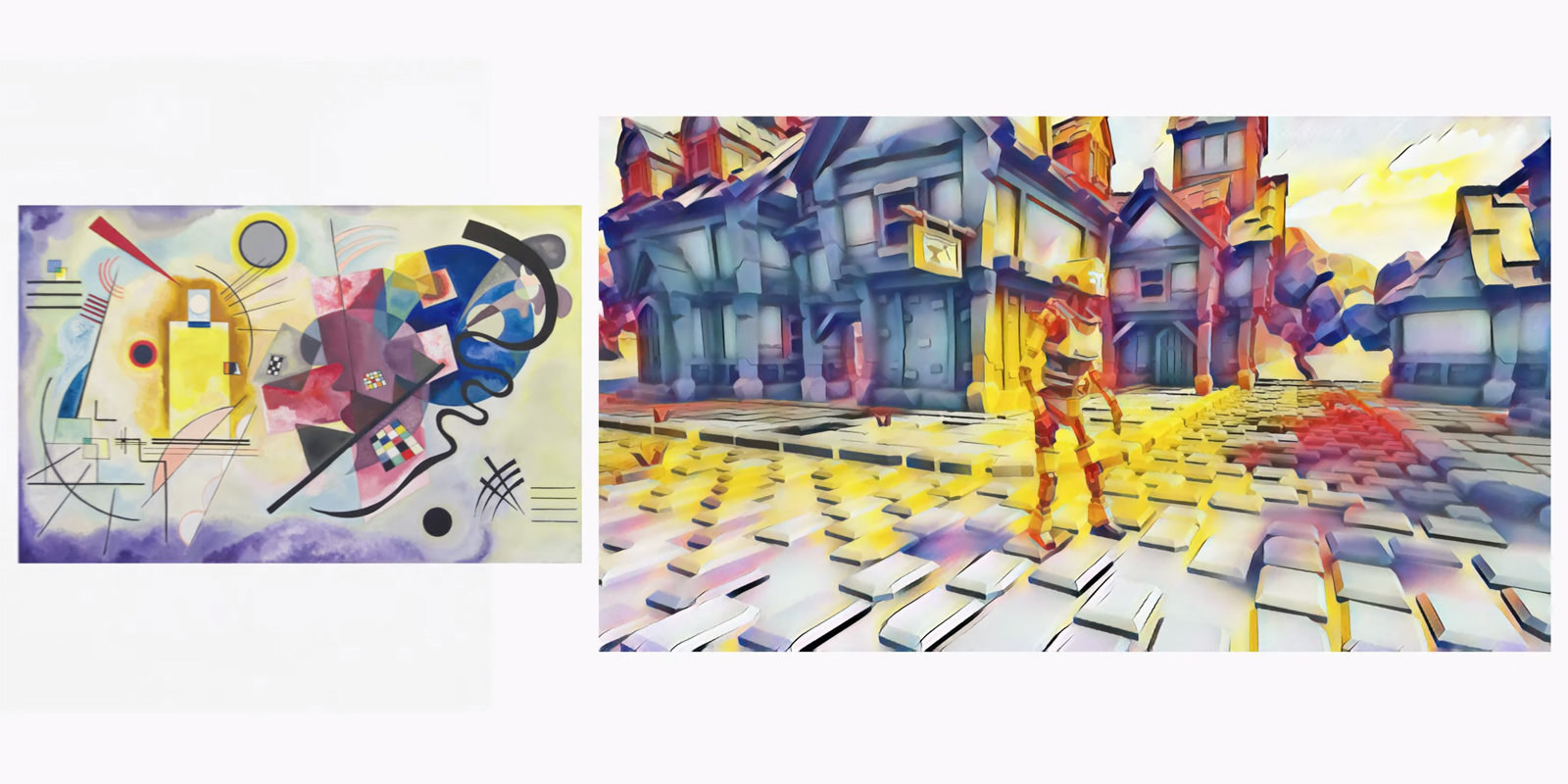
Google Stadia can use AI to change a game's art in real-time
An experimental service turns a photo into a classic portrait. A few words about him .
Anime User Interface
A collection of fantastic anime interfaces.
US Navy will scrap touchscreen controls on its destroyers
US warships will reduce the number of touch screens after a recent collision with a civilian ship.
For general and professional development
The case study factory
Fabricio Teixeira and Caio Braga address the challenges of the product genre article series. There are countless them and often they are stereotyped, they do not solve the main problem - that the author is hired. They give examples of successful cases and give advice to designers.
Christopher Murphy - Building Beautiful UIs
Explore book / interface design course by Christopher Murphy. Served as sharpened to work in Adobe XD, but the first published chapters apply to any tool.
Reaction to the new Snapchat icon
To the piggy bank is too exalted reaction of users to simple changes that do not break user scenarios or recognition in any way. Snapchat changed the thickness of the stroke inside the application icon and grabbed a lot of negative. People are threatening to uninstall the application.
The designer's guide to Netflix - 12 must-watch shows and movies
Browse documentaries and TV shows for designers and artists on Netflix.
People and companies in the industry
How Design Companies Build Communities
A good analysis of how the creators of design tools build a community around them. The opinions of their creators and examples in each of the areas of work.
Intercom Design - Case Studies, Resources, and Design Jobs
Website of the Intercom design team. Articles and an overview of the work process. For example, positions and requirements for them , the process and principles of design , the influence of the designer .
Writing at typeform
Typeform Interface Writers Team Blog.
Conference proceedings
SmashingConf Toronto 2019
The SmashingConf Toronto 2019 conference was held June 25-26 in Toronto. The organizers published a video of the performances. Part of the development, but there are stories about the design system.
Subscribe to the digest on Facebook , VKontakte , Telegram or by mail - there fresh links appear every week. Thanks to everyone who shares the links in the group, especially Gennady Dragun, Pavel Skripkin, Dmitry Podluzhny, Anton Artemov, Denis Efremov, Alexei Kopylov, Taras Brizitsky, Evgeny Sokolov and Anton Oleinik. Special thanks to the Setka team for the editor and Alexander Orlov for the visual style.
All Articles