Accordion, faq, spoiler and other drop-down widgets
You can create an accordion, faq, spoiler and the like using Div and JavaScript.
But better: Details and Summary
It is supported by all modern browsers and this is a semantically correctly formatted code, the use of which will have advantages:
- People with disabilities will be easier to use your site! Their software (screen readers and the like) perfectly understands html5 tags and will correctly process them and correctly inform people about the content.
- The coherence of the text will improve, and search engines will be able to better index the site, as they will better understand how visible and hidden text are related.
- It will be available to control elements from the keyboard and other devices.
- The amount of javascript code to be loaded is reduced, which increases the page loading speed, processing speed and correctness.
- Improving performance in Lighthouse, Google PageSpeed and other similar tools.
- It works when javascript is turned off.
Minus:
- Older browsers do not know such tags and will not hide information.
HTML:
<details> <summary>- </summary> <p> — </p> </details> <details open> <summary>- 2</summary> <p> </p> </details> <details> <summary>- 3</summary> <p> — </p> </details>
Demonstration:
On the one hand, it doesn’t look very beautiful, on the other hand it is neutral and can easily fit into many designs. By the way, the default view of the Details tag is very similar to the spoiler from the Habr, only you need to repaint it a bit, underline it and get the semantically correct, without javascript and divs, Habrovsk spoiler.

Unfortunately, the default marker has two drawbacks:
- Older browsers do not see it.
- Webkit browsers do not allow changing marker symbol.
For this reason, the default marker must be hidden and create your own.
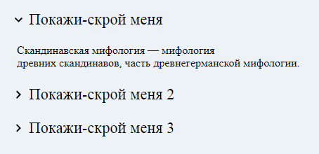
Consider the first Details / Summary example with a modified text marker:
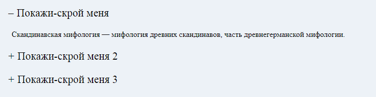
CSS:
summary::-webkit-details-marker{display:none;} summary::-moz-list-bullet{list-style-type:none;} summary::marker{display:none;} summary { display:inline-block; padding: .3em .5em .3em .4em; font-size:1.4em; cursor: pointer; } summary:before { content: "+"; margin-right: .3em; } details[open] > summary:before { content: "–"; } summary ~ * { padding:0 1em 0 1em; } summary:focus { outline:0; box-shadow: inset 0 0 1px rgba(0,0,0,0.3), inset 0 0 2px rgba(0,0,0,0.3); } details{ display:block; margin-bottom: .5rem; }
We make default markers display: none and show the alternative one using summary: before {content: "+";}
summary: focus - stroke using box-shadow, this is necessary for the keyboard so that the active element is visible and you can move with the tab key and open and close with a space.
For the summary tag, I set display: inline-block - so that it does not stretch to the full width and only words are clickable, and not the entire line.
Demonstration:
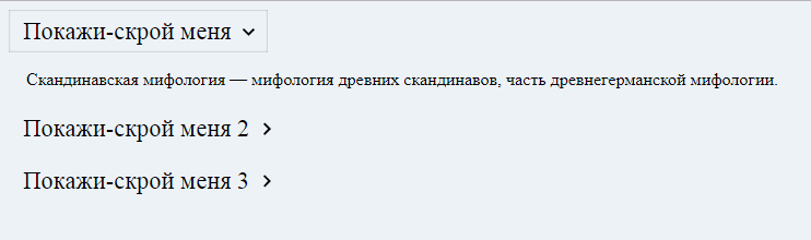
Text marker on the right + simple text and marker animation:
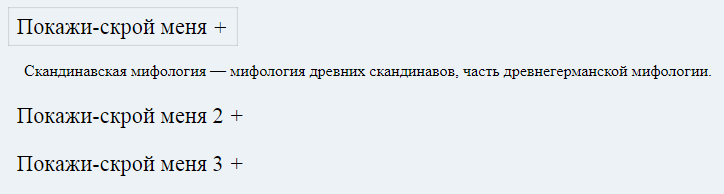
CSS:
summary::-webkit-details-marker{display:none;} summary::-moz-list-bullet{list-style-type:none;} summary::marker{display:none;} summary { display:inline-block; padding: .3em .5em .3em .4em; font-size:1.4em; cursor: pointer; } summary:after { content: "+"; margin-left: .3em; display: inline-block; transition: transform .5s; } details[open] > summary:after { transform: scale(1,-1); } summary ~ * { padding:0 1em 0 1em; } summary:focus { outline:0; box-shadow: inset 0 0 1px rgba(0,0,0,0.3), inset 0 0 2px rgba(0,0,0,0.3); } details[open] summary ~ *{ animation: sweep .5s ease-in-out; } @keyframes sweep { 0% {opacity: 0;} 100% {opacity: 1;} } details{ display:block; margin-bottom: .5rem; }
In the new example, I use summary: after for the marker instead of summary: before, so that it appears on the right.
Marker animation using transform: scale (1, -1);
To all the elements that are after summary, I set the animation for a smooth appearance using animation: sweep .5s ease-in-out;
Demonstration:
Svg marker + rotation animation:
CSS:
summary::-webkit-details-marker{display:none;} summary::-moz-list-bullet{list-style-type:none;} summary::marker{display:none;} summary { display:inline-block; padding: .3em .6em .3em 1.5em; font-size:1.4em; cursor: pointer; position: relative; } summary:before { left: .3em; top: .4em; color: transparent; background: url("data:image/svg+xml;base64,PHN2ZyBoZWlnaHQ9IjM0IiB2aWV3Qm94PSIwIDAgMjQgMjQiIHdpZHRoPSIzNCIgeG1sbnM9Imh0dHA6Ly93d3cudzMub3JnLzIwMDAvc3ZnIj48cGF0aCBkPSJNOC41OSAxNi4zNGw0LjU4LTQuNTktNC41OC00LjU5TDEwIDUuNzVsNiA2LTYgNnoiLz48L3N2Zz4=") no-repeat 50% 50% / 1em 1em; width: 1em; height: 1em; content: ""; position: absolute; transition: transform .5s; } details[open] > summary:before { transform: rotateZ(90deg); } summary ~ * { padding:0 1em 0 1em; } details[open] summary ~ *{ animation: sweep .5s ease-in-out; } @keyframes sweep { 0% {opacity: 0;} 100% {opacity: 1;} } summary:focus { outline:0; box-shadow: inset 0 0 1px rgba(0,0,0,0.3), inset 0 0 2px rgba(0,0,0,0.3); } details{ display:block; margin-bottom: .5rem; }
/ svg + xml; base64, PHN2ZyBoZWlnaHQ9IjM0IiB2aWV3Qm94PSIwIDAgMjQgMjQiIHdpZHRoPSIzNCIgeG1sbnM9Imh0dHA6Ly93d3cudzMub3JnLzIwMDAvc3ZnIj48cGF0aCBkPSJNOC41OSAxNi4zNGw0LjU4LTQuNTktNC41OC00LjU5TDEwIDUuNzVsNiA2LTYgNnoiLz48L3N2Zz4 =") no-repeat summary::-webkit-details-marker{display:none;} summary::-moz-list-bullet{list-style-type:none;} summary::marker{display:none;} summary { display:inline-block; padding: .3em .6em .3em 1.5em; font-size:1.4em; cursor: pointer; position: relative; } summary:before { left: .3em; top: .4em; color: transparent; background: url("data:image/svg+xml;base64,PHN2ZyBoZWlnaHQ9IjM0IiB2aWV3Qm94PSIwIDAgMjQgMjQiIHdpZHRoPSIzNCIgeG1sbnM9Imh0dHA6Ly93d3cudzMub3JnLzIwMDAvc3ZnIj48cGF0aCBkPSJNOC41OSAxNi4zNGw0LjU4LTQuNTktNC41OC00LjU5TDEwIDUuNzVsNiA2LTYgNnoiLz48L3N2Zz4=") no-repeat 50% 50% / 1em 1em; width: 1em; height: 1em; content: ""; position: absolute; transition: transform .5s; } details[open] > summary:before { transform: rotateZ(90deg); } summary ~ * { padding:0 1em 0 1em; } details[open] summary ~ *{ animation: sweep .5s ease-in-out; } @keyframes sweep { 0% {opacity: 0;} 100% {opacity: 1;} } summary:focus { outline:0; box-shadow: inset 0 0 1px rgba(0,0,0,0.3), inset 0 0 2px rgba(0,0,0,0.3); } details{ display:block; margin-bottom: .5rem; }
Summary: before had to be seriously redone:
- Put position: absolute; left: .3em; top: .4em; width: 1em; height: 1em;
- Text marker must be set to color: transparent; otherwise it will be visible.
- We hang the picture using background.
It is also necessary to set padding-left indentation at summary to 1.5em so that the text and the icon do not overlap each other.
Well, we add transform: rotateZ (90deg) for a beautiful turn of the arrow.
Demonstration:
If we need the svg icon on the right, then we need to change summary: before and put right instead of left.
For summary put padding-right: 1.5em;
CSS:
summary::-webkit-details-marker{display:none;} summary::-moz-list-bullet{list-style-type:none;} summary::marker{display:none;} summary { display:inline-block; padding: .3em 1.5em .3em .6em; font-size:1.4em; cursor: pointer; position: relative; } summary:before { right: .3em; top: .4em; color: transparent; background: url("data:image/svg+xml;base64,PHN2ZyBoZWlnaHQ9IjM0IiB2aWV3Qm94PSIwIDAgMjQgMjQiIHdpZHRoPSIzNCIgeG1sbnM9Imh0dHA6Ly93d3cudzMub3JnLzIwMDAvc3ZnIj48cGF0aCBkPSJNOC41OSAxNi4zNGw0LjU4LTQuNTktNC41OC00LjU5TDEwIDUuNzVsNiA2LTYgNnoiLz48L3N2Zz4=") no-repeat 50% 50% / 1em 1em; width: 1em; height: 1em; content: ""; position: absolute; transition: transform .5s; } details[open] > summary:before { transform: rotateZ(90deg); } summary ~ * { padding:0 1em 0 1em; } details[open] summary ~ *{ animation: sweep .5s ease-in-out; } @keyframes sweep { 0% {opacity: 0;} 100% {opacity: 1;} } summary:focus { outline:0; box-shadow: inset 0 0 1px rgba(0,0,0,0.3), inset 0 0 2px rgba(0,0,0,0.3); } details{ display:block; margin-bottom: .5rem; }
/ svg + xml; base64, PHN2ZyBoZWlnaHQ9IjM0IiB2aWV3Qm94PSIwIDAgMjQgMjQiIHdpZHRoPSIzNCIgeG1sbnM9Imh0dHA6Ly93d3cudzMub3JnLzIwMDAvc3ZnIj48cGF0aCBkPSJNOC41OSAxNi4zNGw0LjU4LTQuNTktNC41OC00LjU5TDEwIDUuNzVsNiA2LTYgNnoiLz48L3N2Zz4 =") no-repeat summary::-webkit-details-marker{display:none;} summary::-moz-list-bullet{list-style-type:none;} summary::marker{display:none;} summary { display:inline-block; padding: .3em 1.5em .3em .6em; font-size:1.4em; cursor: pointer; position: relative; } summary:before { right: .3em; top: .4em; color: transparent; background: url("data:image/svg+xml;base64,PHN2ZyBoZWlnaHQ9IjM0IiB2aWV3Qm94PSIwIDAgMjQgMjQiIHdpZHRoPSIzNCIgeG1sbnM9Imh0dHA6Ly93d3cudzMub3JnLzIwMDAvc3ZnIj48cGF0aCBkPSJNOC41OSAxNi4zNGw0LjU4LTQuNTktNC41OC00LjU5TDEwIDUuNzVsNiA2LTYgNnoiLz48L3N2Zz4=") no-repeat 50% 50% / 1em 1em; width: 1em; height: 1em; content: ""; position: absolute; transition: transform .5s; } details[open] > summary:before { transform: rotateZ(90deg); } summary ~ * { padding:0 1em 0 1em; } details[open] summary ~ *{ animation: sweep .5s ease-in-out; } @keyframes sweep { 0% {opacity: 0;} 100% {opacity: 1;} } summary:focus { outline:0; box-shadow: inset 0 0 1px rgba(0,0,0,0.3), inset 0 0 2px rgba(0,0,0,0.3); } details{ display:block; margin-bottom: .5rem; }
Demonstration:
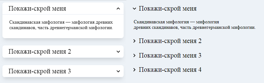
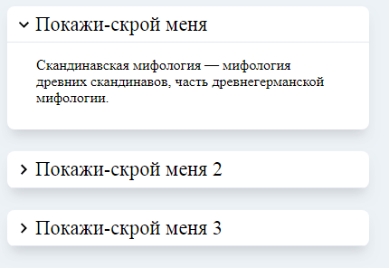
Let's now make one of the most common examples of creating an accordion, where there will be an icon on the left, background, shadows, effects:
CSS:
body{background: #edf2f7;} details{ display:block; background: #fff; width:400px; box-shadow: 0 10px 15px -5px rgba(0, 0, 0, 0.1), 0 10px 10px -5px rgba(0, 0, 0, 0.04); border-radius: 8px; overflow:hidden; margin-bottom: 1.5rem; } summary::-webkit-details-marker{display:none;} summary::-moz-list-bullet{list-style-type:none;} summary::marker{display:none;} summary { display:block; padding: .3em .3em .3em 1.4em; font-size:1.4em; cursor: pointer; position: relative; border-bottom: 1px solid #e2e8f0; } summary:before { top: .4em; left: .3em; color: transparent; background: url("data:image/svg+xml;base64,PHN2ZyBoZWlnaHQ9IjM0IiB2aWV3Qm94PSIwIDAgMjQgMjQiIHdpZHRoPSIzNCIgeG1sbnM9Imh0dHA6Ly93d3cudzMub3JnLzIwMDAvc3ZnIj48cGF0aCBkPSJNOC41OSAxNi4zNGw0LjU4LTQuNTktNC41OC00LjU5TDEwIDUuNzVsNiA2LTYgNnoiLz48L3N2Zz4=") no-repeat 50% 50% / 1em 1em; width: 1em; height: 1em; content: ""; position: absolute; transition: transform .5s; } details[open] > summary:before { transform: rotateZ(90deg); } summary ~ * { padding: 0 2em 10px 2em; } details[open] summary ~ *{ animation: sweep .5s ease-in-out; } @keyframes sweep { 0% {opacity: 0;} 100% {opacity: 1;} } summary:focus { outline:0; box-shadow: inset 0 0 1px rgba(0,0,0,0.3), inset 0 0 2px rgba(0,0,0,0.3); }
/ svg + xml; base64, PHN2ZyBoZWlnaHQ9IjM0IiB2aWV3Qm94PSIwIDAgMjQgMjQiIHdpZHRoPSIzNCIgeG1sbnM9Imh0dHA6Ly93d3cudzMub3JnLzIwMDAvc3ZnIj48cGF0aCBkPSJNOC41OSAxNi4zNGw0LjU4LTQuNTktNC41OC00LjU5TDEwIDUuNzVsNiA2LTYgNnoiLz48L3N2Zz4 =") no-repeat body{background: #edf2f7;} details{ display:block; background: #fff; width:400px; box-shadow: 0 10px 15px -5px rgba(0, 0, 0, 0.1), 0 10px 10px -5px rgba(0, 0, 0, 0.04); border-radius: 8px; overflow:hidden; margin-bottom: 1.5rem; } summary::-webkit-details-marker{display:none;} summary::-moz-list-bullet{list-style-type:none;} summary::marker{display:none;} summary { display:block; padding: .3em .3em .3em 1.4em; font-size:1.4em; cursor: pointer; position: relative; border-bottom: 1px solid #e2e8f0; } summary:before { top: .4em; left: .3em; color: transparent; background: url("data:image/svg+xml;base64,PHN2ZyBoZWlnaHQ9IjM0IiB2aWV3Qm94PSIwIDAgMjQgMjQiIHdpZHRoPSIzNCIgeG1sbnM9Imh0dHA6Ly93d3cudzMub3JnLzIwMDAvc3ZnIj48cGF0aCBkPSJNOC41OSAxNi4zNGw0LjU4LTQuNTktNC41OC00LjU5TDEwIDUuNzVsNiA2LTYgNnoiLz48L3N2Zz4=") no-repeat 50% 50% / 1em 1em; width: 1em; height: 1em; content: ""; position: absolute; transition: transform .5s; } details[open] > summary:before { transform: rotateZ(90deg); } summary ~ * { padding: 0 2em 10px 2em; } details[open] summary ~ *{ animation: sweep .5s ease-in-out; } @keyframes sweep { 0% {opacity: 0;} 100% {opacity: 1;} } summary:focus { outline:0; box-shadow: inset 0 0 1px rgba(0,0,0,0.3), inset 0 0 2px rgba(0,0,0,0.3); }
Demonstration:
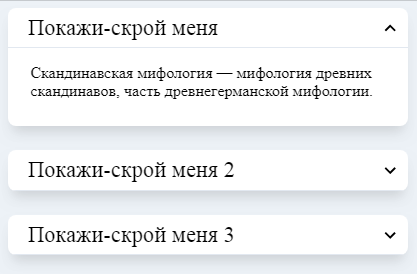
Svg marker on the right + mirror flip effect:
CSS:
body{background: #edf2f7;} details{ display:block; background: #fff; width:400px; box-shadow: 0 10px 15px -5px rgba(0, 0, 0, 0.1), 0 10px 10px -5px rgba(0, 0, 0, 0.04); border-radius: 8px; overflow:hidden; margin-bottom: 1.5rem; } summary::-webkit-details-marker{display:none;} summary::-moz-list-bullet{list-style-type:none;} summary::marker{display:none;} summary { display:block; padding: .3em 1em .3em .9em; border-bottom: 1px solid #e2e8f0; font-size:1.4em; cursor: pointer; position: relative; } summary:before { top: .4em; right: .3em; color: transparent; background: url("data:image/svg+xml;base64,PHN2ZyB4bWxucz0iaHR0cDovL3d3dy53My5vcmcvMjAwMC9zdmciIHdpZHRoPSIyNCIgaGVpZ2h0PSIyNCIgdmlld0JveD0iMCAwIDI0IDI0Ij48cGF0aCBkPSJNMTYuNTkgOC41OUwxMiAxMy4xNyA3LjQxIDguNTkgNiAxMGw2IDYgNi02eiIvPjxwYXRoIGQ9Ik0wIDBoMjR2MjRIMHoiIGZpbGw9Im5vbmUiLz48L3N2Zz4=") no-repeat 50% 50% / 1em 1em; width: 1em; height: 1em; content: ""; position: absolute; transition: transform .5s; } details[open] > summary:before { transform: scale(1,-1); } summary ~ * { padding: 0 1em 10px 1.4em; } details[open] summary ~ *{ animation: sweep .5s ease-in-out; } @keyframes sweep { 0% {opacity: 0;} 100% {opacity: 1;} } summary:focus { outline:0; box-shadow: inset 0 0 1px rgba(0,0,0,0.3), inset 0 0 2px rgba(0,0,0,0.3); }
/ svg + xml; base64, PHN2ZyB4bWxucz0iaHR0cDovL3d3dy53My5vcmcvMjAwMC9zdmciIHdpZHRoPSIyNCIgaGVpZ2h0PSIyNCIgdmlld0JveD0iMCAwIDI0IDI0Ij48cGF0aCBkPSJNMTYuNTkgOC41OUwxMiAxMy4xNyA3LjQxIDguNTkgNiAxMGw2IDYgNi02eiIvPjxwYXRoIGQ9Ik0wIDBoMjR2MjRIMHoiIGZpbGw9Im5vbmUiLz48L3N2Zz4 =") no-repeat body{background: #edf2f7;} details{ display:block; background: #fff; width:400px; box-shadow: 0 10px 15px -5px rgba(0, 0, 0, 0.1), 0 10px 10px -5px rgba(0, 0, 0, 0.04); border-radius: 8px; overflow:hidden; margin-bottom: 1.5rem; } summary::-webkit-details-marker{display:none;} summary::-moz-list-bullet{list-style-type:none;} summary::marker{display:none;} summary { display:block; padding: .3em 1em .3em .9em; border-bottom: 1px solid #e2e8f0; font-size:1.4em; cursor: pointer; position: relative; } summary:before { top: .4em; right: .3em; color: transparent; background: url("data:image/svg+xml;base64,PHN2ZyB4bWxucz0iaHR0cDovL3d3dy53My5vcmcvMjAwMC9zdmciIHdpZHRoPSIyNCIgaGVpZ2h0PSIyNCIgdmlld0JveD0iMCAwIDI0IDI0Ij48cGF0aCBkPSJNMTYuNTkgOC41OUwxMiAxMy4xNyA3LjQxIDguNTkgNiAxMGw2IDYgNi02eiIvPjxwYXRoIGQ9Ik0wIDBoMjR2MjRIMHoiIGZpbGw9Im5vbmUiLz48L3N2Zz4=") no-repeat 50% 50% / 1em 1em; width: 1em; height: 1em; content: ""; position: absolute; transition: transform .5s; } details[open] > summary:before { transform: scale(1,-1); } summary ~ * { padding: 0 1em 10px 1.4em; } details[open] summary ~ *{ animation: sweep .5s ease-in-out; } @keyframes sweep { 0% {opacity: 0;} 100% {opacity: 1;} } summary:focus { outline:0; box-shadow: inset 0 0 1px rgba(0,0,0,0.3), inset 0 0 2px rgba(0,0,0,0.3); }
Demonstration:
Now you can create beautiful accordions, spoilers and faq, without JavaScript, in pure HTML5 and CSS.
Before you remove the outline, think about 100 times how you can replace it, so that a person can see the focus and can move from the keyboard or other devices.
If you need so that when you open one spoiler, the others close, you will have to use javascript, below I give an example of simple JS code that will solve this problem.
JavaScript:
var details = document.querySelectorAll("details"); for(i=0;i<details.length;i++) { details[i].addEventListener("toggle", accordion); } function accordion(event) { if (!event.target.open) return; var details = event.target.parentNode.children; for(i=0;i<details.length;i++) { if (details[i].tagName != "DETAILS" || !details[i].hasAttribute('open') || event.target == details[i]) { continue; } details[i].removeAttribute("open"); } }
Demonstration:
Details support table by browsers.
Sincerely, Creator of Landing Designer for Freelancers CMS cPortfolio
All Articles