How to make applications for phones with disabilities

For several years now, Google’s product teams have been researching to understand how to properly design apps for users from India, South Asia, Africa, Latin America and other regions. In the course of our work, we established several useful patterns related to compatibility - they allow our products to perform well on cheap phones with outdated operating systems, different screen sizes and contrast levels, quickly discharging batteries and cracks on the screen. To help other developers make applications that work — and work well — on all types of devices, we’d like to talk about these patterns.
Operating Systems
Software updates often take up a lot of space on the device, and a lot of expensive mobile traffic. For this reason, not all users are in a hurry to install the latest latest version of the Android operating system - this update alone can completely "eat" their entire paid package of mobile Internet. Such users may have older versions - Ice Cream Sandwich, KitKat or Lollipop.
Strategy:
- Gather information about which versions of the operating system your users find.
- Test your apps on phones with older versions.
- Tell users that an application is compatible with older OS iterations.
Resource: How to provide backward compatibility .
Contrast difference

Screens with low contrast or low resolution are common. If devices with similar features are used in the sun or in high humidity, text and images on the screen become poorly visible. On some phones, in addition to low contrast, the brightness is also reduced so that the battery lasts longer. In addition, contrasting interfaces are useful for those users who have come to the Internet at an advanced age and suffer from vision problems, or those who work with the device in bright light. Applications should remain functional and visually accessible in both low and high ambient light conditions.
Strategy: To improve usability, develop a high-contrast interface with prominent fonts and colors that are clearly distinguishable from each other.
Resrus: Color and contrast .
Different screen sizes

Do not think too big. On some phones, the screens are small and with a low or maximum medium polarity. Make the navigation controls and actions more compact and increase the emphasis on content. The size range is very wide, there are devices with a length of not more than nine centimeters and with a screen resolution of 320 by 480 dp.
Strategy:
- For low- and medium-density screens, make images and text clear, easy to read.
- Avoid iconography with subtle outlines or in light colors - at low or medium density it will be poorly visible.
- Do not forget about the smallest screens: when designing a design, focus on a minimum of nine centimeters and 320 by 480 dp.
- Make sure the interface does not look clogged with information or unreadable.
Examples:
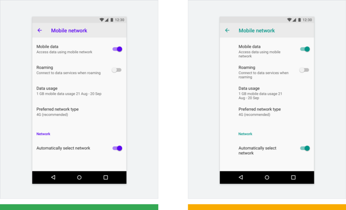
Use the limited space on the screen in the best way, choosing the appropriate amount of indentation.

On the first small screen, the indentation on the left is set to 16dp, so there is enough space for the text - this is a good solution. On the second small screen, the margin is 72dp and the text seems to be squeezed - this approach requires caution.
Understand how components scale on different screens and look on different versions of the interface. Check how the picture changes if the text size increases. In the example below, the image is proportionally reduced if the text below it becomes larger.

Example 1: The illustration is enlarged to fill a large screen.
Example 2: the same illustration is scaled for a small screen with large print.
Flexibility for localization on small screens
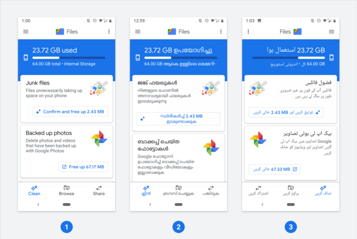
When translating the interface into another language, consider whether it is worth breaking some texts into two lines or changing the order and arrangement of elements. In some languages, the source text will take more characters, which affects the overall design structure on both large and small screens. Calculate what will be better: place part of the characters on the bottom line or stretch the element to fit the text.

Example 1: in English, the phrase Confirm and free up 2.43 MB is suitable in length to the size of the button and does not need to be broken down.
Example 2: in Malayalam, the translation of this text is long - it is divided into two parts.
Example 3: For the Arabic version, the interface elements are located from right to left, which affects the general order and their specific positions in the interface.
Resources:
Android emulator : test the application on a variety of devices with screens of small and medium sizes. The emulator allows you to make changes along the way and immediately check the result.
We create products for a billion Android devices : a guide to support screens of various sizes, backward compatibility and efficient use of available memory.
Characteristics of devices : a very informative resource on which information on the sizes, resolutions and other characteristics of many devices is collected.
Bidirectionality : interfaces for speakers of languages with writing from right to left (for example, Arabic or Jewish) and how to mirror them so that the content is accessible for perception.
Low battery
Some batteries run out quickly. If the battery is old, cheap, or of small capacity, users are often forced to lower the screen brightness, switch to flight mode, and generally use devices to a minimum. Try to ensure that interaction with the application is structured according to the state of the battery and provides the user with transparency and the ability to control the situation.
Strategy: to compensate for the dull screen, try using contrasting colors, as well as increase the font and icons at the most important stages of work.

Example 1: A video call application monitors the status of the battery and reports that the charge level is high enough to last for a call.
Example 2: On the Google Pay screen, sharply contrasting colors (white and blue) are used, a large font and large icons - all elements are clearly distinguishable even at low brightness.
Resources: Creating products for a billion Android devices - how to reduce battery consumption
Damaged devices and screens
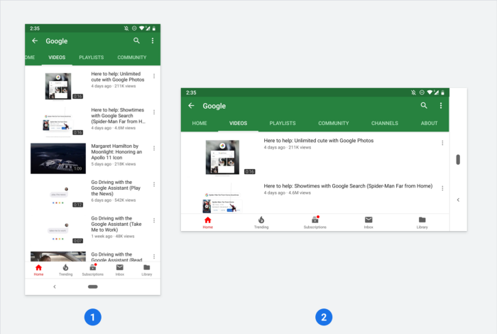
Buying or replacing mobile devices costs a lot of money, so many continue to use phones that have something out of order - individual buttons do not work, the screen cracked, or something else. For some, the drop-out battery rests on an elastic band. Someone gives the damaged devices to “carry” to other family members or friends. If the user cannot interact with some element of the interface due to such damage, he may move out of position by changing the orientation of the screen - switch from portrait to landscape or vice versa.
Strategy: Make sure that everything is displayed in the application as needed in both landscape and portrait orientation.

All Articles