Rules for preparing layouts in Figma

The pain with one project led us to the decision to write the rules of work
The need to make a list of rules appeared when we felt how painful it is to correct errors. The layout of the site from one program wandered into another, the developers did not like it, the designers did not like the fact that the developers are constantly making changes.
The result of walking the rake between the departments of design and development was the idea to formulate the rules, carve them in stone, put in a pdf file and distribute to all participants in the process with the “follow” directive.

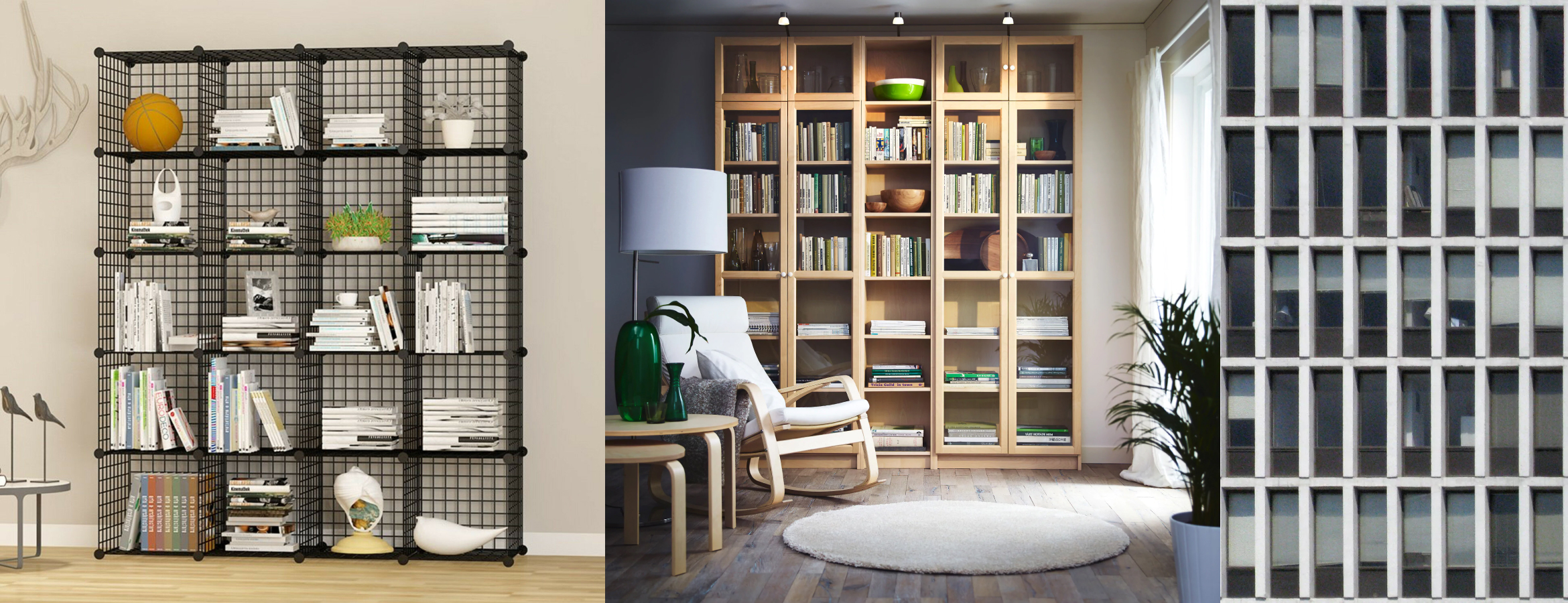
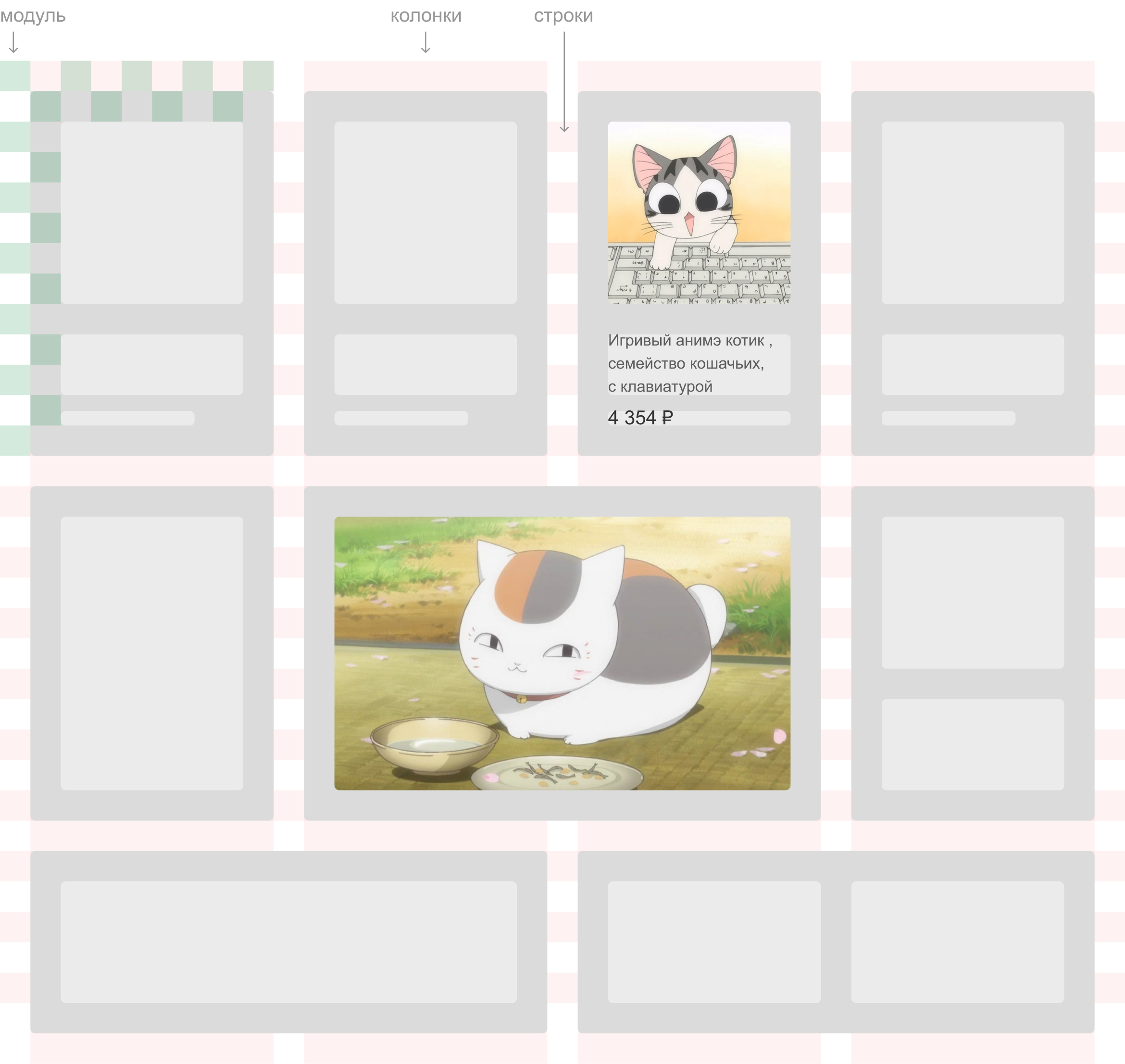
1. Use the grid
The grid helps organize the elements. Like a metronome in music, sets the rhythm. The perception of order in the layout, as well as in reality, is pleasing to the eye, creates a feeling of "nonrandomness."
Good article about grids.
When designers and developers begin to use the grid, many problems disappear. Here is one example of this approach . When layout layout you no longer need to measure the indentation between each element. All of them are subordinate to predefined modules.
Text frames, icons, menus, popups, dropdowns, controls, all this all, everything should be a multiple of the grid modules. Or at least strive for it.
Here's what the guys from the development department say about grids:
Of course, when ordering appeared in layouts, it became easier. We no longer measure each indent manually.
2. Set text blocks to conscious sizes

Here are two seemingly identical text blocks. Description and price. But if you look at how they look in the layout, the difference is immediately visible.

Vitaly, developer:
When I see layouts with different indents between blocks, I am already shaking !!! Designers, stop doing it, it's awful.
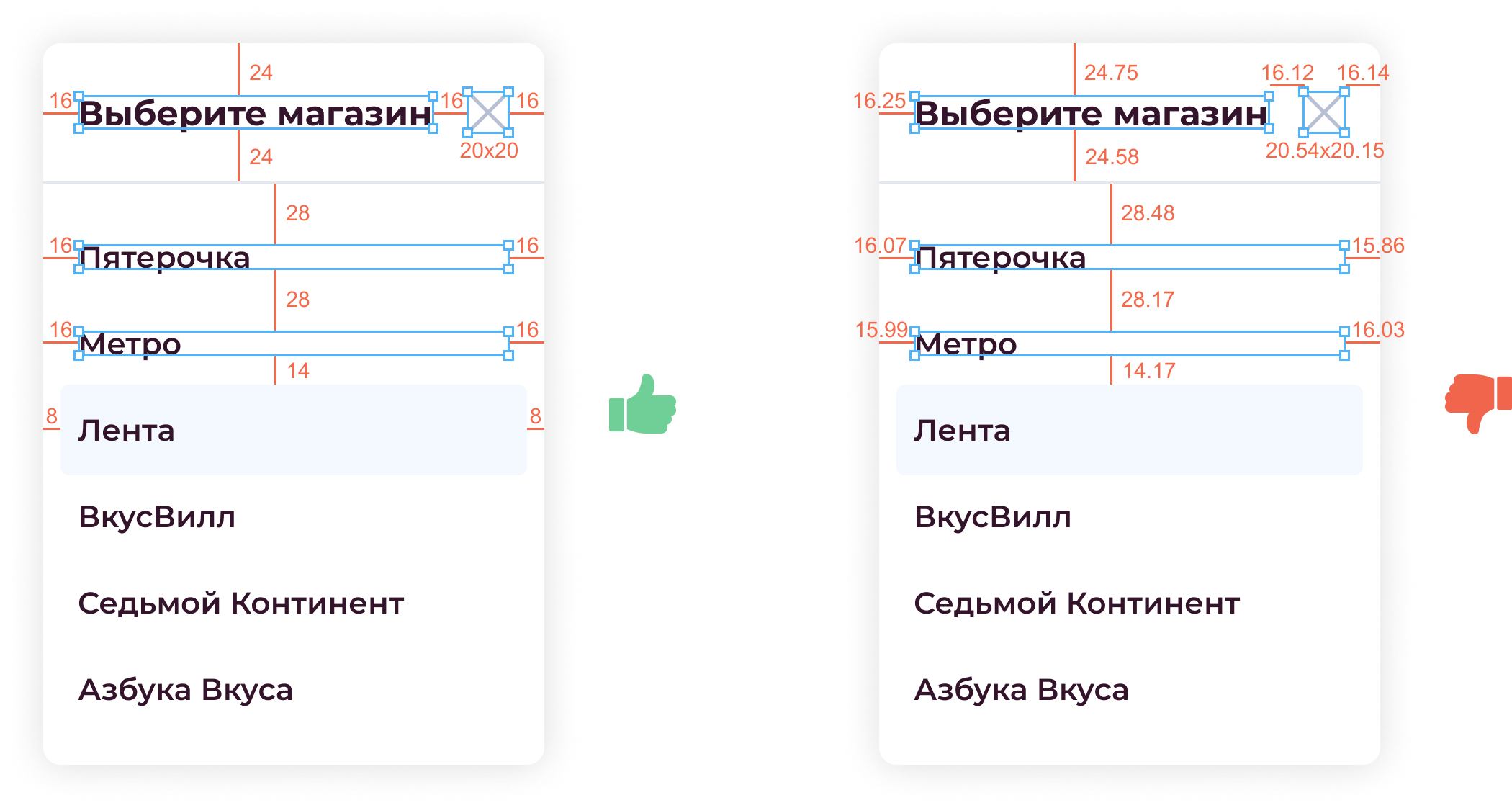
3. Follow the side padding
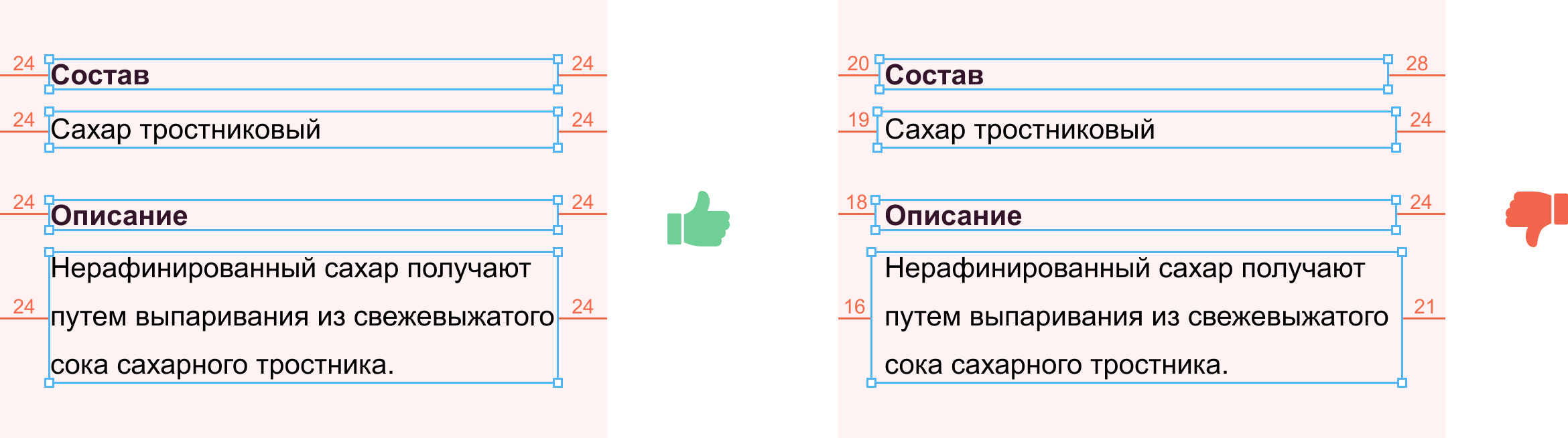
The difference must be justified by something, random values should not be obtained.
Vitaly, developer:
If the indentation in the block is the same, the property that sets the indentation in the parent block is padding: 0, 24.
In the second case, in order to understand the pattern of indentation, you will have to communicate with the designer and clarify: what was meant in this damned chaos.
4. Use Grow Vertically for Text Blocks
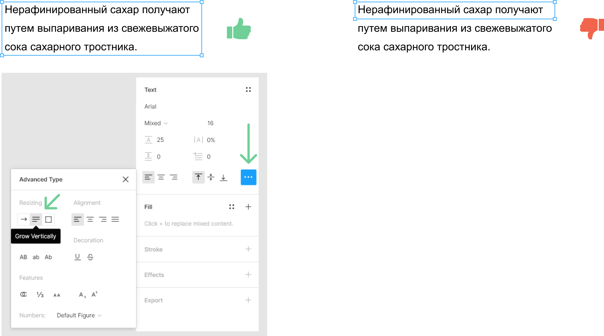
Vitaly, developer:
It is good when the sizes of text blocks in height change automatically. In such blocks, you can immediately get the correct height through the properties. In contrast to the right example, where the block height is 27 px, and in fact should be 70 px.
5. Observe integer values in pixels
Distances between objects must be expressed in integer values. As well as the size of the objects themselves.
Outwardly, layouts with fractional values are not always distinguishable from “normal” ones, but it’s worth diving into them ... and problems begin. Fractional values often arise if you take a group of objects and scale it. Very often, such values indicate that the designer was in a hurry and did not check this moment.
Vitaly, developer:
Yesterday the layout task came into work. I open the layout in the figure, and what I see ... The indentation is all fractional, the size of the font is fractional, the line spacing is also fractional. No, well, of course, I wrote to the designer. I waited for an answer, waited until he figured out where it all came from. As a result, only in the evening I was able to start this task.
6. Use components
The ideology of the components is the main thing that distinguishes Figma from the tools of the previous generation. Create components using any technique that is clear and convenient for you. For example, the concept of atoms , in which, starting with the simplest elements (forms, inscriptions), more complex components based on them are gradually grouped.
Or the creation of individual blocks in the form of components and their reuse. The main thing is that the chosen approach be logical and understandable for those who will work after or simultaneously with you. We usually use components depending on the complexity of the project.
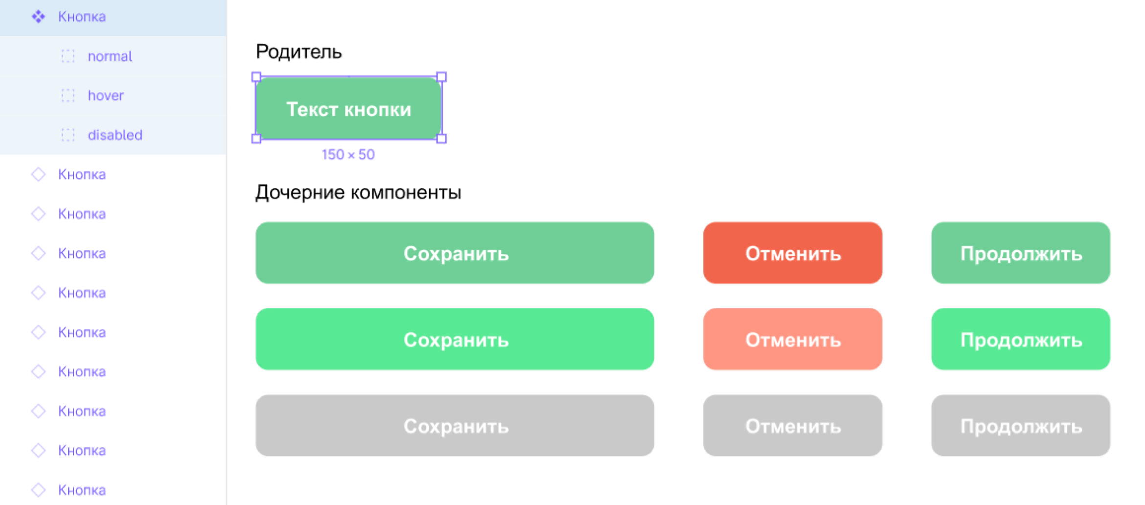
Components and their use are dedicated to separate articles. With a description of the work of constraints and grids inside the components.
7. Name groups and frames meaningfully
Understandable names will help others understand your layout and not remember you with “warm” words.
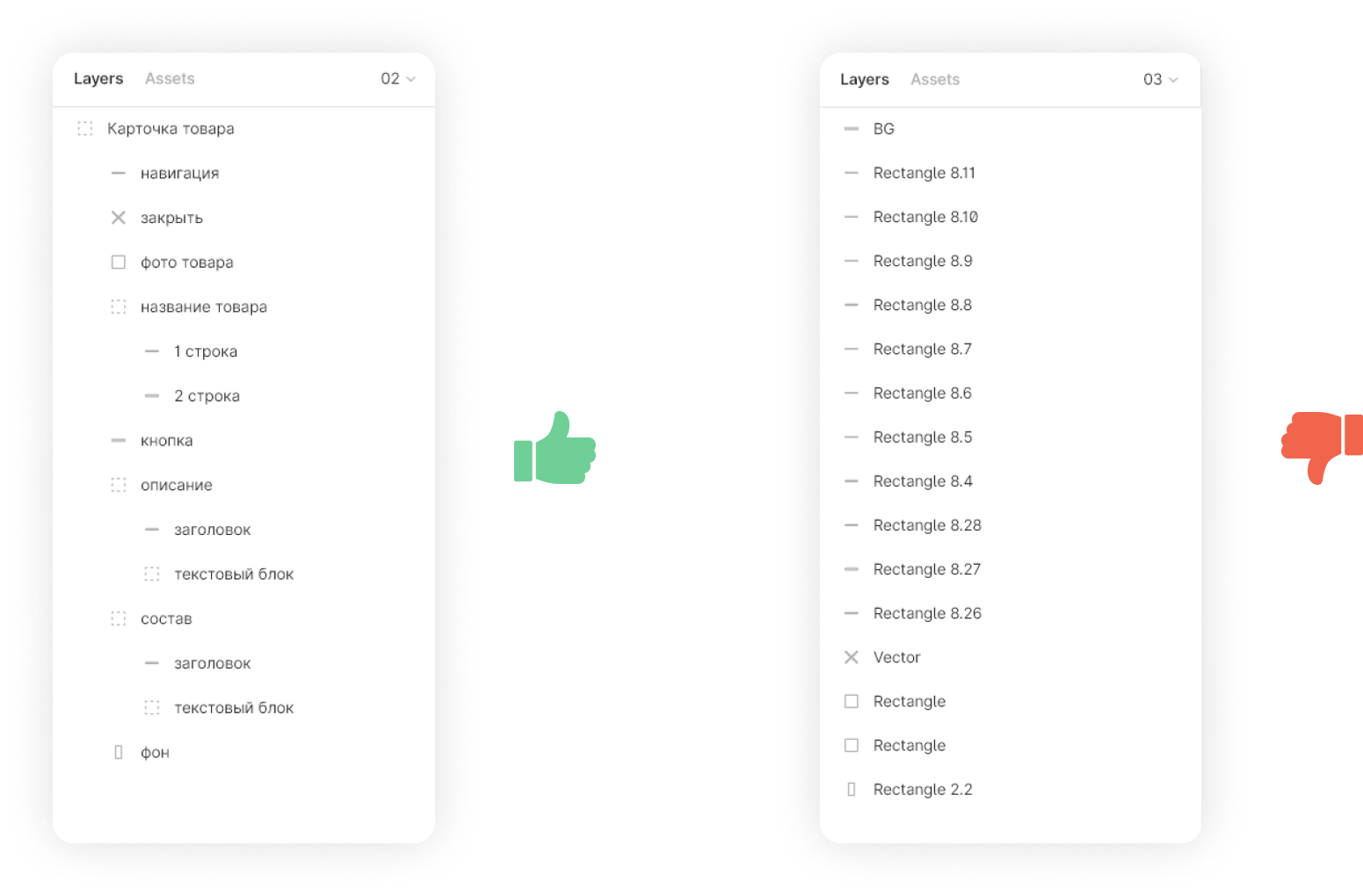
Vitaly, developer:
Among developers, there is a culture of writing variable and function names. And you designers, the better? Why do you easily give out layouts with uninformative names? Sign clearly and clearly the names of frames and components.
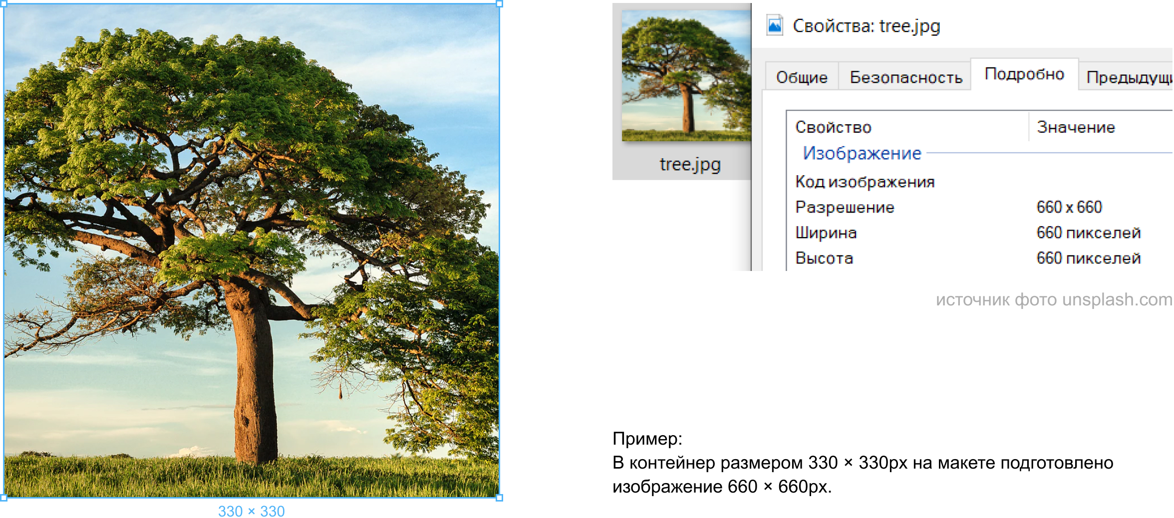
8. Make a raster with double or triple margin in size.
There are many monitors with increased pixel density. What does this mean for a designer?
With the same physical screen sizes, a different number of pixels is placed on each of them. And if you prepare a bitmap image for a regular monitor 1: 1, then on the retina it will look blurry.
Vitaly, developer:
I remember how in 2000 I went online through the good old US Robotics Courier at a speed of 14,400 bps ... Then the graphics were done in 1v1, the sites were made up with tables, there were no retin and other smartphones. In general, they didn’t live. Now CSS pseudo-classes allow children with retina and other hi-end displays to load specially designed raster images for them. At the same time, do not ship them to everyone else.
All Articles