前回の記事では、後から血液で自分自身のデータを抽出する過程で、分類によっていくつかの問題を調べましたが、今は回帰の時が来ました。 今回は手元に照明がなかったので、他のギンプを削ってみることにしました。
記事の 1つで、国内のオープンデータに目を向けるよう読者にキャンペーンを行ったことを思い出します。 しかし、私は「消化のためのケフィア」または馬力のシャンプーの広告の若い女性ではないので、私の良心は私がそれを経験せずに何かをアドバイスすることを許可しませんでした。
どこから始めますか? もちろん、ロシア政府からの公開データにより、そこには全体の省があります。 ロシア政府の公開データに関する私の知り合いは、この記事のイラストとほぼ同じでした。 いいえ、ノービーウレンゴイにあるシネマホールの登録やトゥーラにあるアイススケートリンクのレンタル機器のリストにまったく興味がないわけではありません。これらは回帰タスクには適していません。
調べてみると、ロシア連邦政府のODのサイトで価値のあるものを見つけることができると思いますが、それほど簡単ではありません。
また、後で財務省のデータを残すことにしました。
おそらく、私はモスクワ政府の公開データが好きだったので、そこでいくつかの潜在的な問題を調べ、最終的にモスクワの市民の地位の行為の登録に関する情報を年ごとに選択しました
線形回帰の分野で最小限のスキルを適用して得られたものは、 GitHubで簡単に確認できます。もちろん、猫の下を見ることができます。

UPD:追加セクション-「ボーナス」
はじめに
いつものように、記事の冒頭で、この記事を理解するために必要なスキルについてお話します。
以下が必要になります。
- チュートリアルを読むか、簡単な機械学習コースを実行してください
- 少しのPythonを理解する
- 数学の知識がほとんどない
データ分析と機械学習の分野にまったく慣れていない場合は、シリーズの以前の記事をフォローした順に見てください。各記事は熱心に書かれており、データサイエンスに時間を費やすべきかどうかを理解できます。
以下のネタバレの下に以前に準備されたすべての記事
その他のサイクル記事
1.基本を学ぶ:
2.最初のスキルを練習します
- “ 大小さまざまなデータをキャッチ! »-(認知クラスデータサイエンスコースの概要)
- 「 今、彼もあなたを数えています 」またはData Science from Scratch
- “ オスカーの代わりに氷山! 「または、どのようにしてkaggleでDataScienceの基本を学ぼうとしたのか
- データサイエンスの初心者から見た「できる列車」または「機械学習とデータ分析の専門化」
2.最初のスキルを練習します
- 「Rise of the Machines Learning」、またはデータサイエンスの趣味と光スペクトルの分析を組み合わせたもの
- 「メモのように!」またはAccord.NET Frameworkを使用したC#の機械学習(データサイエンス)
- 「機械学習の力を活用、ルーク!」またはKSSによる照明器具の自動分類
さて、前に約束したように、このシリーズの記事はコンテンツで完了します。
内容:
パートI:「結婚-靱皮靴を履かないでください」-受信および主要なデータ分析。
パートII:「フィールドの戦士ではない」-1単位での回帰
パートIII:「1つの頭は良いが、はるかに良い」-正則化によるいくつかの理由での回帰
パートIV:「すべてが金ではない」-機能の追加
パートV:「新しいカフタンをカットし、古いカフタンを試してみてください!」-トレンド予測
ボーナス-月へのアプローチが異なるため、精度が向上します
それでは、タスクに移りましょう。 私たちの目標は、線形回帰の基本的な手法を実証し、予測するものを自分で決定するのに十分なデータセットを掘り下げることです。
今回は簡潔になりますが、線形回帰のみを考慮することでトピックから逸脱することはありません(他のメソッドの存在についてはおそらく知っています )
パートI :「結婚する-頑固な靴を履かないでください」-受信と一次データ分析
残念ながら、モスクワ政府の公開データは、マイストリートプログラムの美化に費やされた予算ほど広大で無限ではありませんが、それでも価値のあるものを見つけることができました。
市民的地位の行為の登録のダイナミクスは私たちに非常に適しています。
これは、結婚式、出生、親子関係、死亡、名前の変更などのデータを含む、月ごとに分類されたほぼ100のレコードです。
回帰の問題を解決するには非常に適しています。
すべてのコードはGitHubでホストされます
まあ、部分的に、私たちは今それを準備しています。
最初に、ライブラリをインポートします。
import pandas as pd import matplotlib.pyplot as plt import seaborn as sns import numpy as np from sklearn.preprocessing import MinMaxScaler from sklearn.model_selection import train_test_split from sklearn import linear_model import warnings warnings.filterwarnings('ignore') %matplotlib inline
次に、データをロードします。 Pandasライブラリを使用すると、リモートサーバーからファイルをダウンロードできます。これは、通常、ページリダイレクトアルゴリズムがポータルで変更されないという条件で、一般的には素晴らしいことです。
(コードのダウンロードリンクが機能しないことを願っています。機能しなくなった場合は、更新できるように「PM」に書き込んでください)
#download df = pd.read_csv('https://op.mos.ru/EHDWSREST/catalog/export/get?id=230308', compression='zip', header=0, encoding='cp1251', sep=';', quotechar='"') #look at the data df.head(12)
データを見てみましょう:
| ID | global_id | 年 | 月 | StateRegistrationOfBirth | StateRegistrationOfDeath | StateRegistrationOfMarriage | StateRegistrationOfDivorce | StateRegistrationOfPaternityExamination | StateRegistrationOfAdoption | StateRegistrationOfNameChange | 総数 |
|---|---|---|---|---|---|---|---|---|---|---|---|
| 1 | 37591658 | 2010 | 1月 | 9206 | 10430 | 4997 | 3302 | 1241 | 95 | 491 | 29762 |
| 2 | 37591659 | 2010 | 2月 | 9060 | 9573 | 4873 | 2937 | 1326 | 97 | 639 | 28505 |
| 3 | 37591660 | 2010 | 行進 | 10934 | 10528 | 3642 | 4361 | 1644 | 147 | 717 | 31973 |
| 4 | 37591661 | 2010 | 4月 | 10140 | 9501 | 9698 | 3943 | 1530 | 128 | 642 | 35572 |
| 5 | 37591662 | 2010 | 5月 | 9457 | 9482 | 3726 | 3554 | 1397 | 96 | 492 | 28204 |
| 6 | 62353812 | 2010 | 6月 | 11253 | 9529 | 9148 | 3666 | 1570 | 130 | 556 | 35852 |
| 7 | 62353813 | 2010 | 7月 | 11477 | 14340 | 12473 | 3675 | 1568 | 123 | 564 | 44220 |
| 8 | 62353814 | 2010 | 8月 | 10302 | 15016 | 10882 | 3496 | 1512 | 134 | 578 | 41920 |
| 9 | 62353816 | 2010 | 9月 | 10140 | 9573 | 10736 | 3738 | 1480 | 101 | 686 | 36454 |
| 10 | 62353817 | 2010 | 10月 | 10776 | 9350 | 8862 | 3899 | 1504 | 89 | 687 | 35167 |
| 11 | 62353818 | 2010 | 11月 | 10293 | 9091 | 6080 | 3923 | 1355 | 97 | 568 | 31407 |
| 12 | 62353819 | 2010 | 12月 | 10600 | 9664 | 6023 | 4145 | 1556 | 124 | 681 | 32793 |
月に関するデータを使用する場合は、モデルの理解可能な形式に変換する必要があります。scikit-learnには独自のメソッドがありますが、信頼性のために(多くの作業がないため)手作業で行い、同時にIDを持ついくつかの役に立たない列を削除しますゴミ。
注:この場合、Monthカラムには、 ワンホットコーディングを適用する方が正しいと思いますが、この場合、予測の品質にはあまり関心がないため、そのままにしておきます。
UPD:抵抗できず、 ボーナスセクションに調整オプションを追加しました
#code months d={'':1, '':2, '':3, '':4, '':5, '':6, '':7, '':8, '':9, '':10, '':11, '':12} df.Month=df.Month.map(d) #delete some unuseful columns df.drop(['ID','global_id','Unnamed: 12'],axis=1,inplace=True) #look at the data df.head(12)
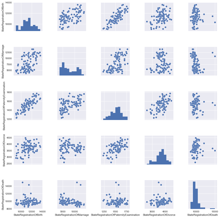
表形式のビューがすべてのユーザーに対して開くかどうかわからないので、画像を使用してデータを見てみましょう。

テーブルのどの列が互いに線形に依存しているかが明らかになるペア図を作成します。 ただし、すぐにすべてのデータを検討するわけではないため、後で追加するものがあるため、最初にデータの一部を削除します。
pandas Dataframeから列の一部を選択(「削除」)する簡単な方法は、必要な列を選択することです。
columns_to_show = ['StateRegistrationOfBirth', 'StateRegistrationOfMarriage', 'StateRegistrationOfPaternityExamination', 'StateRegistrationOfDivorce','StateRegistrationOfDeath'] data=df[columns_to_show]
さて、これでスケジュールを作成できます。
grid = sns.pairplot(data)
馬を干し草の山の重量と1か月の平均気圧と比較しないように、特性をスケーリングすることをお勧めします。
私たちの場合、すべてのデータは同じ値(登録された行為の数)で表示されますが、スケーリングの変化を見てみましょう。
# change scale of features scaler = MinMaxScaler() df2=pd.DataFrame(scaler.fit_transform(df)) df2.columns=df.columns data2=df2[columns_to_show] grid2 = sns.pairplot(data2)
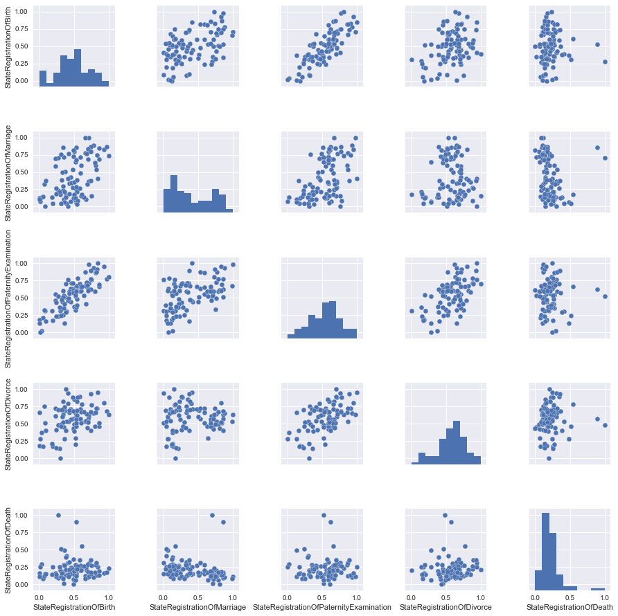
ほとんど何もありませんが、信頼性のために、スケールされたデータをとります。
パートII :「フィールドにいるだけでは戦士ではありません」-1単位で回帰
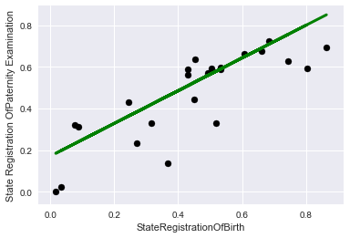
写真を見て、最善の方法は、StateRegistrationOfBirthとStateRegistrationOfPaternityExaminationの2つのサインの関係を直線で記述することです。これは一般にそれほど驚くことではありません(「パタニティー」がチェックされるほど、子供が登録される頻度が高くなります)。
データを準備します。つまり、2つの列の符号と目的関数を選択し、既製のライブラリを使用して、データをトレーニングおよび制御サンプルに分割します(データを目的の形式にするには、コードの最後の操作が必要でした)
X = data2['StateRegistrationOfBirth'].values y = data2['StateRegistrationOfPaternityExamination'].values X_train, X_test, y_train, y_test = train_test_split(X, y, test_size=0.25, random_state=42) X_train=np.reshape(X_train,[X_train.shape[0],1]) y_train=np.reshape(y_train,[y_train.shape[0],1]) X_test=np.reshape(X_test,[X_test.shape[0],1]) y_test=np.reshape(y_test,[y_test.shape[0],1])
時系列にリンクする明確な可能性にもかかわらず、デモンストレーションの目的のために、データを時間に関係なく単にレコードのセットと見なすことに注意することが重要です。
モデルデータを "フィード"して、属性の係数を調べ、R ^ 2(決定係数)を使用してモデルを近似する精度を評価します。
#teach model and get predictions lr = linear_model.LinearRegression() lr.fit(X_train, y_train) print('Coefficients:', lr.coef_) print('Score:', lr.score(X_test,y_test))
それはあまりうまくいきませんでしたが、一方で「推測で突く」よりもはるかに良いです
Coefficients: [[ 0.78600258]]
Score: 0.611493944197
最初にトレーニングデータでチャートでこれを見てみましょう:
plt.scatter(X_train, y_train, color='black') plt.plot(X_train, lr.predict(X_train), color='blue', linewidth=3) plt.xlabel('StateRegistrationOfBirth') plt.ylabel('State Registration OfPaternity Examination') plt.title="Regression on train data"

そして今、コントロールに:
plt.scatter(X_test, y_test, color='black') plt.plot(X_test, lr.predict(X_test), color='green', linewidth=3) plt.xlabel('StateRegistrationOfBirth') plt.ylabel('State Registration OfPaternity Examination') plt.title="Regression on test data"
パートIII :「1つの頭は良いが、はるかに良い」-正則化によるいくつかの理由での回帰
さらに面白くするために、別の目的関数を選択しましょう。これは、明らかに特徴にそれほど線形に依存していません。
記事のタイトルに合わせて、目的関数として結婚登録を選択します。
そして、ペアの図記号の写真のセットから残りのすべての列を作成します。
#get main data columns_to_show2=columns_to_show.copy() columns_to_show2.remove("StateRegistrationOfMarriage") #get data for a model X = data2[columns_to_show2].values y = data2['StateRegistrationOfMarriage'].values X_train, X_test, y_train, y_test = train_test_split(X, y, test_size=0.25, random_state=42) y_train=np.reshape(y_train,[y_train.shape[0],1]) y_test=np.reshape(y_test,[y_test.shape[0],1])
最初に、線形回帰モデルのみをトレーニングします。
lr = linear_model.LinearRegression() lr.fit(X_train, y_train) print('Coefficients:', lr.coef_) print('Score:', lr.score(X_test,y_test))
過去の場合よりも結果が少し悪くなります(驚くことではありません)
Coefficients: [[-0.03475475 0.97143632 -0.44298685 -0.18245718]]
Score: 0.38137432065
再トレーニングおよび/または機能選択と戦うために、通常、線形回帰モデルとともに正則化メカニズムが使用されます。この記事では、なげなわメカニズム( L1-正則化 )を検討します。
アルファ正則化係数が高いほど、モデルは、回帰方程式のいくつかの係数をゼロにするまで、属性の大きな値をより積極的に細かくします。
#let's look at the different alpha parameter: #large Rid=linear_model.Lasso (alpha = 0.01) Rid.fit(X_train, y_train) print(' Appha:', Rid.alpha) print(' Coefficients:', Rid.coef_) print(' Score:', Rid.score(X_test,y_test)) #Small Rid=linear_model.Lasso (alpha = 0.000000001) Rid.fit(X_train, y_train) print('\n Appha:', Rid.alpha) print(' Coefficients:', Rid.coef_) print(' Score:', Rid.score(X_test,y_test)) #Optimal (for these test data) Rid=linear_model.Lasso (alpha = 0.00025) Rid.fit(X_train, y_train) print('\n Appha:', Rid.alpha) print(' Coefficients:', Rid.coef_) print(' Score:', Rid.score(X_test,y_test))
ここで私はここで悪いことをしているので、テストデータに正則化係数を調整したことに注意してください、実際にはこれを行うべきではありませんが、実証するのは問題ありません。
出力を見てみましょう。
Appha: 0.01
Coefficients: [ 0. 0.46642996 -0. -0. ]
Score: 0.222071102783
Appha: 1e-09
Coefficients: [-0.03475462 0.97143616 -0.44298679 -0.18245715]
Score: 0.38137433837
Appha: 0.00025
Coefficients: [-0.00387233 0.92989507 -0.42590052 -0.17411615]
Score: 0.385551648602
この場合、正則化されたモデルでは品質が大幅に向上することはありません。機能を追加してください。
パートIV :「すべてがゴールドではない」-機能を追加
明らかに役に立たない「登録総数」の記号を追加します。なぜそれが明らかなのですか? さあ、自分で見てください。
columns_to_show3=columns_to_show2.copy() columns_to_show3.append("TotalNumber") columns_to_show3 X = df2[columns_to_show3].values # y hasn't changed X_train, X_test, y_train, y_test = train_test_split(X, y, test_size=0.25, random_state=42) y_train=np.reshape(y_train,[y_train.shape[0],1]) y_test=np.reshape(y_test,[y_test.shape[0],1])
まず、正規化せずに結果を見てみましょう。
lr = linear_model.LinearRegression() lr.fit(X_train, y_train) print('Coefficients:', lr.coef_) print('Score:', lr.score(X_test,y_test))
Coefficients: [[-0.45286477 -0.08625204 -0.19375198 -0.63079401 1.57467774]]
Score: 0.999173764473
狂おう! ほぼ100%の精度!
この属性はどのように役に立たないのでしょうか?!
まあ、賢明に考えてみましょう、私たちの結婚数は合計に含まれているので、他の兆候に関する情報があれば、精度は100%に近いです。 実際には、これは特に有用ではありません。
なげなわに移りましょう
まず、小さな正則化係数を選択します。
#Optimal (for these test data) Rid=linear_model.Lasso (alpha = 0.00015) Rid.fit(X_train, y_train) print('\n Appha:', Rid.alpha) print(' Coefficients:', Rid.coef_) print(' Score:', Rid.score(X_test,y_test))
Appha: 0.00015
Coefficients: [-0.44718703 -0.07491507 -0.1944702 -0.62034146 1.55890505]
Score: 0.999266251287
さて、何も大きな変化はありません。面白くないので、増やした場合にどうなるか見てみましょう。
#large Rid=linear_model.Lasso (alpha = 0.01) Rid.fit(X_train, y_train) print('\n Appha:', Rid.alpha) print(' Coefficients:', Rid.coef_) print(' Score:', Rid.score(X_test,y_test))
Appha: 0.01
Coefficients: [-0. -0. -0. -0.05177979 0.87991931]
Score: 0.802210158982
したがって、モデルではほとんどすべての記号が役に立たないと見なされ、レコードの総数の記号が最も有用なままであることがわかります。そのため、突然1-2個の記号のみを使用する必要が生じた場合、損失を最小限に抑えるために何を選択するかがわかります。
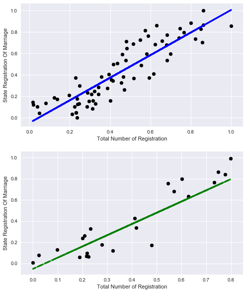
好奇心から、レコードの総数だけで結婚登録の割合を説明できることを見てみましょう。
X_train=np.reshape(X_train[:,4],[X_train.shape[0],1]) X_test=np.reshape(X_test[:,4],[X_test.shape[0],1]) lr = linear_model.LinearRegression() lr.fit(X_train, y_train) print('Coefficients:', lr.coef_) print('Score:', lr.score(X_train,y_train))
Coefficients: [ 1.0571131]
Score: 0.788270672692
まあ、悪くはないが、客観的に他の兆候を考慮するよりも少ない
グラフを見てみましょう:
# plot for train data plt.figure(figsize=(8,10)) plt.subplot(211) plt.scatter(X_train, y_train, color='black') plt.plot(X_train, lr.predict(X_train), color='blue', linewidth=3) plt.xlabel('Total Number of Registration') plt.ylabel('State Registration Of Marriage') plt.title="Regression on train data" # plot for test data plt.subplot(212) plt.scatter(X_test, y_test, color='black') plt.plot(X_test, lr.predict(X_test), '--', color='green', linewidth=3) plt.xlabel('Total Number of Registration') plt.ylabel('State Registration Of Marriage') plt.title="Regression on test data"
元のデータセットに別の役に立たない属性を追加してみましょう。
名前変更の状態登録では、独立してモデルを構築し、この属性が説明するデータ量を確認できます(一言)。
そして、すぐにデータを選択し、古い4つの標識でモデルをトレーニングします。
columns_to_show4=columns_to_show2.copy() columns_to_show4.append("StateRegistrationOfNameChange") X = df2[columns_to_show4].values # y hasn't changed X_train, X_test, y_train, y_test = train_test_split(X, y, test_size=0.25, random_state=42) y_train=np.reshape(y_train,[y_train.shape[0],1]) y_test=np.reshape(y_test,[y_test.shape[0],1]) lr = linear_model.LinearRegression() lr.fit(X_train, y_train) print('Coefficients:', lr.coef_) print('Score:', lr.score(X_test,y_test))
Coefficients: [[ 0.06583714 1.1080889 -0.35025999 -0.24473705 -0.4513887 ]]
Score: 0.285094398157
この症状は私たちを台無しにするだけなので、正則化は試みません;基本的には何も変更しません。
最後に便利な機能を選択しましょう。
誰もが結婚式の暑い季節(夏と初秋)があり、静かな季節(冬)があることを知っています。
ちなみに、5月には結婚式がほとんどないことに驚きました。
#get data columns_to_show5=columns_to_show2.copy() columns_to_show5.append("Month") #get data for model X = df2[columns_to_show5].values # y hasn't changed X_train, X_test, y_train, y_test = train_test_split(X, y, test_size=0.25, random_state=42) y_train=np.reshape(y_train,[y_train.shape[0],1]) y_test=np.reshape(y_test,[y_test.shape[0],1]) #teach model and get predictions lr = linear_model.LinearRegression() lr.fit(X_train, y_train) print('Coefficients:', lr.coef_) print('Score:', lr.score(X_test,y_test))
Coefficients: [[-0.10613428 0.91315175 -0.55413198 -0.13253367 0.28536285]]
Score: 0.472057997208
質の向上、そして最も重要なことは、すべてが健全な論理に対応していることです。
パートv :「新しいカフタンをカットし、古いものを試してみてください!」-トレンド予測
おそらく最後に残したことは、トレンドを予測するためのツールとして線形回帰を見ることです。 前の章では、データをランダムに取得しました。つまり、全時間範囲のデータがトレーニングセットに分類されました。 今回は、データを過去と未来に分割し、何かを予測できるかどうかを確認します
便宜上、2010年1月からの期間を月単位で検討します。このため、データを変換する単純な匿名関数を作成します。その結果、年列を月数で置き換えます。
2016年までデータの調査を行い、2016年から始まるすべてが私たちの未来です。
#get data df3=df.copy() #get new column df3.Year=df.Year.map(lambda x: (x-2010)*12)+df.Month df3.rename(columns={'Year': 'Months'}, inplace=True) #get data for model X=df3[columns_to_show5].values y=df3['StateRegistrationOfMarriage'].values train=[df3.Months<=72] test=[df3.Months>72] X_train=X[train] y_train=y[train] X_test=X[test] y_test=y[test] y_train=np.reshape(y_train,[y_train.shape[0],1]) y_test=np.reshape(y_test,[y_test.shape[0],1]) #teach model and get predictions lr = linear_model.LinearRegression() lr.fit(X_train, y_train) print('Coefficients:', lr.coef_[0]) print('Score:', lr.score(X_test,y_test))
Coefficients: [ 2.60708376e-01 1.30751121e+01 -3.31447168e+00 -2.34368684e-01
2.88096512e+02]
Score: 0.383195050367
このようなデータの内訳を見るとわかるように、精度はいくぶん低下していますが、予測の品質は空の指よりも優れています。
グラフを見て確認してください。
plt.figure(figsize=(9,23)) # plot for train data plt.subplot(311) plt.scatter(df3.Months.values[train], y_train, color='black') plt.plot(df3.Months.values[train], lr.predict(X_train), color='blue', linewidth=2) plt.xlabel('Months (from 01.2010)') plt.ylabel('State Registration Of Marriage') plt.title="Regression on train data" # plot for test data plt.subplot(312) plt.scatter(df3.Months.values[test], y_test, color='black') plt.plot(df3.Months.values[test], lr.predict(X_test), color='green', linewidth=2) plt.xlabel('Months (from 01.2010)') plt.ylabel('State Registration Of Marriage') plt.title="Regression (prediction) on test data" # plot for all data plt.subplot(313) plt.scatter(df3.Months.values[train], y_train, color='black') plt.plot(df3.Months.values[train], lr.predict(X_train), color='blue', label='train', linewidth=2) plt.scatter(df3.Months.values[test], y_test, color='black') plt.plot(df3.Months.values[test], lr.predict(X_test), color='green', label='test', linewidth=2) plt.title="Regression (prediction) on all data" plt.xlabel('Months (from 01.2010)') plt.ylabel('State Registration Of Marriage') #plot line for link train to test plt.plot([72,73], lr.predict([X_train[-1],X_test[0]]) , color='magenta',linewidth=2, label='train to test') plt.legend()
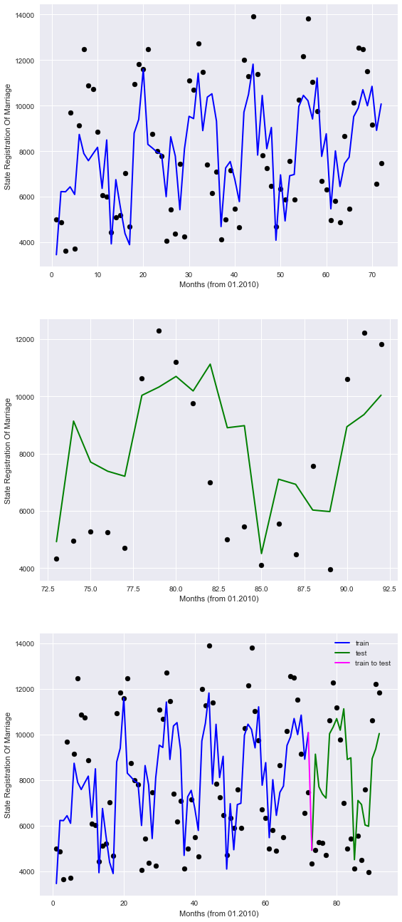
チャートでは、過去は青で表示され、未来は緑で表示され、バンドルは紫で表示されます。
したがって、モデルがポイントを不完全に記述していることは明らかですが、少なくとも季節のパターンを考慮しています。
したがって、将来、利用可能なデータによると、モデルは結婚を登録するという観点から、何らかの形で私たちを方向づけることができると期待できます。
この記事の範囲を超えたトレンド分析用のより高度なツールがありますが(私の意見では、データサイエンスの初期スキル)
おわりに
さて、回帰復元の問題を調査しました。国の州構造のオープンデータポータルで他の依存関係を探すことをお勧めします。興味深い依存関係が見つかるかもしれません。 「チャレンジ」として、ベラルーシ共和国opendata.byのオープンデータポータルで何かを掘り下げることをお勧めします。
写真の最後に、 アレクサンダー・グリゴリエヴィッチと記者とのコミュニケーションと不快な質問への回答に基づいています。

ボーナス-月へのアプローチが異なるため、精度が向上します
同僚は、予測の品質を改善するための推奨事項を含む有用なコメントを残しました。
要するに、すべての提案は、すべてを簡素化するために、「月」列を誤ってエンコードしたという事実に帰着しました(これは本当にそうです)。 これを2つの方法で改善しようとします。
オプション1-ワンホットコーディング。各月の値に対して独自の特性が作成される場合。
開始するには、編集せずにソースプレートをダウンロードしてください
df_base = pd.read_csv('https://op.mos.ru/EHDWSREST/catalog/export/get?id=230308', compression='zip', header=0, encoding='cp1251', sep=';', quotechar='"')
次に、pandasデータフレームライブラリ(get_dummies関数)に実装されたワンホットコーディングを適用し、不要な列を削除し、モデルのトレーニングとグラフの描画を再開します。
#get data for model df4=df_base.copy() df4.drop(['Year','StateRegistrationOfMarriage','ID','global_id','Unnamed: 12','TotalNumber','StateRegistrationOfNameChange','StateRegistrationOfAdoption'],axis=1,inplace=True) df4=pd.get_dummies(df4,prefix=['Month']) X=df4.values X_train=X[train] X_test=X[test] #teach model and get predictions lr = linear_model.LinearRegression() lr.fit(X_train, y_train) print('Coefficients:', lr.coef_[0]) print('Score:', lr.score(X_test,y_test)) # plot for all data plt.scatter(df3.Months.values[train], y_train, color='black') plt.plot(df3.Months.values[train], lr.predict(X_train), color='blue', label='train', linewidth=2) plt.scatter(df3.Months.values[test], y_test, color='black') plt.plot(df3.Months.values[test], lr.predict(X_test), color='green', label='test', linewidth=2) plt.title="Regression (prediction) on all data" plt.xlabel('Months (from 01.2010)') plt.ylabel('State Registration Of Marriage') #plot line for link train to test plt.plot([72,73], lr.predict([X_train[-1],X_test[0]]) , color='magenta',linewidth=2, label='train to test')
ゲット
Coefficients: [ 2.18633008e-01 -1.41397731e-01 4.56991414e-02 -5.17558633e-01
4.48131002e+03 -2.94754108e+02 -1.14429758e+03 3.61201946e+03
2.41208054e+03 -3.23415050e+03 -2.73587261e+03 -1.31020899e+03
4.84757208e+02 3.37280689e+03 -2.40539320e+03 -3.23829714e+03]
Score: 0.869208071831
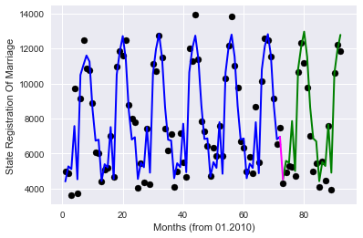
品質が大幅に向上しました!
オプション2-ターゲットエンコーディング、毎月トレーニングサンプルで今月の目的関数の平均値をエンコードします( roryorangepantsに感謝)
#get data for pandas data frame df5=df_base.copy() d=dict() #get we obtain the mean value of Registration Of Marriages by months on the training data for mon in df5.Month.unique(): d[mon]=df5.StateRegistrationOfMarriage[df5.Month.values[train]==mon].mean() #d+={} df5['MeanMarriagePerMonth']=df5.Month.map(d) df5.drop(['Month','Year','StateRegistrationOfMarriage','ID','global_id','Unnamed: 12','TotalNumber', 'StateRegistrationOfNameChange','StateRegistrationOfAdoption'],axis=1,inplace=True) #get data for model X=df5.values X_train=X[train] X_test=X[test] #teach model and get predictions lr = linear_model.LinearRegression() lr.fit(X_train, y_train) print('Coefficients:', lr.coef_[0]) print('Score:', lr.score(X_test,y_test)) # plot for all data plt.scatter(df3.Months.values[train], y_train, color='black') plt.plot(df3.Months.values[train], lr.predict(X_train), color='blue', label='train', linewidth=2) plt.scatter(df3.Months.values[test], y_test, color='black') plt.plot(df3.Months.values[test], lr.predict(X_test), color='green', label='test', linewidth=2) plt.title="Regression (prediction) on all data" plt.xlabel('Months (from 01.2010)') plt.ylabel('State Registration Of Marriage') #plot line for link train to test plt.plot([72,73], lr.predict([X_train[-1],X_test[0]]) , color='magenta',linewidth=2, label='train to test')-
取得するもの:
Coefficients: [ 0.16556761 -0.12746446 -0.03652408 -0.21649349 0.96971467]
Score: 0.875882918435
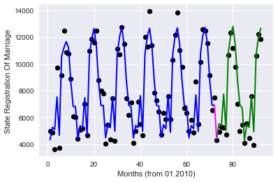
品質の点で非常に類似した結果であり、使用される機能の数は非常に少ない。
まあ、それは私が望むすべてです。
ここに「Zhoposranchik」氏との別れの写真があります。それが誰かを怒らせたり、「holivarov」を引き起こさないことを願っています:)
