この記事では、最後のアプリケーションを作成するときに使用した「チップ」を共有します。 基本的に、これは最新のユーザーインターフェイスを作成するための便利な機能と小さなコンポーネントのセットです。 各「トリック」には、コード例、写真、小さな説明が添付されます。 生きている例から学ぶのはもっと面白いと思うので、記事の最後に、記事で説明されているすべての「チップ」を使用する実際のアプリケーションのリポジトリへのリンクがあります。
この記事は、ユーザーインターフェイスの設計方法やマテリアルデザインの最も内側の意味を説明することを目的とするものではありませんが、これらの例がVvasにアプリケーションの設計を試すきっかけになることを願っています。
1.画像からドミナントカラーを抽出します
特定の画像に応じて動的に色を選択するなど、アプリケーションのカラースキームにさまざまなバリエーションを追加したい場合があります。 特にそのような場合には、Google- Paletteのライブラリがあります。 その使用の一例を見てみましょう。
// Palette build.gradle : // compile 'com.android.support:palette-v7:+' public static int getDominantColor(Bitmap bitmap) { List<Palette.Swatch> swatchesTemp = Palette.from(bitmap).generate().getSwatches(); List<Palette.Swatch> swatches = new ArrayList<Palette.Swatch>(swatchesTemp); Collections.sort(swatches, new Comparator<Palette.Swatch>() { @Override public int compare(Palette.Swatch swatch1, Palette.Swatch swatch2) { return swatch2.getPopulation() - swatch1.getPopulation(); } }); // - , return swatches.size() > 0 ? swatches.get(0).getRgb() : getRandomColor(); } public static int getRandomColor() { Random rnd = new Random(); int color = Color.argb(255, rnd.nextInt(256), rnd.nextInt(256), rnd.nextInt(256)); return color; }
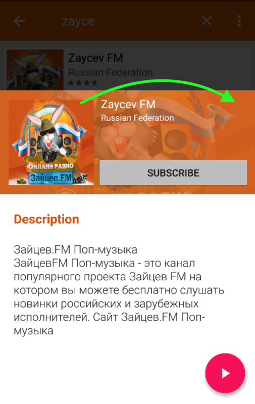
2.コードに直接文字を含むマルチカラーの正方形を生成します
このような正方形は、一般的なアプリケーションでよく見られます。 追加のグラフィックスやxmlレイアウトなしで、通常のビットマップの形式でコード内で直接簡単に作成できます。 元の画像が欠落している場合、それらを「スタブ」として使用しました。 それらを作成するには、 LetterBitmapクラスが1つだけ必要です 。 その使用例と最終結果は以下のとおりです。
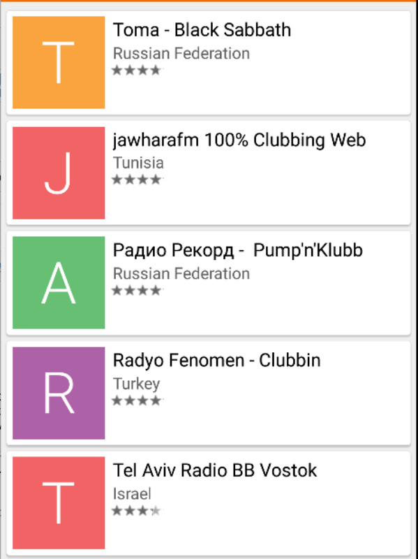
int COVER_IMAGE_SIZE = 100; //in pixels LetterBitmap letterBitmap = new LetterBitmap(context); Bitmap letterTile = letterBitmap.getLetterTile("string for letter", "string for color", COVER_IMAGE_SIZE, COVER_IMAGE_SIZE); ImageView imgAnyImageView = (ImageView) view.findViewById(R.id.imgAnyImageView); imgAnyImageView.setImageBitmap(letterTile);
3.その場で画像を拡大縮小
かなり興味深い機能で、透明度と組み合わせることができます。また、引き伸ばされた画像に半透明の背景を適用すると、「ぼかし」フィルターに似た効果が得られます。 画像が大きい場合は、レンダリングをブロックしないようにバックグラウンドストリームで拡大縮小するのが最適です。 以下の両方のオプションの例:

// public static Bitmap createScaledBitmap(Bitmap bitmap, float scaleFactor) { Matrix m = new Matrix(); m.setRectToRect(new RectF(0, 0, bitmap.getWidth(), bitmap.getHeight()), new RectF(0, 0, bitmap.getWidth() * scaleFactor, bitmap.getHeight() * scaleFactor), Matrix.ScaleToFit.CENTER); return Bitmap.createBitmap(bitmap, 0, 0, bitmap.getWidth(), bitmap.getHeight(), m, true); } // : float COVER_SCALE_FACTOR = 2f; final Bitmap scaledBitmap = UIHelper.createScaledBitmap(regularBitmap, COVER_SCALE_FACTOR); // new Thread(new Runnable() { @Override public void run() { final Bitmap scaledBitmap = UIHelper.createScaledBitmap(regularBitmap, COVER_SCALE_FACTOR); getActivity().runOnUiThread(new Runnable() { @Override public void run() { anyImageView.setImageBitmap(scaledBitmap); } }); } }).run();
そして、これは、上記の例と人気の画像読み込みライブラリの例であるGlideへのGistへのリンクです。
4.ツールバー内の検索フィールドのテキストの色をプログラムで変更します
別のレイアウトを作成せずに、ツールバー内の標準検索文字列の色を変更しようとして、多くの時間を費やしました。 styles.xmlでテーマスタイルを設定することをお勧めします。Android5.0以降では役立つこともありますが、以前のバージョンでは機能しません。 したがって、私はシンプルで普遍的なソフトウェアソリューションを提供します。

public static void changeSearchViewTextColor(View view, int color) { if (view != null) { if (view instanceof TextView) { ((TextView) view).setTextColor(color); return; } else if (view instanceof ViewGroup) { ViewGroup viewGroup = (ViewGroup) view; for (int i = 0; i < viewGroup.getChildCount(); i++) { changeSearchViewTextColor(viewGroup.getChildAt(i), color); } } } } // : Toolbar toolbar = (Toolbar) findViewById(R.id.your_toolbar); MenuItem searchMenuItem = toolbar.getMenu().findItem(R.id.action_search); SearchView searchView = (SearchView) searchMenuItem.getActionView(); setSearchViewStyle(searchView); changeSearchViewTextColor(searchView, Color.WHITE);
5.角が丸いボタン
丸みを帯びたエッジを持つボタンのレイアウト例でトップ5を完成させることにしました。そのようなボタンは最新バージョンの1つとGoogle Playで使用され、とても気に入りました。 おそらくあなたはあなたのアプリケーションでそれらを見つけることができます:

Android 5.0以降の場合:
<?xml version="1.0" encoding="utf-8"?> <ripple xmlns:android="http://schemas.android.com/apk/res/android" android:color="?attr/colorControlHighlight"> <item> <shape xmlns:android="http://schemas.android.com/apk/res/android" android:shape="rectangle"> <corners android:radius="@dimen/rounded_btn_radius" /> <solid android:color="@color/indigo_800" /> </shape> </item> </ripple>
以前のバージョンの場合:
<?xml version="1.0" encoding="utf-8"?> <selector xmlns:android="http://schemas.android.com/apk/res/android"> <item android:state_focused="true"> <shape xmlns:android="http://schemas.android.com/apk/res/android" android:shape="rectangle"> <corners android:radius="@dimen/rounded_btn_radius" /> <solid android:color="@color/indigo_500" /> </shape> </item> <item android:state_pressed="true"> <shape xmlns:android="http://schemas.android.com/apk/res/android" android:shape="rectangle"> <corners android:radius="@dimen/rounded_btn_radius" /> <solid android:color="@color/indigo_500" /> </shape> </item> <item> <shape xmlns:android="http://schemas.android.com/apk/res/android" android:shape="rectangle"> <corners android:radius="@dimen/rounded_btn_radius" /> <solid android:color="@color/indigo_800" /> </shape> </item> </selector>
使用するには、XMLファイルをそれぞれdrawableフォルダーとdrawable-v21フォルダーに入れて、任意のボタンの背景として設定します。
PS約束どおり、上記の「チップ」がすべて使用されたアプリケーションリポジトリへのリンクを残します-Github