As a result, we found people-superconnectors, found out how communities differ in different cities of Russia, and also found out that there are two and a half times more entrepreneurs among those over 50 than the average for all participants in our communities.

Who we are and what we do
Since this is our first article on Habré, I must say a few words about ourselves. In fact, we operate a free, fast-growing network of spaces for presentations and teamwork, where anyone can hold seminars, trainings, meetings or just work as in coworking. In our terminology, we call them Boiling Points.

Yeah, it's for free
In addition, we develop and support the Leader-ID digital platform, which helps build relationships between all participants in the system, share knowledge, seek like-minded partners and create your own communities.
At the moment, we have registered more than 800 thousand people.
It all started three years ago, when the network had only one space - in Moscow on Mayakovskaya.

Boiling point in Maly Konyushkovsky Lane in Moscow
A month later, in November 2016, the second appeared in St. Petersburg. And today we have 82 boiling points in 54 cities of Russia.
How it works
Our principle is very simple: we create a place where active caring people can come, those who have their own ideas, developments, projects. In our spaces, they can meet partners or investors, get insights or advice on how to change their project for the better or implement an idea.
How it works? In theory, when you come to any of our events or just to coworking, you meet new people who are ready and open for communication. The more often you come, the more people you meet and the more often you start to discuss something. And the more reasons for reflection and new ideas appear. New ideas - new contacts - new projects.
To test this theory, we decided to use network analysis and see how the density of communication between the participants in our events changes.
What exactly do we want to know with the help of graphs
Firstly , we were interested to know whether a real community was formed inside each of the Points and how fragmented it is.
Secondly , how this community is divided into themes and directions, how people from different spheres interact in it and whether there are super connectors there - people who keep separate directions, or does everything happen randomly.
Thirdly , how much intersect (and do they intersect at all) in business, education, and power. In theory, there are contacts everywhere, but we were interested in practice.
Plus, we were interested in how the Points in different cities of Russia differ.
General settings
What we did to improve the results and get a more realistic picture:
- Emissions were removed - data from events where the number of participants was abnormally different from the average.
- They set the rules of connectivity - they accepted that people are connected with each other if they were at joint events. The more events they attended together, the stronger the connection.
So let's go.
What the community looks like on the graph and what happens in separate directions
At this stage, we wanted to visualize the connectedness of the local community members with each other, as well as assess the impact of event sizes and topics on establishing connections. By community we mean those who are registered on Leader-ID and at least once attended or organized any of the events in their region.
As a base, we took 85 events of Petrozavodsk, in which from 2 to 20 people took part (the total number of participants in these events is 414 people). They made the assumption that the more people at the event, the less the strength of communication between them: after all, at a large event, the chance to talk with each person is less than at a small one where everyone knows each other or is easily acquainted.
As a result, we divided our 85 events into two categories: a small event (2–8 participants) and an average event (9–20 participants).
Several excessively large events were excluded from the sample according to our postulate on the normalization of data and the rejection of emission analysis.
Analysis Methods Used
- 2-mode-graph to create an affiliation network.
- Kamada - Kawai algorithm for taking into account bond density and quantity (components with tight coupling and a large number of internal bonds are visually closer in the figure).
- Normalization of centralities in a social graph and in a balanced social graph.
- Statistical analysis for the preparation and purification of data.
- Visualization in Pajek.
So, the network of secondary events turned out like this:
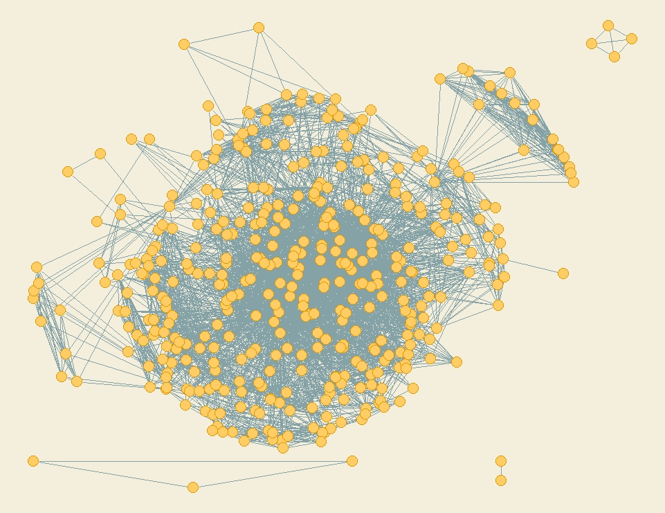
It can be clearly seen that the network core is larger in power than its peripheral part (individual elements not connected to the main graph). So we are dealing with a fully formed community.
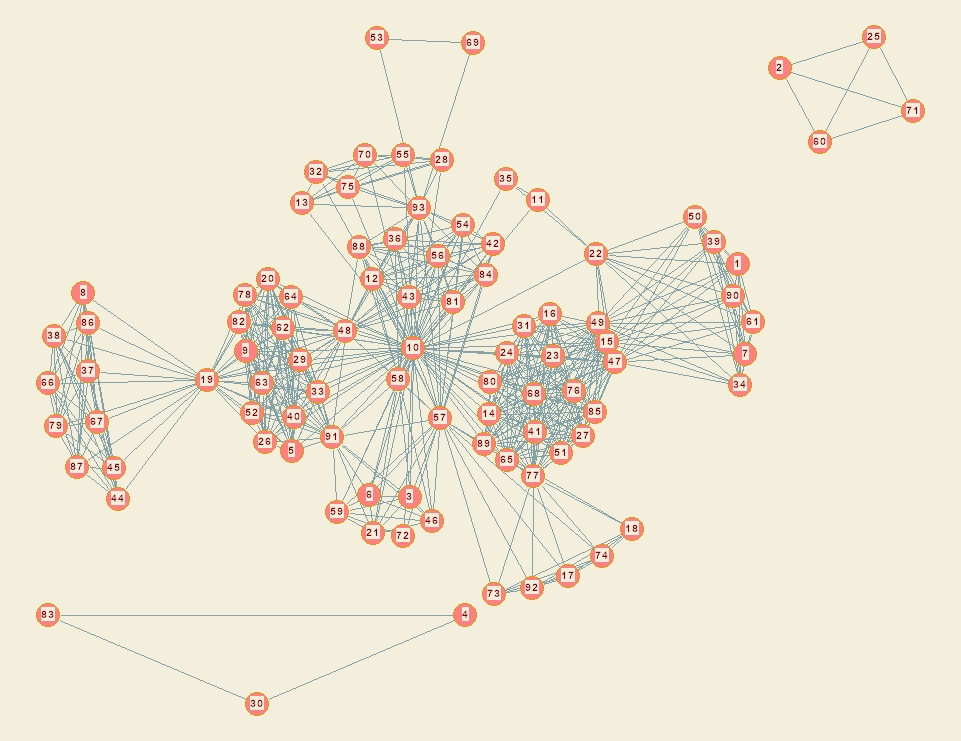
Analyzing the network of participants of only small events (108 people), we saw that several separated components appeared inside - isolated from the general structure of the company of 2-5 people:

The network turned out to be smaller in power, but connectivity still remains high.
Now let's look at the visualization of thematic areas.
To do this, we divided all the activities into three groups:
- events about social projects (44 events);
- events on the development of the region (18 events);
- events about education and technology (10 events).
With these parameters, the constructed networks visually differed from each other. Let's start with social projects, events for which 176 people attended.

Here we see a large core. Perhaps due to the fact that the topics of social projects intersect with each other.
In the development of the region (93 people) the picture is different:
There is a coherence on the topics: there are flagship trends that generate new topics that attract new participants. Due to this, nodes appear on the graph that connect separate groups of highly connected participants.
Now let's look at the direction of education and technology (129 participants):
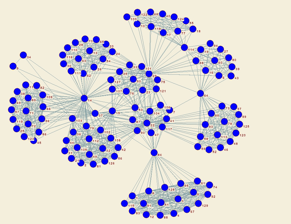
It can be seen that people here are united in small groups on topics. The cohesion of the entire community is ensured thanks to participants with a high Betweenness Centrality, that is, those who are simultaneously interested in several subtopics. And in general, the overall connectivity of the educational community is lower than in the two previous cases.
What have you found useful
- With the help of Degree Centrality, the top 10 participants were identified who have the largest number of jointly attended man-events.
- With the help of Betweenness Centrality, they revealed the top 10 participants through which the largest amount of information passes through the network.
- Revealed the node through which the main network is connected with the clusters.
- The strongest pairs of connections were revealed - people who are best known (top 10 and top 50).
- Designated areas for further research.
As a result, we know who we can turn to if it is necessary to develop certain areas, disseminate certain information, or introduce an idea. People who are central to the graph will be able to do this faster than others.
Does power intersect with business and science
To answer this question, we specifically looked for a regional Point where all these groups are equally active, and found one in Tomsk.
In constructing the graph for Tomsk, we adhered to the hypothesis that our space (Point) in this city promotes the mixing of people from different institutional spheres and increases their connectivity. We are talking about representatives of education and science, business and government.
Analysis Methods of Tomsk
One of the main functions of the boiling point is to connect people, ideas and solutions. To investigate how well this function is implemented, we use the power orientation of the network, based on a combination of simple principles:
- the nodes repel each other and tend to leak to the periphery;
- connections between nodes bring them together.
To achieve a more realistic look, we use the multi-stage method (OpenOrd), since many of its stages correspond to the life cycle of the community: “liquid”, “expansion”, “cooling”, “crunching and boiling” (this cycle is repeated continuously with various parameters).
The analysis base included 650 events in which more than 23 thousand participants took part. We built a graph, thanks to which it was possible to identify several facts and phenomena, as well as build a model of pairwise interaction between all three categories.
The first one. At 80% of the events, trilateral ties were formed between representatives of the scientific community, business and the state. Of these, 20% are highly specialized events, the subject of which is important for representatives of a particular field, for example, professional education.
For simplicity, we visualized institutional affiliation using color. So we saw that the university community is most closed to itself (there are pronounced purple areas on the graph).
The second one. Based on our data, two clusters dominating in composition can be distinguished:
- communications in which all three players participate - universities, business and government;
- communications in which only universities and business participate.
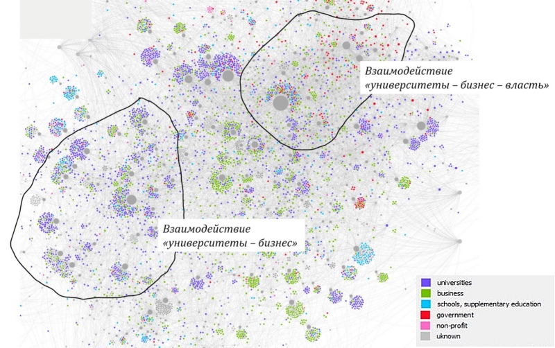
Two clusters of events dominating the composition of participants
Among the distinguished groups (universities, business, and government), universities and business show the greatest communication activity. The graph shows the areas for which the activity of representatives of both clusters is characteristic.
The third. Over the past year, a core of participants has been formed in the region that is involved in intensive meaningful communications, which, as a rule, are united by scientific and technological topics - end-to-end technologies, future markets, and the implementation of a scientific and technological development strategy. This interaction can be seen on the blue graph.

Here visualization is presented in such a way as to demonstrate how various connections depart from the center of the network (core).
Fourth. Thanks to the graph, it was possible to manifest the phenomenon of the so-called superconnectors - individuals who connect participants in one or several thematic areas at once.
According to our estimates, there are about 600 candidates for super connectors: approximately 1 out of 23 unique users or 1 out of 38 participants in events.

We are looking for superconnectors to engage them in co-creation and teamwork, since it is through them that the largest number of communications passes.
What analysis has given us
- Superconnectors are identified - people who have been to many events and, possibly, act as communicators in the community or between communities.
- The topics of events that attract power and business, and science are identified: these are cross-cutting digital technologies, markets for the future, and a strategy for scientific and technological development.
Using visualization, we also identified and studied many models, some of which are outlined below.
Structural Strength : our network is still evolving, but nevertheless we would like to ensure its strength and in this regard we have considered its general structure. The central core consists of several interconnected clusters, which avoids a single “point of destruction” (a network with one central cluster can easily disintegrate if the main cluster is “compromised”).
Closeness (Distance) : We believe that by reducing the distance between people, we can stimulate the flow of ideas. There are a number of characteristics that contribute to this goal. For example, if an idea has many potential ways and tricks from which it can be framed, then the probability of its realization increases. On the graph, we got the opportunity to see participants who have succeeded in combining functionality. Some in the intercluster connection; others within the cluster, which in combination gives a significant improvement.
Entropy : Mixing things up is crucial in order to make sure new ideas can develop (this process resists stagnation). We look at the entropy both at the macro level (cluster) and at the micro level (individual) and take into account the variety of classifications (the theme of the event, participants' affiliation with the institutional sphere, etc.). We think that having many different configurations is critical in and of itself. High entropy is important for mixing ideas and allows them to flow freely and quickly in many directions. Low entropy is important for deeper concentration and development of ideas.
We hope that we will be able to stimulate the development of the network with the advent of new properties that are not planned from above, but appear as if by themselves in the course of the natural evolution and development of communities.
Assessment of differences by city
All boiling points are created according to a single model, but develop in different ways. Therefore, we decided to assess the structure and connectivity of the communities, highlighting the topics that are fundamental for each place.
For example, we pulled out data on Points in Ivanovo and Vladivostok. But here it is worth identifying some differences of the approach from the research of Points in Tomsk or Petrozavodsk:
- we paid attention to the types of communities (business communities, educational communities, etc.), and not just to individual groups. This made it possible to analyze the density of connections not only within, but also between them: are the communities closed to themselves or do they hang out with similar or ideologically different companies;
- we compared the results of the network analysis with the boiling points agenda, that is, with the prevailing topics of events in them.
Methods
In the social graph, we drew an edge between two participants if they participated in common events or projects. The more general events the participants attended, the shorter the rib between them. After that, we clustered members into communities using Fast unfolding of communities in large networks . Usually, participants who attended many common events fell into common clusters. We selected large clusters and tried to clearly characterize them.
Boiling Point of Ivanovo
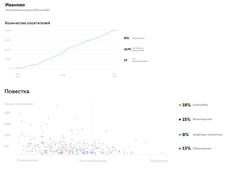
So, in the boiling point asset, we have identified those people who more often than others come to events, organize them or come to coworking. They, along with super connectors, provide connectivity.
The thematic focus in Ivanovo has a pronounced humanitarian bias. The connectivity turned out to be quite high, but at the same time, the directions have a pronounced isolation, which is clearly visible in the color coloring of the core. The graph also shows that business communities are more likely closed, while volunteers and FashionNet are open communities (in terms of the possibility of joining).
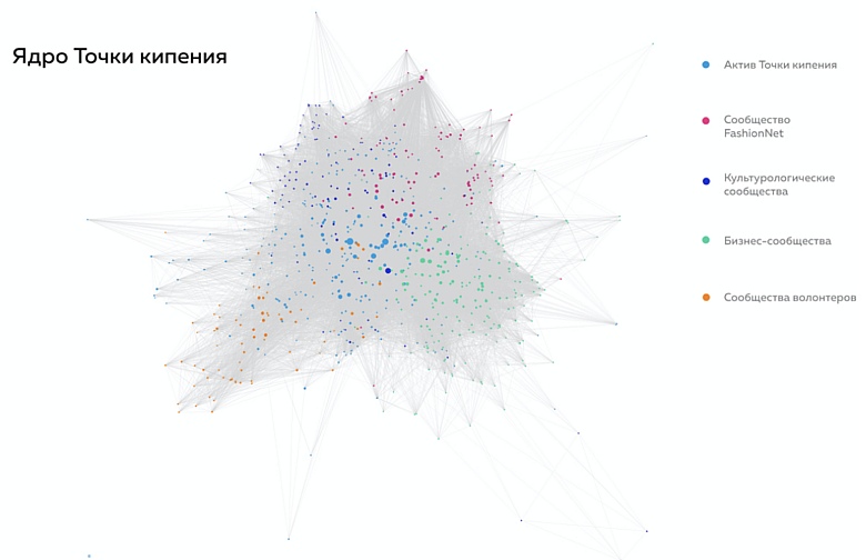
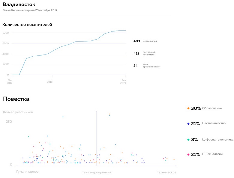
Boiling Point Vladivostok

Here we take a different approach, assuming that communities come together around a topic. Using this typologization, we separated the core of the communities (who united around those) from the agenda (topics of the most popular events).
According to the report, thematic components are expressed more clearly in Vladivostok than in Ivanovo. More than half of the events are somehow related to education, plus IT has taken a significant share. And the kernel graph speaks of little connectivity in thematic areas. It is possible that the nucleus is only just beginning to form there, and therefore looks multipolar.
Boiling Point - Moscow
At the Boiling Point - Moscow in Maly Konyushkovsky Lane we were most interested in the core.

The graph shows that in Moscow there is no asset. Instead, a connecting role is played by methodological communities - those that unite around methodological schools.
By the way, on the structures of Moscow and Ivanovo, there is a difference in the approaches of program directors: a community has gathered in Ivanovo, which in different compositions takes part in various events, providing coherence (we call such people “Asset Points”). In “Moscow”, on the contrary, events, as a rule, take place without such people, but on the other hand, this provides more traffic in the Point, and as a result, more people learn about what we do.
What we got
- Each regional Point provides a specific agenda and becomes a platform for communication and development of specific people. Clustering helped us identify the Points at which the agenda sags.
- We learned to compress a bunch of mixed data on the communities of the Point into one picture. The program directors who are responsible for the communities in our sites can now quickly evaluate the structure of the Point they work with.
General analysis for all regions
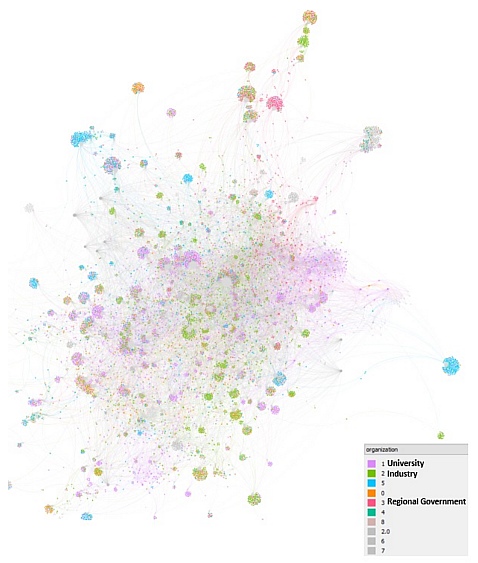
Let's see what interesting can be found inside the entire Leader-ID system. At the time of these studies, we had half a million participants. In general, we conducted a number of analyzes, but for now, we will talk about two of them:
- We determined how the educational community can be differentiated and what topics are connected by various groups attending events under the general heading "Education".
- Identified general trends for individual social groups using network analysis methods (for example, are people over 50 years old involved in networking).
But first things first.
Top topics in education
To begin with, we needed to find out whether the leaders of educational projects are connected with each other. For this, we made the following assumptions:
- Leaders go to interesting events for them or organize them, so we can again turn to the approach described above and analyze the connectedness of the participants in the events.
- Since the field of education is very wide, we need to make an assumption about topics that unite people so much that we can call them communities. We have identified the following subtopics: preschool education, school education, higher education, secondary vocational education, adult education.
Next, we analyzed the topics of the events and found out that the participants are most interested in three things:
- professional growth (problems of professional development, teacher education, advanced training), and most of all in children’s, school and higher education;
- professions of the future (skills of the future, demanded competencies, Atlas of new professions ), which are the subject of discussion of participants in events for children, higher, secondary vocational and adult education;
- high technologies (end-to-end technologies, technologies in education), which relate to school education, secondary vocational education and adult education.
Now the graph:
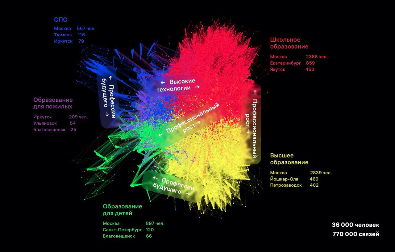
The main conclusion - our assumption about the separation of participants in events in the field of "Education" was justified: the graph shows that the density of interaction within these five subgroups is higher than the density of bonds between them. Otherwise, the graph would be visually similar to the one we received in Tomsk.
By the way, due to the huge number of vertices we rendered this graph using Gephi, while the previous ones were created using NetworkX.
What can be said about those who are 50+
We asked ourselves if we have enough data to assess the involvement of people aged 50+ in active social life. It turned out that yes - we have more than 60 thousand such participants, that is, every tenth.
Let's start with the connectivity graph for participants aged 50+. It turned out like this:

We are encouraged that sometimes you can just admire the results of network analysis and endlessly look at this rock guitar. Everything is very good here.
Next, we tried to analyze what topics these people are interested in, what organizations they represent, and what exactly connects them. As a result, we received the following (unexpected for us) insights:
- The percentage of entrepreneurs among Leader-ID participants older than 50 years is 2.5 times higher than the national average. It turned out after analyzing the places of work of 45 thousand Leader-ID participants older than 50 years, where the words “Founder”, “Founder” and their synonyms are found in 8% of the sample with an average value of 3%.
- Leader-ID participants over 50 are interested in the same topics as participants of other ages: education, strategic management, innovation, science and research, public administration.
- The density of connections of Leader-ID participants older than 50 years is no less than the density of connections of participants in other social categories: in other words, networking is a common trend for all people.
In the dry residue
Graph visualization is a cool thing. In our case, we were able to assess the core of the communities, coherence and mutual penetration in certain areas, themes and institutional areas. In the next step, we will pull out key topics and agendas that bring people from different fields together and see how these areas can be developed further.
Plus, we identified superconnector people with whom we now plan to actively interact and help in various organizational matters.