In a previous article, we looked at some basic JavaFX layouts. Now it's time to consider the rest of the available layouts.
- JavaFX Tutorial: Getting Started
- JavaFX Tutorial: Hello world!
- JavaFX Tutorial: FXML and SceneBuilder
- JavaFX Tutorial: Basic Layouts
- JavaFX Tutorial: Advanced Layouts
- JavaFX Tutorial: CSS styling
- JavaFX Weaver: Integrating JavaFX and Spring Boot Applications
Anchorpan
AnchorPane is an interesting and powerful layout. This allows you to define anchor points (anchors) to components within the layout. There are 4 types of anchors:
- top
- bottom
- left
- right
Each component can have any combination of anchors. From zero to all four.
Anchoring a component means that it keeps a certain distance from a certain edge of the layout (for example, TOP). This distance is maintained even when the layout is resized.
For example: anchorRight = 10 means that the component will keep a distance of 10 from the right edge of the layout.
You can specify two anchor points that are not in opposite directions to snap your component to a specific corner of the layout.
The binding TOP = 10 , RIGHT = 10 means that the component will remain in the upper right corner of the layout at a distance of 10 from both edges.
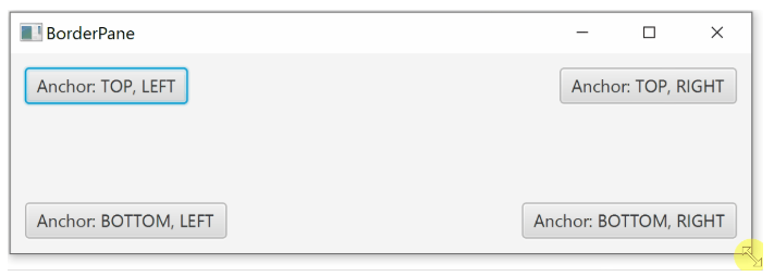
In the above example, the size of each component remains unchanged when the window is resized. However, if you define snap points in opposite directions, you can increase / decrease your component when you resize the window.
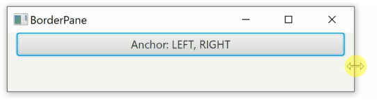
You can use various binding combinations, for example:
- LEFT + RIGHT resizes horizontally
- TOP + BOTTOM resizes vertically
- Specifying all 4 anchors means both horizontal and vertical component resizing
Defining anchor points in FXML is easy. The following example has all four anchors, but you can only include the ones you want, or not include any.
<AnchorPane> <Button AnchorPane.topAnchor="10" AnchorPane.leftAnchor="10" AnchorPane.rightAnchor="10" AnchorPane.bottomAnchor="10">I am fully anchored!</Button> </AnchorPane>
Now let's look at how binding is implemented in Java:
AnchorPane anchorPane = new AnchorPane(); Button button = new Button("I am fully anchored!"); AnchorPane.setTopAnchor(button, 10d); AnchorPane.setBottomAnchor(button, 10d); AnchorPane.setLeftAnchor(button, 10d); AnchorPane.setRightAnchor(button, 10d); anchorPane.getChildren().add(button);
Gridpan
GridPane is a layout that allows you to arrange your components in a table. Unlike TilePane , which adds components one by one, here, when adding each new component, you need to specify the coordinates of its location in your table.
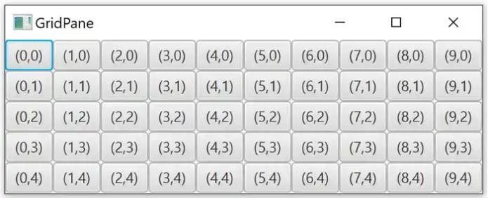
<GridPane hgap="10" vgap="10"> <Label GridPane.rowIndex="0" GridPane.columnIndex="0">First</Label> ... </GridPane>
In Java, when adding a new component, we first specify the ColumnIndex (x) parameter and then RowIndex (y) .
GridPane grid = new GridPane(); grid.add(new Label("Hello!"), columnIndex, rowIndex);
Spacing
By default, table cells have no spaces. The components are next to each other, without intervals. The interval can be defined separately for rows and columns, that is, horizontally and vertically.
- hgap sets the horizontal spacing (between columns)
- vgap sets the vertical spacing (between rows)
<GridPane hgap="10" vgap="10"> ... </GridPane>
Spacing defined in Java:
GridPane grid = new GridPane(); grid.setHgap(10); grid.setVgap(10);
Spacing for multiple cells
Components in a GridPane can span multiple rows and / or columns. The component with rowspan extends to the bottom from its original cell. The colspan component expands to the right.
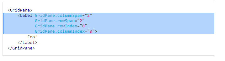
In Java, there are two ways to set rowSpan and columnSpan. You can install them directly when adding a component to the table:
grid.add(component, columnIndex, rowIndex, columnSpan, rowSpan);
Or via GridPane:
GridPane.setColumnSpan(component, columnSpan); GridPane.setRowSpan(component, rowSpan);
Sizing
Although in the original example all cells were the same size, this does not have to be so. Table cell sizes are defined as follows:
- The height of each row is equal to the largest element in the row
- The width of each column is equal to the widest element in the column
Column and Row Constraints
As already mentioned, by default, column and row sizes are based on the components inside the panel. Fortunately, it is possible to better control the size of individual columns and rows.
For this, the ColumnContstraints and RowConstraints classes are used.
In fact, you have two options. Either set the percentage of available space for individual rows and columns, or set the preferred width / height. In the latter case, you can also determine the preferred behavior when resizing columns and rows.
Percent
It is pretty simple. You can set the percentage of the available space that will be occupied by a given row or column. When you resize the layout, the rows and columns also change to reflect the new size.
<GridPane> <columnConstraints> <ColumnConstraints percentWidth="50" /> <ColumnConstraints percentWidth="50" /> </columnConstraints> <rowConstraints> <RowConstraints percentHeight="50" /> <RowConstraints percentHeight="50" /> </rowConstraints> ... </GridPane>
Same Java example:
GridPane gridPane = new GridPane(); ColumnConstraints col1 = new ColumnConstraints(); col1.setPercentWidth(50); ColumnConstraints col2 = new ColumnConstraints(); col2.setPercentWidth(50); gridPane.getColumnConstraints().addAll(col1, col2); RowConstraints row1 = new RowConstraints(); row1.setPercentHeight(50); RowConstraints row2 = new RowConstraints(); row2.setPercentHeight(50); gridPane.getRowConstraints().addAll(row1, row2);
Absolute size
Instead of specifying the size as a percentage, you can determine the preferred and minimum size. In addition, you can specify how the row / column should behave when the layout is resized. Columns use the hgrow property, and rows have the vgrow property.
These properties can have three different meanings.
- NEVER : NEVER increases or decreases when the layout is resized. The default value.
- ALWAYS : ALWAYS: When you resize the layout, all items with this value are either stretched to fill the available space, or shrunk.
- SOMETIMES (SOMETIMES): The size of these elements changes only if there are no other elements.
<GridPane> <columnConstraints> <ColumnConstraints minWidth="50" prefWidth="100" /> <ColumnConstraints minWidth="50" prefWidth="100" hgrow="SOMETIMES" /> </columnConstraints> <rowConstraints> <RowConstraints minHeight="50" prefHeight="100" /> <RowConstraints minHeight="50" prefHeight="100" vgrow="SOMETIMES" /> </rowConstraints> ... </GridPane>
Same Java example:
GridPane gridPane = new GridPane(); ColumnConstraints col1 = new ColumnConstraints(); col1.setMinWidth(50); col1.setPrefWidth(100); ColumnConstraints col2 = new ColumnConstraints(); col2.setMinWidth(50); col2.setPrefWidth(100); col2.setHgrow(Priority.SOMETIMES); gridPane.getColumnConstraints().addAll(col1, col2); RowConstraints row1 = new RowConstraints(); row1.setMinHeight(50); row1.setPrefHeight(100); RowConstraints row2 = new RowConstraints(); row2.setMinHeight(50); row2.setPrefHeight(100); row2.setVgrow(Priority.SOMETIMES); gridPane.getRowConstraints().addAll(row1, row2);
You can also specify the maxHeight and maxWidth parameters (maximum height and line) for individual rows and columns.
Borderpan
BorderPane is a five-section layout:
- Top
- Bottom (Bottom)
- Right
- Left
- Center
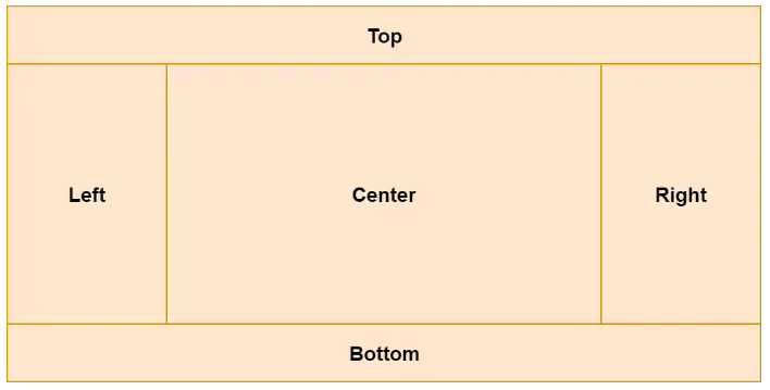
You can assign components to individual BorderPane sections:
<BorderPane> <top> <Label>TOP</Label> </top> <bottom> <Label>BOTTOM</Label> </bottom> <left> <Label>LEFT</Label> </left> <right> <Label>RIGHT</Label> </right> <center> <Label>CENTER</Label> </center> </BorderPane>
Now the same example in Java:
Label top = new Label("TOP"); Label bottom = new Label("BOTTOM"); Label left = new Label("LEFT"); Label right = new Label("RIGHT"); Label center = new Label("CENTER"); BorderPane borderPane = new BorderPane(); borderPane.setTop(top); borderPane.setBottom(bottom); borderPane.setLeft(left); borderPane.setRight(right); borderPane.setCenter(center);
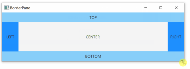
Sizing
All regions, except the central ( center ), have a fixed size. The center then fills the rest of the space.
The upper ( Top ) and lower ( Bottom ) areas stretch across the entire available horizontal space. Their height depends on the height of the component inside.
Left and right fill all available vertical space (except that they occupy the top and bottom). Their width depends on the width of the component inside.
The center is dynamic in size and fills the rest of the space not occupied by other sections. Let's look at an example:
What's next
Now that we know how to use various layouts, we’ll look at how to style JavaFX components with CSS.