
In this article, I’ll teach you how to use CSS Grid to create a cool image grid that changes the number of columns depending on the width of the screen or browser window.
The coolest thing is that to add responsiveness you will need to write one line of CSS code
This means that we don’t need to clutter up HTML with ugly class names (e.g. col-sm-4, col-md-8) or create media queries to accommodate the size of each screen.
I also created a free CSS Grid course. Click to get full access to the course .
Let's start!
Customization
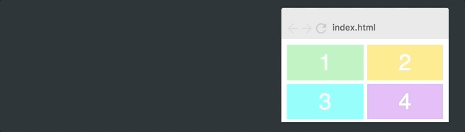
This is what our initial grid looks like:

HTML code:
<div class="container"> <div>1</div> <div>2</div> <div>3</div> <div>4</div> <div>5</div> <div>6</div> </div>
CSS Code:
.container { display: grid; grid-template-columns: 100px 100px 100px; grid-template-rows: 50px 50px; }
Note: in the example there are several basic styles that I will not consider here, since they have nothing to do with CSS Grid.
Let's start by making the columns responsive.
Basic responsiveness
CSS Grid has a value that is written as fr and allows you to break the container into parts, the number of which can be any.
Change the value of grid-template-columns to 1fr 1fr 1fr :
.container { display: grid; grid-template-columns: 1fr 1fr 1fr; grid-template-rows: 50px 50px; }
Now the grid splits the entire width of the container into three parts. Each column takes its own part (unit). Here is the result:

If we change the value of grid-template-columns to 1fr 2fr 1fr , then the second column will be twice as wide as the others and the total width will be four units (the second column takes up two of them, and the rest - one at a time.) Here is what it looks like:

In other words, using the ft value makes it easy to change the width of the columns.
Improved responsiveness
However, the above example does not give us the required responsiveness, since this grid will always have a fixed number of columns. We want our grid to change the number of columns depending on the width of the container. To achieve this, you need to learn three new concepts.
repeat ()
Let's start with the repeat () function. This is a more convenient way to specify row and column parameters:
.container { display: grid; grid-template-columns: repeat(3, 100px); grid-template-rows: repeat(2, 50px); }
In other words, the repeat function (3, 100px) is identical to writing 100px 100px 100px . The first parameter indicates how many columns or rows you want, and the second indicates their width. We get the same layout we started with:
auto fit
Next, consider the auto-fit function. Replace the specified number of columns with the auto-fit function:
.container { display: grid; grid-gap: 5px; grid-template-columns: repeat(auto-fit, 100px); grid-template-rows: repeat(2, 100px); }
This leads to the following:

Now the grid changes the number of columns depending on the width of the container.
In fact, the function is simply trying to place as many columns as 100 pixels wide in the container.
However, if we encode that all columns will have a width, for example, strictly 100px, then we will never get the desired flexibility, since the full width of the columns is not shown. As you can see in the figure above, the grid leaves an empty space on the right side.
minmax ()
The last function we need to fix this is called minmax () . We just replace 100px with minmax (100px, 1fr) . Here is the latest CSS code:
.container { display: grid; grid-gap: 5px; grid-template-columns: repeat(auto-fit, minmax(100px, 1fr)); grid-template-rows: repeat(2, 100px); }
Note that all responsiveness is added by writing one line of CSS code.
This leads to the following:
As you can see, this works great. The minmax () function defines a range of sizes greater than or equal to min and less than or equal to max.
Thus, columns will always have a size of at least 100 pixels. However, if there is more available space, then the grid will simply distribute it equally between each of the columns.
Adding Images
Now the last step is to add the images. This has nothing to do with CSS Grid, but let's take a look at this step.
We'll start by adding an image tag inside each grid element.
<div><img src="img/forest.jpg"/></div>
To make the image fit the size of the element, we set it to be as wide and tall as the element itself, and then use object-fit: cover. Then the image will cover the entire area provided for it, and the browser will crop it, if necessary.
.container > div > img { width: 100%; height: 100%; object-fit: cover; }
Here is the result:

That's all! Now you know one of the most complex concepts in CSS Grid.
Browser support
Before we finish, I should also mention browser support. At the time of this writing, 92% of the world's web browsers support CSS Grid .
I believe that mastering CSS Grid is an essential skill for a front-end developer.
So check out my CSS Grid course if you are interested in this topic.
Thanks for reading! My name is Per, I am a co-founder of Scrimba (a tool for creating interactive screen codes).