In this article, I will teach you many tricks of responsive design in 5 minutes. This is obviously not enough for proper study, but here you will find an overview of the following most important methods:
- CSS relative units
- Media queries
- Flexbox
- Responsive Typography
CSS relative units
Responsive web design is based on relative CSS units. These are units that get their values from some external values. This is convenient because it allows, for example, to proportionally scale the image width relative to the width of the browser window.
The most common relative units:
- %
- em
- rem
- vw
- vh
In this section, we start with the percentage% as a unit of measurement, and then in the last section we look at the unit rem.
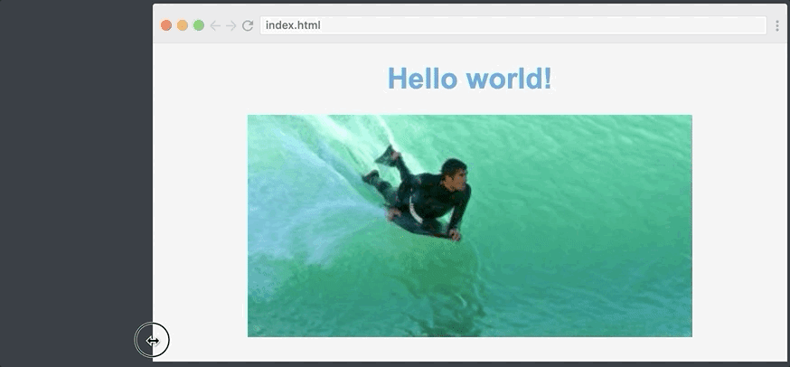
Let's say we have a very simple site like the one below:
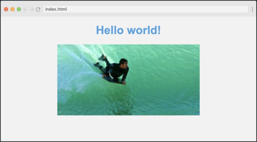
Its HTML code is as follows:
<body> <h1>Welcome to my website</h1> <image src="path/to/img.png" class="myImg"> </body>
As you can see from the GIF below, our default image will have a fixed width:
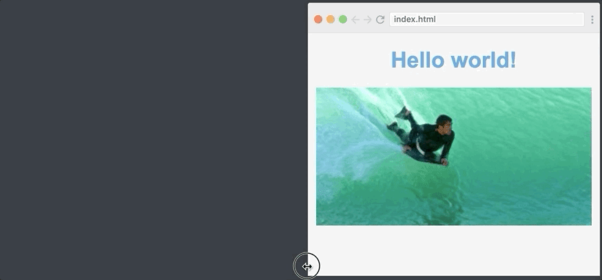
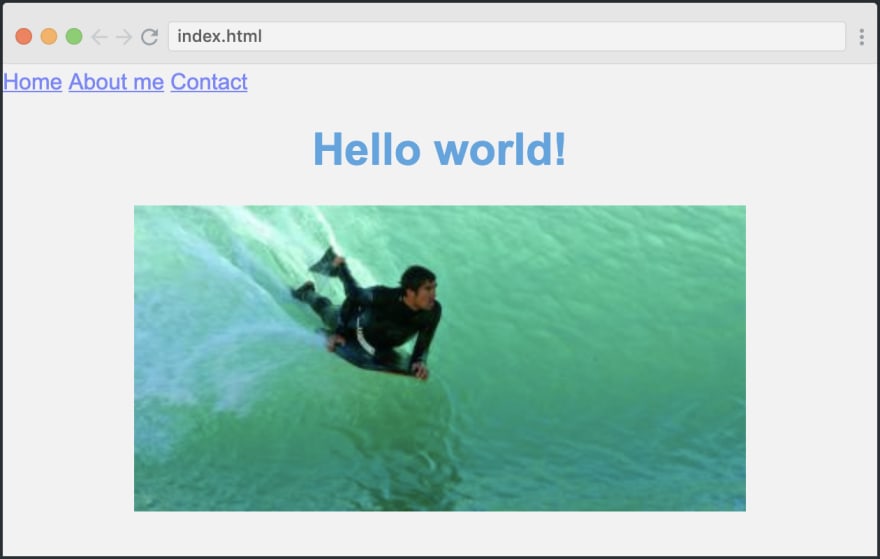
The image is not particularly responsive, so let's change the width to 70%. We simply write the following:
.myImg { width: 70%; }
This sets the image width to 70% of the width of the original element that is written in the tag. Since the tag covers the entire width of the screen, the image will always be 70% of the browser window itself.
Here is the result:
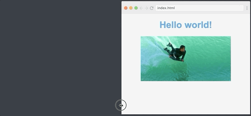
It's so easy to create a responsive image.
Using media queries to improve the mobile version of the site
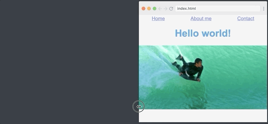
We have one problem with our responsive layout - it looks weird on very small screens. An equal 70% width should decrease when viewed on a mobile phone. Just take a look for yourself:
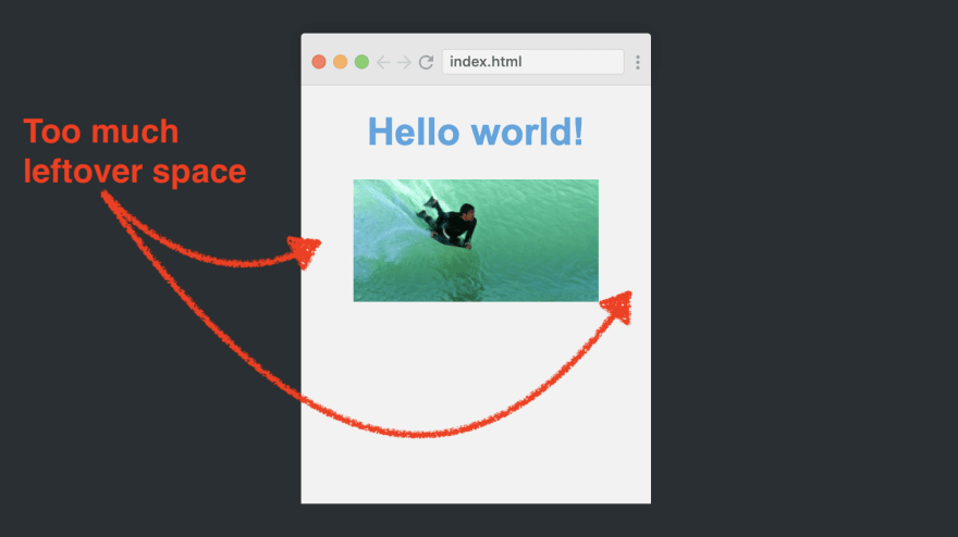
To make the image look better in this case is a task just for media queries. They allow you to apply various styles, for example, depending on the width of the screen. We can prescribe that if the screen width is less than 768px, then we need to use a different style.
Here's how we create a media query in CSS:
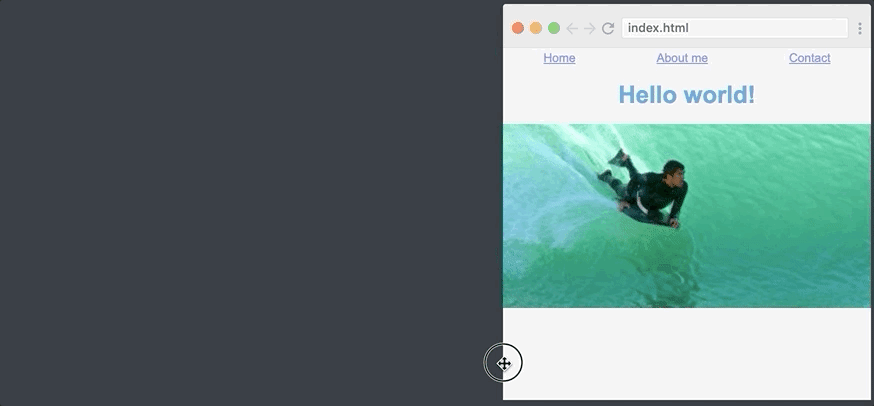
@media (max-width: 768px) { .myImage { width: 100% } }
This CSS block will only be applied if the screen width is less than 768 pixels.
Here is the result:
As you can see, the page has a breakpoint where the image gets wider: when the browser window is 768px wide, the image width changes from 70% to 100%.
Navigation Menu Using Flexbox
Next comes Flexbox. You simply cannot understand responsiveness without first becoming familiar with Flexbox. When Flexbox was introduced several years ago, it changed its responsive design, since this module makes it much easier to position elements along the axis.
To use Flexbox, we will make our site a little more complicated by adding a navigation menu above the header. Here is the HTML for this:
<nav> <a href="#">Home</a> <a href="#">About me</a> <a href="#">Contact</a> </nav>
By default, it will look something like this:
Our menu items are shifted to the left, but this is not what we need. We want them to be evenly aligned across the width of the page.
To do this, we simply turn the container into flexbox, and then apply the justify-content magic property.
nav { display: flex; justify-content: space-around; }
Let's figure it out. Display: flex turns into a flexible box. Justify-content: space-around tells the browser that the elements inside the flexible container should have space around them. So the browser evenly distributes all the space remaining around the three elements.
Here is how it looks. And, as you can see, the site scales well:
Responsive Typography: rem
The last step is to make our typography responsive. You see, I want the navigation menu and the title to be slightly smaller when the screen width is less than 768px (our reference point, remember?).
One way to do this is to reduce the font size in the media query, for example, as follows:
@media (max-width: 768px) { nav { font-size: 14px; } h1 { font-size: 28px; } }
It turned out far from perfect. An application can have several control points and many elements (h2, h3, paragraphs, and so on). As a result, we will have to track all the elements in all the different breakpoints. It is easy to guess that this will create some confusion.
However, most likely, they will relate to each other more or less the same at different control points. For example, h1 will always be more than a paragraph.
What if there was a way to set up one element and then make the rest of the font sizes scale relative to that element?
Enter rem!
Rem basically means the font size value you set for your element. Type of the following:
html { font-size: 14px; }</source , rem 14px. , rem. : <source lang="xml">h1 { font-size: 2rem; } nav { font-size: 1rem; }
And then we just change the font size value for the tag inside our media request. This will provide font resizing for our h1 and nav elements.
Here's how we change the rem value in a media query:
@media (max-width: 768px) { html { font-size: 14px } }
And just like that, we have a breakpoint for all of our font sizes. Notice how the font size changes when the page crosses the 768-pixel mark:
You learned how to adjust the sizes of fonts, images, and the navigation menu so that they respond to page width in just 5 minutes. This is great, because you have already taken the first steps to mastering the very valuable skills of creating responsive websites.
Good coding!