I’m Mikhail Kravchenko, game interface designer.
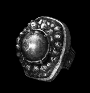
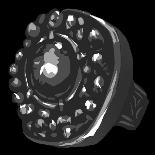
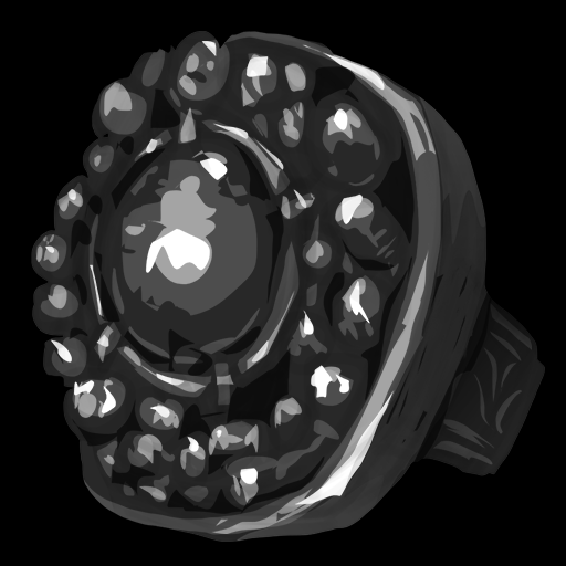
This article is about how to draw a Havel ring from the game Dark Souls 3. Here is the result that I achieved in about an hour and a half in Photoshop.

The interface designer is periodically asked to draw several icons for the game, for example, when the artist is on vacation and something is urgently needed. So to have such a skill in your arsenal is quite useful. Below I will describe the process of drawing an icon.
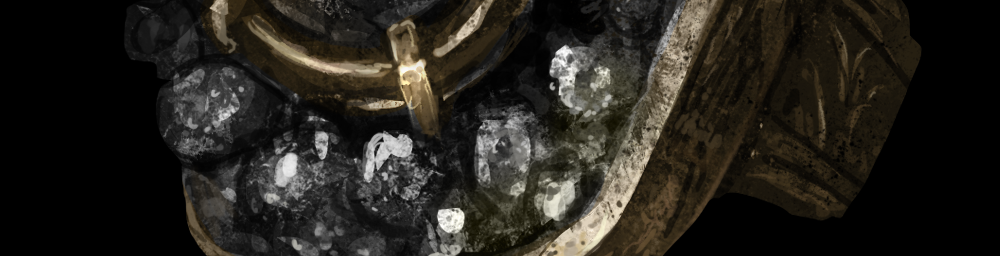
Icons are convenient to draw in large sizes, and then reduce to the desired. This allows you to draw quite casually, and when you reduce the picture, carelessly drawn places cease to be noticeable. I usually choose a size 4 times larger than what I will need in the end. The image below shows an enlarged icon, as you can see, it is drawn rather casually.
References
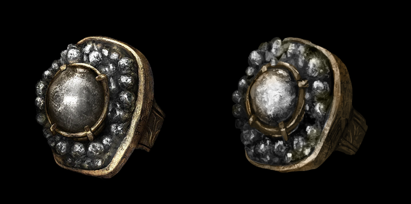
References are images that help you learn a subject. Looking at them, we understand how it is lit, what texture and color it has. And all this helps to improve our result.
For example, if we are going to draw a stone, we need to find some pictures of the stones, study them and only then draw. And in the process of drawing, be sure to keep pictures in a prominent place and periodically look at them. In our case, the ring from the game acts as a reference.
Sketch
A sketch is needed to indicate the main forms of which the subject consists. When creating a sketch, you need to go from general to particular - first outline the overall dimensions of the subject, and then clarify its details. If we immediately move on to the small details, we are likely to screw up with overall dimensions and as a result we get a curved object.
I have a round hard brush for sketches, I set the alpha and flow parameters in the region of 30%. They also change by pressing the pen. Such a brush allows you to gradually refine the details of the sketch and find the desired shape. Below you see the brush settings.


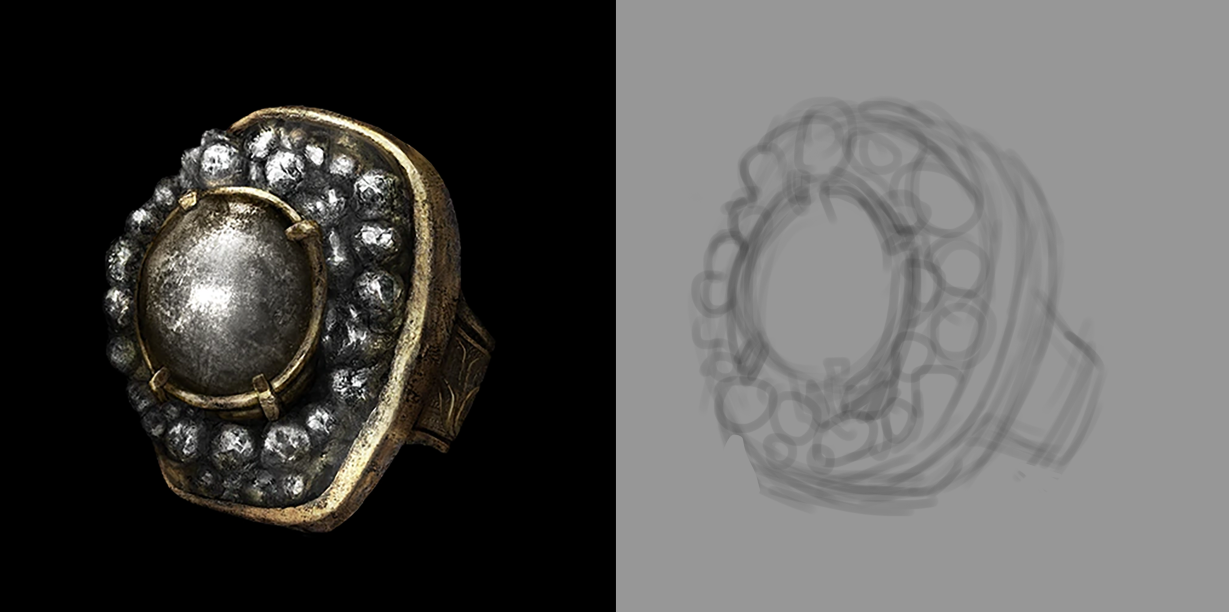
We set the reference on the left, and draw a sketch on the right. As a result, we get something like this.
Silhouette
Next is the work with the silhouette of the subject. You need to create a new layer and select the usual lasso.
The hotkey to create a new layer is Ctrl + Shift + N, and the lasso can be found on the toolbar, or call L.
Circle the item with the lasso. You can do this in parts by holding the Shift key. Then fill the selected area with color by pressing Alt + Backspace. Get the flooded silhouette highlighted around the perimeter.

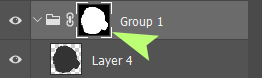
Wrap the layer with the fill in the group - click on it and press Ctrl + G. A folder will appear on the layers panel, and there will be a filled layer in it.

Click on the folder and click on the mask icon at the bottom of the layers panel.

A mask icon appears on the group.
Now you can draw on layers within the group and not be afraid to crawl out of the boundaries of the silhouette of the subject. The mask will hide everything that is behind them.
Volume
Next, show the volume of the item. First, we desaturate our reference. At this stage, the colors will only interfere with us, so you need to turn them off. Click on the reference layer and create an adjustment layer on top for the hue saturation parameters.

Hold Alt and click between layers. Now the adjustment layer is stuck to the reference layer and affects only it. Click on the adjustment layer and move the saturation slider all the way to the left.
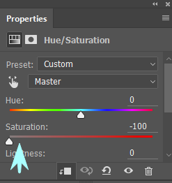
The picture has become black and white.
Let's create a new group in our group with a mask, there will be layers in it in which we show the volume. Here's how it works. We take the lasso and select the bright areas of the object, then fill them with white and adjust the transparency of the layer so that the result becomes closer to the reference.
The transparency of the layer is adjusted here.

It can also be changed by pressing the numbers on the keyboard. The number 1 - 10%, 2 - 20%, 3 - 30% and so on. Next, create a new layer and repeat the procedure for the lighter areas of the subject, and then do the same for the dark areas. Below you see several such steps.
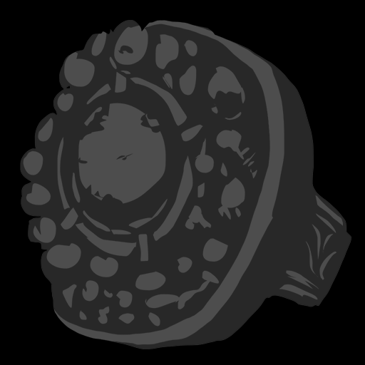

The result was a blank with volume.
Textures
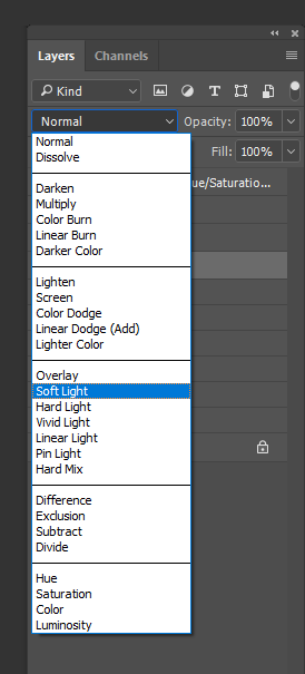
The next step will sketch on the subject of texture. As at the last stage, you need to create a new folder and create several layers in it with Soft light blending mode.
The mode is set here:
Then we take a texture brush and go through the entire surface of the subject. Texture brushes are large and sometimes the object that we draw is not visible behind them. To hide the outlines of the brush, click on CapsLock.
As at the last stage, you can use several layers. As a result, the disc will become rough and it will be possible to move on.
Details
Again, create a separate group and layers in it.

Take a hard brush and work out the details. If you select a brush and press Alt, it will turn into a dropper and allow you to take colors directly from the picture. First, work with a large brush, and then gradually reduce it. Shortcuts for resizing brushes are square brackets. The left one reduces the brush, and the right one increases.
If you need to show clear forms, you can use a lasso. Select the desired area and draw a brush over it. When we select a region with the help of a lasso, running contours form along its perimeter. So that they do not interfere, they can be turned off by pressing Ctrl + H.
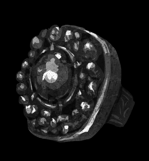
At some point you may notice that the picture is not enough volume. This can be fixed by creating a layer with Softlight blending mode and painting the missing volume with a soft brush. It is better to add it gradually, using a brush with transparency. As a result, we get a black and white image of the subject close to the original.

Colors
We are done with the shape and can add colors. We hide or remove the adjustment layer of reference, again we take a new layer and a new group. For the layer, select the blending mode color. We take a soft translucent brush and gradually add color to the subject. Let me remind you - if you select a brush and hold Alt, it will turn into a dropper and we can take colors directly from the reference.
By the way, the transparency of the brush can be changed by pressing the number keys on the keyboard. 1 - 10%, 2 - 20% and so on. As in the previous stages, we can use several layers and adjust their transparency in order to change the color intensity and achieve a result close to the reference.
Remaining details
The last step is to clarify the remaining details. We will again need a new group and new layers in it. At this stage, we achieve maximum similarity with the reference.
Done.
I hope that this article was useful to you, the source and brushes can be downloaded from the links below.
Brushes
Source code
Good luck to everyone, and creative success.