Examples of guides for creating dark themes for Material Design.
Of course, there is nothing new in combining a dark background with light text. The WYSIWYG word processors that were developed in the 1980s (the abbreviation for “what you see is what you get”, “what you see, you get”, pronounced “wiziwig”) first introduced us to user interfaces that resembled the usual black text on white paper . Before that, computers had monochrome CRT monitors that displayed pixelated green text on a black background. Adobe Creative Suite has been using a dark interface for many years, and Spotify has been using the “light to dark” color scheme for quite some time (although it was redone in 2015).
Dark interfaces have been around for a very long time, but they have become incredibly popular with users only in the last few years. Only last year, the options for turning on the dark mode appeared in MacOS, Apple iOS and Android, as well as in many other applications and platforms. Instagram dark mode appeared in early October ; Gmail’s dark mode appeared this week.
What drives this new obsession with the web in dark colors? When I asked my friends why they switched to dark mode, many answered that it was “more comfortable for the eyes,” for example, at night the dark background is less sharp than a bright white screen. Although a darker interface may seem better for the eyes (and it actually saves battery power), it doesn't improve readability.
Apple's Human Interface Design Guidelines for Dark Mode iOS.
I asked Raluca Budiu, research director at Nielsen Norman Group, a consultancy for UX and UI, to comment on the view that the dark mode is less eye strain. “When researching usability, we have a“ don't listen to the user ”rule. It means that you need to observe how people perform actions (and take measurements), and not believe what they say. ”
Budiu said that her company did not conduct its own studies on the usability of the dark regime, but in general, she does not recommend the use of such a color scheme to "people with normal vision." According to her, the positive polarity of contrast, that is, the good old "black text on a white background", is better read and more distinguishable.
Ergonomics research published seems to confirm her opinion. A 2017 study from Applied Ergonomics magazine found that dark characters on a light background increase readability and are highly recommended regardless of the user's age. Human Factors: The Journal of the Human Factors and Ergonomics Society found out in 2013 that "usually an increased brightness of positive polarity leads to improved perception of details."
In the case of people with visual impairments, the situation is not so clear. According to Budiu, some studies have shown that people with "certain types of disorders" (for example, cataracts) are better at dark and some users with violations prefer it. But even in such studies, Budiu says, “there is no full consensus.”
Therefore, if you need to read a lot, Budiu still recommends the proven “black on white” pattern. But if you really do not want to give up the dark mode, then here are some tips to deal with a decrease in readability. Apple recommends testing the content by turning on the “Increase Contrast and Reduce Transparency” option in the iPhone’s settings in dark mode, both together and separately.
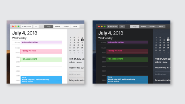
Also in some contexts, dark mode may be useful. According to Apple’s manual on human interface , dark mode allows you to highlight content, while the surrounding UI fades into the background. Therefore, it is logical that Adobe Creative Cloud uses a dark user interface: this software is designed for image editing, and a dark UI increases the priority of graphics, minimizing it for less important text elements.
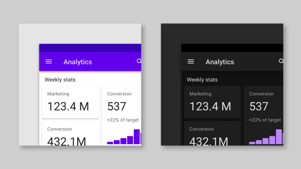
For the same reason, the dark mode is well suited if you want to motivate the user to quickly read the indicators and focus on the main points, for example, when studying charts or graphs. A Salesforce study makes it clear that in the case of such data, there may be functional benefits. By asking survey participants to compare graphs created in light and dark topics and to rank data by value, as if they had to pay for them, the Salesforce team found that participants make decisions faster and with the same accuracy using the dark interface. It is curious that this contradicted the personal impression of the participants: they liked the bright interfaces more at first glance and were associated with great value.
To summarize: the choice of a decision about whether to use the dark mode should be based on your aesthetic preferences, because from the point of view of readability and convenience, it is actually not better. Rather, it serves as a signal of a “trend towards the strengthening of minimalism” or an increase in the personalization of user interfaces in general. So whether to turn the interface of your phone into something like Wensday Addams is a matter of beauty, and nothing more.

Link to the poll of April 22
In the spring, the Habr editorial staff conducted a survey on dark topics in the VK community. There, Dark Mode won by a wide margin. It is interesting that the audience of the site thinks about dark topics in the web and applications.