When you work on a library of reusable components, the API question is especially acute. On the one hand, you need to make a reliable, accurate decision, on the other hand, to satisfy a lot of special cases. This applies to working with data, and to the external features of various use cases. In addition, everything should be easily updated and rolled out on projects.
Such components need unprecedented flexibility. At the same time, the setting can not be made too complicated, because they will be used by both the seniors and the June. Reducing code duplication is one of the tasks of the component library. Therefore, the configuration cannot be turned into copying code.

Data-agnostic components
Let's say we make a button with a drop-down menu. What will be its API? Of course, he needs some items as an input - an array of menu items. Most likely, the first version of the interface will be like this:
interface MenuItem { readonly text: string; readonly onClick(): void; }
Pretty quickly, disabled: boolean
will add to this. Then designers will come and draw a menu with icons. And the guys from the neighboring project, they will draw icons on the other hand. And now the interface is growing, it is necessary to cover more and more special cases, and from the abundance of flags the component begins to resemble the UN Assembly.

Generics come to the rescue. If you organize the component so that it does not care about the data model, then all these problems will disappear. Instead of clicking item.onClick
on a click, the menu will simply emit the clicked item out. What to do with it afterwards is a task for library users. Even if they call the same item.onClick
.
In the case of a disabled
state, for example, the issue is resolved using special handlers. The disabledItemHandler: (item: T) => boolean
method is passed to the component disabledItemHandler: (item: T) => boolean
, through which each item is run. The result says whether this element is locked.

If you are doing a ComboBox , an interface may come to mind that stores a string for display and a real arbitrary value that is used in the code. This idea is clear. After all, when the user types the text, the ComboBox should filter options according to the entered line.
interface ComboBoxItem { readonly text: string; readonly value: any; }
But here, too, the limitations of such an approach will come up - as soon as a design appears in which the line is not enough. In addition, the form will contain a wrapper instead of the real value, the search is not always carried out exclusively by the string representation (for example, we can drive in a phone number, but the name of the person should be displayed). And the number of interfaces will grow with the advent of other components, even if the data model under them is the same.
Generics and handlers will also help here. Let us give the function (item: T) => string
stringify
component. The default value is item => String(item)
. Thus, you can even use classes as options by defining the toString()
method in them. As mentioned above, it is necessary to filter options not only by string representation. This is also a good case for using handlers. You can provide a component with a function that receives a search string and an element. It will return boolean
- this will tell if the item is suitable for the request.
Another common example of using an interface is a unique id, which matches copies of JavaScript objects. When we received the form value immediately, and the options for selection came in a separate request from the server - they will only have a copy of the current element. This task is handled by a handler that receives two elements as an input and returns their equality. The default comparison is normal===
.
The tab display component, in fact, does not need to know in what form the tab was transferred to it: even with text, even with an object with additional fields, even with how. Knowledge of the format is not necessary for implementation, but many make the link to a specific format. The absence of ties means that the components will not entail breaking changes during refinement, will not force users to adapt their data for them, and will allow combining atomic components with each other like lego cubes.
The same choice of items is suitable for both the context menu and combobox, select, multi-select, simple components are easily included in more complex designs. However, you need to be able to somehow display arbitrary data.

Lists can contain avatars, different colors, icons, the number of unread messages, and much more.
To do this, the components must work with the appearance in a manner similar to generics.
Design-agnostic components
Angular provides powerful tools to set the look.
For example, consider a ComboBox , as it can look very diverse. Of course, a certain level of restrictions will be laid down in the component, because it must obey the overall design of the application. Its size, default colors, padding - all this should work by itself. We do not want to force users to think about everything regarding appearance.

Arbitrary data are like water: they have no form, they do not carry anything specific in themselves. Our task is to provide an opportunity to set a “vessel” for them. In this sense, the development of a component abstracted from appearance is as follows:
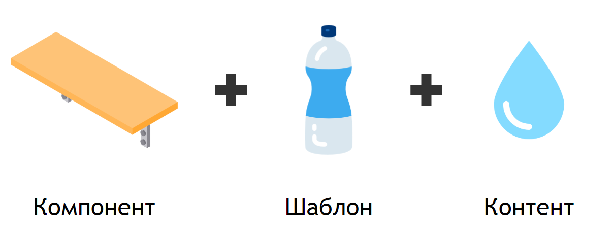
The component is a kind of shelf of the required size, and a custom template is used to display the content, which is “put on” it. A standard method, such as outputting a string representation, is laid down in the component initially, and the user can transfer more complex options from the outside. Let's take a look at the possibilities that Angular has for this.
The simplest way to change the appearance is line interpolation. But an invariable line is not suitable for displaying menu items, because it does not know anything about each item - and they will all look the same. A static string is deprived of context . But it is quite suitable for setting the text “Nothing Found” if the list of options is empty.
<div>{{content}}</div>
We have already talked about the string representation of arbitrary data. The result is also a string, but is determined by the input value. In this situation, the context will be a list item. This is a more flexible option, although it does not allow styling the result - the string is not interpolated in HTML - and even more so it will not allow the use of directives or components.
<div>{{content(context)}}</div>
Angular provides
ng-template
and the*ngTemplateOutlet
structural directive to*ngTemplateOutlet
. With their help, we can determine a piece of HTML that expects some data to be input and pass it to the component. There he will be instantiated with a specific context. We will pass on our element to it without worrying about the model. Drawing up the right template for your objects is the task of the consumer-developer of our component.
<ng-container *ngTemplateOutlet="content; context: context"></ng-container>
A template is a very powerful tool, but it needs to be defined in some existing component. This greatly complicates its reuse. Sometimes the same appearance is required in different parts of the application and even in different applications. In my practice, this, for example, is the appearance of the account selection with the name, currency and balance displayed.
The most complex way to customize the look that solves this problem is dynamic components. In Angular, the
*ngComponentOutlet
directive has long existed to create them declaratively. It does not allow the transfer of context, but this problem is solved by the implementation of dependencies. We can make a token for the context and add it to theInjector
with which the component is created.
<ng-container *ngComponentOutlet="content; injector: injector"></ng-container>
It is worth noting that the context can be not only the element that we want to display, but also the circumstances in which it is located:
<ng-template let-item let-focused="focused"> <!-- ... --> </ng-template>
For example, in the case of withdrawal of an account, the state of focus of the item is reflected in the appearance - the background of the icon changes from gray to white. In general terms, it makes sense to transfer to the context those conditions that potentially affect the display of the template. This point is perhaps the only limitation-interface of this approach.
Universal Outlet
The tools described above are available in Angular from the fifth version. But we want to easily switch from one option to another. To do this, we will assemble a component that accepts content and context as input and implements the appropriate way to insert this content automatically. In general, it is enough for us to learn to distinguish between types string
, number
, (context: T) => string | number
(context: T) => string | number
, TemplateRef<T>
and Type<any>
(but there are several nuances here, which we will discuss below).
The component template will look like this:
<ng-container [ngSwitch]="type"> <ng-container *ngSwitchCase="'primitive'">{{content}}</ng-container> <ng-container *ngSwitchCase="'function'">{{content(context)}}</ng-container> <ng-container *ngSwitchCase="'template'"> <ng-container *ngTemplateOutlet="content; context: context"></ng-container> </ng-container> <ng-container *ngSwitchCase="'component'"> <ng-container *ngComponentOutlet="content; injector: injector"></ng-container> </ng-container> </ng-container>
The code will get a type getter to select the appropriate method. It should be noted that in general we cannot distinguish a component from a function. When using lazy modules, we need an Injector
that knows about the existence of the component. To do this, we will create a wrapper class. This will also make it possible to determine it by instanceof
:
export class ComponentContent<T> { constructor( readonly component: Type<T>, private readonly injector: Injector | null = null, ) {} }
Add a method to create an injector with the passed context:
createInjectorWithContext(injector: Injector, context: C): Injector { return Injector.create({ parent: this.injector || injector, providers: [ { provide: CONTEXT, useValue: context, }, ], }); }
As for the templates, for most cases you can work with them as is. But we must keep in mind that the template is subject to verification of changes in the place of its definition. If you transfer it to the View , which is parallel or higher in the tree from the place of definition, then the changes that can be triggered in it will not be picked up in the original View .
To correct this situation, we will use not just a template, but a directive that will also have ChangeDetectorRef
its place of definition. This way we can start checking for changes when necessary.
Polymorphic Patterns
In practice, it can be useful to control the behavior of the template depending on the type of content that came into it.
For example, we want to give the opportunity to transfer a template to a component for something special. At the same time, in most cases, you just need an icon. In such a situation, you can configure the default behavior and use it when a primitive or function gets to the input. Sometimes even the type of primitive is important: for example, if you have a badge component to display the number of unread messages on a tab, but at the same time you want to highlight pages that require attention with a special icon.

To do this, you need to add one more thing - passing a template to display primitives. Add @ContentChild
to the component, which takes TemplateRef
from the content. If one is found and a function, string or number is passed to the content, we can instantiate it with the primitive as a context:
<ng-container *ngSwitchCase="'interpolation'"> <ng-container *ngIf="!template; else child">{{primitive}}</ng-container> <ng-template #child> <ng-container *ngTemplateOutlet="template; context: { $implicit: primitive }" ></ng-container> </ng-template> </ng-container>
Now we can style the interpolation or even pass the result to some component for display:
<content-outlet [content]="content" [context]="context"> <ng-template let-primitive> <div class="primitive">{{primitive}}</div> </ng-template> </content-outlet>
It's time to put our code into practice.
Using
For examples, we outline two components: tabs and ComboBox . The tab template will simply consist of a content-outlet for each tab, where the context will be the object passed by the user:
<content-outlet *ngFor="let tab of tabs" [class.disabled]="disabledItemHandler(tab)" [content]="content" [context]="getContext(tab)" (click)="onClick(tab)" ></content-outlet>
You need to set the default styles: for example, font size, underline under the current tab, color. But we will leave concrete appearance to content. The component code will be something like this:
export class TabsComponent<T> { @Input() tabs: ReadonlyArray<T> = []; @Input() content: Content = ({$implicit}) => String($implicit); @Input() disabledItemHandler: (tab: T) => boolean = () => false; @Input() activeTab: T | null = null; @Output() activeTabChange = new EventEmitter<T>(); getContext($implicit: T): IContextWithActive<T> { return { $implicit, active: $implicit === this.activeTab, }; } onClick(tab: T) { this.activeTab = tab; this.activeTabChange.emit(tab); } }
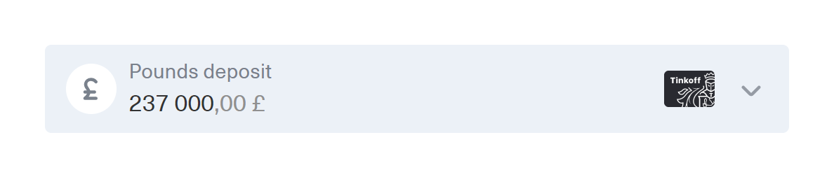
We got a component that can work with an arbitrary array, displaying it as tabs. You can simply pass strings there and get the basic look:

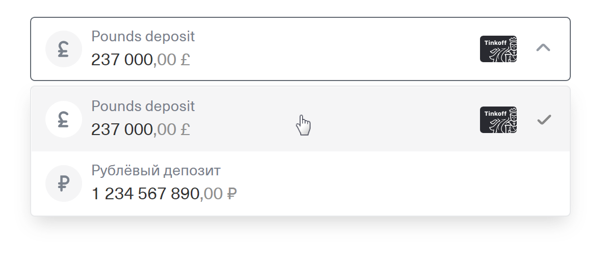
And you can transfer objects and a template to display them and customize the appearance to fit your needs, add HTML, icons, indicators:

In the case of ComboBox, we will first make two basic components of which it consists: an input field with an icon and a menu. The latter does not make sense to paint in detail - it is very similar to the tabs, only vertically and has other basic styles. And the input field can be implemented as follows:
<input #input [(ngModel)]="value"/> <content-outlet [content]="content" (mousedown)="onMouseDown($event, input)" > <ng-template let-icon> <div [innerHTML]="icon"></div> </ng-template> </content-outlet>
If you make the input absolutely positioned, it will block the outlet and all clicks will be on it. This is convenient for a simple input field with a decorative icon, such as a magnifying glass icon. In the example above, the polymorphic template approach is applied - the transmitted string will be used as innerHTML
to insert the SVG icon. If, for example, we need to show the avatar of the entered user, we can transfer the template there.
ComboBox also needs an icon, but it needs to be interactive. To prevent it from breaking focus, add the onMouseDown
handler to the outlet:
onMouseDown(event: MouseEvent, input: HTMLInputElement) { event.preventDefault(); input.focus(); }
Passing the template as content will allow us to raise it higher through CSS by simply making the position: relative icon. Then you can subscribe to clicks on it in the ComboBox itself:
<app-input [content]="icon"></app-input> <ng-template #icon> <svg xmlns="http://www.w3.org/2000/svg" width="24" height="24" viewBox="0 0 24 24" class="icon" [class.icon_opened]="opened" (click)="onClick()" > <polyline points="7,10 12,15 17,10" fill="none" stroke="currentColor" stroke-linecap="round" stroke-linejoin="round" stroke-width="2" /> </svg> </ng-template>
Thanks to such an organization, we get the desired behavior:
Component code, as in the case of tabs, dispenses with knowledge of the data model. It looks something like this:
export class ComboBoxComponent<T> { @Input() items: ReadonlyArray<T> = []; @Input() content: Content = ({$implicit}) => String($implicit); @Input() stringify = (item: T) => String(item); @Input() value: T | null = null; @Output() valueChange = new EventEmitter<T | null>(); stringValue = ''; // get filteredItems(): ReadonlyArray<T> { return this.items.filter(item => this.stringify(item).includes(this.stringValue), ); } }
Such simple code allows you to use any objects in ComboBox and customize their display very flexibly. After some improvements that are not related to the described concept, it is ready for use. Appearance can be customized for every taste:
Output
The creation of agnostic components eliminates the need to take into account each particular case. At the same time, users get a simple tool to configure the component for a specific situation. These solutions are easy to reuse. Independence from the data model makes the code universal, reliable and extensible. At the same time, we did not write so many lines and mainly used the built-in Angular tools.
Using the approach described, you will quickly notice how convenient it is to think in terms of content, rather than specific lines or patterns. Displaying validation error messages, tooltips, modal windows - this approach is good not only for customizing the appearance, but also for transferring the content as a whole. Sketching layouts and testing logic is easy! For example, to show the popup, the user does not need to create a component or even a template, you can just pass the stub string and return to it later.
We at Tinkoff.ru have long successfully applied the described approach and moved it to a tiny (1 KB gzip) open-source library called ng-polymorpheus .
Do you also have something that you wanted to put in open source, but are you frightened off by the associated chores? Try the Angular Open-source Library Starter , which we made for our projects. CI, commit checks, linters, CHANGELOG generation, test coverage and all that stuff are already configured in it.