The Internet changes literally every day, so it is always necessary to monitor the relevance and convenience of your Internet resources. Technologies that were popular 5 years ago today may completely lose their relevance and your site may (and will) be inconvenient for your visitors and customers, respectively, you will lose potential profit every day. By virtue of which, each of the entrepreneurs will sooner or later come to the issue of redesigning their online store or service site.
Key issues when changing a site design
Before starting any work, you must clearly understand whether you need a website redesign.
I recommend answering the following questions:
- Is conversion falling? Is time on the site falling, are conversions falling? * See all this information in the metric.
- Does your online store look modern? * Browse all your competitors for basic needs, compare their design with yours, usability, product filters, various blocks and so on.
- Does your site have a mobile version or responsive design? * I think you know the answer to this question, if not, then go to webmaster.yandex.ru, in the "Diagnostics" - "Site Diagnostics" section, the report will contain recommendations on the mobile version.
On this, all the main points that you need to understand end, we turn to the main issues and problems during the redesign of the site.
How to change the site design and not lose position?
If your online store has good positions in the region, of course, no one wants to lose them, therefore, I recommend that you carefully adhere to the following main recommendations when redesigning the site:
- Firstly, we never change the structure of the site, that is, after changing the design, your pages should have the same urls, this is very important (redesign means just changing the appearance and no more). If the page addresses change, this will entail reindexing, 404 errors (if there are no 301 redirects), the distribution of the static weight across the pages will be completely different, all this will entail an inevitable change of position. * If large-scale work on the site is planned, including a change in structure, then this procedure is carried out before the redesign.
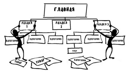
- Do not change the site engine. When changing the CMS, the entire code of your online store will be new, which again will require a complete reindexing of your site, which in turn will be reflected in the positions.

- I recommend remembering all the basic html tags. This is not only about the headers H1-H6, but also about the tags b, i, ul, etc. I recommend to leave them where they were (we include this in the statement of work when layout layout). All these tags affect the relevance of the page to requests to one degree or another, and we want not to spoil the position of our site, so it’s highly desirable to leave these points as they were.
- Moments with new blocks. For example, take the product category page, in the new design we have a block with store news, an example:

All this is good, but it’s worthwhile to understand that these are all internal links that convey their weight, that is, in fact, we have added 6-7 (depending on how many articles are in the carousel) links to articles (which we don’t need to promote) ) Also, this block adds irrelevant content to our page, which is not good.
There can be a lot of such “new” blocks, so I recommend putting some of them in noindex tags and links in the nofollow attribute, this will protect your site from changes in the search. We do the same with all similar blocks.
After some time (1-2) weeks, I recommend starting to gradually remove the tags and look at the position of the site. This will give us the opportunity to "Roll back the changes" when changing positions in an undesirable direction.
- A bit of relevance. Again, take the product category page that displays the product blog. There may be a situation that earlier, each of the product cards showed certain characteristics (price, article, color, size, etc.), but in the new version, the designer did not like how it looked and removed the output of the characteristics from the cards. This can and will affect the position of the site, both from the relevance of the content (as some of the content will disappear), and from the side of user behavior, it is worth remembering this.
To summarize all the main recommendations:
- Do not change the structure, do not change the url;
- Do not change the CMS;
- Minimum changes in the main layout tags that affect relevance (H1-H6, b, i, etc.);
- We make sure that all information that was previously displayed remains on the site (if you need it, you can see the metric - a map of clicks, videos of user actions, etc.).
- If we add a lot of new blocks, a new functionality that uses a lot of content, I recommend closing them from the index (thereby protecting ourselves from unnecessary questions). Next, gradually remove the noindex and monitor the positions (it is possible to return everything back).
- Similar mechanics with new blocks in which there will be many links, I also recommend closing links in the nofollow attributes (preserving our positions is everything), then we gradually remove them, we look at the results of position removal.
After all these actions, we will have an understanding of why we need a redesign and how to do it correctly so as not to spoil what has been acquired by our work and time. You can proceed to the next step.
Preparing a prototype for future website design
This is the most important and main part of our work, since the prototype is the main and main TK, which we will send to our designer.
The designer’s thoughts and yours will never coincide, the designer will think one thing, you’re different, it’s far from the fact that you will really find a professional who can advise you something, unfortunately, from experience, the designer will simply do the work on the technical task and not a single step side, perform how he feels comfortable and how he likes it more. As a result, we get a mediocre design, which, when filling out the content, the layout will go away, since the designer did not think it through, there may not be guidance effects, and indeed we can get not what we wanted.
Therefore, the most important thing is to form a competent technical task, after which neither you nor the designer will have questions and we will get what we want.
Choosing a prototype program
Today, there are a lot of similar programs and services, so I do not recommend focusing on this, we just take the one that is free and in which we are comfortable working:
1. Gliffy
There is a free version, you can use it.
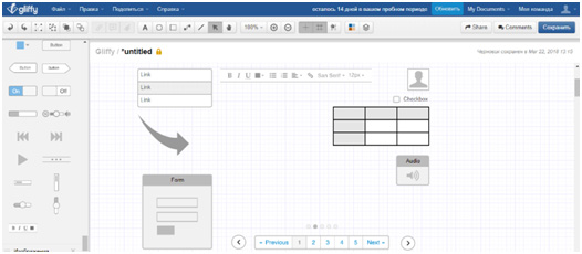
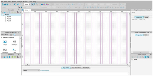
2) Axure
Simple and convenient program.
3) Mockingbird
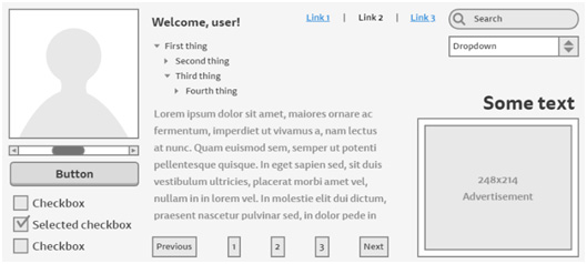
There is a free version, you can export in any format, a very simple and intuitive interface, you do not need to download anything. We will use it.
Prototype preparation
1) We find all our competitors
 * We don’t take only the top 5, since these stores may have different rankings from search engines (niche tops) and some points (blocks, functionality, etc.) that we decide to take from them may not improve the situation for us, but may worsen.
We find 20-30 sites (we take different regions) that we liked and carefully analyze them. We take from everyone the best solution of this or that block, whether it is a product filter, a block of recommended goods, any tips and so on. It is worth paying attention to everything where the link is, which button, etc.
2) We write out all the blocks
Which we want to use on our website. We choose the best block for implementation, we don’t need to invent proportions ourselves, where will the photo be, where will the text be, and where is the button, we just take the best solution of this or that block from competitors.
3) We select all elements of the site
At this stage, you need to decide what the header will be, what the main menu will be, the basement, and so on.
* All the competitors we have chosen have good positions in the PS, respectively, and their designs will also be good, you don’t need to think that we ourselves will come up with a better solution or even more so our designer, we already have working, tested versions of this or that functional, we just take use it with us.
4) Decide on the style and color scheme
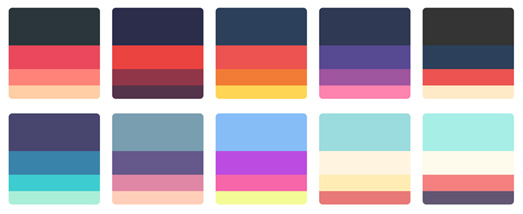
Choosing a color scheme and style is not easy enough. Also, I recommend that you do not rely on the opinion of your designer, he does not know what you want, so you need to deal with this issue at this stage.
For this, I recommend that you pay attention to the freelance sites on which we will order our design. There are a lot of similar sites, here are the most popular:
- Kwork.ru ;
- Fl.ru ;
- Weblancer.net ;
- and others.
We select a resource, go to the "Design" section and go to the performers, look at their portfolio. There are a lot of designers, there are a lot of works presented in their portfolio, so we can easily choose a design that we like both in terms of execution style and color scheme. After choosing save yourself the selected work.
At this stage, we have everything that we need to create a high-quality and well-thought-out prototype, and as a result, our TK.
Rendering a site prototype
 We stopped at the Mockingbird service, so we go over, register and start our work.
We need to clearly draw all of our future Home pages, Product category, Product card, News category, News, Contacts, as well as all forms.
At the previous stage, we selected all the blocks that we want to see in the future design, chose how the site header, menu, and so on, will be located in them. Therefore, we only need to transfer all this to the prototype. In the prototype, it is necessary to fully reflect all the elements, all the blocks of the site, this will give the designer an understanding of what we need and he won’t have to think long how and what to draw, because in fact everything is already drawn, he can only add graphics.
Optionally, you can refine everything in Photoshop, so that all the elements are even more visual.
At the output, we have something like the following:
 |  |
We also rendered all forms, tabs in the prototype:
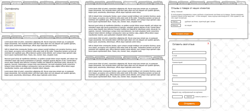
After creating a full-fledged prototype of the future design, we proceed to the preparation of the ToR; we need to describe in detail all the points presented in the prototype.
We write a detailed description of the prototype

This is also a very crucial moment, as if we forget something about this and will not be in the design.
- We specify in what format the design should be (.psd)
- Specify the image from the portfolio (which we previously selected). We write that we want a design in a similar style and color scheme. We indicate that buttons, frames, etc. can be taken from this design.
- Buttons, links, and other elements should have hover and activity effects.
- Attach the fonts you use to the design (some typesetters need them)
- Next, we indicate all the points that, in our opinion, should be clarified. For example, we want that after pointing to the product’s card, the “Add to Cart” button is displayed, we describe all such moments.
* These issues and nuances can be described on the prototype itself, for example:
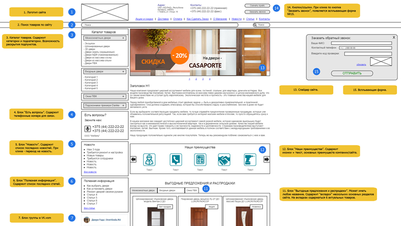
We proceed directly to the selection and ordering of design.
Select artist, order design

There are two options for ordering design:
1) Contact the design studio or sites
I think this option is not the best, firstly the price will be much higher, if we turned to a freelancer, we would also have to spend not only a lot of money, but also time. It is worth noting that this option will not always differ in quality and meeting deadlines.
2) Contact a freelancer through popular sites
This option is ideal for us. Since, the main goal of preparing a detailed prototype and TK was not only to obtain exactly the design that we need, but also a way to save our money. After all, all that remains for the designer is only to add graphics to our prototype, in fact we have already drawn the entire “design”, the artist does not need to think about how and what should look like, everything has already been drawn, the style and color scheme are provided.
As I wrote above, there is a huge selection of venues with frisers and they are all good in their own way. But we will choose Kwork.ru service, since we need decent quality for an adequate amount, and as I wrote above, we do not need a professional for 100 thousand, we need graphics for our prototype. Also, here is a very simple and secure payment system, we do not need to directly pay the freelancer, all payments are made through the service itself. If the design provided is not in accordance with the statement of work, then you can easily return the funds.
First of all, register and go to the design section. I recommend not to waste your time on a long choice of designer, browsing through hundreds of portfolios and so on, open the top 20-30 and send everyone our TK, specify the price and terms.
After that, everyone who is interested in completing your assignment will offer you their conditions on the basis of which we can make our choice. Everything is quite simple and transparent.
* It is worth remembering that everything that we expect from design has already been written by us in the statement of work, therefore it is better to give preference to the financial side of the issue, since the result from this will not actually change.
As a result, we have a fully finished, simple and modern design:
 |  |
All highlights:
- It is necessary to clearly determine whether we need a website redesign;
- We select the best competitors, based on their sites, functionality, we choose all the best;
- Based on the prepared information, we make a high-quality prototype of each of the pages;
- Choose a site that suits us completely in color and style;
- We make an explanatory note, tz to the prototype;
- We order design on the popular freelance exchanges;
- We get the finished design that we wanted, which we need, for an adequate price;
- We turn to the compilation of technical specifications for layout and stretch, the search for the contractor.
Certain nuances of ordering layout, as well as the mobile version for the site, will be described in the next article.