WWDC 2019: Custom Instruments and SF Symbols, as well as new approaches to the development of iOS applications
People say that luck is the result of hard and long work. This is probably partly true. Two of our employees won tickets to the most sought after Apple conference in a random lottery and went this summer in San Jose.
If not for this event, then the dream of discussing new features from Apple with the pros, getting to know the top iOS developers of the world and speaking publicly on iThink # 3 would have remained in dreams.
Any iOS developer wants to take part in the WWDC conference. Of course, you can argue: “Is there an online broadcast, is it really not enough?” Yes, there is, but we want to note that the competition simply rolls over at the random draw of tickets to the event! And this is clearly not without reason.
Unfortunately, viewers of online broadcasts see no more than 25-30% of the entire event, and most importantly, they do not participate in master classes and sessions. Unfortunately, these very interesting events remain behind the scenes of online broadcasting and are available only to those who personally attended the conference.
Just for the sake of being present at this closed part, developers from all over the world participate in the draw of tickets and do not sleep at night, waiting for the result. It is here that they are told about important updates and changes in the writing of code, they are introduced to the tools that will be used in the future.
Only by visiting the event in person, you can evaluate its value. Without exaggeration, we can say that WWDC 2019 is the most significant event in the last 5 years.
It was on it that visitors were informed that Apple had completely changed the technology for writing code that had developed over the years and familiar to all of us, greatly simplifying it. And this will force many developers to seriously rethink their working methods, taking a fresh look at many, familiar things.
We want to tell you about the real tasks that the global community of iOS developers will be in contact with very soon. Specifically, we will examine the use cases and capabilities of Custom Instruments and SF Symbols and give examples from our work with new tools at WWDC 2019.
Custom instruments
This proprietary "chip" for developers was shown by Apple last year. But the details about her became known only now. During WWDC 2019 sessions, Apple specialists told the guests in detail about how custom tools work, what the developer benefits from them, and most importantly, how to effectively apply them in practice.
The os_signpost tracer introduced last year is the main tracer in this toolkit. His main tasks include creating simple events and intervals.
Apple also introduced developers to the os_signpost low-cost tracer. According to the speakers, it can now be easily integrated even into the final versions. But Apple programmers recommend careful use of this tool, controlling the number of arguments during the trace, without abusing them.
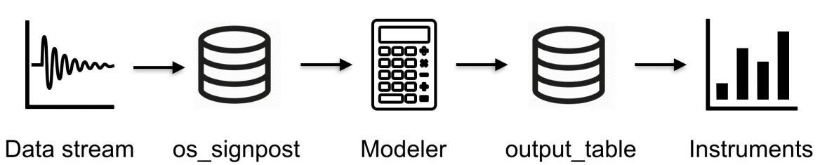
The architecture of the toolkit is structured as follows:
- Data stream You can solve the problem of obtaining a data stream using the os_signpost tracer, which translates data into an input table. The structure of the input and output tables is described in a specially created XML file. And the process of reading and writing data to the table is a step-by-step trace.
- Modeller Processes and analyzes data from the input table. Modeller itself, written in a special CLIPS language, has two parts - declarative and imperative. This is precisely its uniqueness! It processes new events and converts data. Using Modeller, you can perform custom calculation or data conversion to the format that the developer needs. At the end of the conversion, the new values will be saved in the output table. This process is called "modeling."
- Instruments With their help, the information recorded in the table is read to be displayed on the screen. You can control the display format using an XML form. True, it must be created for this.
- Utility StandartUI. Responsible for reading and visualizing information from the output table.
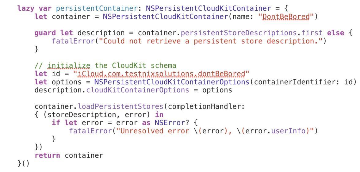
CloudKit + CoreData
This is one of the latest branded "chips." It is entrusted with the task of synchronizing Core Data and the Cloud Kit in automatic mode. To activate it, it is necessary to mark the necessary positions before the start of the project:
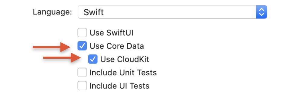
Please note that notifications, as well as CLoudKit in Capabilities in automatic mode will not turn on. This will have to be done manually.
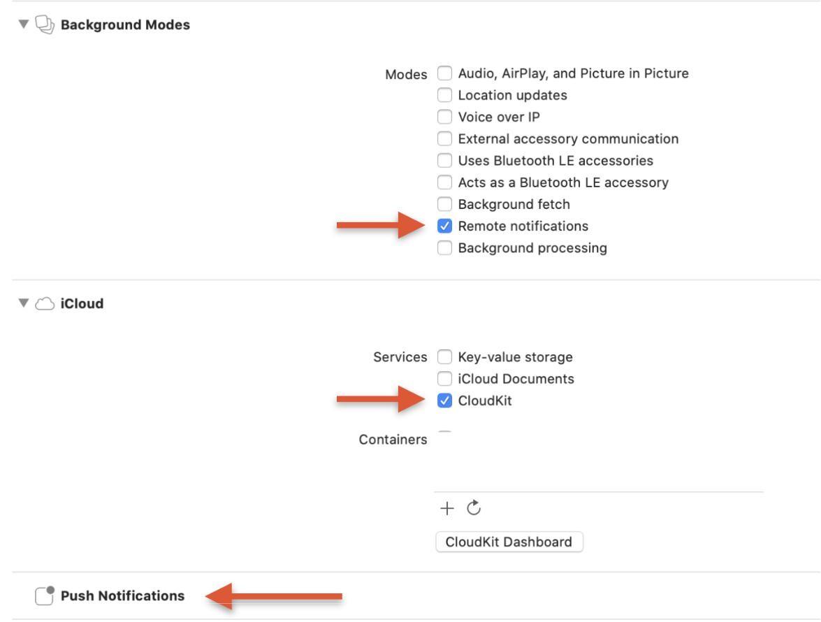
This is where your work ends; Xcode will do the rest automatically. He himself will create a container for aggregation of work based on the database and CloudKit.
Separately, we note that this new and very useful feature will work correctly in previously launched projects. All that the developer needs to do is create a new Container instead of the existing one. As you can see, the synchronization process in old projects has now become much easier.
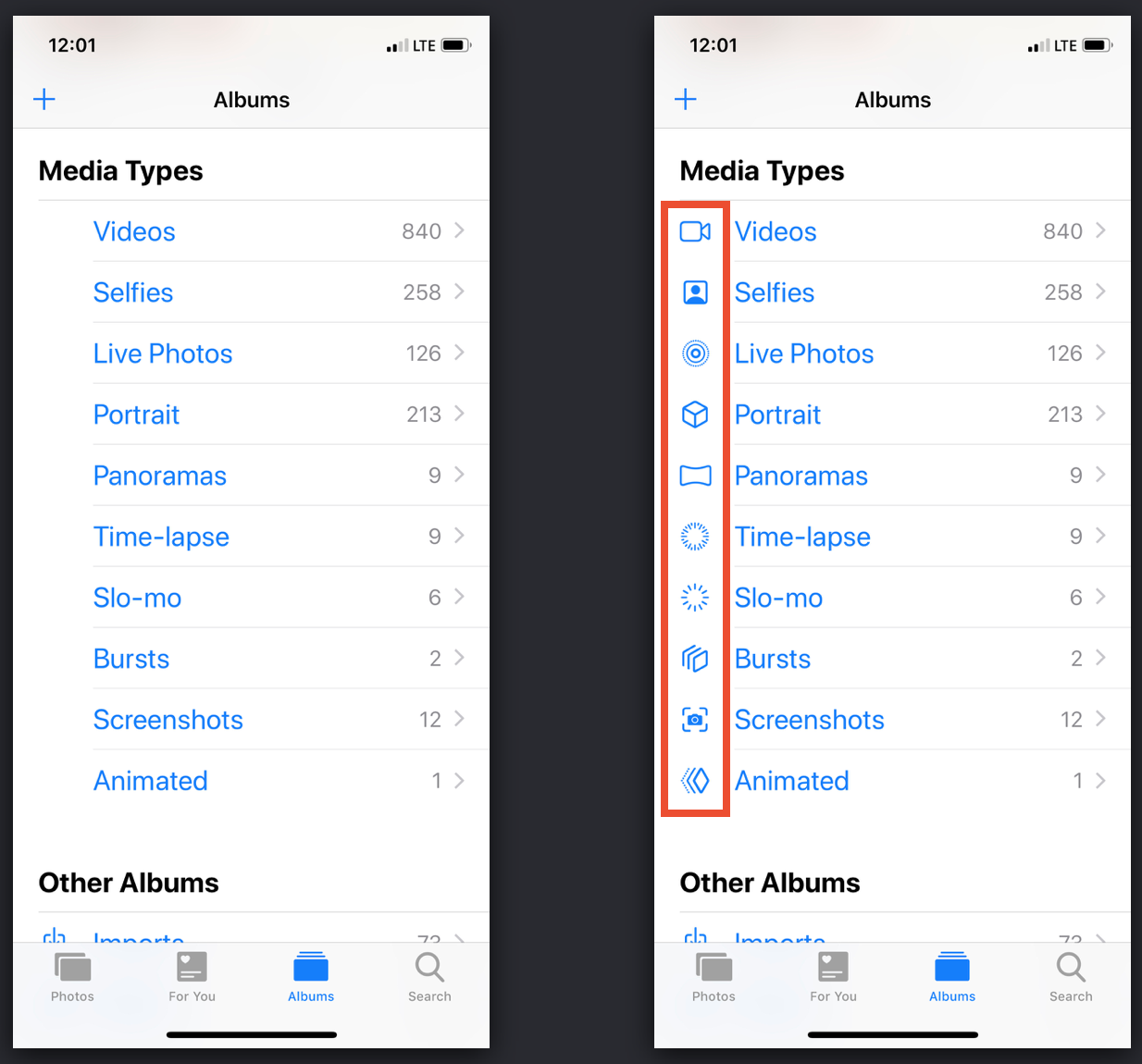
SF Symbols
This topic at WWDC 2019 caused the largest number of questions, which is not surprising, because the speakers “walked” on it literally at a gallop. It was such an accelerated, concise summary that caused confusion among the conference guests.
Many visitors seriously thought about the question: “Why did Apple show and introduce new characters? Indeed, for many years, developers have been making great use of the familiar .png / .jpg / .pdf images. ” Yes, this method has certain drawbacks, but it is so familiar and familiar to UI developers that a good reason is needed to abandon it.
But even with this in mind, do not underestimate the importance of the new icons provided by Apple for creating a friendly user interface. After unsuccessfully choosing icons, you risk that the application will lose its nativeness, become inconvenient and incomprehensible to the user, and this will inevitably reduce its popularity.
It is very important for the developer to correctly understand and evaluate the functionality of the icons in the application, their appearance and impact on the usability of the user.
To make it easier to understand the purpose of the icons, we grouped them into three categories:
- separation of context;
- consolidation of context;
- visual context matching.
Thanks to this separation, we realized that SF Symbols was specially created to help in the optimal selection of icons. Note that Apple even developed a separate application for this https://developer.apple.com/design/human-interface-guidelines/sf-symbols/overview/ , in which you can learn about 1,500 new characters in detail. For the convenience of the developer, the application has a search and customizable parameters. Using them, you can evaluate how the icons will look when changing their values.
Well, if among 1500 characters you do not find the desired icon, you can always draw your own. How to do this, we described in our guide .
Please note that in the application you create a vector image of the icon, which includes text metadata. Perhaps someone working with vector graphics will be unusual. It is no accident that WWDC devoted a separate session to the process of creating new characters. It clearly showed that the old, time-tested icons are hopelessly outdated and have lost their effectiveness. And today, the most relevant trend in iOS development is to think of symbols as UIFont.
Working with the new selection of icons is very simple, because it is integrated with the San Francisco system font. And to use it you do not have to do anything.
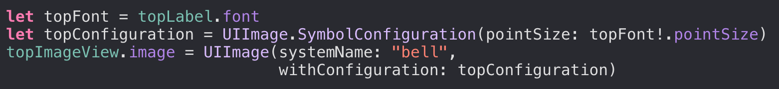
You can create a character using the initializers from UIImage:
The code shows that one of the initializers received a new parameter,
UIImage.Configuration
. You can pass the value of the
UIImage.SymbolConfiguration
parameter, which is the descendant of
UIImage.Configuration
. Note that the configurations are unchangeable, and you can only apply new parameters when using
applying(:)
(https://developer.apple.com/documentation/uikit/uiimage/configuration/3294236-applying).
Using the configuration, you can change:
- PointSize
- UIImage.SymbolScale;
- UIFont.TextStyle;
- UIImage.SymbolWeight;
- UIFont.
We will tell you more about each item.
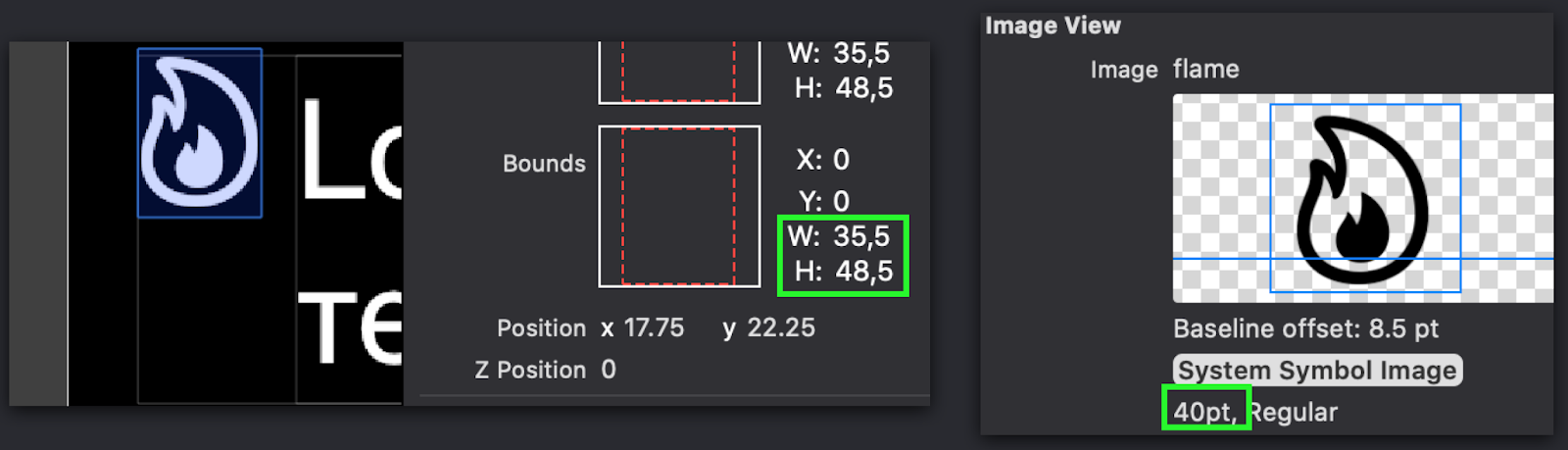
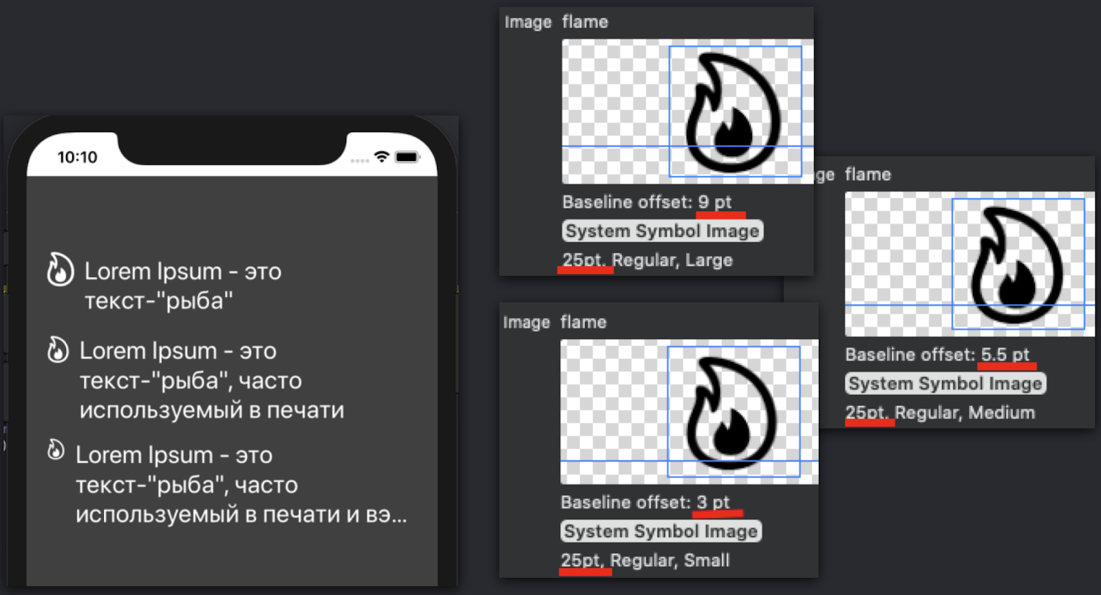
Point size
This parameter is responsible for the size of the characters, and also shows that the character is no longer a regular PNG image. Also remember that from now on
Point size (CGFloat) != CGSize
. Therefore, now consider SF Symbols only with the point size value. This relationship is clearly visible when sharing characters and text.
UIImage.SymbolWeight
If you need to change the thickness or boldness of characters, as in UIFont, use the
UIImage.SymbolWeight
parameter for this.
SymbolConfiguration.init (font: UIFont)
Working with this option is very simple. With it, you just need to select the desired UIFont, and then the system will do everything on the "autopilot".
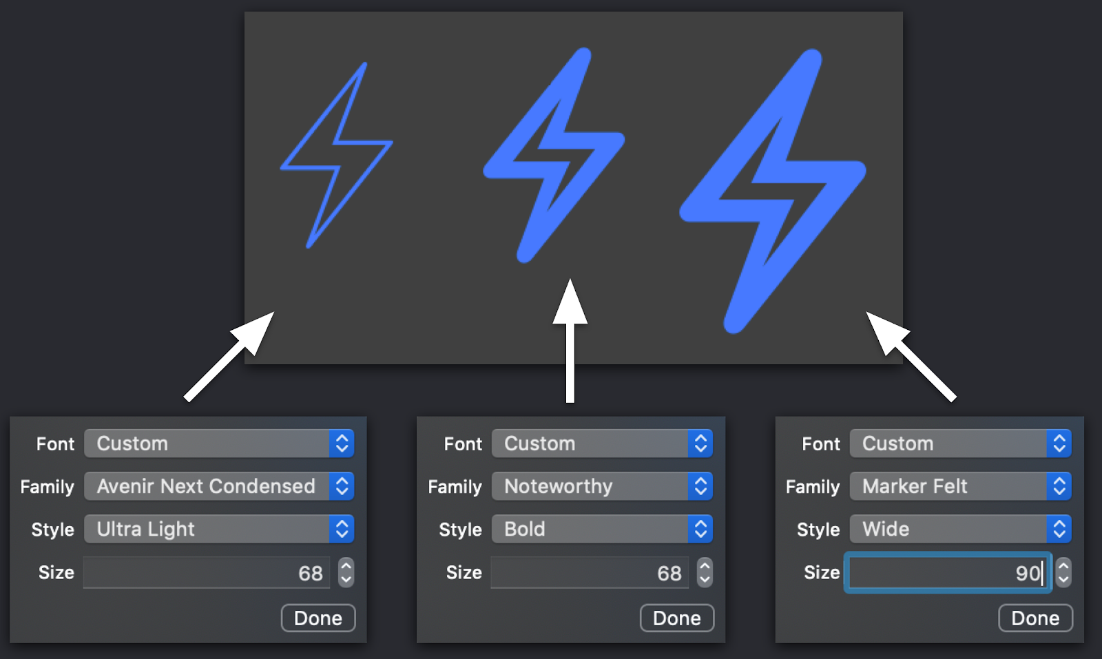
UIImage.SymbolScale
In our opinion, this is one of the most controversial parameters. The first function that it performs is resizing a character. And here the fun begins. The fact is that now we have as many as two active parameters that affect this. But don't be nervous!
From practical experience, we can say that these parameters are not just easy to “get along together,” but complement each other perfectly. We specially simulated the situation and set the identical point size to our UIFont in the live. And they saw that the size of the symbol on the screen visually differs from the size of the text (it remains larger or smaller than it). To facilitate the work, and not to create another configuration using the new point size value, we recommend using the
SymbolScale
parameter. It will resize the image without changing its point size.
UIFont.TextStyle
This is the easiest option to use. Apple developers recommend using it when you need to implement a dynamic font type.
From our story it is clear that most of the updates presented are aimed at making application developers rethink the old working methods. Although it seems to us that this is only a small part of what you may encounter in the near future. Well, so that the innovations do not take you by surprise, we recommend that you start their development in the near future!
All Articles