Data preparation in a Data Science project: recipes for young housewives

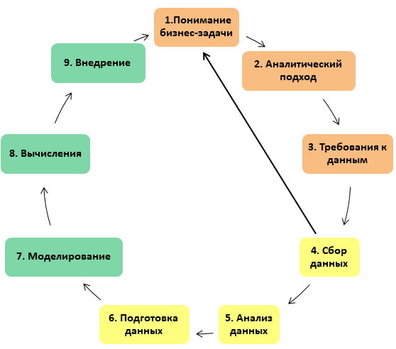
In a previous article I talked about the structure of a Data Science project based on IBM methodology materials: how it is structured, what stages it consists of, what tasks are solved at each stage. Now I would like to give an overview of the most time-consuming stage, which can take up to 90% of the total project time: these are the stages associated with the preparation of data - collection, analysis and cleaning.
In the original description of the methodology, the Data Science project is compared with the preparation of a dish, and the analyst with a chef. Accordingly, the stage of data preparation is compared with the preparation of products: after we have decided on the recipe for the dish that we will prepare at the stage of analyzing the business task, we need to find, collect in one place, clean and chop the ingredients. Accordingly, the taste of the dish will depend on how well this stage was performed (suppose that we guessed with the recipe, especially since there are a lot of recipes in the public domain). Working with ingredients, that is, preparing data, is always a jewelry, laborious and responsible business: one spoiled or unwashed product - and all the work is wasted.
Data collection
After we have received a list of ingredients that we may need, we proceed to search for data to solve the problem and form a sample with which we will continue to work. Recall why we need a sample: firstly, we use it to make an idea of the nature of the data at the stage of data preparation, and secondly, we will form test and training samples from it at the stages of development and configuration of the model.

Of course, we don’t take cases when you, under the threat of being
- reflected all the necessary properties of the population
- It was convenient to work, that is, not too big.
It would seem, why limit yourself to the amount of data in the era of big data? In sociology, as a rule, the general population is not available: when we examine public opinion, it is impossible to question all people, even in theory. Or in medicine, where a new medicine is being studied on a certain number of experimental rabbits / mice / flies: each additional object in the study group is expensive, troublesome and difficult. However, even if the entire population is actually available to us, big data requires an appropriate infrastructure for calculations, and its deployment is expensive in itself (we are not talking about cases where a ready-made and configured infrastructure is at your fingertips). That is, even if it is theoretically possible to calculate all the data, it usually turns out that it is long, expensive and generally why, because you can do without all this if you prepare a high-quality, albeit small, selection, consisting, for example, of several thousand records.
The time and effort spent on creating the sample allows you to devote more time to data mining: for example, outliers or missing data can contain valuable information, but among millions of records it is impossible to find, and among several thousand it is completely.
How to evaluate data representativeness?
In order to understand how representative our sample is, common sense and statistics are useful to us. For categorical data, we need to make sure that in our sample every attribute that matters from the point of view of the business problem is presented in the same proportions as in the general population. For example, if we examine the data of patients in the clinic and the question concerns people of all ages, a sample that includes only children is not suitable for us. For historical data, it is worth checking that the data covers a representative time interval at which the features under investigation take all possible values. For example, if we analyze appeals to government agencies, the data for the first week of January is most likely not suitable for us, because the decline in appeals falls at this time. For numerical signs, it makes sense to calculate the main statistics (at least point statistics: average, median, variability and compare with similar statistics of the general population, if possible, of course).
Data Collection Issues
It often happens that we lack data. For example, an information system has changed and data from the old system is not available, or the data structure is different: new keys are used and the connection between old and new data cannot be established. Organizational issues are also not uncommon when data is held by various owners and not everyone can be configured to spend time and resources on uploading for a third-party project.
What to do in this case? Sometimes it turns out to find a replacement: if there are no fresh tomatoes, then canned ones can come up. And if the carrot turned out to be all rotten, you need to go to the market for a new portion. So it may very well happen that at this stage we will need to return to the previous stage, where we analyzed the business task and wondered whether it is possible to reformulate the question somehow: for example, we cannot clearly determine which version of the online store page is better sells a product (for example, there is not enough sales data), but we can say on which page users spend more time and which less failures (very short browsing sessions that are several seconds long).
Exploratory data analysis
Suppose the data are received, and there is confidence that they reflect the general population and contain an answer to the business task posed. Now they need to be examined in order to understand what quality the data

Central position assessment
At the first stage of the study, it would be good to understand what values for each characteristic are typical. The simplest estimate is the arithmetic mean: a simple and well-known indicator. However, if the scatter of data is large, then the average will not tell us much about typical values: for example, we want to understand the level of salary in a hospital. To do this, add up the salary of all employees, including the director, who receives several times more than the nurse. The arithmetic mean obtained will be higher than the salary of any of the employees (except the director) and will not tell us anything about a typical salary. Such an indicator is only suitable for reporting to the Ministry of Health, which will proudly report salary increases. The value obtained is too subject to the influence of limit values. In order to avoid the influence of outliers (atypical, limit values), other statistics are used: the median, which is calculated as the central value in the sorted values.
If the data is binary or categorical, you should find out which values are more common and which are less common. To do this, use the mod: the most common value or category. This is useful, among other things, for understanding the representativeness of the sample: for example, we examined the data of patient medical records and found that ⅔ cards belong to women. This will make you wonder if there was an error in sampling. To display category ratios relative to each other, a graphical representation of the data is useful, for example, in the form of bar or pie charts.
Assessment of data variability
After we have determined the typical values of our sample, we can look at atypical values - outliers. Emissions can tell us something about the quality of the data: for example, they can be signs of errors: confusion of dimensionality, loss of decimal places or encoding curve. They also talk about how much the data varies, what are the limiting values of the studied characteristics.
Next, we can proceed to a general assessment of how much the data varies. Variability (it is also dispersion) shows how strongly the values of the trait differ. One way to measure variability is to evaluate typical deviations of features from a central value. It is clear that averaging these deviations will not give us much, since negative deviations neutralize the positive ones. The best-known estimates of variability are variance and standard deviation, taking into account the absolute value of the deviations (variance is the mean of square deviations, and standard deviation is the square root of the variance).
Another approach is based on the consideration of the spread of sorted data (for large data sets, these measures are not used, since you must first sort the values, which is expensive in itself). For example, assessment using percentiles (you can also find just centiles). The Nth percentile is such a value that at least N percent of the data takes this value or more. In order to prevent outlier sensitivity, values can be dropped from each end. The generally accepted measure of variability is the difference between the 25th and 75th percentiles - the interquartile range.
Data Distribution Survey
After we have estimated the data using generalized numerical characteristics, we can estimate how the data distribution as a whole looks. This is most conveniently done with the help of visual modeling tools - graphs.
The following chart types are most commonly used: a box chart (or box with a mustache) and bar charts. A box with a mustache - a convenient compact representation of the selection, allows you to see several of the studied characteristics on one image, and therefore, compare them with each other. Otherwise, this type of graph is called a box-and-whiskers diagram or plot, box plot. This kind of diagram in an understandable form shows the median (or, if necessary, the average), the lower and upper quartiles, the minimum and maximum values of the sample and outliers. Several of these boxes can be drawn side by side to visually compare one distribution with another; they can be placed both horizontally and vertically. Distances between different parts of the box allow you to determine the degree of dispersion (dispersion), data asymmetry and identify outliers.

Also a useful tool is a well-known histogram - visualization of the frequency table, where the frequency intervals are plotted on the X axis and the amount of data on the Y axis. A bar chart will also be useful for researching historical data: it will help you understand how the records were distributed over time and can you trust them. Using the graph, it is possible to identify both sampling errors and broken data: bursts in unexpected places or the presence of records related to the future can make it possible to detect problems with the data format, for example, mixing date formats in the sample part.
Correlation
After we looked at all the variables, we need to understand if there are any extra ones among them. For this, a correlation coefficient is used - a metric indicator that measures the degree to which numerical variables are related to each other and takes values in the range from 1 to -1. The correlation matrix is a table in which rows and columns are variables. and cell values are correlations between these variables. Scattering diagram - along the x axis the values of one variable, along the y axis - another.
Data cleansing
After we have examined the data, it needs to be cleaned and possibly transformed. At this stage, we must get an answer to the question: how do we need to prepare the data in order to use it as efficiently as possible? We need to get rid of erroneous data, process missing records, remove duplicates, and make sure everything is formatted properly. Also at this stage we define a set of features on which machine learning will be further built. The quality of the execution of this stage will determine whether the signal in the data is distinguishable for the machine learning algorithm. If we are working with text, additional steps may be required to turn unstructured data into a set of attributes suitable for use in the model. Data preparation is the foundation upon which the next steps will be built. As in cooking, just one spoiled or unpeeled ingredient can ruin an entire dish. Any carelessness in handling data can lead to the fact that the model will not show good results and will have to go back a few steps.

Delete unwanted entries
One of the first data cleanup operations is to delete unnecessary records. It includes two steps: deleting duplicate or erroneous entries. We found erroneous values at the previous stage, when we studied outliers and atypical values. We could obtain duplicate data upon receipt of similar data from various sources.
Structural Error Correction
There are frequent cases when the same categories can be named differently (worse, when different categories have the same name): for example, in the open data of the Moscow government, construction data are presented quarterly, but the total volume for the year is signed as a year, and in some records are designated as 4th quarter. In this case, we restore the correct category values (if possible).
If you have to work with text data, then at least you need to carry out the following manipulations: remove spaces, remove all formatting, align the case, correct spelling errors.
Outlier removal
For machine learning tasks, the data in the sample should not contain outliers and be as standardized as possible, so unit limit values need to be deleted.
Missing Data Management
Working with missing data is one of the most difficult steps in clearing data. The absence of a part of the data, as a rule, is a problem for most algorithms, so you have to either not use records where a part of the data is missing, or try to restore the missing ones based on any assumptions about the nature of the data. At the same time, we understand that filling data gaps (no matter how sophisticated we do it) is not adding new information, but simply a crutch that allows you to use other information more efficiently. Both approaches are not so fire, because in any case, we lose information. However, the lack of data can be a signal in itself. For example, we examine refueling data and the lack of sensor data can be a clear sign of a violation.
When working with categorical data, the best we can do with missing data of this type is to mark it as “missing”. This step actually involves adding a new categorical data class. A similar way is to deal with missing data of a numerical type: you need to somehow mark the missing data, for example, replace the missing data with zero. But you need to keep in mind that zero does not always fit. For example, our data are counter readings and the absence of readings cannot be confused with real zeros in the data values.
Data cleaning tools
As a rule, data cleaning is not a one-time event; most likely we will have to add new data to the sample, which will again have to be passed through the developed cleaning procedures. To optimize the process, it’s nice to use specialized applications (in addition to, of course, Excel 'I, which may also be useful), for example:
- Talend Data Preparation is a free desktop application with a visual interface that simplifies and automates data cleaning tasks: it allows you to build a custom data processing pipeline. You can use a variety of data sources with Talend, including csv files or Excel data.
- OpenRefine This tool used to be called Google Refine or Freebase Gridworks. Now OpenRefine is a popular desktop application for cleaning and converting data formats.
- Trifacta Wrangler - a desktop application that allows you to work with complex data types, is also useful for exploratory data analysis. It does not require special user training.
Well, of course, the data cleaning pipeline can be implemented in any convenient programming language - from Python to Scala, the main thing is that the processing takes an acceptable time.

And finally ...
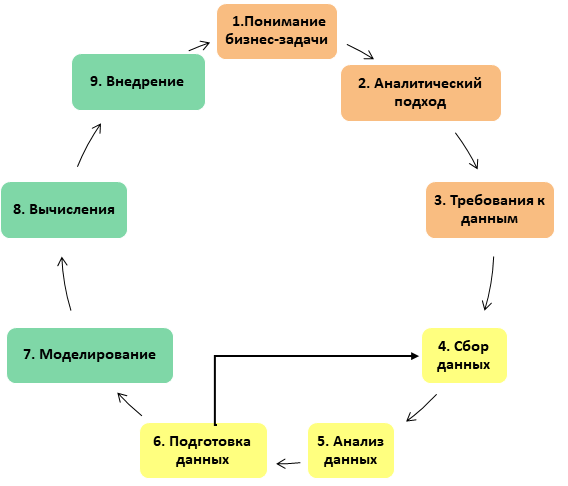
After we cleaned and transformed the data, it may turn out that the data is somehow not enough, so it’s normal if you have to return to the step of obtaining data from this stage, add more values to the selection, or search for new data sources. This is normal.
Conclusion
Yes, data preparation is not an easy task, sometimes even painful, but the efforts spent at this stage will return a hundredfold when starting the model: there are cases when even simple models quickly show excellent results and require minimal calibration if they work on well-prepared data.
Hope the article was helpful.
PS: The products used for illustrations were not harmed, but were used for their intended purpose!
All Articles